- Understanding Color Blindness
- A Little Bit About Color
- 2 Million+ WordPress Themes & Plugins, Web & Email Templates, UI Kits and More
- Designing As: Monochromatic Colors
- Designing For: High Contrast
- Designing For: Hue, Saturation & Brightness
- Designing As: “Borrowing” Colors
- Designing For: Selecting Colors with Specialist Tools
- Designing For: Don’t Associate Color with Feedback
- Bonus: Use the Colorblind Web Page Filter
- Conclusion
https://webdesign.tutsplus.com/articles/designing-for-and-as-a-color-blind-person—webdesign-3408
Color blindness is a mild disability through which the affected experience a decreased ability to distinguish colors from others. This can be a real drawback for anyone in the design field since color theory is an integral feature in successful design, and a lot of decisions are based on the feeling and emotion derived from design decisions, rather than a generic set of guidelines and taxonomies.
You’ve probably heard a lot about accessibility in web design already; it’s important to cater for the widest audience, who could potentially have problems with your website if not designed in the right way. As a bonus, we’ll touch on that a bit later, but the main focus of this article is actually looking at how a color-blind designer can still successfully tailor a website’s design.
In today’s article, we’re going to look at how color-blind designers can still create a successful case study for good use of color and how non-sufferers can still take into account the needs of their color-blind audience.
色盲是一种轻微的残疾,受影响的人通过这种能力将颜色与他人区分开来的能力下降。这对于设计领域的任何人来说都是一个真正的缺点,因为色彩理论是成功设计中不可或缺的特征,而且许多决策都是基于设计决策的感觉和情感,而不是一套通用的指导方针和分类法。
您可能已经听说过很多关于网页设计中的可访问性的内容;迎合最广泛的受众很重要,如果没有以正确的方式设计,他们可能会对您的网站产生问题。作为奖励,我们稍后会谈到这一点,但本文的主要重点实际上是研究色盲设计师如何仍然能够成功地定制网站的设计。
在今天的文章中,我们将看看色盲设计师如何仍然可以创建一个成功的案例研究以充分利用色彩,以及非患者如何仍然可以考虑到他们的色盲观众的需求。
Understanding Color Blindness
As I said before, color blindness is a mild disability in which distinguishing color can be an issue. In a nutshell, people with color blindness can’t identify certain colors amongst similar others, or just none at all.
There are multiple types of color blindness. Total color blindness (“monochromacy”) is a very rare condition, in which people only see different tones and brightness levels, with no color at all. However, more common cases are an inability to recognize blue/yellow or red/green, with the latter being the more common of the two.
Tests have been developed in order to recognize color blindness, normally by asking the potential suffer to recognize a message comprised of dots. Sufferers and non-sufferers will see different messages, allowing one to determine if they are a sufferer.
正如我之前所说,色盲是一种轻度残疾,区分颜色可能是一个问题。简而言之,色盲的人无法识别某些颜色以及其他相似的颜色,或者根本没有。
色盲有多种类型。完全色盲(“单色盲”)是一种非常罕见的情况,人们只能看到不同的色调和亮度级别,根本看不到颜色。然而,更常见的情况是无法识别蓝色/黄色或红色/绿色,后者是两者中更常见的一种。
已经开发了测试来识别色盲,通常是通过要求潜在的患者识别由点组成的信息。受难者和非受难者会看到不同的信息,从而可以确定他们是否是受难者。
What do you see in this circle of dots? Unaffected persons should see the number “74”, but those with the condition might see 21, or nothing at all.
Hopefully the image above better represents what I’m trying to get across. Your colors can be perceived differently by the two different groups (sufferers and non-sufferers), therefore invalidating your unmodified color scheme. One person might see 74, but a sufferer could completely miss it and allow it to go completely off the radar.
你在这个圆点中看到了什么?未受影响的人应该看到数字“74”,但有条件的人可能会看到 21,或者什么也没有。
希望上面的图片能更好地代表我想要表达的内容。两个不同的群体(受苦者和非受苦者)可能对您的颜色有不同的感知,因此使您未修改的配色方案无效。一个人可能会看到 74,但患者可能会完全错过它并让它完全消失。
A Little Bit About Color
We already have an article here at Webdesigntuts+ on color theory, which you should probably have a read of before we continue. Thomas Cannon does a darn good job at explaining what color theory is.
Color theory actually covers a number of things, but at the most basic level it is the interaction of colors in a design through complementation, contrast, and vibrancy.
As you’re probably aware, colors on the web are generally referred to as a hexadecimal code; something like #ff0000. Our browser then intelligently translates these into RGB values, in order to render the color that we have asked it to show up. If you want to dive in a little deeper, hexadecimal codes are actually very interesting, as you can break it down in order to find out the specifications for red, green and blue, thanks to the values ranging from 0-9 or A-F.
Thankfully, creative types have had a pretty great tool for a long time to help them work out what colors look good together: the color wheel. The color wheel is a donut-like shape of colors, stemming from the three primary colors: red, yellow and blue. It’s beyond the horizon of this article to go into too much detail here (and, plus, I’d be walking in the same footsteps at Thomas), so I won’t go much further than saying that this wheel can help us determine which colors have a natural chemistry.
A color scheme is simply a logical set of colors that go together, and these stem from the color wheel. There’s a handful of different methods for picking out colors in the color wheel, which you can learn about in the latter half of Thomas’s article.
Now we know a little more about how color, and color schemes, work, let’s actually look at how we can “assume” schemes that will naturally fit together.
关于颜色的一点点
我们已经在 Webdesigntuts+ 上发表了一篇关于色彩理论的文章,在我们继续之前,您可能应该阅读一下。 Thomas Cannon 在解释什么是色彩理论方面做得非常好。
颜色理论实际上涵盖了很多东西,但在最基本的层面上,它是设计中颜色通过互补、对比和活力的相互作用。
您可能知道,网络上的颜色通常被称为十六进制代码。类似于#ff0000。然后,我们的浏览器智能地将这些转换为 RGB 值,以呈现我们要求它显示的颜色。如果你想深入一点,十六进制代码实际上是非常有趣的,因为你可以分解它以找出红色、绿色和蓝色的规格,这要归功于 0-9 或 A-F 的值。
值得庆幸的是,创意类型长期以来一直有一个非常棒的工具来帮助他们确定哪些颜色搭配起来看起来不错:色轮。色轮是一种类似甜甜圈的颜色形状,源于三种原色:红色、黄色和蓝色。在这里详细介绍超出了本文的范围(而且,另外,我会走在托马斯的相同脚步),所以我不会说这个轮子可以帮助我们确定哪个颜色具有天然的化学成分。
配色方案只是一组合乎逻辑的颜色,这些颜色源于色轮。有几种不同的方法可以在色轮中挑选颜色,您可以在 Thomas 文章的后半部分了解这些方法。
现在我们对颜色和配色方案的工作原理有了更多的了解,让我们实际看看我们如何“假设”可以自然地组合在一起的方案。
2 Million+ WordPress Themes & Plugins, Web & Email Templates, UI Kits and More
Download thousands of WordPress themes and plugins, web templates, UI elements, and much more with an Envato Elements membership. Get unlimited access to a growing library to millions of creative and web design assets.
百万+ WordPress 主题和插件、Web 和电子邮件模板、UI 工具包等
通过 Envato Elements 会员资格下载数千个 WordPress 主题和插件、Web 模板、UI 元素等等。无限制地访问不断增长的库,其中包含数百万个创意和网页设计资产。 Email Templates
Create professional, responsive emails with 200+ templates. Shopify Themes
Build a beautiful online store that stands out from the crowd. UX & UI Kits
Easily customizable UX and UI kits to inspire your next project.
Designing As: Monochromatic Colors
Monochromatic color schemes are not to be confused with monochromacy. Monochromacy is the color blindness we talked about earlier, which is very rare and makes the sufferer only see a single color, in multiple shades. Monochrome is, in fact, intended to be in such a way, with designs consisting entirely of a single color in multiple shades, versus using multiple colors.
Using a monochromatic color scheme is not necessarily a hindrance. In fact, it can be a great advantage to give unity within your design. What about black? Sure, you could class black as a second color, but you can still achieve similar contrast with just using a very dark variant of your chosen color.
Achieving contrast is super simple when using a monochromatic color scheme. Since those with color blindness can still recognize different shades of color, introducing contrast is no problem since it is recognized in the same way.
Of course, a monochromatic color scheme can be used with any single color and can be quite effective in that way. However, for those that instantly thought “black and white” when I mentioned monochrome, that’s effective too. A lot of minimalist sites use a grayscale color scheme, which should be no problem for anyone to view in the intended way. If you want to stay safe, grayscale can look awesome, as long as it fits into the overall tone and feel of your design.
Designing For: High Contrast
High amounts of contrast is really important here because it’s a great way of creating a consistent color scheme, without actually having to bother about the color park. We can create very light to very dark shades of a single color, giving us a wealth of different values to use. For example, if you were using a light blue for your background, you’d want to use a much darker blue for the text in order to keep your text legible.
Using monochrome offers color blind visitors a way of easily appreciating your design, even if they can’t necessarily identify the intended colors. However, high contrast offers a great deal of readability improvements to any user and is a designing principle we should be aware of away from accessibility.
Designing For: Hue, Saturation & Brightness
Like tweaking contrast, modifying the hue, saturation and brightness of colors can help us show definition and allow users to distinguish, without using multiple colors. By sticking with a small set of colors, or even just one, changing the saturation can really show a distinguishing contrast within two samples of a color, as can brightness and hue.
These methods allow color-blind designers to easily define different bits of their design through color, without having to worry too much about the aesthetics as if they were adding a new color to the mix. For the color-blind visitors, this allows for distinguishing different looking parts easily.
Both these examples started out as exact duplicates. However, the hue has been turned up slightly on the right.
Designing As: “Borrowing” Colors
This is mainly a tip aimed at color-blind designers, rather than those simply considering their color-blind audience.
It’s incredibly easy to “borrow” colors from fellow web designs, or other non-web-based designs nowadays. By simply pulling out the eyedropper tool from our arsenal of graphic editing tools, we can easily identify colors within a design and start using them in ours. “Stealing” color schemes can be a really effective way of identifying what works well and replicating it in a different form while maintaining the successful intentions of a successful scheme.
Of course, this is kind of cheating, but not so much that it’s stealing. We’re simply picking out colors in web designs that work well, and not going in and lifting entire elements. Fortunately, color isn’t copyrighted.
Once we’ve identified colors and got them represented by hex values, we can use it in conjunction with other methods (such as using a single color with multiple shades, as detailed above). It might be harder, but do make sure you vary your palette and invent it yourself, without lifting the entire scheme from another’s design.
Designing For: Selecting Colors with Specialist Tools
If you’re designing while taking into account color-blind persons, there are a couple of online tools that will allow you to simulate individual colors under color-blind circumstances.
These tools offer some insight into what color-blind visitors will see, and allow you to carefully select colors by making sure they look good for regular and suffering visitors. The first tool, the Color Laboratory, actually allows you to check out how colors look in conjunction with each other so you can easily create color schemes that work well for anyone - sufferer or not - on any operating system.
设计为:“借用”颜色
这主要是针对色盲设计师的提示,而不是那些仅仅考虑他们的色盲观众的人。
如今,从其他网页设计或其他非基于网页的设计中“借用”颜色非常容易。只需从我们的图形编辑工具库中取出吸管工具,我们就可以轻松识别设计中的颜色并开始在我们的设计中使用它们。 “窃取”配色方案可能是一种非常有效的方法,可以识别哪些效果很好,并以不同的形式复制它,同时保持成功方案的成功意图。
当然,这是一种作弊,但不是偷窃。我们只是在网页设计中挑选出效果良好的颜色,而不是进入并提升整个元素。幸运的是,颜色不受版权保护。
一旦我们确定了颜色并用十六进制值表示它们,我们就可以将它与其他方法结合使用(例如使用具有多种阴影的单一颜色,如上所述)。这可能会更难,但一定要确保你改变你的调色板并自己发明它,而不是从另一个人的设计中提升整个方案。
设计:使用专业工具选择颜色
如果您在设计时考虑到色盲人,那么有几个在线工具可以让您在色盲情况下模拟个人颜色。
这些工具提供了一些关于色盲访问者会看到什么的洞察力,并允许您仔细选择颜色,确保它们看起来适合普通和受苦的访问者。第一个工具,颜色实验室,实际上允许您检查颜色如何相互结合,以便您可以轻松地创建适用于任何人(无论是否受苦)在任何操作系统上的配色方案。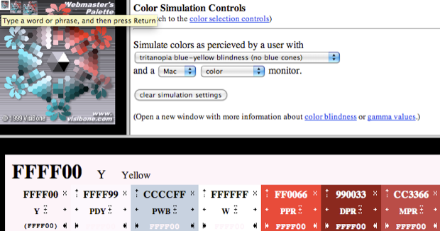
The second tool is a simple form that allows you to paste in your HTML and swap out hexadecimal color values with the color-blind equivalent, allowing you to easily tweak them in order to create a palette that is appealing to sufferers and non-sufferers alike.
第二个工具是一个简单的表单,它允许您粘贴 HTML 并用色盲等效项替换十六进制颜色值,允许您轻松调整它们以创建一个对患者和非患者都有吸引力的调色板.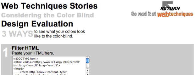
Designing For: Don’t Associate Color with Feedback
Next up is a tip mainly aimed at designers considering their possible color-blind audience. We naturally assume certain feelings with color, such as red with danger or green with safety. Using this principle within our web designs is a great way of immediately associating the result of a certain action, but only to those with regular vision. Your color-blind visitors might not make the instant association, suggesting you need to integrate some additional method of warning, or praise.
设计:不要将颜色与反馈联系起来
接下来是一个提示,主要针对考虑到他们可能的色盲观众的设计师。我们自然而然地用颜色来假设某些感觉,例如红色代表危险或绿色代表安全。在我们的网页设计中使用这一原则是一种立即关联特定操作结果的好方法,但仅限于那些有正常视力的人。您的色盲访客可能不会立即产生联想,这表明您需要整合一些额外的警告或表扬方法。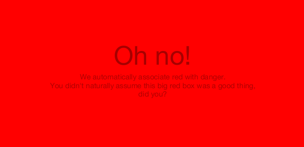
This is more of a usability point, but it’s one you should probably take notice of in order to minimize user frustration. Of course, colorblind people are not completely blind to color. Instead, they see different colors than what we see and have, therefore, naturally associated different colors with different messages. However, it’s a lot easier to ensure recognition through other means too.
这更像是一个可用性点,但您可能应该注意这一点,以最大程度地减少用户的挫败感。当然,色盲的人并非完全对颜色视而不见。相反,他们看到的颜色与我们看到的不同,因此自然地将不同的颜色与不同的信息联系起来。但是,通过其他方式确保识别也容易得多。
Bonus: Use the Colorblind Web Page Filter
Designing for the colorblind can be troublesome for designers who aren’t actually colorblind. How do we take into account accessibility when we do not suffer from the condition in hand?
Luckily, there’s a handful of accessibility “simulators” available on the web where a web page is rendered in a certain way. The example below, named pretty generically as the “Colorblind Web Page Filter“, takes your site and filters it as if you were color blind.
The tool is still in development and it can take some time for a render to become available for viewing. However, the range of color filters available is fairly extensive, covering all major types of colorblindness.
使用色盲网页过滤器
对于实际上不是色盲的设计师来说,为色盲设计可能会很麻烦。当我们不受手头状况的影响时,我们如何考虑可访问性?
幸运的是,网络上有一些可访问性“模拟器”,其中网页以某种方式呈现。下面的示例非常笼统地命名为“色盲网页过滤器”,它会获取您的网站并对其进行过滤,就好像您是色盲一样。
该工具仍在开发中,渲染可能需要一些时间才能查看。但是,可用的滤色器范围相当广泛,涵盖了所有主要类型的色盲。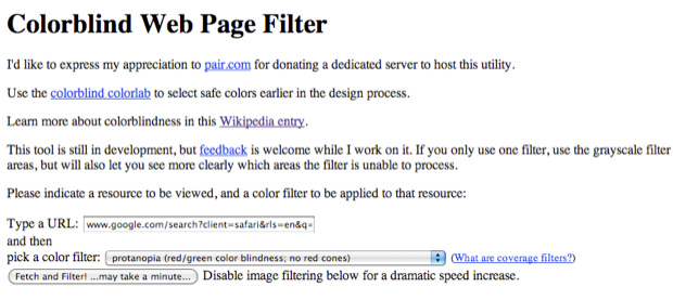
Another simulator for previewing what a color-blind audience would see is Vischeck, allowing you to preview a live webpage, or some images, in one of three types of color vision deficits. It even has a tool that will correct images so color-blind viewers can see them naturally.
另一个用于预览色盲观众会看到什么的模拟器是 Vischeck,它允许您在三种色觉缺陷类型之一中预览实时网页或某些图像。它甚至有一个工具可以校正图像,让色盲的观众可以自然地看到它们。
Conclusion
Color blindness of any sort is not a rare problem that only affects a handful of people. In fact, it’s a widespread condition that many people encounter in their every day lives. We should, as web designers, try to take into account these visitors as best we could. If we use color, in conjunction with a well organized layout, being color blind shouldn’t be a problem, in terms of readability or aesthetics.
The effects of color-blindness will be most felt when it’s the designer who suffers. Luckily, we can design in monochrome and create a universal, aesthetically-pleasing design by using contrast over multiple colors. It turns out, contrast is key. As a designer, this should not be something we don’t know already, as contrast is a key in the legibility of a design.
Of course, we understand that any design - monochrome or not - should have high levels of contrast to increase the legibility of elements on a page. However, we can “cheat” and borrow colors, or use one of the aforementioned tools to create color schemes that will automatically work for everyone.
Luckily, color blindness isn’t a massive complaint on the web, as it is in some other fields. By learning some color theory, we can assume schemes without even seeing them through the right eyes, allowing you to get perfect results each time.
结论
任何类型的色盲都不是一个罕见的问题,它只影响少数人。事实上,这是许多人在日常生活中遇到的普遍情况。作为网页设计师,我们应该尽可能地考虑这些访问者。如果我们将颜色与组织良好的布局结合使用,就可读性或美观性而言,色盲应该不是问题。
当受害的是设计师时,色盲的影响最为明显。幸运的是,我们可以进行单色设计,并通过使用多种颜色的对比来创建通用的、美观的设计。事实证明,对比度是关键。作为设计师,这不应该是我们不知道的事情,因为对比度是设计易读性的关键。
当然,我们知道任何设计(无论是否单色)都应该具有高对比度,以增加页面上元素的易读性。但是,我们可以“作弊”和借用颜色,或者使用上述工具之一来创建自动适用于所有人的配色方案。
幸运的是,色盲在网络上并不是一个大问题,就像在其他一些领域一样。通过学习一些色彩理论,我们甚至可以在不通过右眼看到它们的情况下假设方案,让您每次都能获得完美的结果。

若有收获,就点个赞吧
0 人点赞
