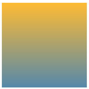
1.渐变平分盒子
.box{width: 200px;height: 200px;margin: 100px auto;background: linear-gradient(#fb3,#58a);}
2.有三种颜色的条纹图案
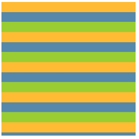<br />如果我们第二个的色标值为0,那他的位置总是被浏览器调整为前一个色标的位置
.box{width: 200px;height: 200px;margin: 100px auto;background: linear-gradient(#fb3 33.33%,#58a 0,#58a 66.6%,yellowgreen 0);background-size: 100% 45px;}
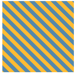
3.斜向条纹
.box{width: 200px;height: 200px;margin: 100px auto;background: linear-gradient(45deg, #fb3 25%,#58a 0,#58a 50%,#fb3 0, #fb3 75% , #58a 0);background-size: 30px 30px;}
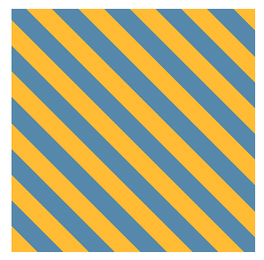
<br /> 4.更简洁 规范的斜向条纹(repeating-linear-gradient 色标是无限循环重复的,直到填满整个背景)
.box{width: 200px;height: 200px;margin: 100px auto;background: repeating-linear-gradient(45deg,#fb3, #fb3 15px, #58a 0, #58a 30px);}

若有收获,就点个赞吧
0 人点赞
