html:
(1)当一个整体快包含四部分时,这四个部分有框架和fas组成,那么可以四个部分可以不由块元素包围,而是采用a标签
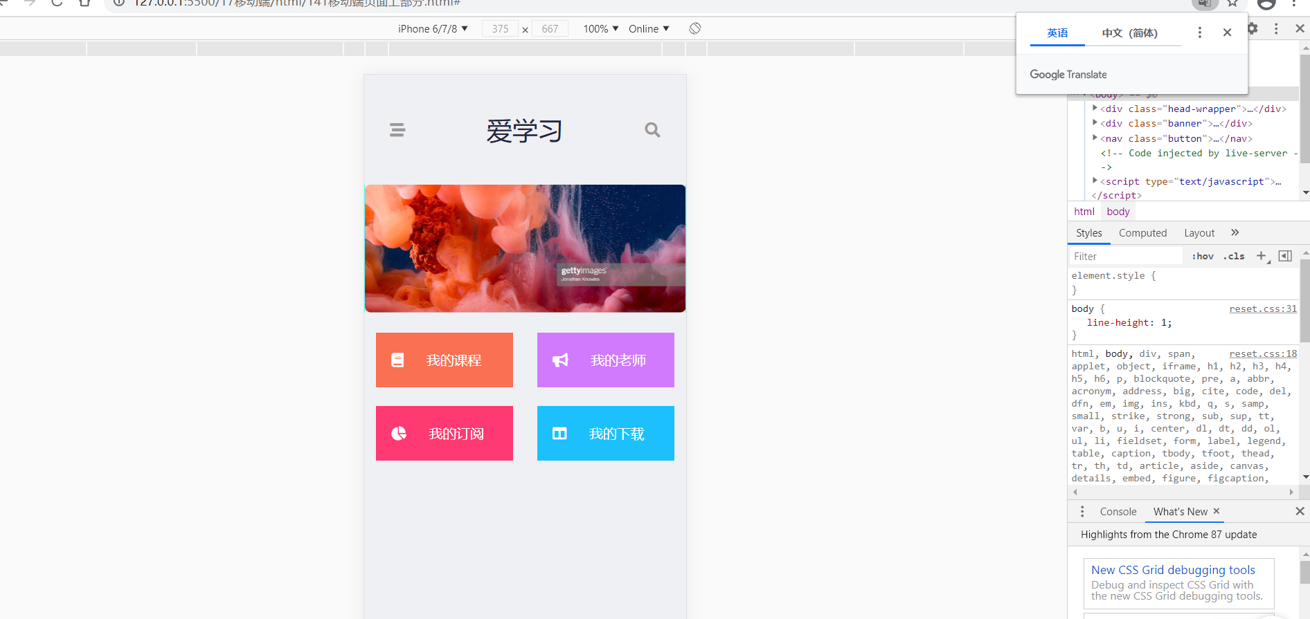
<!DOCTYPE html><html lang="en"><head><meta charset="UTF-8"><meta http-equiv="X-UA-Compatible" content="IE=edge"><meta name="viewport" content="width=device-width, initial-scale=1.0"><title>Document</title><link rel="stylesheet" href="../../css/reset.css"><link rel="stylesheet" href="../css/141移动端页面上部分.css"><link rel="stylesheet" href="../../fa/css/all.css"></head><body><div class="head-wrapper"><div class="stream"><a href="#"></a><i class="fas fa-stream"></i></div><h1 class="head-title"><a href="#">爱学习</a></h1><div class="search"><a href="#"></a><i class="fas fa-search"></i></div></div><div class="banner"><img src="../img/banner.png"></div><nav class="button"><a class="course" href="#"><i class="fas fa-book"></i>我的课程</a><a class="teacher" href="#"><i class="fas fa-bullhorn"></i>我的老师</a><a class="sub" href="#"><i class="fas fa-chart-pie"></i>我的订阅</a><a class="download" href="#"><i class="fas fa-columns"></i>我的下载</a></nav></body></html>
less:
(1)统一设置宽度和大小变量,并且将.w {} 写好,以后每一个直接通过 :extend(.w) {} 来引用
(2)justify-content在flex布局中,设置主轴的对齐方式。 space-between是中间间隔,space-evenly; //定义了辅轴上的对齐方式, 均匀排列每个元素,每个元素之间的间隔相等//
justify-content: space-around; //定义了主轴上的对齐方式,所有元素两端都有间隔//
(3)当父元素设置为flex之后,那么a元素也可以设置长宽了
@total-width:750;
@h:175;

.w {
    width: 693/40rem;
    margin: 0 auto;

}

html {
    font-size: 100vw/@total-width*40;
    background-color: #eff0f4;
}

.head-wrapper:extend(.w) {
    background-color: #eff0f4;
    display: flex;
    height: 8rem;
    flex-direction: row;
    justify-content: space-between;
    align-items: center;
    .stream {
        margin: 0 0 0 30px;
        font-size: 18px;
        color: #999999;
    }

    .search {
        margin: 0 30px 0 0;
        font-size: 18px;
        color: #999999;
    }

    .head-title {
        font-size: 30px;
        a {
            text-decoration: none;
            color: #24253d;
        }
    }
}

.banner:extend(.w) {
    border-radius: 10px;
    img {
        width: 100%;
    }
}

.button:extend(.w) {

    display: flex;
    flex-wrap: wrap;
    flex-direction: row;
    background-color: #eff0f4;
    height: 12rem;
    align-content: space-evenly;    //定义了辅轴上的对齐方式, 均匀排列每个元素,每个元素之间的间隔相等//
    justify-content: space-around;  //定义了主轴上的对齐方式,所有元素两端都有间隔//
    a {
        width: 10rem;
        height: 4rem;
        line-height: 4rem;
        text-decoration: none;
        color: #ffffff;
        i {
            margin: 0 22px 0 18px;
        }
    }

    .course {
        background-color: #f97053;
    }

    .teacher {
        background-color: #d17afd;
    }

    .sub {
        background-color: #ff3971;
    }

    .download {
        background-color: #1bc0fc;
    }
}

若有收获,就点个赞吧
0 人点赞
