属性说明
| 属性名 | 类型 | 默认值 | 说明 | 平台差异说明 |
|---|---|---|---|---|
| checked | Boolean | false | 是否选中 | |
| disabled | Boolean | false | 是否禁用 | 字节跳动小程序不支持 |
| type | String | switch | 样式,有效值:switch, checkbox | |
| @change | EventHandle | checked 改变时触发 change 事件,event.detail={ value:checked} | ||
| color | Color | switch 的颜色,同 css 的 color |
示例
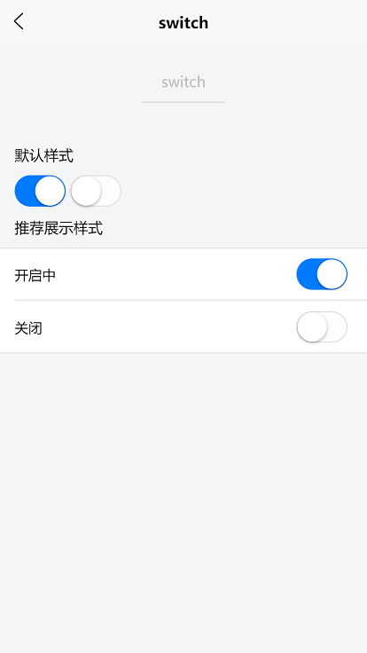
<template><view><view class="uni-padding-wrap uni-common-mt"><view class="uni-title">默认样式</view><view><switch checked @change="switch1Change" /><switch @change="switch2Change" /></view><view class="uni-title">推荐展示样式</view></view><view class="uni-list"><view class="uni-list-cell uni-list-cell-pd"><view class="uni-list-cell-db">开启中</view><switch checked /></view><view class="uni-list-cell uni-list-cell-pd"><view class="uni-list-cell-db">关闭</view><switch /></view></view></view></template>
export default {data() {return {}},methods: {switch1Change: function (e) {console.log('switch1 发生 change 事件,携带值为', e.target.value)},switch2Change: function (e) {console.log('switch2 发生 change 事件,携带值为', e.target.value)}}}
示例代码说明:以上示例代码从hello uni-app示例中复制,涉及的css样式在hello uni-app的app.vue和uni.css中
预览H5效果:使用浏览器的手机模式访问https://hellouniapp.dcloud.net.cn/pages/component/switch/switch
注意
- switch的默认颜色,在不同平台不一样。微信小程序是绿色的,字节跳动小程序为红色,其他平台是蓝色的。更改颜色使用color属性。
- 如需调节switch大小,可通过css的scale方法调节,如缩小到70%
style="transform:scale(0.7)"

若有收获,就点个赞吧
0 人点赞
