平台差异说明
| App | H5 | 微信小程序 | 支付宝小程序 | 百度小程序 | 字节跳动小程序 | QQ小程序 | 快应用 | 360小程序 |
|---|---|---|---|---|---|---|---|---|
| √ | √(2.2.3+) | √ | √ | √ | √ | √ | √ | √ |
Tips
- 由于 icon 组件各端表现存在差异,可以通过使用 字体图标 的方式来弥补各端差异。
属性说明
| 属性名 | 类型 | 默认值 | 说明 | | —- | —- | —- | —- | | type | String | | icon的类型 | | size | Number | 23 | icon的大小,单位px | | color | Color | | icon的颜色,同css的color |
各平台 type 有效值说明:
| 平台 | type 有效值 |
|---|---|
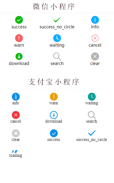
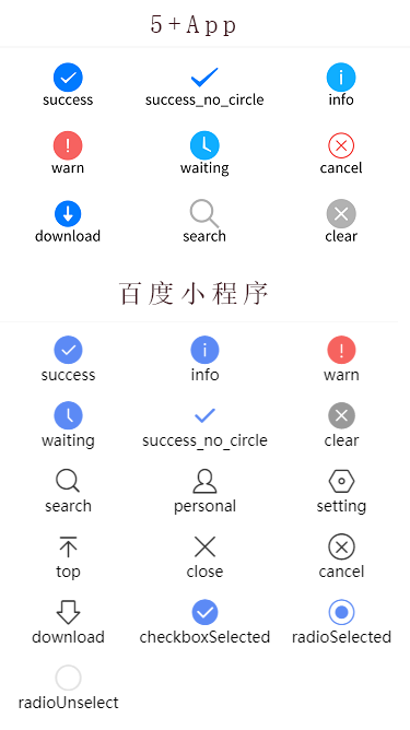
| App、H5、微信小程序、QQ小程序 | success, success_no_circle, info, warn, waiting, cancel, download, search, clear |
| 支付宝小程序 | info, warn, waiting, cancel, download, search, clear, success, success_no_circle,loading |
| 百度小程序 | success, info, warn, waiting, success_no_circle, clear, search, personal, setting, top, close, cancel, download, checkboxSelected, radioSelected, radioUnselect |
示例
<view class="item" v-for="(value,index) in iconType" :key="index"><icon :type="value" size="26"/><text>{{value}}</text></view>
export default {data() {return {iconType: ['success']}},onLoad() {// #ifdef APP-PLUS|| MP-WEIXINthis.iconType = ['success', 'success_no_circle', 'info', 'warn', 'waiting', 'cancel', 'download', 'search','clear']// #endif// #ifdef MP-ALIPAYthis.iconType = ['info', 'warn', 'waiting', 'cancel', 'download', 'search', 'clear', 'success', 'success_no_circle', 'loading']// #endif// #ifdef MP-BAIDUthis.iconType = ['success', 'info', 'warn', 'waiting', 'success_no_circle', 'clear', 'search', 'personal', 'setting', 'top', 'close', 'cancel', 'download', 'checkboxSelected', 'radioSelected', 'radioUnselect']// #endif}}
效果展示

若有收获,就点个赞吧
0 人点赞
