- WGCNA术语
- 整体思路
- R脚本
- 加载R包
- 1. 数据读入,处理和保存
- 转置数据,行为样本,列为基因
- data<-log10(date[,-1]+0.01)
- sizeGrWindow(12,9)
- 2. 选择合适的阀值
- Call the network topology analysis function
- Plot the results:
- Scale-free topology fit index as a function of the soft-thresholding power
- this line corresponds to using an R^2 cut-off of h
- Mean connectivity as a function of the soft-thresholding power
- =====================================================================================
- 网络构建有两种方法,One-step和Step-by-step;
- 第一种:一步法进行网络构建
- =====================================================================================
- 3. 一步法网络构建:One-step network construction and module detection
- 4. 绘画结果展示
- open a graphics window
- sizeGrWindow(12, 9)
- Convert labels to colors for plotting
- Plot the dendrogram and the module colors underneath
- 5.结果保存
- 6. 导出网络到Cytoscape
- Recalculate topological overlap if needed
- Read in the annotation file
- annot = read.csv(file = “GeneAnnotation.csv”);
- Select modules需要修改,选择需要导出的模块颜色
- Select module probes选择模块探测
- modGenes = annot$gene_symbol[match(modProbes, annot$substanceBXH)];
- Select the corresponding Topological Overlap
- Export the network into edge and node list files Cytoscape can read
- =====================================================================================
- 分析网络可视化,用heatmap可视化权重网络,heatmap每一行或列对应一个基因,颜色越深表示有较高的邻近
- =====================================================================================
- 1. 可视化全部基因网络
- Calculate topological overlap anew: this could be done more efficiently by saving the TOM
- calculated during module detection, but let us do it again here.
- Transform dissTOM with a power to make moderately strong connections more visible in the heatmap
- Set diagonal to NA for a nicer plot
- Call the plot function
- sizeGrWindow(9,9)
- 随便选取1000个基因来可视化
- For reproducibility, we set the random seed
- There’s no simple way of restricting a clustering tree to a subset of genes, so we must re-cluster.
- Open a graphical window
- sizeGrWindow(9,9)
- Taking the dissimilarity to a power, say 10, makes the plot more informative by effectively changing
- the color palette; setting the diagonal to NA also improves the clarity of the plot
- =====================================================================================
- 第二种:一步步的进行网络构建
- =====================================================================================
- 2.选择合适的阀值,同上
- 3. 网络构建:
- (1) Co-expression similarity and adjacency
- (2) 邻近矩阵到拓扑矩阵的转换,Turn adjacency into topological overlap
- (3) 聚类拓扑矩阵
- Call the hierarchical clustering function
- Plot the resulting clustering tree (dendrogram)
- sizeGrWindow(12,9)
- (4) 聚类分支的休整dynamicTreeCut
- We like large modules, so we set the minimum module size relatively high:
- Module identification using dynamic tree cut:
- 4. 绘画结果展示
- Convert numeric lables into colors
- Plot the dendrogram and colors underneath
- sizeGrWindow(8,6)
- 5. 聚类结果相似模块的融合,Merging of modules whose expression profiles are very similar
- 在聚类树中每一leaf是一个短线,代表一个基因,
- 不同分之间靠的越近表示有高的共表达基因,将共表达极其相似的modules进行融合
- Calculate eigengenes
- Calculate dissimilarity of module eigengenes
- Cluster module eigengenes
- Plot the result
- sizeGrWindow(7, 6)
- 选择有75%相关性的进行融合
- Plot the cut line into the dendrogram
- Call an automatic merging function
- The merged module colors
- Eigengenes of the new merged modules:
- 绘制融合前(Dynamic Tree Cut)和融合后(Merged dynamic)的聚类图
- sizeGrWindow(12, 9)
- pdf(file = “Plots/geneDendro-3.pdf”, wi = 9, he = 6)
- dev.off()
- 只是绘制融合后聚类图
- 5.结果保存
- Rename to moduleColors
- Construct numerical labels corresponding to the colors
- Save module colors and labels for use in subsequent parts
- 6. 导出网络到Cytoscape
- Recalculate topological overlap if needed
- Read in the annotation file
- annot = read.csv(file = “GeneAnnotation.csv”);
- Select modules需要修改
- Select module probes
- modGenes = annot$gene_symbol[match(modProbes, annot$substanceBXH)];
- Select the corresponding Topological Overlap
- Export the network into edge and node list files Cytoscape can read
- =====================================================================================
- 分析网络可视化,用heatmap可视化权重网络,heatmap每一行或列对应一个基因,颜色越深表示有较高的邻近
- =====================================================================================
- 1. 可视化全部基因网络
- Calculate topological overlap anew: this could be done more efficiently by saving the TOM
- calculated during module detection, but let us do it again here.
- Transform dissTOM with a power to make moderately strong connections more visible in the heatmap
- Set diagonal to NA for a nicer plot
- Call the plot function
- sizeGrWindow(9,9)
- 随便选取1000个基因来可视化
- For reproducibility, we set the random seed
- There’s no simple way of restricting a clustering tree to a subset of genes, so we must re-cluster.
- Open a graphical window
- sizeGrWindow(9,9)
- Taking the dissimilarity to a power, say 10, makes the plot more informative by effectively changing
- the color palette; setting the diagonal to NA also improves the clarity of the plot
- 此处画的是根据基因间表达量进行聚类所得到的各模块间的相关性图
来源:tiramisutes2
在转录组数据处理过程中我们经常会用到差异表达分析这一概念,通过比较不同处理或不同组织间基因表达量(FPKM)差异来寻找特异基因,但这前提是你的不同处理或不同组织样本较少,当不同处理或组织有较多样本,如40个,此时的两两比较有780组比较^_^,这根本不是我们想要的结果;
此时就需要WGCNA(weighted gene co-expression network analysis)将复杂的数据进行归纳整理。除了这种最常见的比较差异表达,我们还想知道在不同处理或不同组织间是否有些基因的表达存在内在的联系或相关性?WGCNA同样可以帮助我们预测基因间的相互作用关系。
WGCNA术语
权重(weghted)

Module
模块(module):表达模式相似的基因分为一类,这样的一类基因成为模块;
Eigengene
Eigengene(eigen- + gene):基因和样本构成的矩阵,https://en.wiktionary.org/wiki/eigengene;
Adjacency Matrix
邻近矩阵:是图的一种存储形式,用一个一维数组存放图中所有顶点数据;用一个二维数组存放顶点间关系(边或弧)的数据,这个二维数组称为邻接矩阵;
Topological Overlap Matrix(TOM)

整体思路
先对数据进行处理→分层聚类→表达模式相似的基因组成模块→研究某一个模块中相关基因的功能富集(GO,KEGG),各个模块与样本表型数据间的相关性,各个模块与样本本身间的相关性(没有表型数据的情况,如不同组织)→具体到特定模块后分析其所包含基因间的相互作用网络关系,并找出其中的关键基因。
分析构建的网络寻找以下有用信息
- 这类处于调控网络中心的基因称为核心基因(hub gene),这类基因通常是转录因子等关键的调控因子,是值得我们优先深入分析和挖掘的对象。
- 在网络中,被调控线连接的基因,其表达模式是相似的。那么它们潜在有相似的功能。所以,在这个网络中,如果线条一端的基因功能是已知的,那么就可以预测线条另一端的功能未知的基因也有相似的功能。
R脚本
输入数据为RNA-seq不同处理或组织所有样本的FPKM值组成的矩阵,切记含有 0 的要去掉; ```bash setwd(“F:/WGCNA”)加载R包
library(WGCNA) options(stringsAsFactors = FALSE) enableWGCNAThreads()
1. 数据读入,处理和保存
fpkm<- read.csv(“trans_counts.counts.matrix.TMM_normalized.FPKM.nozero.csv”) head(fpkm) dim(fpkm) names(fpkm)
转置数据,行为样本,列为基因
datExpr0=as.data.frame(t(fpkm[,-c(1)])); names(datExpr0)=fpkm$trans; rownames(datExpr0)=names(fpkm)[-c(1)];
data<-log10(date[,-1]+0.01)
gsg = goodSamplesGenes(datExpr0, verbose = 3); gsg$allOK sampleTree = hclust(dist(datExpr0), method = “average”)
sizeGrWindow(12,9)
par(cex = 0.6) par(mar = c(0,4,2,0)) plot(sampleTree, main = “Sample clustering to detect outliers”, sub=””, xlab=””, cex.lab = 1.5, cex.axis = 1.5, cex.main = 2) abline(h = 80000, col = “red”);
clust = cutreeStatic(sampleTree, cutHeight = 80000, minSize = 10) table(clust) keepSamples = (clust==1) datExpr = datExpr0[keepSamples, ] nGenes = ncol(datExpr) nSamples = nrow(datExpr) save(datExpr, file = “AS-green-FPKM-01-dataInput.RData”)
2. 选择合适的阀值
powers = c(c(1:10), seq(from = 12, to=20, by=2))
Call the network topology analysis function
sft = pickSoftThreshold(datExpr, powerVector = powers, verbose = 5)
Plot the results:
sizeGrWindow(9, 5)
par(mfrow = c(1,2)); cex1 = 0.9;
Scale-free topology fit index as a function of the soft-thresholding power
plot(sft$fitIndices[,1], -sign(sft$fitIndices[,3])sft$fitIndices[,2], xlab=”Soft Threshold (power)”,ylab=”Scale Free Topology Model Fit,signed R^2”,type=”n”, main = paste(“Scale independence”)); text(sft$fitIndices[,1], -sign(sft$fitIndices[,3])sft$fitIndices[,2], labels=powers,cex=cex1,col=”red”);
this line corresponds to using an R^2 cut-off of h
abline(h=0.90,col=”red”)
Mean connectivity as a function of the soft-thresholding power
plot(sft$fitIndices[,1], sft$fitIndices[,5], xlab=”Soft Threshold (power)”,ylab=”Mean Connectivity”, type=”n”, main = paste(“Mean connectivity”)) text(sft$fitIndices[,1], sft$fitIndices[,5], labels=powers, cex=cex1,col=”red”)
=====================================================================================
网络构建有两种方法,One-step和Step-by-step;
第一种:一步法进行网络构建
=====================================================================================
3. 一步法网络构建:One-step network construction and module detection
net = blockwiseModules(datExpr, power = 6, maxBlockSize = 6000, TOMType = “unsigned”, minModuleSize = 30, reassignThreshold = 0, mergeCutHeight = 0.25, numericLabels = TRUE, pamRespectsDendro = FALSE, saveTOMs = TRUE, saveTOMFileBase = “AS-green-FPKM-TOM”, verbose = 3) table(net$colors)
4. 绘画结果展示
open a graphics window
sizeGrWindow(12, 9)
Convert labels to colors for plotting
mergedColors = labels2colors(net$colors)
Plot the dendrogram and the module colors underneath
plotDendroAndColors(net$dendrograms[[1]], mergedColors[net$blockGenes[[1]]], “Module colors”, dendroLabels = FALSE, hang = 0.03, addGuide = TRUE, guideHang = 0.05)
5.结果保存
moduleLabels = net$colors moduleColors = labels2colors(net$colors) table(moduleColors) MEs = net$MEs; geneTree = net$dendrograms[[1]]; save(MEs, moduleLabels, moduleColors, geneTree, file = “AS-green-FPKM-02-networkConstruction-auto.RData”)
6. 导出网络到Cytoscape
Recalculate topological overlap if needed
TOM = TOMsimilarityFromExpr(datExpr, power = 6);
Read in the annotation file
annot = read.csv(file = “GeneAnnotation.csv”);
Select modules需要修改,选择需要导出的模块颜色
modules = c(“turquoise”, “blue”);
Select module probes选择模块探测
probes = names(datExpr) inModule = is.finite(match(moduleColors, modules)); modProbes = probes[inModule];
modGenes = annot$gene_symbol[match(modProbes, annot$substanceBXH)];
Select the corresponding Topological Overlap
modTOM = TOM[inModule, inModule]; dimnames(modTOM) = list(modProbes, modProbes)
Export the network into edge and node list files Cytoscape can read
cyt = exportNetworkToCytoscape(modTOM, edgeFile = paste(“AS-green-FPKM-One-step-CytoscapeInput-edges-“, paste(modules, collapse=”-“), “.txt”, sep=””), nodeFile = paste(“AS-green-FPKM-One-step-CytoscapeInput-nodes-“, paste(modules, collapse=”-“), “.txt”, sep=””), weighted = TRUE, threshold = 0.02, nodeNames = modProbes,
#altNodeNames = modGenes,nodeAttr = moduleColors[inModule]);
=====================================================================================
分析网络可视化,用heatmap可视化权重网络,heatmap每一行或列对应一个基因,颜色越深表示有较高的邻近
=====================================================================================
options(stringsAsFactors = FALSE); lnames = load(file = “AS-green-FPKM-01-dataInput.RData”); lnames lnames = load(file = “AS-green-FPKM-02-networkConstruction-auto.RData”); lnames nGenes = ncol(datExpr) nSamples = nrow(datExpr)
1. 可视化全部基因网络
Calculate topological overlap anew: this could be done more efficiently by saving the TOM
calculated during module detection, but let us do it again here.
dissTOM = 1-TOMsimilarityFromExpr(datExpr, power = 6);
Transform dissTOM with a power to make moderately strong connections more visible in the heatmap
plotTOM = dissTOM^7;
Set diagonal to NA for a nicer plot
diag(plotTOM) = NA;
Call the plot function
sizeGrWindow(9,9)
TOMplot(plotTOM, geneTree, moduleColors, main = “Network heatmap plot, all genes”)
随便选取1000个基因来可视化
nSelect = 1000
For reproducibility, we set the random seed
set.seed(10); select = sample(nGenes, size = nSelect); selectTOM = dissTOM[select, select];
There’s no simple way of restricting a clustering tree to a subset of genes, so we must re-cluster.
selectTree = hclust(as.dist(selectTOM), method = “average”) selectColors = moduleColors[select];
Open a graphical window
sizeGrWindow(9,9)
Taking the dissimilarity to a power, say 10, makes the plot more informative by effectively changing
the color palette; setting the diagonal to NA also improves the clarity of the plot
plotDiss = selectTOM^7; diag(plotDiss) = NA; TOMplot(plotDiss, selectTree, selectColors, main = “Network heatmap plot, selected genes”)
=====================================================================================
第二种:一步步的进行网络构建
=====================================================================================
#############Step-by-step network construction and module detection
2.选择合适的阀值,同上
3. 网络构建:
(1) Co-expression similarity and adjacency
softPower = 6; adjacency = adjacency(datExpr, power = softPower);
(2) 邻近矩阵到拓扑矩阵的转换,Turn adjacency into topological overlap
TOM = TOMsimilarity(adjacency); dissTOM = 1-TOM
(3) 聚类拓扑矩阵
Call the hierarchical clustering function
geneTree = hclust(as.dist(dissTOM), method = “average”);
Plot the resulting clustering tree (dendrogram)
sizeGrWindow(12,9)
plot(geneTree, xlab=””, sub=””, main = “Gene clustering on TOM-based dissimilarity”, labels = FALSE, hang = 0.04);
(4) 聚类分支的休整dynamicTreeCut
We like large modules, so we set the minimum module size relatively high:
minModuleSize = 30;
Module identification using dynamic tree cut:
dynamicMods = cutreeDynamic(dendro = geneTree, distM = dissTOM, deepSplit = 2, pamRespectsDendro = FALSE, minClusterSize = minModuleSize); table(dynamicMods)
4. 绘画结果展示
Convert numeric lables into colors
dynamicColors = labels2colors(dynamicMods) table(dynamicColors)
Plot the dendrogram and colors underneath
sizeGrWindow(8,6)
plotDendroAndColors(geneTree, dynamicColors, “Dynamic Tree Cut”, dendroLabels = FALSE, hang = 0.03, addGuide = TRUE, guideHang = 0.05, main = “Gene dendrogram and module colors”)
5. 聚类结果相似模块的融合,Merging of modules whose expression profiles are very similar
在聚类树中每一leaf是一个短线,代表一个基因,
不同分之间靠的越近表示有高的共表达基因,将共表达极其相似的modules进行融合
Calculate eigengenes
MEList = moduleEigengenes(datExpr, colors = dynamicColors) MEs = MEList$eigengenes
Calculate dissimilarity of module eigengenes
MEDiss = 1-cor(MEs);
Cluster module eigengenes
METree = hclust(as.dist(MEDiss), method = “average”);
Plot the result
sizeGrWindow(7, 6)
plot(METree, main = “Clustering of module eigengenes”, xlab = “”, sub = “”)
选择有75%相关性的进行融合
MEDissThres = 0.25
Plot the cut line into the dendrogram
abline(h=MEDissThres, col = “red”)
Call an automatic merging function
merge = mergeCloseModules(datExpr, dynamicColors, cutHeight = MEDissThres, verbose = 3)
The merged module colors
mergedColors = merge$colors;
Eigengenes of the new merged modules:
mergedMEs = merge$newMEs;
绘制融合前(Dynamic Tree Cut)和融合后(Merged dynamic)的聚类图
sizeGrWindow(12, 9)
pdf(file = “Plots/geneDendro-3.pdf”, wi = 9, he = 6)
plotDendroAndColors(geneTree, cbind(dynamicColors, mergedColors), c(“Dynamic Tree Cut”, “Merged dynamic”), dendroLabels = FALSE, hang = 0.03, addGuide = TRUE, guideHang = 0.05)
dev.off()
只是绘制融合后聚类图
plotDendroAndColors(geneTree,mergedColors,”Merged dynamic”, dendroLabels = FALSE, hang = 0.03, addGuide = TRUE, guideHang = 0.05)
5.结果保存
Rename to moduleColors
moduleColors = mergedColors
Construct numerical labels corresponding to the colors
colorOrder = c(“grey”, standardColors(50)); moduleLabels = match(moduleColors, colorOrder)-1; MEs = mergedMEs;
Save module colors and labels for use in subsequent parts
save(MEs, moduleLabels, moduleColors, geneTree, file = “AS-green-FPKM-02-networkConstruction-stepByStep.RData”)
6. 导出网络到Cytoscape
Recalculate topological overlap if needed
TOM = TOMsimilarityFromExpr(datExpr, power = 6);
Read in the annotation file
annot = read.csv(file = “GeneAnnotation.csv”);
Select modules需要修改
modules = c(“brown”, “red”);
Select module probes
probes = names(datExpr) inModule = is.finite(match(moduleColors, modules)); modProbes = probes[inModule];
modGenes = annot$gene_symbol[match(modProbes, annot$substanceBXH)];
Select the corresponding Topological Overlap
modTOM = TOM[inModule, inModule]; dimnames(modTOM) = list(modProbes, modProbes)
Export the network into edge and node list files Cytoscape can read
cyt = exportNetworkToCytoscape(modTOM, edgeFile = paste(“AS-green-FPKM-Step-by-step-CytoscapeInput-edges-“, paste(modules, collapse=”-“), “.txt”, sep=””), nodeFile = paste(“AS-green-FPKM-Step-by-step-CytoscapeInput-nodes-“, paste(modules, collapse=”-“), “.txt”, sep=””), weighted = TRUE, threshold = 0.02, nodeNames = modProbes,
#altNodeNames = modGenes,nodeAttr = moduleColors[inModule]);
=====================================================================================
分析网络可视化,用heatmap可视化权重网络,heatmap每一行或列对应一个基因,颜色越深表示有较高的邻近
=====================================================================================
options(stringsAsFactors = FALSE); lnames = load(file = “AS-green-FPKM-01-dataInput.RData”); lnames lnames = load(file = “AS-green-FPKM-02-networkConstruction-stepByStep.RData”); lnames nGenes = ncol(datExpr) nSamples = nrow(datExpr)
1. 可视化全部基因网络
Calculate topological overlap anew: this could be done more efficiently by saving the TOM
calculated during module detection, but let us do it again here.
dissTOM = 1-TOMsimilarityFromExpr(datExpr, power = 6);
Transform dissTOM with a power to make moderately strong connections more visible in the heatmap
plotTOM = dissTOM^7;
Set diagonal to NA for a nicer plot
diag(plotTOM) = NA;
Call the plot function
sizeGrWindow(9,9)
TOMplot(plotTOM, geneTree, moduleColors, main = “Network heatmap plot, all genes”)
随便选取1000个基因来可视化
nSelect = 1000
For reproducibility, we set the random seed
set.seed(10); select = sample(nGenes, size = nSelect); selectTOM = dissTOM[select, select];
There’s no simple way of restricting a clustering tree to a subset of genes, so we must re-cluster.
selectTree = hclust(as.dist(selectTOM), method = “average”) selectColors = moduleColors[select];
Open a graphical window
sizeGrWindow(9,9)
Taking the dissimilarity to a power, say 10, makes the plot more informative by effectively changing
the color palette; setting the diagonal to NA also improves the clarity of the plot
plotDiss = selectTOM^7; diag(plotDiss) = NA; TOMplot(plotDiss, selectTree, selectColors, main = “Network heatmap plot, selected genes”)
此处画的是根据基因间表达量进行聚类所得到的各模块间的相关性图
MEs = moduleEigengenes(datExpr, moduleColors)$eigengenes MET = orderMEs(MEs) sizeGrWindow(7, 6) plotEigengeneNetworks(MET, “Eigengene adjacency heatmap”, marHeatmap = c(3,4,2,2), plotDendrograms = FALSE, xLabelsAngle = 90)
<a name="ufupB"></a>### 部分结果图简单解释[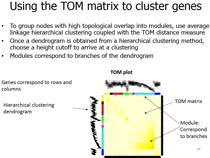](https://image.plob.org/wp-content/uploads/2016/12/1482205419-4066-WGCNA6.png)<a name="uFoZ6"></a>## Cytoscape生成网络图只需要第二个edges文件就能构建网络图。导入该文件后,在软件的导入设置中,将第一列设置为fromNode,第二列设置为toNode,最后把第三列设为网络关系属性,完成设置,便可生成网络图了。<a name="kaToh"></a>## WGCNA样本要求由于WGCNA是基于相关系数的表达调控网络分析方法。当样本数过低的时候,相关系数的计算是不可靠的,得到的调控网络价值不大。所以,我们推荐的样本数如下:- 当独立样本数≥8(非重复样本)时,可以考虑基于Pearson相关系数的WGCNA共表达网络的方法(效果看实际情况而定);- 当样本数≥15(可以包含生物学重复)时,WGCNA方法会有更好的效果。- 当样品数<8时,不建议进行该项分析。<a name="rz0Ms"></a>## 报错暨解决办法按照WGCNA手册第五步Network visualization using WGCNA functions时报错如下:```bash> TOMplot(plotTOM, geneTree, moduleColors, main = "Network heatmap plot, all genes")Error in .heatmap(as.matrix(dissim), Rowv = as.dendrogram(dendro, hang = 0.1), :row dendrogram ordering gave index of wrong length
看到row dendrogram ordering gave index of wrong length这句报错内容,分别察看plotTOM, geneTree, moduleColors这三个变量length;
> dim(plotTOM)> geneTree> moduleColors
果然,三者的length不同,发现geneTree少了一些,往回找geneTree来源 geneTree = net$dendrograms[[1]],net来源于网络构建过程:
net = blockwiseModules(datExpr, power = 6,TOMType = "unsigned", minModuleSize = 30,reassignThreshold = 0, mergeCutHeight = 0.25,numericLabels = TRUE, pamRespectsDendro = FALSE,saveTOMs = TRUE,saveTOMFileBase = "femaleMouseTOM",verbose = 3)
所以,这是问题所在,继续察看文档发现blockwiseModules函数默认最大maxBlockSize=5000,而我们的数据超过了这个值,所以函数自动做了拆分处理,而解决办法也很简单,设置maxBlockSize参数大于我们的值即可。
- 版权声明 本文源自 tiramisutes, XP 整理
- 转载请务必保留本文链接:https://www.plob.org/article/10682.html

若有收获,就点个赞吧
0 人点赞
