第1步:导入数据分析库pandas,数据可视化库matplotlib
%matplotlib inline是Ipython的魔法函数,其作用是使matplotlib绘制的图像嵌入在juptyer notebook的单元格里
import pandas as pdimport matplotlib.pyplot as plt%matplotlib inline
第2步:导入数据集,查看数据集
代码:
dataset = pd.read_csv('./studentscores.csv')dataset.head(10) # 展示前10行
输出:
Hours Scores0 2.5 211 5.1 472 3.2 273 8.5 754 3.5 305 1.5 206 9.2 887 5.5 608 8.3 819 2.7 25
代码:
dataset.shape # 查看形状
输出:
(25, 2) # 25行2列
代码:
dataset.columns # 查看表头
输出:
Index(['Hours', 'Scores'], dtype='object')
代码:
dataset.info() # 查看数据的具体信息
输出:
<class 'pandas.core.frame.DataFrame'>RangeIndex: 25 entries, 0 to 24Data columns (total 2 columns):# Column Non-Null Count Dtype--- ------ -------------- -----0 Hours 25 non-null float641 Scores 25 non-null int64dtypes: float64(1), int64(1)memory usage: 528.0 bytes
代码:
dataset.describe() # 查看基本统计特征
输出:
Hours Scorescount 25.000000 25.000000mean 5.012000 51.480000std 2.525094 25.286887min 1.100000 17.00000025% 2.700000 30.00000050% 4.800000 47.00000075% 7.400000 75.000000max 9.200000 95.000000
第3步:提取特征
提取特征:学习时间, 提取标签:学习成绩
feature_columns = ['Hours']label_column = ['Scores']features = dataset[feature_columns]label = dataset[label_column]X = features.values # 特征数据Y = label.values # 标签数据
第四步:建立模型
拆分数据,四分之三的数据作为训练集,四分之一的数据作为测试集
from sklearn.model_selection import train_test_splitX_train, X_test, Y_train, Y_test = train_test_split( X, Y, test_size = 1/4, random_state = 0)
用训练集的数据进行训练
from sklearn.linear_model import LinearRegressionregressor = LinearRegression()regressor = regressor.fit(X_train, Y_train)
对测试集进行预测
Y_pred = regressor.predict(X_test)
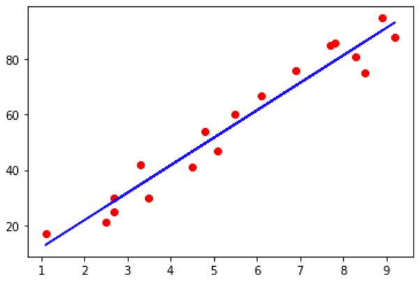
可视化
# 散点图:红色点表示训练集的点plt.scatter(X_train, Y_train, color = 'red')# 线图:蓝色线表示由训练集训练出的线性回归模型plt.plot(X_train, regressor.predict(X_train), color ='blue')plt.show()
# 散点图:红色点表示测试集的点plt.scatter(X_test , Y_test, color = 'red')# 线图:蓝色线表示对测试集进行预测的结果plt.plot(X_test, regressor.predict(X_test), color ='blue')plt.show()

若有收获,就点个赞吧
0 人点赞
