数据可视化简单的说就是将数据呈现为漂亮的统计图表,然后进一步发现数据中包含的规律以及隐藏的信息。之前的课程,我们已经为大家展示了Python在数据处理方面的优势,为大家介绍了NumPy和Pandas的应用,以此为基础,我们可以进一步使用Matplotlib和Seaborn来实现数据的可视化,将数据处理的结果展示为直观的可视化图表。
Matplotlib 是一个 Python 的 2D 绘图库,它以各种硬拷贝格式和跨平台的交互式环境生成出版质量级别的图形 。通过 Matplotlib,开发者可以仅需要几行代码,便可以生成绘图,直方图,功率谱,条形图,错误图,散点图等。
Seaborn 是基于 Python 且非常受欢迎的图形可视化库,在 Matplotlib 的基础上,进行了更高级的封装,使得作图更加方便快捷。即便是没有什么基础的人,也能通过极简的代码,做出具有分析价值而又十分美观的图形。
Matplotlib
1.1 通过 figure()函数创建画布
import matplotlib.pyplot as plt%matplotlib inlineimport numpy as npdata_one = np.arange(100, 201) # 生成包含100~200的数组plt.plot(data_one) # 绘制data1折线图plt.show()

# 创建新的空白画布,返回Figure实例figure_obj = plt.figure()data_two = np.arange(200, 301) # 生成包含200~300的数组plt.figure(facecolor='gray') # 创建背景为灰色的新画布plt.plot(data_two) # 通过data2绘制折线图plt.show()

1.2 通过 subplot()函数创建单个子图
nums = np.arange(0, 101) # 生成0~100的数组# 分成2*2的矩阵区域,占用编号为1的区域,即第1行第1列的子图plt.subplot(221)# 在选中的子图上作图plt.plot(nums, nums)# 分成2*2的矩阵区域,占用编号为2的区域,即第1行第2列的子图plt.subplot(222)# 在选中的子图上作图plt.plot(nums, -nums)# 分成2*1的矩阵区域,占用编号为2的区域,即第2行的子图plt.subplot(212)# 在选中的子图上作图plt.plot(nums, nums**2)# 在本机上显示图形plt.show()

1.3 通过 subplots()函数创建多个子图
# 生成包含1~100之间所有整数的数组nums = np.arange(1, 101)# 分成2*2的矩阵区域,返回子图数组axesfig, axes = plt.subplots(2, 2)ax1 = axes[0, 0] # 根据索引[0,0]从Axes对象数组中获取第1个子图ax2 = axes[0, 1] # 根据索引[0,1]从Axes对象数组中获取第2个子图ax3 = axes[1, 0] # 根据索引[1,0]从Axes对象数组中获取第3个子图ax4 = axes[1, 1] # 根据索引[1,1]从Axes对象数组中获取第4个子图# 在选中的子图上作图ax1.plot(nums, nums)ax2.plot(nums, -nums)ax3.plot(nums, nums**2)ax4.plot(nums, np.log(nums))plt.show()

1.4 通过 add_subplot()方法添加和选中子图
# 引入matplotlib包import matplotlib.pyplot as pltimport numpy as np# 创建Figure实例fig = plt.figure()# 添加子图fig.add_subplot(2, 2, 1)fig.add_subplot(2, 2, 2)fig.add_subplot(2, 2, 4)fig.add_subplot(2, 2, 3)# 在子图上作图random_arr = np.random.randn(100)# 默认是在最后一次使用subplot的位置上作图,即编号为3的位置plt.plot(random_arr)plt.show()

1.5 添加各类标签
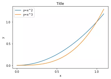
import numpy as npdata = np.arange(0, 1.1, 0.01)plt.title("Title") # 添加标题plt.xlabel("x") # 添加x轴的名称plt.ylabel("y") # 添加y轴的名称# 设置x和y轴的刻度plt.xticks([0, 0.5, 1])plt.yticks([0, 0.5, 1.0])plt.plot(data, data**2) # 绘制y=x^2曲线plt.plot(data, data**3) # 绘制y=x^3曲线plt.legend(["y=x^2", "y=x^3"]) # 添加图例plt.show() # 在本机上显示图形
import numpy as npx=np.linspace(-3,3,50)#产生-3到3之间50个点y1=2*x+1#定义函数y2=x**2
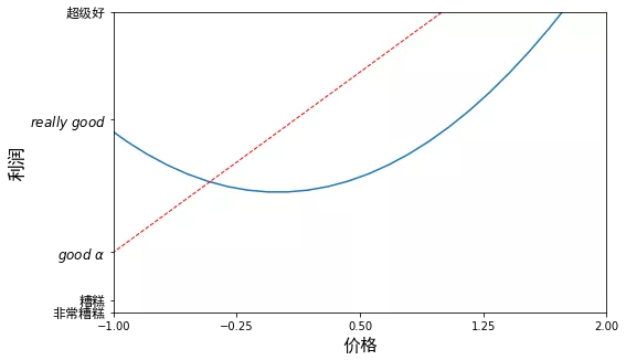
# num=3表示图片上方标题 变为figure3,figsize=(长,宽)设置figure大小plt.figure(num=3, figsize=(8, 5))plt.plot(x, y2)# 红色虚线直线宽度默认1.0plt.plot(x, y1, color='red', linewidth=1.0, linestyle='--')plt.xlim((-1, 2)) #设置x轴范围plt.ylim((-2, 3)) #设置轴y范围#设置坐标轴含义, 注:英文直接写,中文需要后面加上fontproperties属性plt.xlabel(u'价格', fontproperties='SimHei', fontsize=16)plt.ylabel(u'利润', fontproperties='SimHei', fontsize=16)# 设置x轴刻度# -1到2区间,5个点,4个区间,平均分:[-1.,-0.25,0.5,1.25,2.]new_ticks = np.linspace(-1, 2, 5)print(new_ticks)plt.xticks(new_ticks)# 设置y轴刻度'''设置对应坐标用汉字或英文表示,后面的属性fontproperties表示中文可见,不乱码,内部英文$$表示将英文括起来,r表示正则匹配,通过这个方式将其变为好看的字体如果要显示特殊字符,比如阿尔法,则用转意符\alpha,前面的\ 表示空格转意'''plt.yticks([-2, -1.8, -1, 1.22, 3.],['非常糟糕', '糟糕', r'$good\ \alpha$', r'$really\ good$', '超级好'],fontproperties='SimHei',fontsize=12)plt.show()
[-1. -0.25 0.5 1.25 2. ]
1.6 绘制常见类型图表
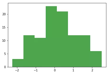
arr_random = np.random.randn(100) # 创建随机数组plt.hist(arr_random, bins=8, color='g', alpha=0.7) # 绘制直方图plt.show() # 显示图形
# 创建包含整数0~50的数组,用于表示x轴的数据x = np.arange(51)# 创建另一数组,用于表示y轴的数据y = np.random.rand(51) * 10plt.scatter(x, y) # 绘制散点图plt.show()

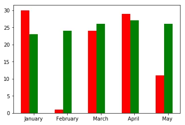
# 创建包含0~4的一维数组x = np.arange(5)# 从上下限范围内随机选取整数,创建两个2行5列的数组y1, y2 = np.random.randint(1, 31, size=(2, 5))width = 0.25# 条形的宽度ax = plt.subplot(1, 1, 1) # 创建一个子图ax.bar(x, y1, width, color='r') # 绘制红色的柱形图ax.bar(x+width, y2, width, color='g') # 绘制另一个绿色的柱形图ax.set_xticks(x+width) # 设置x轴的刻度# 设置x轴的刻度标签ax.set_xticklabels(['January', 'February', 'March', 'April ', 'May '])plt.show() # 显示图形
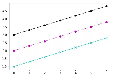
data = np.arange(1, 3, 0.3)# 绘制直线,颜色为青色,标记为“x”,线型为长虚线plt.plot(data, color="c", marker="x", linestyle="--")# 绘制直线,颜色为品红,标记为实心圆圈,线型为短虚线plt.plotpy(data+1, color="m", marker="o", linestyle=":")# 绘制直线,颜色为黑色,标记为五边形,线型为短点相间线plt.plot(data+2, color="k", marker="p", linestyle="-.")# 也可采用下面的方式绘制三条不同颜色、标记和线型的直线# plt.plot(data, 'cx--', data+1, 'mo:', data+2, 'kp-.')plt.show()
1.7 本地保存图形
# 创建包含100个数值的随机数组import numpy as nprandom_arr = np.random.randn(100)random_arr
array([ 0.5506946 , -0.93184784, -0.34192483, -0.59184734, -0.28140589,-1.91080432, 1.52786038, -0.13289318, -0.67912617, -1.17602117,0.15633553, 1.3658886 , 0.22478519, 2.00116302, -0.67192195,-0.55761648, 0.01942985, 1.29884514, 0.44144816, -0.1610381 ,0.76308923, 0.47130472, 1.67521309, -1.45096055, -1.80438387,-0.83963824, -0.66452815, 0.19143391, -0.10206618, 1.42044442,1.10553431, 1.40906801, 1.02359221, 1.79859871, -0.96928966,-0.26288545, 0.69277633, -0.34563312, 0.93557198, -1.06210292,-0.28565588, 0.15651077, 0.47359365, -0.33175624, 2.36693616,-0.74061052, -1.56619329, -2.12128548, 1.78034265, 0.61048058,-0.32100977, -0.61043266, 1.36360773, -1.29657881, 0.6497825 ,-0.67314797, 0.74769152, 0.60069556, 0.05080522, -1.95145632,-1.26971253, 0.48083896, -0.37624288, -0.74478956, -0.71895128,-1.69721944, -0.03597352, -0.24894019, -0.07964356, -1.16312749,0.50639813, -0.85338869, 1.30731047, -1.08536664, 0.09577968,0.50427837, -1.08315542, 2.15700225, 0.52469659, -0.73132736,-0.92606593, -1.59648011, -0.28655152, -0.54707725, 0.31113425,0.4402609 , 1.52134919, 0.39298995, -1.11919536, -0.72356993,-0.42444862, 1.94747579, 0.25962732, -1.22917497, 0.56530296,0.53379607, 0.79267297, -0.30161815, 0.0450943 , 0.0763264 ])
# 将随机数组的数据绘制线形图plt.plot(random_arr)#plt.show()plt.savefig('保存测试.png')

seaborn—绘制统计图形
2.1 可视化数据的分布
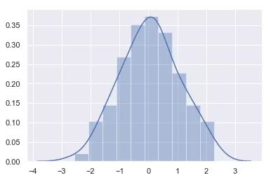
import seaborn as sns%matplotlib inlineimport numpy as npsns.set() # 显式调用set()获取默认绘图np.random.seed(0) # 确定随机数生成器的种子arr = np.random.randn(100) # 生成随机数组ax = sns.distplot(arr, bins=10) # 绘制直方图
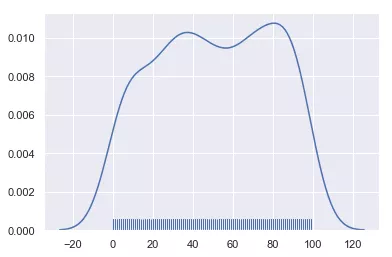
# 创建包含500个位于[0,100]之间整数的随机数组array_random = np.random.randint(0, 100, 500)# 绘制核密度估计曲线sns.distplot(array_random, hist=False, rug=True)
# 创建DataFrame对象import pandas as pddataframe_obj = pd.DataFrame({"x": np.random.randn(500),"y": np.random.randn(500)})dataframe_obj
x y0 0.282163 -1.2702931 -1.979984 -0.2498662 0.070588 0.0137333 0.031652 -0.5187714 -0.316808 -0.345096... ... ...495 -0.497264 0.897153496 -0.285931 -0.963349497 0.185089 -1.109227498 0.629815 2.818780499 1.979086 -0.040899500 rows × 2 columns
# 绘制散布图sns.jointplot(x="x", y="y", data=dataframe_obj)

# 绘制二维直方图sns.jointplot(x="x", y="y", data=dataframe_obj, kind="hex")

# 核密度估计sns.jointplot(x="x", y="y", data=dataframe_obj, kind="kde")

# 加载seaborn中的数据集dataset = sns.load_dataset("tips")# 绘制多个成对的双变量分布sns.pairplot(dataset)

2.2 用分类数据绘图
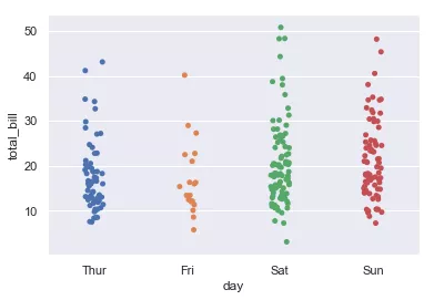
tips = sns.load_dataset("tips")sns.stripplot(x="day", y="total_bill", data=tips)
tips = sns.load_dataset("tips")sns.stripplot(x="day", y="total_bill", data=tips, jitter=True)

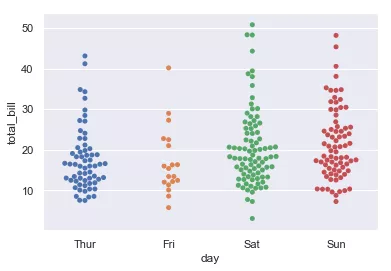
sns.swarmplot(x="day", y="total_bill", data=tips)
sns.boxplot(x="day", y="total_bill", data=tips)

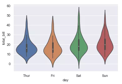
sns.violinplot(x="day", y="total_bill", data=tips)
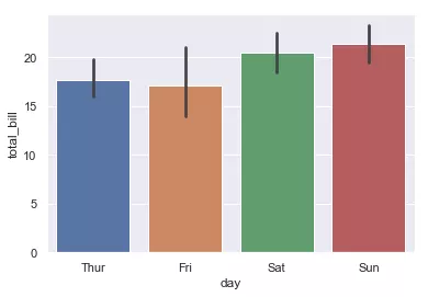
sns.barplot(x="day", y="total_bill", data=tips)
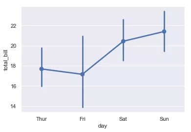
sns.pointplot(x="day", y="total_bill", data=tips)

若有收获,就点个赞吧
0 人点赞
