flex布局
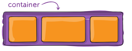
容器 container
不要用任何非约定的缩写
- 容器:一般来做父元素
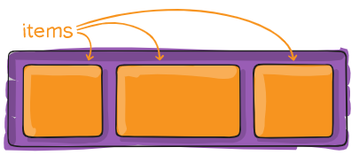
- 里面的直接的子元素叫items
flex container有哪些样式
让一个元素变成flex容器
只有两种写法
.container { display: flex; / or inline-flex / }
- flex就是另起一行
- inline-flex就不会另起一行,会和别的东西拼成一行。
-
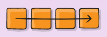
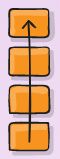
改变items流动方向(主轴)
flex-direction:row;
flex-direction:row-reverse;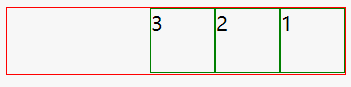
flex-direction:column;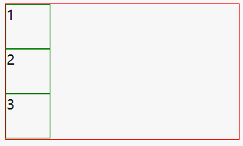
flex-direction:column-reverse;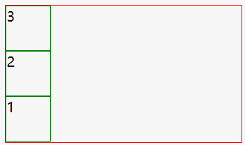
改变折行
nowrap 不折行
- wrap 折行,一般都是折行的,不折行非常奇怪
- wrap-reverse 从底下往上折 基本没有人用
.container { flex-wrap: nowrap | wrap | wrap-reverse; }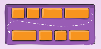
主轴的对齐方式
默认主轴是横轴
除非你改变了flex-direction的方向
.container { justify-content: flex-start | flex-end | center | space-between | space-around | space-evenly | start | end | left | right … + safe | unsafe; }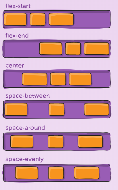
次轴对齐
默认次轴是纵轴
stretch默认值,一样高
.container { align-items: stretch | flex-start | flex-end | center | baseline | first baseline | last baseline | start | end | self-start | self-end + … safe | unsafe; }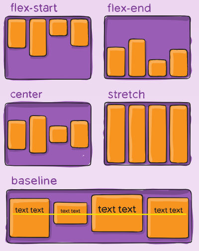
多行内容
很少用到
.container{ align-content:flex-start | flex-end | center | space-between | space-around | space-evenly | stretch | start | end | baseline | first baseline | last baseline+…safe | unsafe; }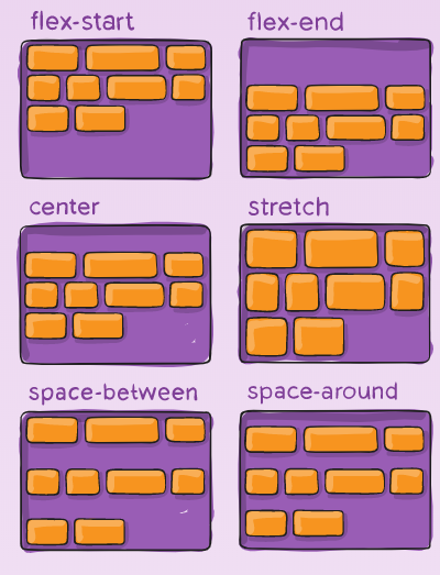
flex item
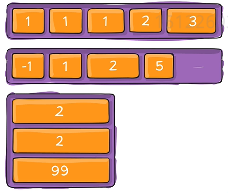
item上面加order
- 默认的order为0
- 如果把order改成一个数,他就会从小到大排列
- 负数也一样从小到大排列
- 竖着也是一样的
.item { order: 5; / default is 0 / }
item上面加flex-grow
- 默认为0
- 它接受作为比例的无单位值,决定了项目应在flex容器内占用的可用空间量;
- 如果所有项目的flex-grow都设置为1,则容器中的剩余空间将平均分配给所有子项。如果其中一个孩子的值为2,则剩余空间将占其他孩子的两倍。
- 负数无效。
- 做导航栏时可以把logo和用户头像都设为0,中间的导航栏设为1,就是把所有空余空间都给导航。
.item { flex-grow: 4; / default 0 / }

flex-shrink
这定义了flex在必要时收缩的能力。
- 一般写flex-shrink:0防止收缩
- 默认是1
- 当空间不够时才会收缩
- 一般来说让中间的导航内容区缩小
.item { flex-shrink: 3; / default 1 / }
flex-basis
控制基准宽度,定义了剩余空间分配之前元素的默认大小。
-
align-self定制align-items
允许align-items为单个弹性项目覆盖默认对齐方式(由指定的对齐方式对齐)。
.item { align-self: auto | flex-start | flex-end | center | baseline | stretch; }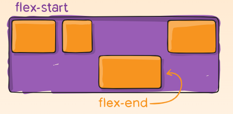
重点
display:flex;
- flex-direction:row/column;
- flex-weap:weap;
- just-content:conter/space-between;
-
经验
不要把width和height写死,除非有特殊说明
- 写死
- width:100px;
- width:100px;
- 不写死
- width:50%;
- max-width:100px;
- width:30vw;vw屏幕宽度的百分之一;
- min-width:80%;
- 特点:不使用px,或者加min max前缀
- width:50%;
- 写死
- 用min-width/max-width/min-height/max-height更加灵活
- flex可以基本满足所有需求
- flex和margin-xxx:auto 配合有意外的效果

若有收获,就点个赞吧
0 人点赞
