1.实列图片
2.代码部分
<!--* @description:Clamp 文字显示* @author: wanghao* @Date: 2022-03-29 20:20:50* @Modified By:* @version: 1.0.0--><template><div ref="textOverflow" class="ami-clamp" :style="boxStyle"><div :class="autoresize === true ? 'autoresize':''"><!-- before 文字之前显示内容 --><slot name="before"></slot><ami-tooltip :disabled="showtip||expanded" :content="text" :placement="placement" :effect="effect"><span ref="overEllipsis">{{realText}}</span></ami-tooltip><!-- after 文字之后显示内容 --><span class="slot-after" ref="slotRef" v-if="showSlotNode"><slot name="after"></slot></span></div></div></template><script>export default {name: 'AmiClamp',props: {// 文本text: {type: String,default: ''},// 最大行数maxLines: {type: Number,default: 2},// 扩展(显示全部)expanded: {type: Boolean,default: false},// 省略符号ellipsis: {type: String,default: '...'},// 文字提示主题色effect: {type: String,default: 'dark'},// 文字显示对其方向 方向-对齐位置placement: {type: String,default: 'bottom'},// 是否显示(可见)showtip: {type: Boolean,default: false},// 宽度width: {type: Number,default: 0},// 最大高度maxHeight: {type: Number,default: 0},// 自动调整大小autoresize: {type: Boolean,default: false}},data() {return {offset: this.text.length,slotBoxWidth: 0,textBoxWidth: this.width,// 控制slot是否隐藏showSlotNode: false};},computed: {// 最大高度boxhight() {if (this.maxHeight) {return {height: this.maxHeight + 'px'};}},// 计算宽度boxStyle() {if (this.width) {return {width: this.width + 'px'};}},// 返回展示的文字realText() {// 是否被截取const isCutOut = this.offset !== this.text.length;let realText = this.text;if (isCutOut && !this.expanded) {// ellipsis 省略符号realText = this.text.slice(0, this.offset) + this.ellipsis;}return realText;}},watch: {realText(newVal, oldVal) {this.$emit('chang', newVal);}},methods: {// 计算截取位置calculateOffset(from, to) {this.$nextTick(() => {if (Math.abs(from - to) <= 1) return;if (this.isOverflow()) {to = this.offset;} else {from = this.offset;}this.offset = Math.floor((from + to) / 2);this.calculateOffset(from, to);});},// 判断是否超出最大行数isOverflow() {const { len, lastWidth } = this.getLines();if (len < this.maxLines) {return false;}if (this.maxLines) {// 超出部分 行数 > 最大行数 或则 已经是最大行数但最后一行宽度 + 后面内容超出正常宽度const lastLineOver = !!(len === this.maxLines && lastWidth + this.slotBoxWidth > this.textBoxWidth);if (len > this.maxLines || lastLineOver) {return true;}}return false;},// 获取当前文本行数getLines() {const clientRects = this.$refs.overEllipsis.getClientRects();return {len: clientRects.length,lastWidth: clientRects[clientRects.length - 1].width};}},mounted() {// 计算插槽内容宽度const { len } = this.getLines();if (len > this.maxLines) {this.showSlotNode = true;this.$nextTick(() => {this.slotBoxWidth = this.$refs.slotRef.clientWidth;this.textBoxWidth = this.$refs.textOverflow.clientWidth;this.calculateOffset(0, this.text.length);});}}};</script>
3.说明文档
Clamp 文字显示
多行文本展开收起
基础用法
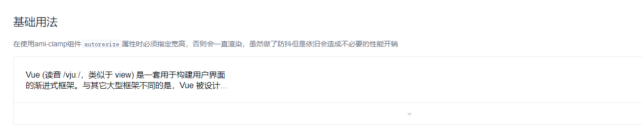
在使用ami-clamp组件autoresize属性时必须指定宽高,否则会一直渲染,虽然做了防抖但是依旧会造成不必要的性能开销width宽度
<ami-clamp autoresize :showtip="false" :maxLines="maxLines" :width="400" :text="text"></ami-clamp><script>export default {data(){return{text:"Vue (读音 /vjuː/,类似于 view) 是一套用于构建用户界面的渐进式框架。与其它大型框架不同的是,Vue 被设计为可以自底向上逐层应用。Vue 的核心库只关注视图层,不仅易于上手,还便于与第三方库或既有项目整合。另一方面,当与现代化的工具链以及各种支持类库结合使用时,Vue 也完全能够为复杂的单页应用提供驱动另一方面,当与现代化的工具链以及各种支持类库结合使用时,Vue 也完全能够为复杂的单页应用提供驱动另一方面,当与现代化的工具链以及各种支持类库结合使用时",maxLines:2, //最大行数}}}</script>
最大行数
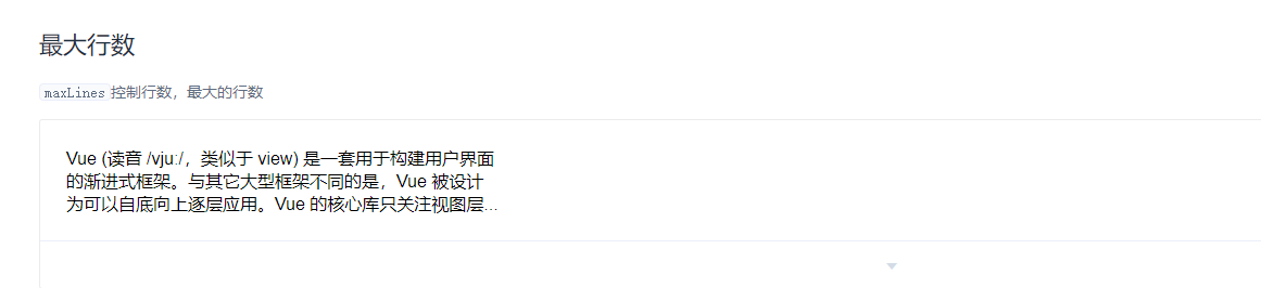
maxLines控制行数,最大的行数maxLines控制行数,最大的行数
<ami-clamp autoresize :showtip="false" :maxLines="maxLines" :width="400" :text="text"></ami-clamp><script>export default {data() {return{text:"Vue (读音 /vjuː/,类似于 view) 是一套用于构建用户界面的渐进式框架。与其它大型框架不同的是,Vue 被设计为可以自底向上逐层应用。Vue 的核心库只关注视图层,不仅易于上手,还便于与第三方库或既有项目整合。另一方面,当与现代化的工具链以及各种支持类库结合使用时,Vue 也完全能够为复杂的单页应用提供驱动另一方面,当与现代化的工具链以及各种支持类库结合使用时,Vue 也完全能够为复杂的单页应用提供驱动另一方面,当与现代化的工具链以及各种支持类库结合使用时",maxLines:3, //最大行数}},methods: {handleChange(value) {console.log(value);}}}</script>
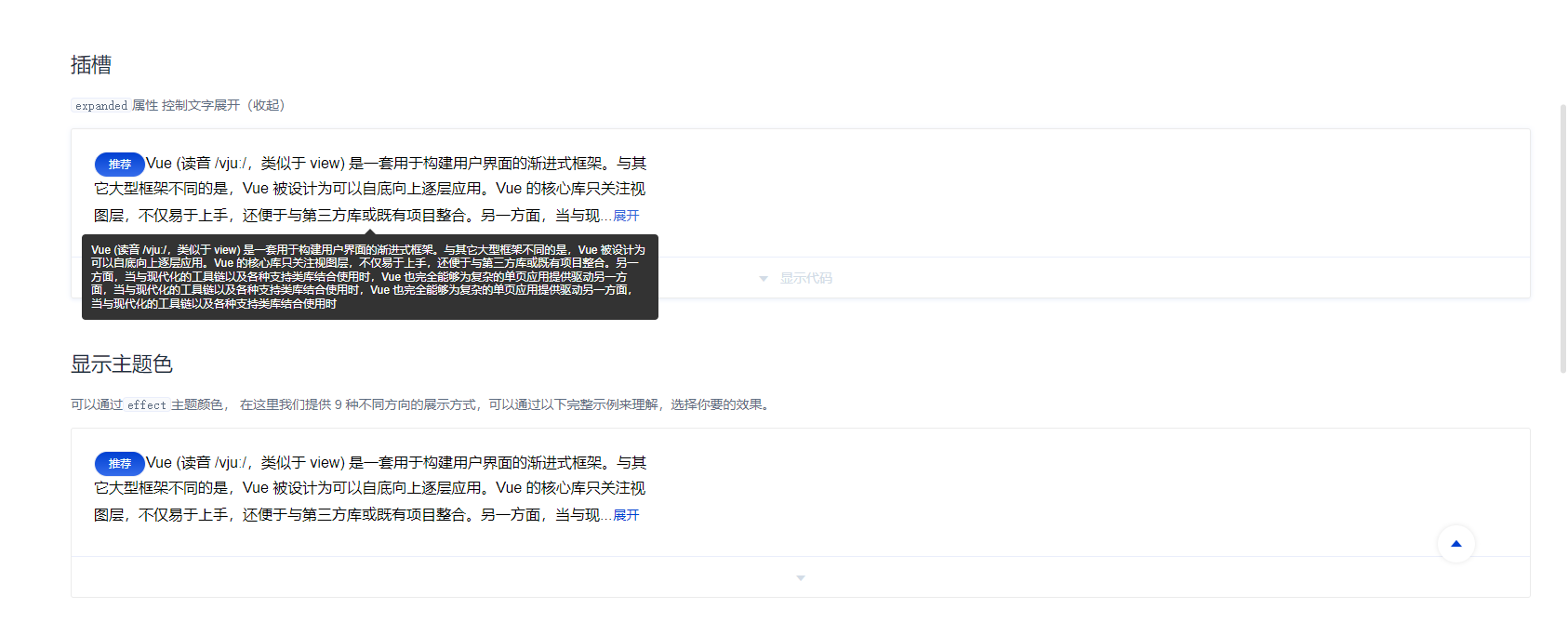
插槽
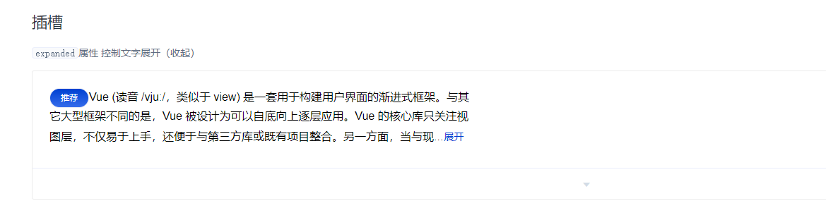
expanded属性 控制文字展开(收起)
before文字前显示,after文字后显示
<ami-clamp autoresize :maxLines="maxLines" :width="600" :text="text" :expanded="expanded"><ami-button slot="before" type="primary" size="mini" round>推荐</ami-button><div slot="after"><ami-button type="text" @click="clickToggle()">{{expanded ? "收起" : "展开"}}</ami-button></div></ami-clamp><script>export default {data() {return{text:"Vue (读音 /vjuː/,类似于 view) 是一套用于构建用户界面的渐进式框架。与其它大型框架不同的是,Vue 被设计为可以自底向上逐层应用。Vue 的核心库只关注视图层,不仅易于上手,还便于与第三方库或既有项目整合。另一方面,当与现代化的工具链以及各种支持类库结合使用时,Vue 也完全能够为复杂的单页应用提供驱动另一方面,当与现代化的工具链以及各种支持类库结合使用时,Vue 也完全能够为复杂的单页应用提供驱动另一方面,当与现代化的工具链以及各种支持类库结合使用时",maxLines:3, //最大行数expanded:false}},methods: {clickToggle() {this.expanded = !this.expanded;}}}</script>
显示主题色
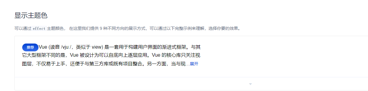
可以通过effect主题颜色,
在这里我们提供 9 种不同方向的展示方式,可以通过以下完整示例来理解,选择你要的效果。
effect主题颜色,dark默认,light 白色。placement属性值为:方向-对齐位置;四个方向:top、left、right、bottom;三种对齐位置:start, end。
<ami-clamp :maxLines="maxLines" :expanded="expanded" :width="600" :text="text" placement="top" effect="light"><ami-button slot="before" type="primary" size="mini" round>推荐</ami-button><div slot="after"><ami-button type="text" @click="clickToggle()">{{expanded ? "收起" : "展开"}}</ami-button></div></ami-clamp><script>export default {data() {return{text:"Vue (读音 /vjuː/,类似于 view) 是一套用于构建用户界面的渐进式框架。与其它大型框架不同的是,Vue 被设计为可以自底向上逐层应用。Vue 的核心库只关注视图层,不仅易于上手,还便于与第三方库或既有项目整合。另一方面,当与现代化的工具链以及各种支持类库结合使用时,Vue 也完全能够为复杂的单页应用提供驱动另一方面,当与现代化的工具链以及各种支持类库结合使用时,Vue 也完全能够为复杂的单页应用提供驱动另一方面,当与现代化的工具链以及各种支持类库结合使用时",maxLines:3, //最大行数expanded:false,}},methods: {clickToggle() {this.expanded = !this.expanded;}}}</script>
Attributes
| 参数 | 说明 | 类型 | 可选值 | 默认值 |
|---|---|---|---|---|
| text | 文本 | String | — | 空 |
| maxLines | 最大行数 | Number | — | — |
| expanded | 扩展(显示全部) | boolean | true / false | false |
| showtip | 显示提示 | boolean | — | false |
| ellipsis | 省略符号(可自己选择符号) | String | — | … |
| effect | 默认提示的主题 | String | dark / light | dark |
| placement | 文字显隐的出现位置 | String | top/top-start/top-end/bottom/bottom-start/bottom-end/left/left-start/left-end/right/right-start/right-end | bottom |
| width | 宽度 | Number | — | — |
| autoresize | 自动调整大小 | boolean | — | false |
Clamp slot
| name | 说明 |
|---|---|
| before | 文字之前显示内容 |
| after | 文字之后显示内容 |

若有收获,就点个赞吧
0 人点赞
