题目:
要求:
- 生成样本数据,模拟匹配实验
- 生成绘制数据表格
bokhe制图
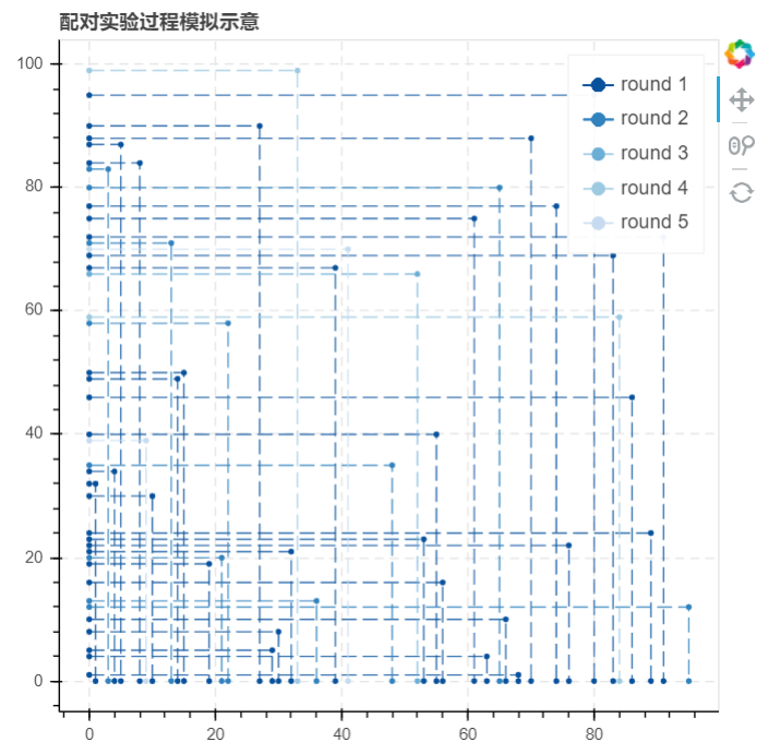
bokeh制图时,y轴为男性,x轴为女性
- 绘制数据表格中,需要把男女性的数字编号提取出来,这样图表横纵轴好识别
- bokhe绘制折线图示意:p.line([0,女性数字编号,女性数字编号],[男性数字编号,男性数字编号,0])
导入库
import numpy as npimport pandas as pdimport matplotlib.pyplot as pltimport osimport time#倒入时间模块import warningswarnings.filterwarnings('ignore')#不发出警告from bokeh.plotting import figure, show, output_filefrom bokeh.models import ColumnDataSource, HoverTool#导入bokeh绘图模块
生成样本数据,模拟实验
根据之前项目中实现的10000个男性与10000个女性样本的实验过程与结果,在此模拟生成99个男性与女性的样本进行试验
sample1_m2 = create_sample(99, 'm')sample1_f2 = create_sample(99, 'f')sample1_m2['strategy'] = np.random.choice([1, 2, 3], 99)#创建样本数据test_m2 = sample1_m2.copy()test_f2 = sample1_f2.copy()#复制实验数据,创建实验副本n = 1#设置一个实验次数变量starttime = time.time()#设置起始时间success_roundn = different_strategy(test_m2, test_f2, n)match_success2 = success_roundntest_m2 = test_m2.drop(success_roundn['m'].tolist())test_f2 = test_f2.drop(success_roundn['f'].tolist())print('成功进行第%i轮试验,本轮实验成功匹配%i对,总共成功匹配%i对,还剩下%i位男性和%i为女性'%(n, len(success_roundn), len(match_success2), len(test_m2),len(test_f2)))#第一轮测试while len(success_roundn) != 0:n += 1success_roundn = different_strategy(test_m2,test_f2,n)#得到该轮成功匹配数据match_success2 = pd.concat([match_success2,success_roundn])# 将成功匹配数据汇总test_m2 = test_m2.drop(success_roundn['m'].tolist())test_f2 = test_f2.drop(success_roundn['f'].tolist())# 输出下一轮实验数据print('成功进行第%i轮实验,本轮实验成功匹配%i对,总共成功匹配%i对,还剩下%i位男性和%i位女性' %(n,len(success_roundn),len(match_success2),len(test_m2),len(test_f2)))endtime = time.time()#记录结束时间print('--------------------')print('本次实验总共进行了%i轮,配对成功%i对\n---------------'%(n, len(match_success2)))print('实验总共耗时%.2f秒'%(endtime - starttime))
生成绘制数据表格
为了接下里我们作图的需要,我们需要生成图像的点数据,并且设置每一循环对应的线条颜色,然后筛选出我们作图所需要的数据字段
graphdata1 = match_success2.copy()graphdata1 = pd.merge(graphdata1,sample1_m2,left_on = 'm',right_index = True)graphdata1 = pd.merge(graphdata1,sample1_f2,left_on = 'f',right_index = True)# 合并数据,得到成功配对的男女各项分值graphdata1['x'] = '0,' + graphdata1['f'].str[1:] + ',' + graphdata1['f'].str[1:]graphdata1['x'] = graphdata1['x'].str.split(',')graphdata1['y'] = graphdata1['m'].str[1:] + ',' + graphdata1['m'].str[1:] + ',0'graphdata1['y'] = graphdata1['y'].str.split(',')# 筛选出id的数字编号,制作x,y字段from bokeh.palettes import brewer# 导入调色模块round_num = graphdata1['round_n'].max()color = brewer['Blues'][round_num+1] # 这里+1是为了得到一个色带更宽的调色盘,避免最后一个颜色太浅graphdata1['color'] = ''for rn in graphdata1['round_n'].value_counts().index:graphdata1['color'][graphdata1['round_n'] == rn] = color[rn-1]# 设置颜色graphdata1 = graphdata1[['m','f','strategy_type','round_n','score_x','score_y','x','y','color']]# 筛选字段
Bokeh绘图(pic1.html)
output_file('C:\\Users\\RaingEye\\Desktop\\数据分析项目实战\\婚恋配对实验\\pic1.html')p = figure(plot_width=500, plot_height=500,title="配对实验过程模拟示意" ,tools= 'reset,wheel_zoom,pan') # 构建绘图空间for datai in graphdata1.values:p.line(datai[-3],datai[-2],line_width=1, line_alpha = 0.8, line_color = datai[-1],line_dash = [10,4],legend= 'round %i' % datai[3])# 绘制折线p.circle(datai[-3],datai[-2],size = 3,color = datai[-1],legend= 'round %i' % datai[3])# 绘制点p.ygrid.grid_line_dash = [6, 4]p.xgrid.grid_line_dash = [6, 4]p.legend.location = "top_right"p.legend.click_policy="hide"# 设置其他参数show(p)

若有收获,就点个赞吧
0 人点赞
