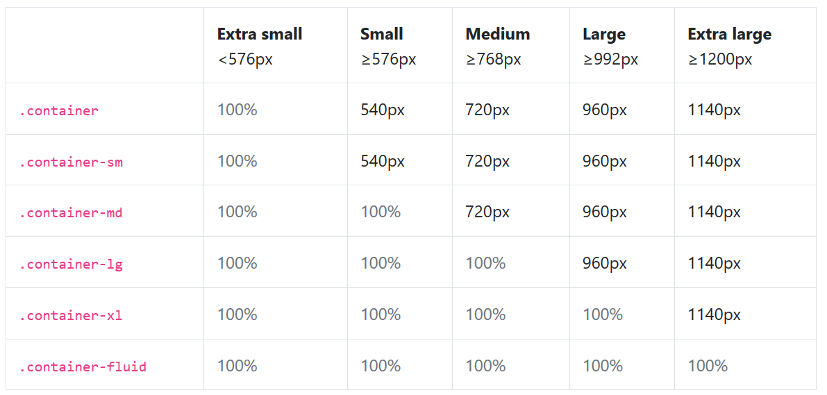
概念:
1)Container容器是窗口布局的最基本元素,BootStrap推荐所有的样式都定义在.container或.container-fluid容器之中。
2)这是启用整个栅格系统的前置条件
3)图示
超小屏幕、小屏幕(次小屏)、中等屏幕(宅屏)、大屏幕(桌面显示器)、超大屏幕(大桌面显示器)
代码:
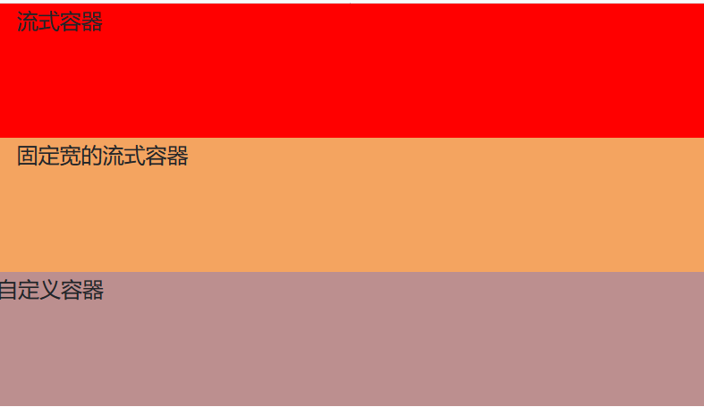
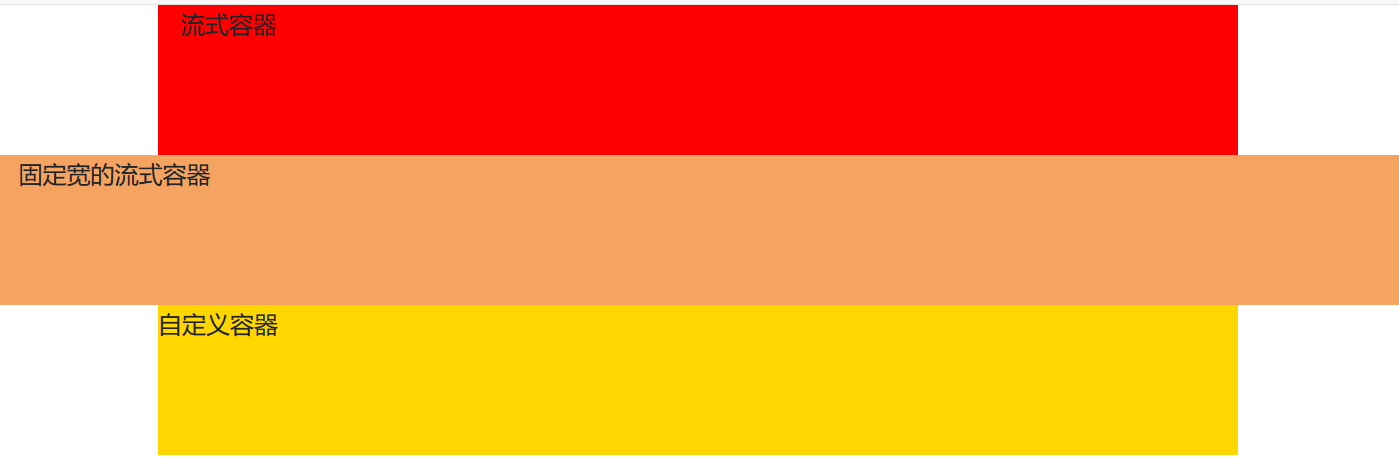
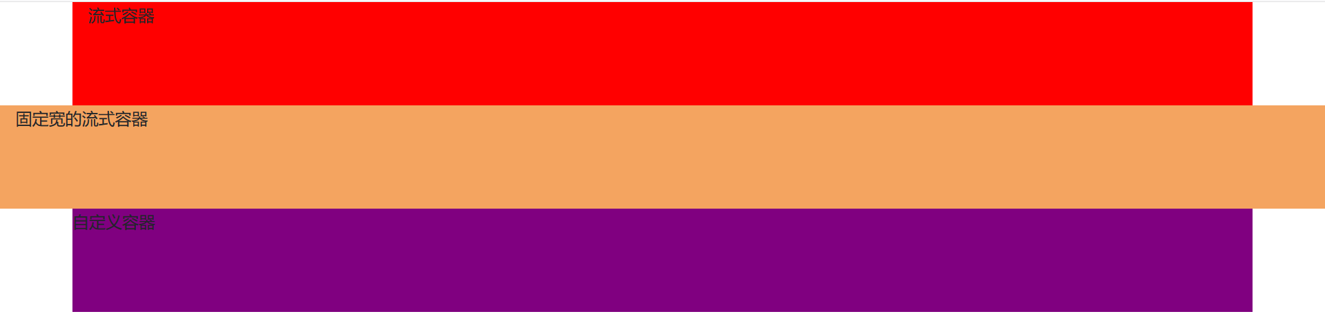
<!DOCTYPE html><html lang="zh-cn"><head><meta charset="UTF-8"><meta name="viewport" content="width=device-width, initial-scale=no"><meta http-equiv="X-UA-Compatible" content="ie=edge"><link rel="stylesheet" rel="stylesheet" href="../resource/bootstrap/css/bootstrap.min.css"><script src="../resource/jquery-3.4.1.min.js"></script><script src="../resource/bootstrap/js/bootstrap.min.js"></script><title>BootStrap布局</title><style>/* 超小屏幕 Extra small */@media (max-width: 575px) {.container-self{background-color: rosybrown;width: 100%; /*对应图示比率*/}}/* 小屏幕 Small */@media (min-width: 576px) and (max-width: 767px) {.container-self{background-color: slategray;width: 540px; /*对应图示比率*/}}/* 中等屏幕 Medium */@media (min-width: 768px) and (max-width: 991px) {.container-self{background-color: gold;width: 720px; /*对应图示比率*/}}/* 大屏幕 Large */@media (min-width: 992px) and (max-width: 1199px) {.container-self{background-color: blue;width: 960px; /*对应图示比率*/}}/* 超大屏幕 Extra large */@media (min-width: 1200px) {.container-self{background-color: purple;width: 1140px; /*对应图示比率*/}}</style></head><body><div class="container" style="background-color: red; height: 100px;">流式容器</div><div class="container-fluid" style="background-color: sandybrown; height: 100px; margin-top: 50px;">固定宽的流式容器</div><div class="container-self" style="height: 100px; margin: 0 auto;">自定义容器</div></body></html>
样式:
代码文件:

若有收获,就点个赞吧
0 人点赞
