卡片布局:
支持多种多样的内容,包括图片、文本、列组、链接等,混合并匹配多种内容类型以创建你想要的卡片。
卡片样例:
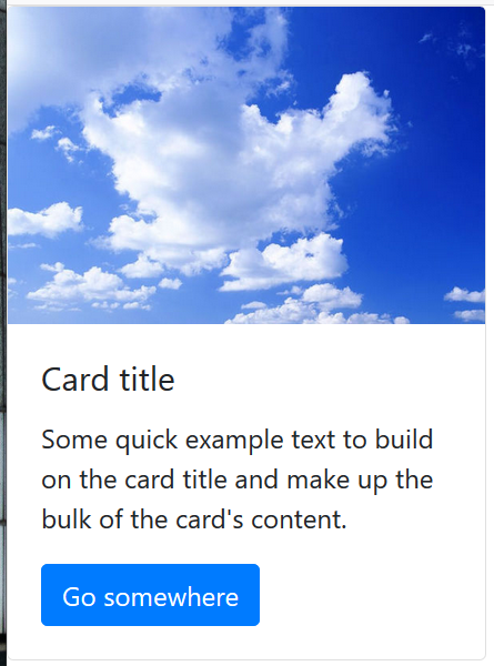
基本卡片:
<div class="card" style="width: 18rem;"><img class="card-img-top" src="../../../pic/pic.jpg" alt="Card image cap"><div class="card-body"><h5 class="card-title">Card title</h5><p class="card-text">Some quick example text to build on the card title and make up the bulk of thecard's content.</p><a href="#" class="btn btn-primary">Go somewhere</a></div></div>
基本卡片效果:
列表卡片:
<div class="card" style="width: 18rem;">
                <img class="card-img-top" src="../../../pic/pic.jpg" alt="Card image cap">
                <div class="card-body">
                    <h5 class="card-title">Card title</h5>
                    <p class="card-text">Some quick example text to build on the card title and make up the bulk of the
                        card's content.</p>
                    <a href="#" class="btn btn-primary">Go somewhere</a>
                </div>
            </div>
列表卡片样式:
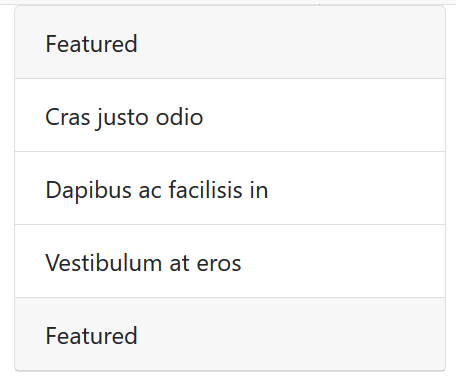
组合卡片:
<div class="card" style="width: 18rem;">
                <div class="card-header">
                    Featured
                </div>
                <ul class="list-group list-group-flush">
                    <li class="list-group-item">Cras justo odio</li>
                    <li class="list-group-item">Dapibus ac facilisis in</li>
                    <li class="list-group-item">Vestibulum at eros</li>
                </ul>
                <div class="card-header">
                    Featured
                </div>
            </div>
组合卡片样式:

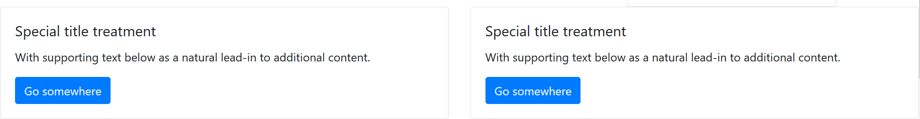
组件布局:
<div class="row">
        <div class="col-sm-6">
            <div class="card">
                <div class="card-body">
                    <h5 class="card-title">Special title treatment</h5>
                    <p class="card-text">With supporting text below as a natural lead-in to additional content.</p>
                    <a href="#" class="btn btn-primary">Go somewhere</a>
                </div>
            </div>
        </div>
    </div>
布局样式:
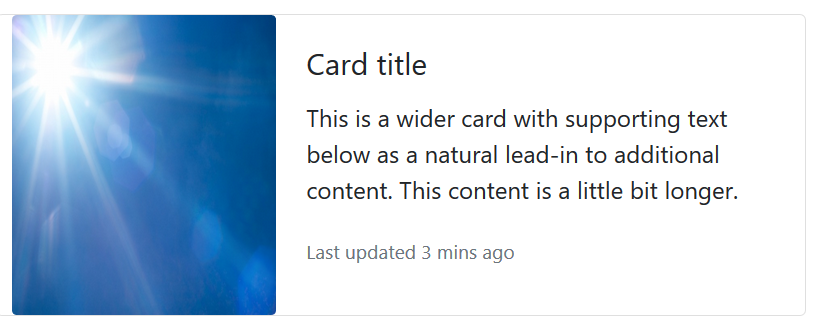
水平排列:
<div class="card mb-3" style="max-width: 540px; padding-left: 10px;">
        <div class="row no-gutters">
            <div class="col-md-4">
                <img src="../../../pic/pic2.jpg" class="card-img" alt="..." height="200px">
            </div>
            <div class="col-md-8">
                <div class="card-body">
                    <h5 class="card-title">Card title</h5>
                    <p class="card-text">This is a wider card with supporting text below as a natural lead-in to
                        additional content. This content is a little bit longer.</p>
                    <p class="card-text"><small class="text-muted">Last updated 3 mins ago</small></p>
                </div>
            </div>
        </div>
    </div>
水平排列效果:
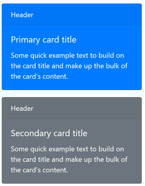
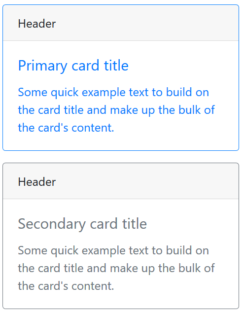
卡片颜色:
<div class="card text-white bg-primary mb-3" style="max-width: 20rem;">
<div class="card-header">Header</div>
<div class="card-body">
<h5 class="card-title">Primary card title</h5>
<p class="card-text">Some quick example text to build on the card title and make up the bulk of the card's
content.</p>
</div>
</div>
<div class="card text-white bg-secondary mb-3" style="max-width: 20rem;">
<div class="card-header">Header</div>
<div class="card-body">
<h5 class="card-title">Secondary card title</h5>
<p class="card-text">Some quick example text to build on the card title and make up the bulk of the card's
content.</p>
</div>
</div>
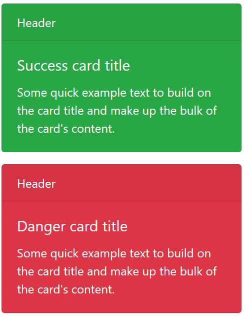
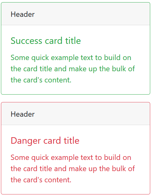
<div class="card text-white bg-success mb-3" style="max-width: 20rem;">
<div class="card-header">Header</div>
<div class="card-body">
<h5 class="card-title">Success card title</h5>
<p class="card-text">Some quick example text to build on the card title and make up the bulk of the card's
content.</p>
</div>
</div>
<div class="card text-white bg-danger mb-3" style="max-width: 20rem;">
<div class="card-header">Header</div>
<div class="card-body">
<h5 class="card-title">Danger card title</h5>
<p class="card-text">Some quick example text to build on the card title and make up the bulk of the card's
content.</p>
</div>
</div>
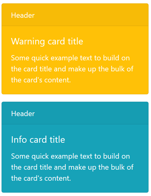
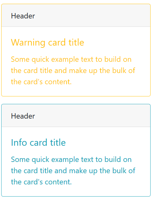
<div class="card text-white bg-warning mb-3" style="max-width: 20rem;">
<div class="card-header">Header</div>
<div class="card-body">
<h5 class="card-title">Warning card title</h5>
<p class="card-text">Some quick example text to build on the card title and make up the bulk of the card's
content.</p>
</div>
</div>
<div class="card text-white bg-info mb-3" style="max-width: 20rem;">
<div class="card-header">Header</div>
<div class="card-body">
<h5 class="card-title">Info card title</h5>
<p class="card-text">Some quick example text to build on the card title and make up the bulk of the card's
content.</p>
</div>
</div>
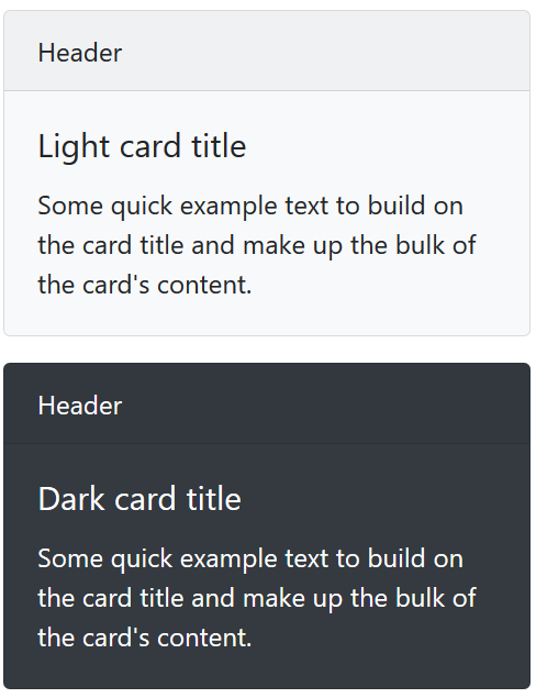
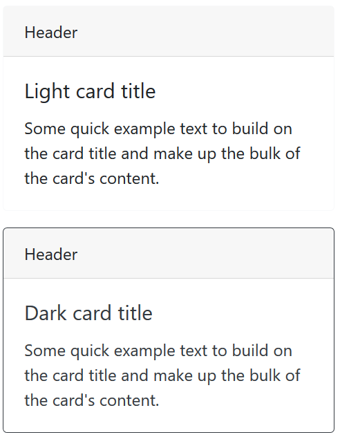
<div class="card bg-light mb-3" style="max-width: 20rem;">
<div class="card-header">Header</div>
<div class="card-body">
<h5 class="card-title">Light card title</h5>
<p class="card-text">Some quick example text to build on the card title and make up the bulk of the card's
content.</p>
</div>
</div>
<div class="card text-white bg-dark mb-3" style="max-width: 20rem;">
<div class="card-header">Header</div>
<div class="card-body">
<h5 class="card-title">Dark card title</h5>
<p class="card-text">Some quick example text to build on the card title and make up the bulk of the card's
content.</p>
</div>
</div>
<div class="card border-primary mb-3" style="max-width: 20rem;">
<div class="card-header">Header</div>
<div class="card-body text-primary">
<h5 class="card-title">Primary card title</h5>
<p class="card-text">Some quick example text to build on the card title and make up the bulk of the card's
content.</p>
</div>
</div>
<div class="card border-secondary mb-3" style="max-width: 20rem;">
<div class="card-header">Header</div>
<div class="card-body text-secondary">
<h5 class="card-title">Secondary card title</h5>
<p class="card-text">Some quick example text to build on the card title and make up the bulk of the card's
content.</p>
</div>
</div>
<div class="card border-success mb-3" style="max-width: 20rem;">
<div class="card-header">Header</div>
<div class="card-body text-success">
<h5 class="card-title">Success card title</h5>
<p class="card-text">Some quick example text to build on the card title and make up the bulk of the card's
content.</p>
</div>
</div>
<div class="card border-danger mb-3" style="max-width: 20rem;">
<div class="card-header">Header</div>
<div class="card-body text-danger">
<h5 class="card-title">Danger card title</h5>
<p class="card-text">Some quick example text to build on the card title and make up the bulk of the card's
content.</p>
</div>
</div>
<div class="card border-warning mb-3" style="max-width: 20rem;">
<div class="card-header">Header</div>
<div class="card-body text-warning">
<h5 class="card-title">Warning card title</h5>
<p class="card-text">Some quick example text to build on the card title and make up the bulk of the card's
content.</p>
</div>
</div>
<div class="card border-info mb-3" style="max-width: 20rem;">
<div class="card-header">Header</div>
<div class="card-body text-info">
<h5 class="card-title">Info card title</h5>
<p class="card-text">Some quick example text to build on the card title and make up the bulk of the card's
content.</p>
</div>
</div>
<div class="card border-light mb-3" style="max-width: 20rem;">
<div class="card-header">Header</div>
<div class="card-body">
<h5 class="card-title">Light card title</h5>
<p class="card-text">Some quick example text to build on the card title and make up the bulk of the card's
content.</p>
</div>
</div>
<div class="card border-dark mb-3" style="max-width: 20rem;">
<div class="card-header">Header</div>
<div class="card-body text-dark">
<h5 class="card-title">Dark card title</h5>
<p class="card-text">Some quick example text to build on the card title and make up the bulk of the card's
content.</p>
</div>
</div>
卡片颜色效果:
卡片组:
当使用带页脚的卡片图时,他们的内容会自动水平对齐和栅格式布局。
<div class="card-group">
        <div class="card">
            <img class="card-img-top" src="..." alt="Card image cap">
            <div class="card-body">
                <h5 class="card-title">Card title</h5>
                <p class="card-text">This is a wider card with supporting text below as a natural lead-in to additional
                    content. This content is a little bit longer.</p>
            </div>
            <div class="card-footer">
                <small class="text-muted">Last updated 3 mins ago</small>
            </div>
        </div>
        <div class="card">
            <img class="card-img-top" src="..." alt="Card image cap">
            <div class="card-body">
                <h5 class="card-title">Card title</h5>
                <p class="card-text">This card has supporting text below as a natural lead-in to additional content.</p>
            </div>
            <div class="card-footer">
                <small class="text-muted">Last updated 3 mins ago</small>
            </div>
        </div>
        <div class="card">
            <img class="card-img-top" src="..." alt="Card image cap">
            <div class="card-body">
                <h5 class="card-title">Card title</h5>
                <p class="card-text">This is a wider card with supporting text below as a natural lead-in to additional
                    content. This card has even longer content than the first to show that equal height action.</p>
            </div>
            <div class="card-footer">
                <small class="text-muted">Last updated 3 mins ago</small>
            </div>
        </div>
    </div>
卡片组效果:

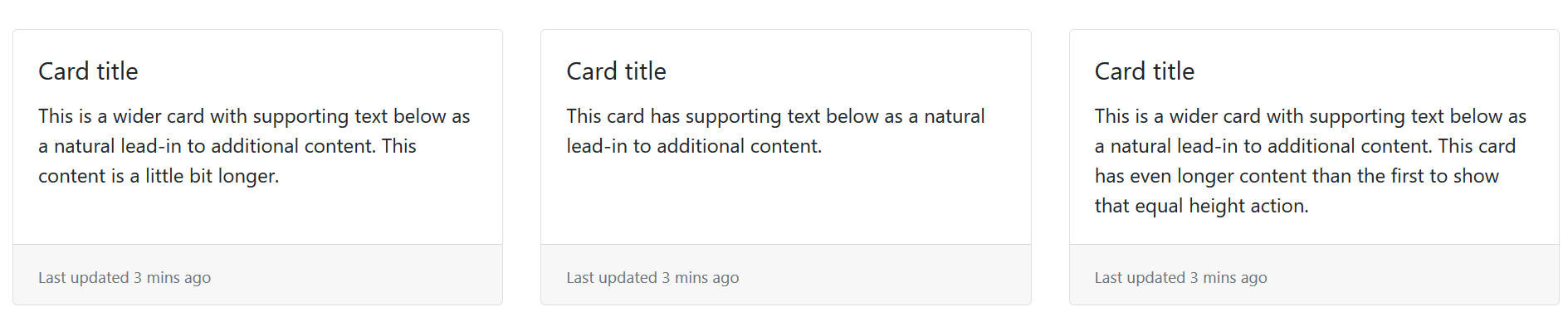
Card-decks卡片阵列:
<div class="card-deck" style="padding-left: 10px; padding-right: 10px; padding-bottom: 10px;">
        <div class="card">
            <!-- <img class="card-img-top" src="..." alt="Card image cap"> -->
            <div class="card-body">
                <h5 class="card-title">Card title</h5>
                <p class="card-text">This is a wider card with supporting text below as a natural lead-in to additional
                    content. This content is a little bit longer.</p>
            </div>
            <div class="card-footer">
                <small class="text-muted">Last updated 3 mins ago</small>
            </div>
        </div>
        <div class="card">
            <!-- <img class="card-img-top" src="..." alt="Card image cap"> -->
            <div class="card-body">
                <h5 class="card-title">Card title</h5>
                <p class="card-text">This card has supporting text below as a natural lead-in to additional content.</p>
            </div>
            <div class="card-footer">
                <small class="text-muted">Last updated 3 mins ago</small>
            </div>
        </div>
        <div class="card">
            <!-- <img class="card-img-top" src="..." alt="Card image cap"> -->
            <div class="card-body">
                <h5 class="card-title">Card title</h5>
                <p class="card-text">This is a wider card with supporting text below as a natural lead-in to additional
                    content. This card has even longer content than the first to show that equal height action.</p>
            </div>
            <div class="card-footer">
                <small class="text-muted">Last updated 3 mins ago</small>
            </div>
        </div>
    </div>
卡片阵列效果:

若有收获,就点个赞吧
0 人点赞
