关于画图的一些知识
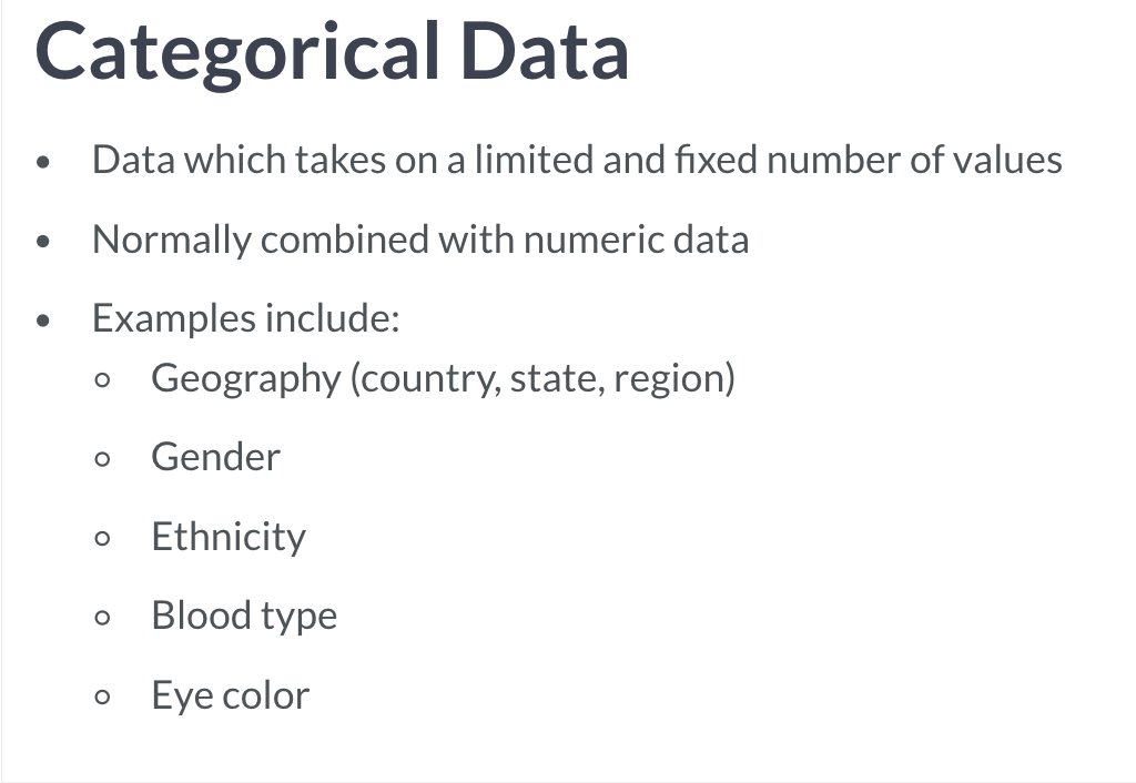
分类变量与连续变量
图像以外的东东
0)开始之前的操作
合理的处理数据
通过numpy与pandas 的学习,了解到了如何处理数据。一个好的数据的呈现,需要的是呈现前的数据的整理。
选择合适的图形
如果是比较连续变量间的变化,该选择哪个图像?如果是探究变量的分布情况该选择谁? 如果是比较分类变量间的差异又该作何选择?
选择合适的风格
相当于在作图前为自己选择合适的主题。
就像做网站一样,已经有很多现成的模版,对于坐标间距设定、字体大小设定等等,我们可以使用matplotlib 默认的,也可以选择其他风格的。
plt.style.use('xx') ,如果不设定,则默认为 default ,其他还有 ggplot , seaborn-colorblind 。
创建画板
还可以先创建空白画板, fig, ax = plt.subplots() ,fig 作为图像的名称,而ax 则是坐标的名称,再对 ax.plot() ,也即坐标轴进行操作。
# Import the matplotlib.pyplot submodule and name it pltimport matplotlib.pyplot as plt# Create a Figure and an Axes with plt.subplotsfig, ax = plt.subplots()# Plot MLY-PRCP-NORMAL from seattle_weather against MONTHax.plot(seattle_weather["MONTH"], seattle_weather["MLY-PRCP-NORMAL"])# Plot MLY-PRCP-NORMAL from austin_weather against MONTHax.plot(austin_weather["MONTH"], austin_weather["MLY-PRCP-NORMAL"])# Call the show functionplt.show()
1)输入数据
plt.xxx() 选择合适的图形,输入数据。
也可以直接 data.xxx() 输入。或通过 kind 参数设定。如 kind = 'bar' 表示条形图。
相关参数
color 设定颜色。alpha 设定透明度。rot 设定x,y 轴坐标的旋转程度。marker 设置点的标记。有多种标记 如’o’, ‘v’…
2)调整与自定义图像
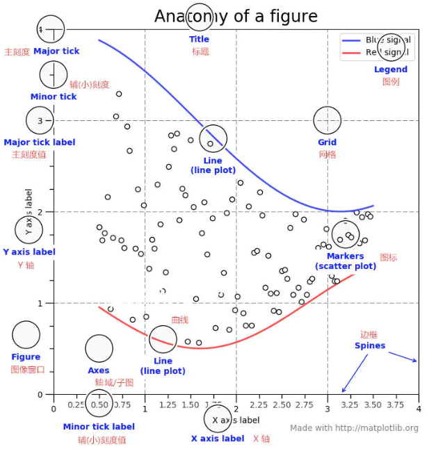
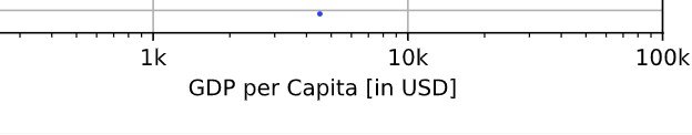
plt.[xy]label() 添加标签。 plt.title() 添加标题。plt.[xy]scale() 更改坐标轴轴距。plt.[xy]ticks() 更改坐标轴轴距,并添加新注释。(常用于设置连续变量)
tick_val = [1000, 10000, 100000]
tick_lab = ['1k', '10k', '100k'] # 为坐标轴轴距添加注释
plt.xticks(tick_val, tick_lab)
plt.text() 为某个点进行额外标注。plt.legend() 为图像进行标注。.tick_params() 可以设定某一边坐标轴的颜色。如 ax2.tick_params('y', colors = 'red') .[xy]ticklabels() 可以设置rotation 参数,如 rotation = 90 将标签翻转90度。(常用于设置分类变量)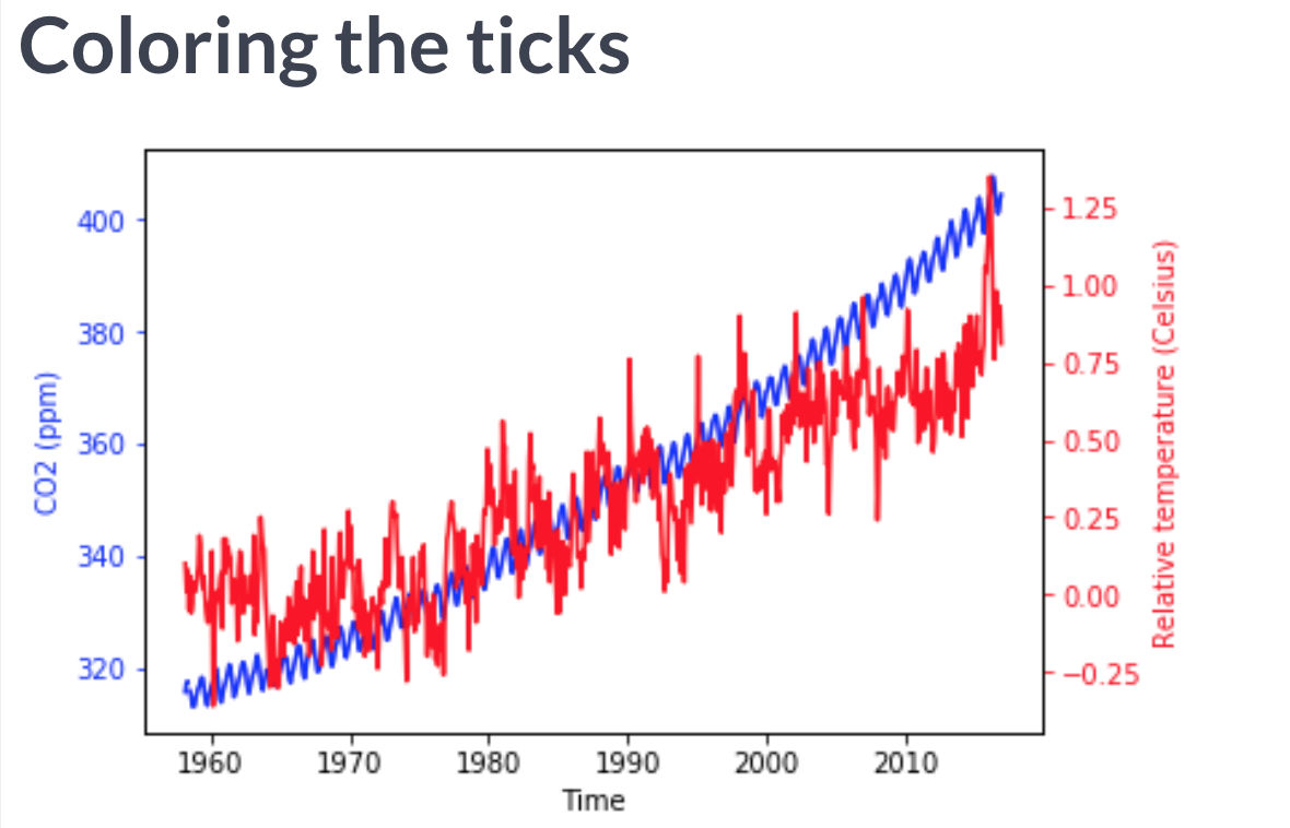
ps:这些设定都是全局的,因此如果需要将某些参数应用于某个图形的内部而非外部,可以在设定图形参数时在局部使用。
另外,在通过fig, ax = plt.subplots() ,再对 ax.plot() 处理时,使用到的命令一般都需要加 set_ 。
添加额外y或x轴
有时候,相同的一组数据,它们对应的另外一组数据的变化幅度如果不相同,甚至非常的大,则在显示时对变化幅度小的一组非常的不友好(matplotlib 自然会偏向变化幅度大的一组调整轴距)。
这时候可以使用 ax2 = ax.twin[xy]() ,表示ax2 的图像与原来的ax 分享相同的x或y轴,但有自己的另外一个坐标。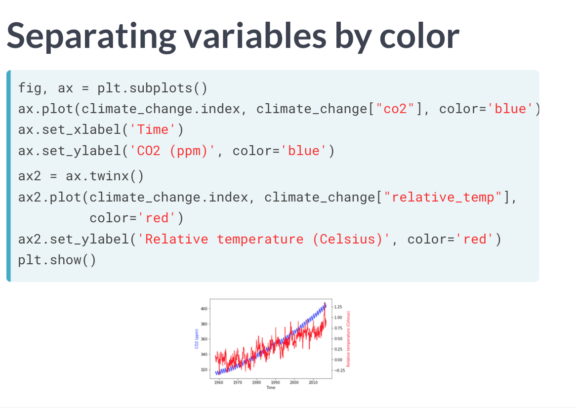
3)展示与删除图像
plt.show() 绘图。该函数一定要在所有其他函数之后。plt.clf() 删除先前图像。
放大局部图像
可以将一段图像的局部赋值给某个变量,再对这个变量进行作图。
4)保存图像
plt.show() 会将图像运行出来,但并不能将它保存到本地。
进行保存,需要执行 fig.savefig('xxx.xxx') ,格式一般有.png(质量好、文件大),.jpg(质量低、文件小) 还可以对它们设定 quality ,可以理解为原图像的质量度,一般取值0~95(高于95就没有压缩意义)。另外 dpi 也用于设定图像的质量,一般数值越高质量越好(300是个相对比较高的数值)。
其他格式还有.svg,其保存为矢量图格式,适合后期使用其他图形软件做进一步处理。
另外一个重要的内容是保存图像的大小。fig.set_size_inches([x, y]) ,x设定宽度,y设定高度
关于axes
如果使用subplots 的方式创建了图像,则可以通过 ax.set() 修改元素对许多内容进行设置:
[xy]label,设置标签。
[xy]lim,设置坐标轴取值。
title,设置标题。
线图
# import package
import matplotlib.pyplot as plt

# Make a line plot, gdp_cap on the x-axis, life_exp on the y-axis
plt.plot(gdp_cap, life_exp)

# Display the plot
plt.show()
相关参数
linestyle 可以设定线段的风格,如 -- 。或者选择 None 取消所有的线段。
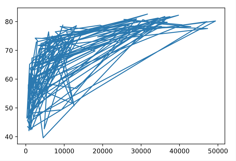
散点图
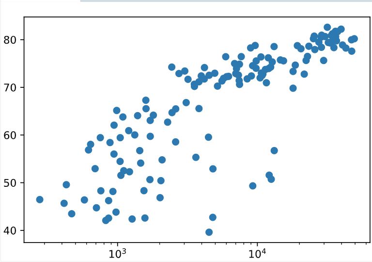
相比起连续变量间的变化趋势与关系,散点图更能表现整体的分布情况。
# Change the line plot below to a scatter plot
plt.scatter(gdp_cap, life_exp)

# Put the x-axis on a logarithmic scale
plt.xscale('log')

# Show plot
plt.show()
相关参数
s 可以设定散点图点的大小。c 可以替代color 设置颜色。
直方图
不同于线图与散点图更多是表现连续变量的变化趋势,或变量之间的相互影响,直方图更利于表现 数据的分布 。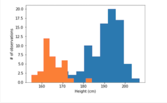
# Build histogram with 5 bins
plt.hist(life_exp, bins = 5)

# Show and clean up plot
plt.show()
plt.clf()
相关参数
bins 可以设定x轴数据分隔的大小。还可以手动设定bins 的取值,通过输入一个列表。histtype 可以设定直方图形状,如’step’ 类型。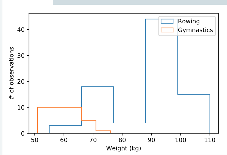
fig, ax = plt.subplots()

# Plot a histogram of "Weight" for mens_rowing
ax.hist(mens_rowing["Weight"], histtype='step', label="Rowing", bins=5)

# Compare to histogram of "Weight" for mens_gymnastics
ax.hist(mens_gymnastics["Weight"], histtype='step', label="Gymnastics", bins=5)

ax.set_xlabel("Weight (kg)")
ax.set_ylabel("# of observations")

# Add the legend and show the Figure
ax.legend()
plt.show()
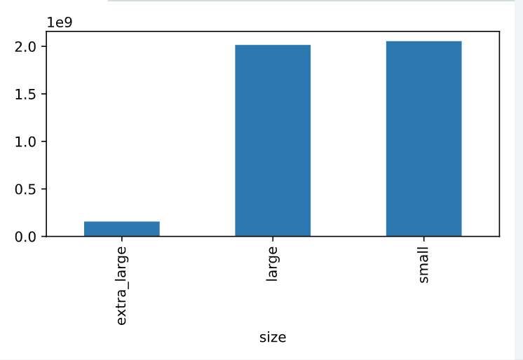
条形图
条形图可以很好的反映分类变量和连续变量之间的关系。
# Import matplotlib.pyplot with alias plt
import matplotlib.pyplot as plt

# Get the total number of avocados sold of each size
nb_sold_by_size = avocados.groupby("size")["nb_sold"].sum()

# Create a bar plot of the number of avocados sold by size
nb_sold_by_size.plot(kind="bar")

# Show the plot
plt.show()
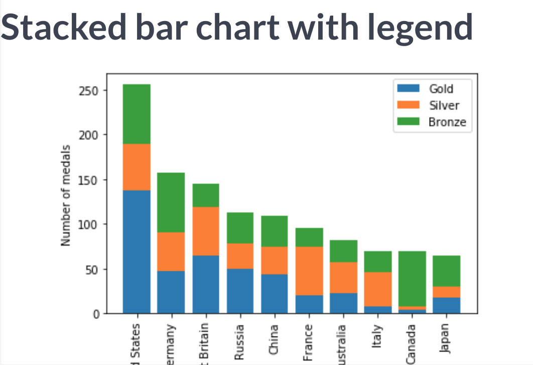
可以将具有相同x轴信息的不同y标注的信息堆积在一起,如一个国家奥林匹克比赛的金牌与银牌的数量。通过设定 bottom 设定在底部的信息。而bottom 的信息,可以用+连接。如 bottom = df['1'] + df['2'] 。
相关参数
error bar
可以为条形图添加误差棒,error bar, yerr = df['xx'].std() ,比如可以为其设置为条形图的标准差。另外,误差棒其本身也可以作为一个图像添加,比如 ax.errorbar() 或 kind = 'errorbar' 。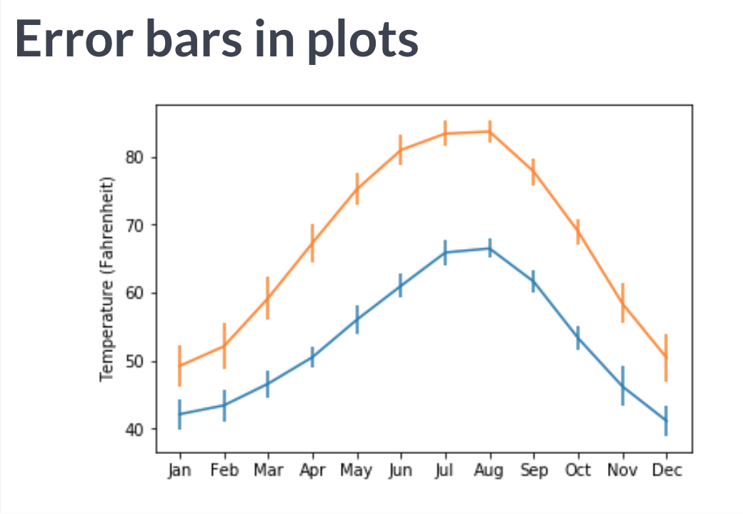
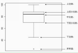
箱线图
boxplot, 专门用于表示分类变量内的统计分析的图像,相当于条形图的升级。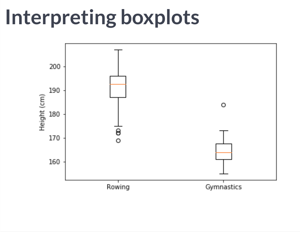
fig, ax = plt.subplots()

# Add a boxplot for the "Height" column in the DataFrames
ax.boxplot([mens_rowing["Height"], mens_gymnastics["Height"]])

# Add x-axis tick labels:
ax.set_xticklabels(["Rowing", "Gymnastics"])

# Add a y-axis label
ax.set_ylabel("Height (cm)")

plt.show()
为图像添加标注
简单标注
通过作图中数据指定 label = 'xx' ,并在画图前加上 ax.legend() 添加标注。
# Add bars for "Gold" with the label "Gold"
ax.bar(medals.index, medals['Gold'], label='Gold')

# Stack bars for "Silver" on top with label "Silver"
ax.bar(medals.index, medals['Silver'], bottom=medals['Gold'], label = 'Silver')

# Stack bars for "Bronze" on top of that with label "Bronze"
ax.bar(medals.index, medals['Bronze'], bottom=medals['Gold'] + medals['Silver'], label = 'Bronze')

# Display the legend
ax.legend()

plt.show()
annotate
此标注与简单的legend或text 可不同,而是专门的annotate方法。
首先需要输入标注的文本 .annotate('xxx') ,接着设定坐标 xy=( , ) ,在本例中为日期,因此需引用pd包以定位时间变量中的内容 pd.Timestamp('xxxx-xx-xx') 。
自定义箭头
arrowprops 使用字典对其定义,若为其赋值为一个空字典,则使用默认的箭头风格。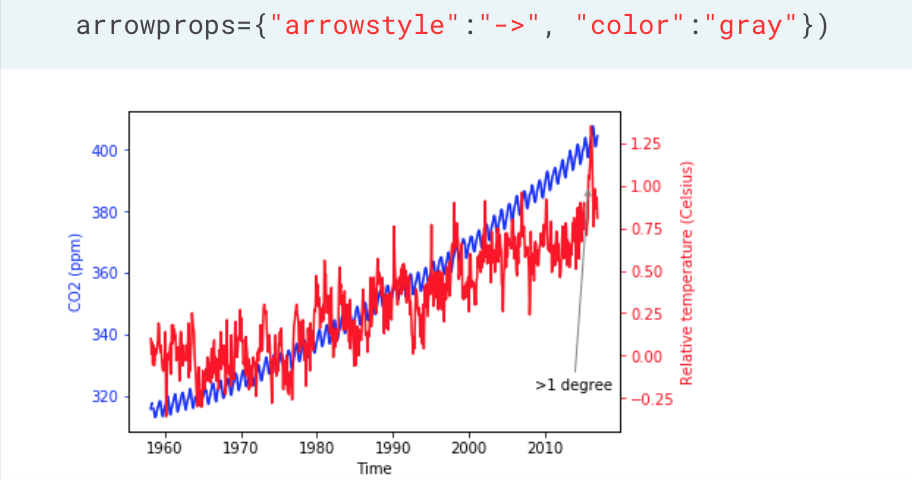
竖直线
ax.axvline(x=median, color='m', label='Median', linestyle='--', linewidth=2)
创建多个图像
plt.subplots
通常来说,在一张图里展示不同的数据,可以非常好的进行数据间的对比。但有时候,数据过多也会物极必反。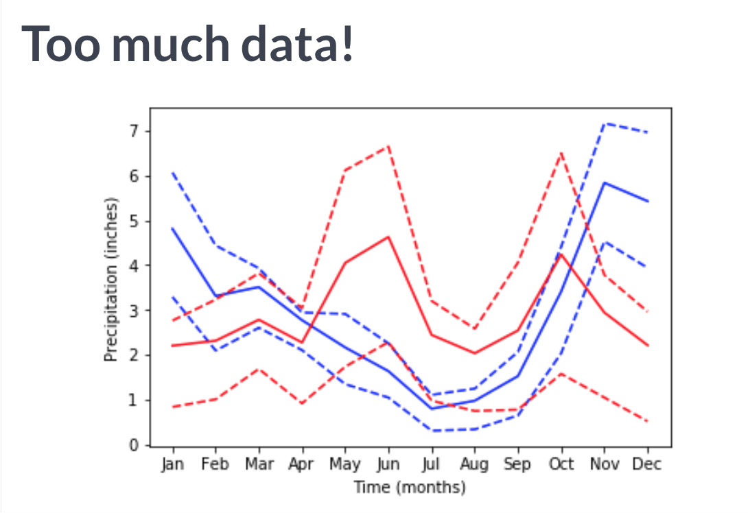
fig, ax = plt.subplots(n, m) ,创建nxm个坐标图(n行,m列)。
或者直接, fig, ax1, ax2 = plt.subplots(nrows = , ncols = ) ,为坐标轴变量命名。
其中还可以设定参数:
share[xy](分层图像是否共享x或y轴)。figsize = (x, y) 。
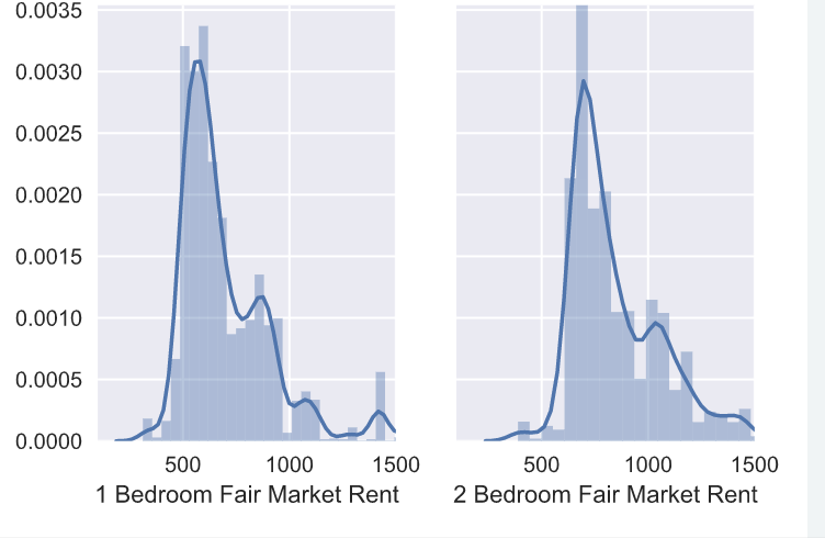
# Create a plot with 1 row and 2 columns that share the y axis label
fig, (ax0, ax1) = plt.subplots(nrows=1, ncols=2, sharey=True)

# Plot the distribution of 1 bedroom apartments on ax0
sns.distplot(df['fmr_1'], ax=ax0)
ax0.set(xlabel="1 Bedroom Fair Market Rent", xlim=(100,1500))

# Plot the distribution of 2 bedroom apartments on ax1
sns.distplot(df['fmr_2'], ax=ax1)
ax1.set(xlabel="2 Bedroom Fair Market Rent", xlim=(100,1500))

# Display the plot
plt.show()
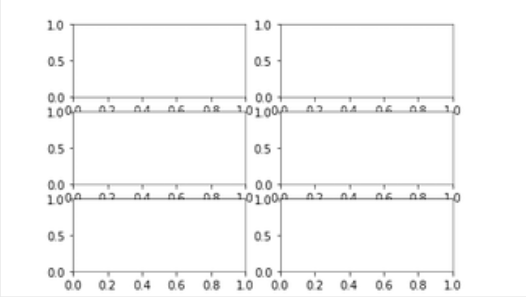
这时候的坐标就和表格中的元素一样了。而我们也通过类似的方法进行调用。ax[0, 1].plot() 表示第一行第二个图表。(ps:引用是从0开始!)
定义作图函数
如果需要对不同的数据进行相同风格的作图操作,一遍遍调用matplotlib 中的函数显的非常麻烦。
如果实现定义一个函数,则会轻松许多。
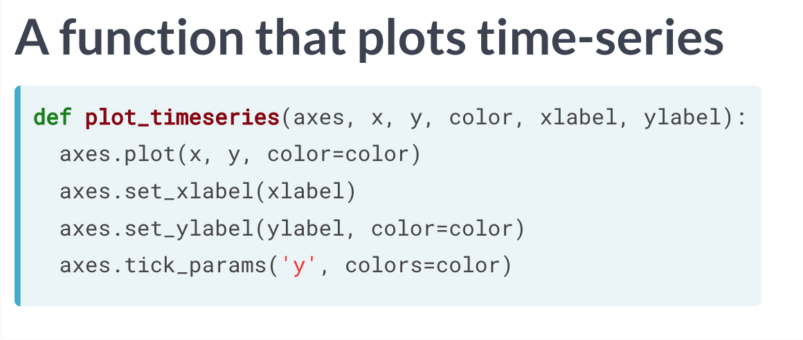
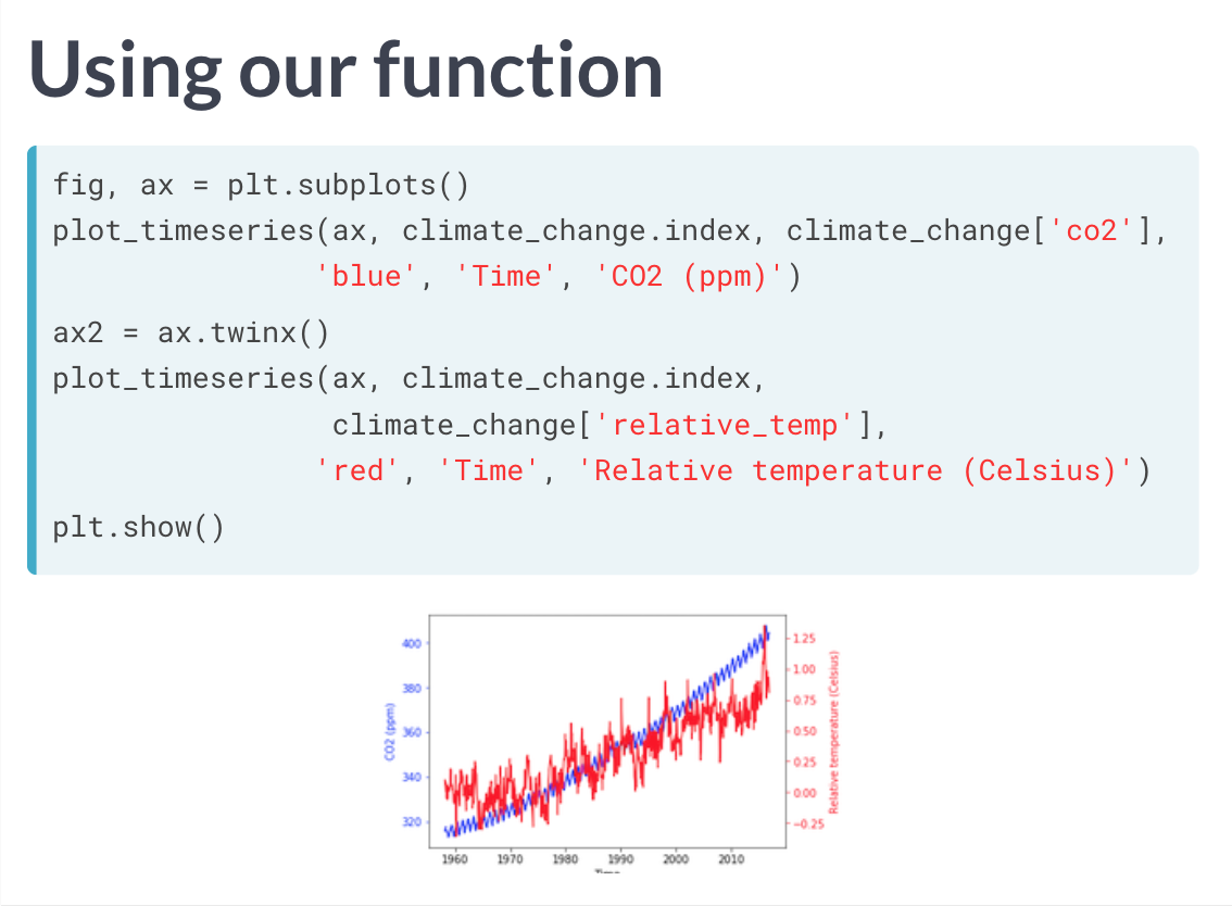
除此之外,我们还可以设定一个循环,这样可以批量的将信息转化为需要的图像。
fig, ax = plt.subplots()

# Loop over the different sports branches
for sport in sports:
  # Extract the rows only for this sport
  sport_df = summer_2016_medals[summer_2016_medals['Sport'] == sport]
  # Add a bar for the "Weight" mean with std y error bar
  ax.bar(sport, sport_df["Weight"].mean(), yerr=sport_df["Weight"].std())

ax.set_ylabel("Weight")
ax.set_xticklabels(sports, rotation=90)

# Save the figure to file
fig.savefig("sports_weights.png")
matplotlib 能干的多着呢


若有收获,就点个赞吧
0 人点赞
