TextButton可简单理解为按钮,即可点击的Text。
常用属性如下:
- TextButton常用属性:
- autofocus
- child
- clipBehavior
- enabled
- focusNode
- onLongPress
- onPressed
- style
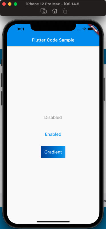
来看一下,定义三个按钮,分别对应,按钮不可点击,按钮可点击,按钮带有渐变背景,三种情况,效果如下:
使用代码如下:
class MyApp extends StatelessWidget {const MyApp({Key? key}) : super(key: key);static const String _title = 'Flutter Code Sample';@overrideWidget build(BuildContext context) {return MaterialApp(title: _title,home: Scaffold(appBar: AppBar(title: const Text(_title),),body: const MyStatelessWidget(),));}}class MyStatelessWidget extends StatelessWidget {const MyStatelessWidget({Key? key}) : super(key: key);@overrideWidget build(BuildContext context) {return Center(child: Column(mainAxisSize: MainAxisSize.min,children: [TextButton(onPressed: null,child: const Text('Disabled'),style: TextButton.styleFrom(textStyle: const TextStyle(fontSize: 20),),),const SizedBox(height: 30,),TextButton(onPressed: () {},child: const Text('Enabled'),style: TextButton.styleFrom(textStyle: const TextStyle(fontSize: 20),),),const SizedBox(height: 30,),ClipRRect(borderRadius: BorderRadius.circular(4),child: Stack(children: [Positioned.fill(child: Container(decoration: const BoxDecoration(gradient: LinearGradient(colors: [Color(0xFF0D47A1),Color(0xFF1976D2),Color(0xFF42A5F5),],),),),),TextButton(onPressed: () {},child: const Text('Gradient'),style: TextButton.styleFrom(padding: const EdgeInsets.all(16.0),primary: Colors.white,textStyle: const TextStyle(fontSize: 20),),),],),)],),);}}
注意渐变按钮的实现,使用了Stack。
参考

若有收获,就点个赞吧
0 人点赞
