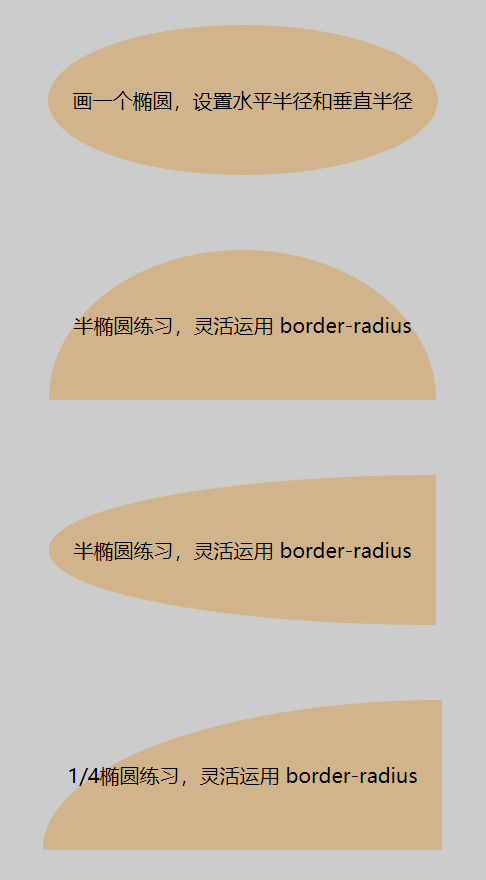
一、自适应椭圆
border-radius 可以给 div 的四个角上做圆角,参数可以写椭圆的横向半径和纵向半径。
.exercise1-1 {background: tan;border-radius: 50% / 50%;}.exercise1-2 {background: tan;border-radius: 50% / 100% 100% 0 0;}.exercise1-3 {background: tan;border-radius: 100% 0 0 100% / 50%;}.exercise1-4 {background: tan;border-radius: 100% 0 0 0 / 100% 0 0 0;}
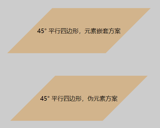
二、平行四边形
transform 属性中的 skew 函数可以使元素做倾斜,它做了全部的倾斜,如果子元素想回正,就把它做反向倾斜。使用伪元素也可以达到这样的效果,需要注意的是设置一下 z-index,放在文字的下面。
.exercise2-11 {background: tan;transform: skewX(-45deg);}.exercise2-12 {transform: skewX(45deg);}.exercise2-2 {position: relative;}.exercise2-2:after {position: absolute;content: '';background: tan;transform: skewX(-45deg);top: 0;left: 0;bottom: 0;right: 0;z-index: -1;}
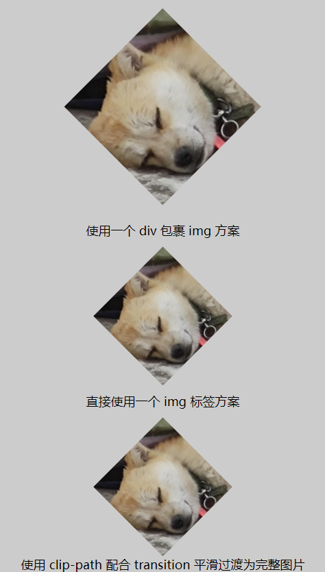
三、菱形图片
菱形图片可以使用 transform 中 rotate 函数做旋转 45°,也可以直接在原图上做裁剪。
.exercise3-11 {margin: 50px;transform: rotate(45deg);overflow: hidden;}.exercise3-11 .exercise3-12 {vertical-align: middle;transform: rotate(-45deg) scale(1.42);}.exercise3-2 {clip-path: polygon(50% 0, 100% 50%, 50% 100%, 0 50%);}.exercise3-3 {clip-path: polygon(50% 0, 100% 50%, 50% 100%, 0 50%);transition: 1s clip-path;}.exercise3-3:hover {clip-path: polygon(0 0, 100% 0, 100% 100%, 0 100%)}
「@浪里淘沙的小法师」

若有收获,就点个赞吧
0 人点赞
