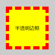
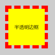
一、半透明边框
background-clip 可以调整背景颜色的覆盖范围,它默认值是 border-box,我们可以重新设置其值为 padding-box,然后将 border 设置为半透明的。
.exercise1{border: 10px dashed red;background: yellow;background-clip: border-box/padding-box;}
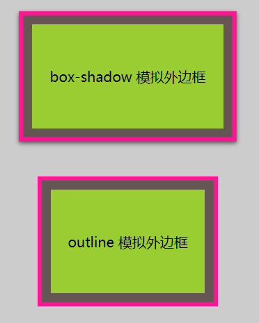
二、多重边框
box-shadow 、outline 可以模拟边框的效果,box-shadow 可以模拟无数个,outline 只能模拟 1 个
.exercise2-1 {background: yellowgreen;box-shadow: 0 0 0 10px #655, 0 0 0 15px deeppink, 0 2px 5px 15px rgba(0, 0, 0, 0.6);}.exercise2-2 {background: yellowgreen;border: 10px solid #655;outline: 5px solid deeppink;}
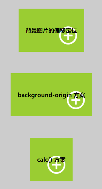
三、灵活的背景定位
background-position 设定背景图片的位置,background-origin 可以设置背景图片的定位基准,它默认值是 padding-box,我们修改成 content-box。
background 是一种 CSS 简写属性,用于一次性集中定义各种背景属性,写法可以参看「MDN」。
.exercise3-1 {font-weight: bold;background: url(../img/add.png) no-repeat bottom right yellowgreen;background-size: 50px;background-position: right 20px bottom 20px;}.exercise3-2 {font-weight: bold;background: url(../img/add.png) bottom right no-repeat yellowgreen;background-size: 50px;background-origin: content-box;}.exercise3-3 {font-weight: bold;background: url(../img/add.png) no-repeat right yellowgreen;background-size: 50px;background-position: calc(100% - 20px) calc(100% - 20px);}
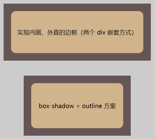
四、边框内圆角
实现边框内圆角有两种方式,一种是两个 div 嵌套,一种是在一个 div 上添加 box-shadow 和 outline 属性。
.exercise4-11 {background: #655;}.exercise4-12 {background: tan;border-radius: .8em;padding: 1em;}.exercise4-2 {background: tan;border-radius: .8em;box-shadow: 0 0 0 10px #655;outline: 20px solid #655;}
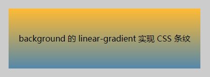
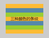
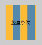
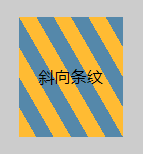
五、条纹背景
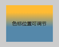
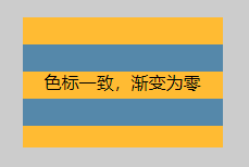
background 中的 linear-gradient 函数可以实现渐变和条纹,需指定颜色和色标。linear-gradient 本质上是用 CSS 方式生成一张图片,所以我们可以使用 background-size 等属性设置。repeating-linear-gradient 可以实现斜向条纹。
.exercise5-1 {background: linear-gradient(#fb3, #58a);}.exercise5-2 {background: linear-gradient(#fb3 20%, #58a 60%);}.exercise5-3 {background: linear-gradient(#fb3 50%, #58a 50%);background-size: 100% 50px;}.exercise5-4 {background: linear-gradient(#fb3 33.3%, #58a 0, #58a 66.6%, yellowgreen 0);background-size: 100% 52px;}.exercise5-5 {background: linear-gradient(to right, #fb3 50%, #58a 0);background-size: 50px 100%;}.exercise5-6 {background: repeating-linear-gradient(60deg, #fb3, #fb3 15px, #58a 0, #58a 30px);}
「@浪里淘沙的小法师」

若有收获,就点个赞吧
0 人点赞
