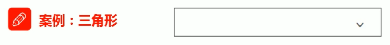
实现:
<style>div {position: relative;width: 300px;height: 40px;margin: 200px auto;border: 1px solid #bfbfbf;}/* 三角形用伪元素做*/div::after {position: absolute;top: 13px;right: 10px;content: '';width: 10px;height: 10px;border-right: 2px solid #bdbdbd;border-bottom: 2px solid #bdbdbd;transform: rotate(45deg);transition: 0.3s;}div:hover::after{transform: rotate(225deg);}</style></head><body><div></div></body>

若有收获,就点个赞吧
0 人点赞
