流程图
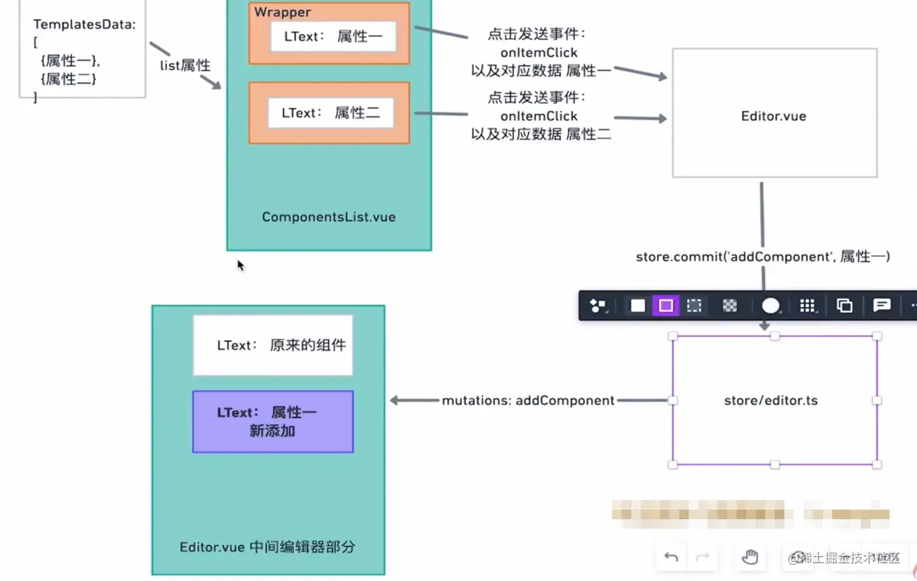
点击模版列表添加到画布的行为流程图如下。
- TemplatesData 为本地写死的模板数据,内部包含 l-text 组件的各个属性 。
- 通过 Editor.vue 把 TemplatesData 传递给 ComponentsList.vue 组件。
- ComponentsList.vue 组件接受并渲染父组件传递过来的 TemplatesData。
- 在 l-text 外层包裹 Wrapper 用来传递事件。
- 当点击 Wrapper 的时候,发送事件 onItemClick。
- 父组件执行 store.commit 向 store 中添加一条数据。
- 由于 store 是响应式的,所以当 store 多了一条数据的时候,画布就会自动渲染出来。
vscode-code-to-type ,复制 js 对象,生成 ts 类型
添加/删除模版到画布
export const defaultTextTemplates = [{text: '大标题',fontSize: '30px',fontWeight: 'bold',tag: 'h2',},{text: '正文内容',tag: 'p',},{text: '链接内容',color: '#1890ff',textDecoration: 'underline',tag: 'p',},{text: '按钮内容',color: '#ffffff',backgroundColor: '#1890ff',borderWidth: '1px',borderColor: '#1890ff',borderStyle: 'solid',borderRadius: '2px',paddingLeft: '10px',paddingRight: '10px',paddingTop: '5px',paddingBottom: '5px',width: '100px',tag: 'button',textAlign: 'center',},]
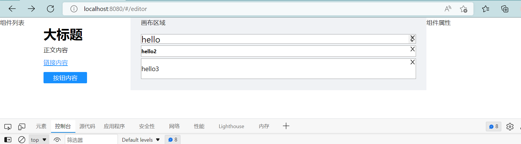
import { Module } from 'vuex'import { v4 as uuidv4 } from 'uuid'import { ImageComponentProps, TextComponentProps } from '@/ts/defaultProps'import { GloabalDataProps } from '.'import { ADDCOMPONENT, DELCOMPONENT } from './mutation-types'export interface ComponentData {// 这个元素的 属性,属性请详见下面props: Partial<TextComponentProps & ImageComponentProps>// id,uuid v4 生成id: string// 业务组件库名称 l-text,l-image 等等name: 'l-text' | 'l-image'}export const testComponents: ComponentData[] = [{id: uuidv4(),name: 'l-text',props: {text: 'hello',fontSize: '20px',color: '#000000',lineHeight: '1',textAlign: 'left',fontFamily: '',},},{id: uuidv4(),name: 'l-text',props: {text: 'hello2',fontSize: '10px',fontWeight: 'bold',lineHeight: '2',textAlign: 'left',fontFamily: '',},},{id: uuidv4(),name: 'l-text',props: {text: 'hello3',fontSize: '15px',actionType: 'url',url: 'https://www.baidu.com',lineHeight: '3',textAlign: 'left',fontFamily: '',},},]export interface EditorProps {// 供中间编辑器渲染的数组components: ComponentData[]// 当前编辑的是哪个元素,uuidcurrentElement: string}//两个参数 第一个本地的interface,第二个是全局的interfaceconst editor: Module<EditorProps, GloabalDataProps> = {state: {components: testComponents,currentElement: '',},mutations: {[ADDCOMPONENT](state, componentData: ComponentData) {state.components.push(componentData)},[DELCOMPONENT](state, componentData: ComponentData) {const res = state.components.filter((item) => item.id !== componentData.id,)state.components = res},},getters: {},}export default editor
<template><div class="create-component-list"><divv-for="(item, index) in list":key="index"class="component-item"@click="onItemClick(index)"><l-text v-bind="item"></l-text></div></div></template><script lang="ts">import { defineComponent } from 'vue'import { v4 as uuidv4 } from 'uuid'import { message } from 'ant-design-vue'import LText from '@/components/LText.vue'import props from 'ant-design-vue/lib/dropdown/props'import { ComponentData } from '@/store/editor'export default defineComponent({props: {list: {type: Array,default: [],},},components: { LText },emits: ['on-item-click'],setup(props, context) {//子向父传值const onItemClick = (index: number) => {const componentData = {name: 'l-text',id: uuidv4(),props: props.list[index],}context.emit('on-item-click', componentData)}return { onItemClick }},})</script><style>.component-item {width: 100px;margin: 0 auto;margin-bottom: 15px;}</style>
<template><div class="editor-container"><a-layout><a-layout-sider width="300" style="background: #fff"><div class="sidebar-container">组件列表</div><components-list:list="defaultTextTemplates"@on-item-click="addComponent"></components-list></a-layout-sider><a-layout style="padding: 0 24px 24px"><a-layout-content class="preview-container"><p>画布区域</p><!--引用的是component--><div v-for="item in components" :key="item.id" class="l-text-wrapper"><close-outlined class="icon-close" @click="delComponent(item)" /><componentclass="preview-list"id="canvas-area":is="item.name"v-bind="item.props"></component></div></a-layout-content></a-layout><a-layout-siderwidth="300"style="background: #fff"class="settings-panel">组件属性</a-layout-sider></a-layout></div></template><script lang="ts">import { GloabalDataProps } from '@/store'import { defineComponent, computed } from 'vue'import { useStore } from 'vuex'import LText from '@/components/LText.vue'import { CloseOutlined } from '@ant-design/icons-vue'import ComponentsList from '@/components/ComponentsList.vue'import { defaultTextTemplates } from '@/ts/defaultTemplates'import { ComponentData } from '@/store/editor'import { ADDCOMPONENT, DELCOMPONENT } from '@/store/mutation-types'export default defineComponent({components: { LText, ComponentsList, CloseOutlined },setup() {const store = useStore<GloabalDataProps>()const components = computed(() => store.state.editor.components)const addComponent = (data: ComponentData) => {store.commit(ADDCOMPONENT, data)}const delComponent = (data: ComponentData) => {console.log(data)store.commit(DELCOMPONENT, data)}return {components,defaultTextTemplates,addComponent,delComponent,}},})</script><style lang="less" scoped>.icon-close {position: absolute;z-index: 999;right: 0;}.l-text-wrapper {position: relative;border: 1px solid #999;margin: 2px 0;}.editor-container .preview-container {margin: 0;display: flex;flex-direction: column;// align-items: center;position: relative;}.editor-container .preview-list {padding: 0;margin: 0;border: 1px solid #efefef;background: #fff;overflow-x: hidden;overflow-y: auto;position: fixed;}</style>

若有收获,就点个赞吧
0 人点赞
