2-2 LText 组件初步实现
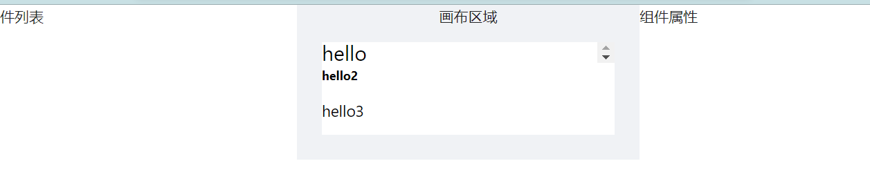
<template><div class="editor-container"><a-layout><a-layout-sider width="300" style="background: #fff"><div class="sidebar-container">组件列表</div></a-layout-sider><a-layout style="padding: 0 24px 24px"><a-layout-content class="preview-container"><p>画布区域</p><!--引用的是component--><componentclass="preview-list"id="canvas-area"v-for="item in components":key="item.id":is="item.name"v-bind="item.props"></component></a-layout-content></a-layout><a-layout-siderwidth="300"style="background: #fff"class="settings-panel">组件属性</a-layout-sider></a-layout></div></template><script lang="ts">import { GloabalDataProps } from '@/store'import { defineComponent, computed } from 'vue'import { useStore } from 'vuex'import LText from '@/components/LText.vue'export default defineComponent({components: { LText },setup() {const store = useStore<GloabalDataProps>()return {components: store.state.editor.components,}},})</script><style lang="less" scoped>.editor-container .preview-container {padding: 24px;margin: 0;display: flex;flex-direction: column;align-items: center;position: relative;}.editor-container .preview-list {padding: 0;margin: 0;border: 1px solid #efefef;background: #fff;overflow-x: hidden;overflow-y: auto;position: fixed;}</style>
<template><!--component 的tag是一个的动态组件--><component :is="tag" :style="styleProps" class="l-text-component">{{ text }}</component></template><script>import { computed, defineComponent, PropType } from 'vue'import _ from 'lodash-es'export default defineComponent({name: 'l-text',props: {text: {type: String,},fontSize: {type: String,},tag: {type: String,default: 'div',},},setup(props) {console.log(props)const styleProps = computed(() => _.pick(props, ['fontSize']))return {styleProps,}},})</script><style lang="less" scoped>h2.l-text-component,p.l-text-component {margin-bottom: 0;}button.l-text-component {padding: 5px 10px;cursor: pointer;}.l-text-component {box-sizing: border-box;white-space: pre-wrap;position: relative !important;width: 100%;height: 100%;}</style>
2-3 LText 添加通用属性
配置组件的通用默认属性以及 l-text 组件的特有默认属性。
...<script>import { computed, defineComponent, PropType } from 'vue'import _ from 'lodash-es'import {transformToComponentProps,textDefaultProps,textStylePropNames,} from '@/ts/defaultProps'const defaultProps = transformToComponentProps(textDefaultProps)//增加其他通用属性export default defineComponent({name: 'l-text',props: {tag: {type: String,default: 'div',},...defaultProps,},setup(props) {const styleProps = computed(() => _.pick(props, textStylePropNames))return {styleProps,}},})</script>...
import _, { without } from 'lodash-es'export interface CommonComponentProps {// actionsactionType: stringurl: string// sizeheight: stringwidth: stringpaddingLeft: stringpaddingRight: stringpaddingTop: stringpaddingBottom: string// border typeborderStyle: stringborderColor: stringborderWidth: stringborderRadius: string// shadow and opacityboxShadow: stringopacity: string// position and x,yposition: stringleft: stringtop: stringright: string}export const commonDefaultProps: CommonComponentProps = {// actionsactionType: '',url: '',// sizeheight: '',width: '373px',paddingLeft: '0px',paddingRight: '0px',paddingTop: '0px',paddingBottom: '0px',// border typeborderStyle: 'none',borderColor: '#000',borderWidth: '0',borderRadius: '0',// shadow and opacityboxShadow: '0 0 0 #000000',opacity: '1',// position and x,yposition: 'absolute',left: '0',top: '0',right: '0',}export interface TextComponentProps extends CommonComponentProps {text: stringfontSize: stringfontFamily: stringfontWeight: stringfontStyle: stringtextDecoration: stringlineHeight: stringtextAlign: stringcolor: stringbackgroundColor: string}//extends 追加export interface TextComponentProps extends CommonComponentProps {text: stringfontSize: stringfontFamily: stringfontWeight: stringfontStyle: stringtextDecoration: stringlineHeight: stringtextAlign: stringcolor: stringbackgroundColor: string}export const textDefaultProps: TextComponentProps = {// basic props - font stylestext: '正文内容',fontSize: '14px',fontFamily: '',fontWeight: 'normal',fontStyle: 'normal',textDecoration: 'none',lineHeight: '1',textAlign: 'left',color: '#000000',backgroundColor: '',...commonDefaultProps,}export interface ImageComponentProps extends CommonComponentProps {src: string}export const imageDefaultProps: ImageComponentProps = {src: 'test.url',...commonDefaultProps,}// 排除非样式属性export const textStylePropNames = without(Object.keys(textDefaultProps),'actionType','url','text',)// 转换成组件的props属性export const transformToComponentProps = (props: { [key: string]: any }) => {return _.mapValues(props, (item) => {return {type: item.constructor,default: item,}})}
2-4 LText 使用 hooks 重用逻辑
封装一个 hooks ,挑选出样式属性,并返回一个点击事件处理函数。
import { computed } from 'vue'import _ from 'lodash-es'export default function useComponentCommon<T extends { [key: string]: any }>(props: T,picks: string[],) {const styleProps = computed(() => _.pick(props, picks))const handleClick = () => {if (props.actionType === 'url' && props.url) {window.location.href = props.url}}//事件类型:无|跳转URL下拉菜单return { styleProps, handleClick }}
<template><!--component 的tag是一个的动态组件--><component:is="tag":style="styleProps"class="l-text-component"@click="handleClick">{{ text }}</component></template><script>import { computed, defineComponent, PropType } from 'vue'import _ from 'lodash-es'import {transformToComponentProps,textDefaultProps,textStylePropNames,} from '@/ts/defaultProps'import useComponentCommon from '@/hooks/useComponentCommon'const defaultProps = transformToComponentProps(textDefaultProps)export default defineComponent({name: 'l-text',props: {tag: {type: String,default: 'div',},...defaultProps,},setup(props) {console.log(props)const { styleProps, handleClick } = useComponentCommon(props,textStylePropNames,)return {styleProps,handleClick,}},})</script>...

若有收获,就点个赞吧
0 人点赞
