ggpubr 是由 Alboukadel Kassambara 开发的一款非常优秀的基于ggplot2作图的可视化R包,一行命令即可简单方便的绘制出符合出版物要求的图形。
ggplot2 by Hadley Wickham is an excellent and flexible package for elegant data visualization in R. However the default generated plots requires some formatting before we can send them for publication. Furthermore, to customize a ggplot, the syntax is opaque and this raises the level of difficulty for researchers with no advanced R programming skills. The ‘ggpubr’ package provides some easy-to-use functions for creating and customizing ‘ggplot2’- based publication ready plots.
R包安装
install.packages("ggpubr")library(ggpubr)# github安装if(!require(devtools)) install.packages("devtools")devtools::install_github("kassambara/ggpubr")library(ggpubr)
常用图形绘制
分布图绘制(Distribution)
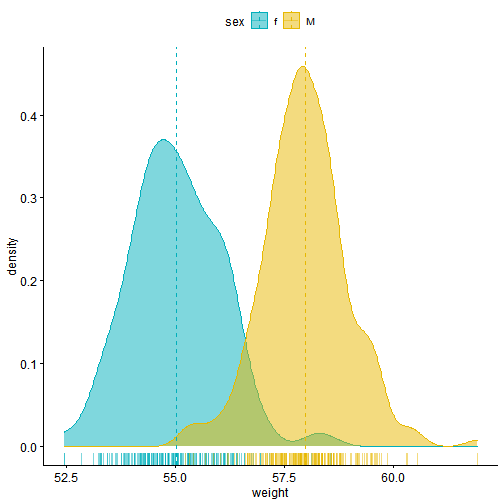
- 带有均值线和地毯线的密度图
#构建数据集set.seed(1234)df <- data.frame( sex=factor(rep(c("f", "M"), each=200)),weight=c(rnorm(200, 55), rnorm(200, 58)))# 预览数据格式head(df)
## sex weight## 1 f 58.29504## 2 f 53.92389## 3 f 55.38073## 4 f 53.90834## 5 f 54.95872## 6 f 55.28395
# 绘制密度图# rug参数添加地毯线,add参数可以添加均值mean和中位数median,按性别”sex“分组标记边框线颜色和填充色,使用palette参数自定义颜色p1 <- ggdensity(df, x="weight", add = "mean", rug = TRUE, color = "sex",fill = "sex",palette = c("#00AFBB", "#E7B800"))p1
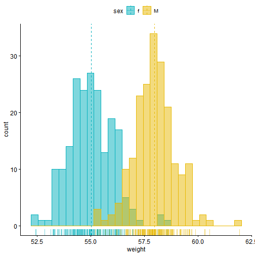
- 带有均值线和边际地毯线的直方图
p2 <- gghistogram(df, x="weight", add = "mean", rug = TRUE, color = "sex",fill = "sex",palette = c("#00AFBB", "#E7B800"))p2
箱线/小提琴图绘制(barplot/violinplot)
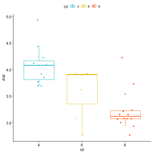
- 箱线图+分组形状+统计
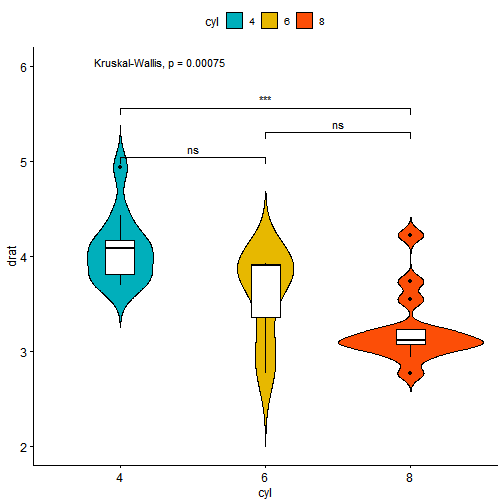
data("mtcars")#jitter参数添加扰动点,点的形状shape由dose变量映射p3 <- ggboxplot(mtcars, x="cyl", y="drat", color = "cyl",palette = c("#00AFBB", "#E7B800", "#FC4E07"),add = "jitter", shape="cyl")p3
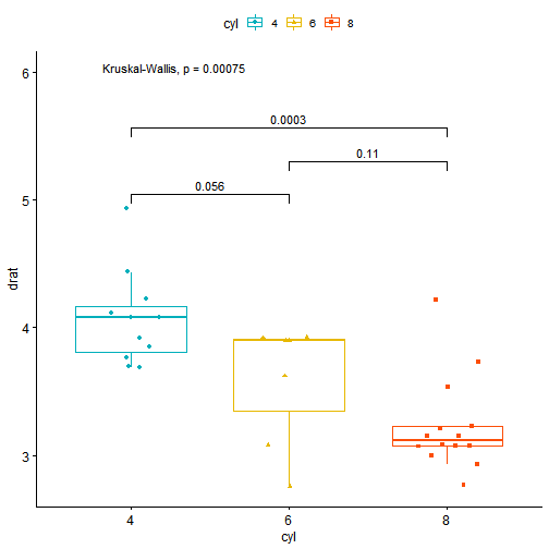
# stat_compare_means参数比较不同组之间的均值,并增加不同组间比较的p-value值,可以自定义需要标注的组间比较my_comparisons <- list(c("4", "6"), c("6", "8"), c("4", "8"))p4 <- p3 + stat_compare_means(comparisons = my_comparisons)+stat_compare_means(label.y = 6)p4
- 内有箱线图的小提琴图+星标记
# add = “boxplot”添加箱线图,stat_compare_means中设置lable=”p.signif”,即可添加星添加组间比较连线和统计P值按星分类add添加箱线图,label标注选择显著性标记(星号)p5 <- ggviolin(mtcars, x="cyl", y="drat", fill = "cyl",palette = c("#00AFBB", "#E7B800", "#FC4E07"),add = "boxplot", add.params = list(fill="white"))+stat_compare_means(comparisons = my_comparisons, label = "p.signif") +stat_compare_means(label.y = 6)p5
条形/柱状图绘制(barplot)
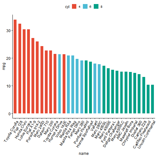
df2 <- mtcars# 设置因子变量df2$cyl <- factor(df2$cyl)df2$name <- rownames(df2) #添加一新列namehead(df2[, c("name", "wt", "mpg", "cyl")])
## name wt mpg cyl## Mazda RX4 Mazda RX4 2.620 21.0 6## Mazda RX4 Wag Mazda RX4 Wag 2.875 21.0 6## Datsun 710 Datsun 710 2.320 22.8 4## Hornet 4 Drive Hornet 4 Drive 3.215 21.4 6## Hornet Sportabout Hornet Sportabout 3.440 18.7 8## Valiant Valiant 3.460 18.1 6
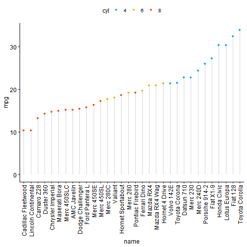
# 颜色按nature配色方法(支持 ggsci包中的本色方案 ,如: “npg”, “aaas”, “lancet”, “jco”, “ucscgb”, “uchicago”, “simpsons” and “rickandmorty”)p6 <- ggbarplot(df2, x="name", y="mpg", fill = "cyl", color = "white",palette = "npg", #杂志nature的配色sort.val = "desc", #降序排序sort.by.groups=FALSE, #不按组排序x.text.angle=60)p6
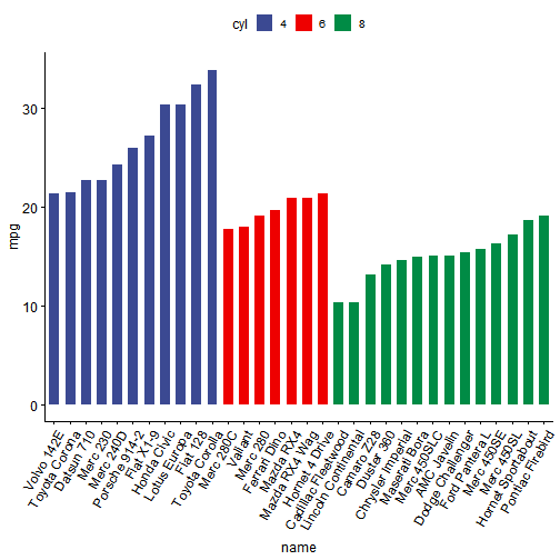
# 按组进行排序p7 <- ggbarplot(df2, x="name", y="mpg", fill = "cyl", color = "white",palette = "aaas", #杂志Science的配色sort.val = "asc", #升序排序,区别于descsort.by.groups=TRUE,x.text.angle=60) #按组排序 x.text.angl设置x轴标签旋转角度p7
ƫ��ͼ����(Deviation graphs)
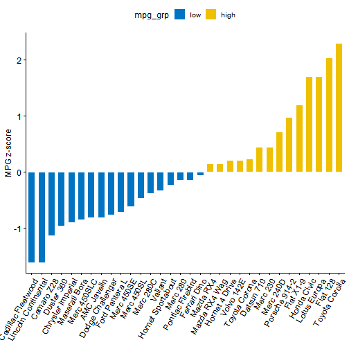
df2$mpg_z <- (df2$mpg-mean(df2$mpg))/sd(df2$mpg)# 相当于Zscore标准化,减均值,除标准差df2$mpg_grp <- factor(ifelse(df2$mpg_z<0, "low", "high"), levels = c("low", "high"))#设置分组因子head(df2[, c("name", "wt", "mpg", "mpg_grp", "cyl")])
## name wt mpg mpg_grp cyl## Mazda RX4 Mazda RX4 2.620 21.0 high 6## Mazda RX4 Wag Mazda RX4 Wag 2.875 21.0 high 6## Datsun 710 Datsun 710 2.320 22.8 high 4## Hornet 4 Drive Hornet 4 Drive 3.215 21.4 high 6## Hornet Sportabout Hornet Sportabout 3.440 18.7 low 8## Valiant Valiant 3.460 18.1 low 6
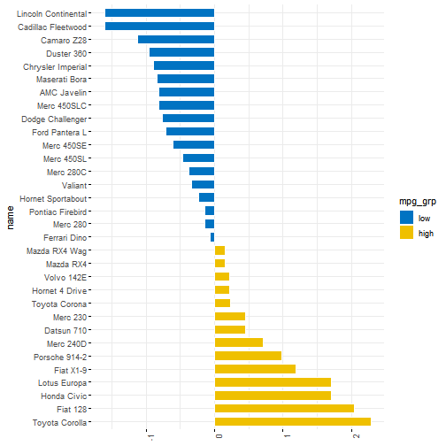
p8 <- ggbarplot(df2, x="name", y="mpg_z", fill = "mpg_grp", color = "white",palette = "jco", sort.val = "asc", sort.by.groups = FALSE,x.text.angle=60, ylab = "MPG z-score", xlab = FALSE)p8
# rotate设置x/y轴对换p9 <- ggbarplot(df2, x="name", y="mpg_z", fill = "mpg_grp", color = "white",palette = "jco", sort.val = "desc", sort.by.groups = FALSE,x.text.angle=90, ylab = "MPG z-score", xlab = FALSE,rotate=TRUE, ggtheme = theme_minimal())p9
棒棒糖图绘制(Lollipop chart)
棒棒图代替条形图展示数据
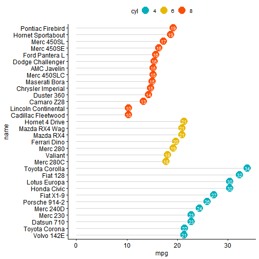
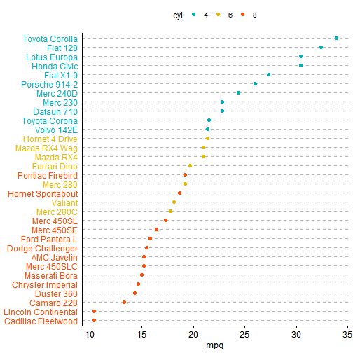
p10 <- ggdotchart(df2, x="name", y="mpg", color = "cyl",palette = c("#00AFBB", "#E7B800", "#FC4E07"),sorting = "ascending",add = "segments", ggtheme = theme_pubr())p10
# 设置其他参数, dot.size = 6调整糖的大小,添加label标签,设置字体样式和方向p11 <- ggdotchart(df2, x="name", y="mpg", color = "cyl",palette = c("#00AFBB", "#E7B800", "#FC4E07"),sorting = "descending", add = "segments", rotate = TRUE,group = "cyl", dot.size = 6,label = round(df2$mpg), font.label = list(color="white",size=9, vjust=0.5), ggtheme = theme_pubr())p11
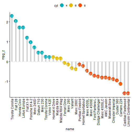
#棒棒糖偏差图p12 <- ggdotchart(df2, x = "name", y = "mpg_z",color = "cyl", # Color by groupspalette = c("#00AFBB", "#E7B800", "#FC4E07"), # Custom color palettesorting = "descending", # Sort value in descending orderadd = "segments", # Add segments from y = 0 to dotsadd.params = list(color = "lightgray", size = 2), # Change segment color and sizegroup = "cyl", # Order by groupsdot.size = 6, # Large dot sizelabel = round(df2$mpg_z,1), # Add mpg values as dot labels,设置一位小数font.label = list(color = "white", size = 9, vjust = 0.5), # Adjust label parametersggtheme = theme_pubr()) +geom_hline(yintercept = 0, linetype = 2, color = "lightgray")p12
Cleveland��ͼ����
# theme_cleveland()主题可设置为Cleveland点图样式p13 <- ggdotchart(df2, x = "name", y = "mpg",color = "cyl", # Color by groupspalette = c("#00AFBB", "#E7B800", "#FC4E07"), # Custom color palettesorting = "descending", # Sort value in descending orderrotate = TRUE, # Rotate verticallydot.size = 2, # Large dot sizey.text.col = TRUE, # Color y text by groupsggtheme = theme_pubr()) +theme_cleveland() # Add dashed gridsp13
常用基本绘图函数及参数
基本绘图函数
gghistogram Histogram plot #绘制直方图ggdensity Density plot #绘制密度图ggdotplot Dot plot #绘制点图ggdotchart Cleveland's Dot Plots #绘制Cleveland点图ggline Line plot #绘制线图ggbarplot Bar plot #绘制条形/柱状图ggerrorplot Visualizing Error #绘制误差棒图ggstripchart Stripcharts #绘制线带图ggboxplot Box plot #绘制箱线图ggviolin Violin plot #绘制小提琴图ggpie Pie chart #绘制饼图ggqqplot QQ Plots #绘制QQ图ggscatter Scatter plot #绘制散点图ggmaplot MA-plot from means and log fold changes #绘制M-A图ggpaired Plot Paired Data #绘制配对数据ggecdf Empirical cumulative density function #绘制经验累积密度分布图
基本参数
ggtext Text #添加文本border Set ggplot Panel Border Line #设置画布边框线grids Add Grids to a ggplot #添加网格线font Change the Appearance of Titles and Axis Labels #设置字体类型bgcolor Change ggplot Panel Background Color #更改画布背景颜色background_image Add Background Image to ggplot2 #添加背景图片facet Facet a ggplot into Multiple Panels #设置分面ggpar Graphical parameters #添加画图参数ggparagraph Draw a Paragraph of Text #添加文本段落ggtexttable Draw a Textual Table #添加文本表格ggadd Add Summary Statistics or a Geom onto a ggplot #添加基本统计结果或其他几何图形ggarrange Arrange Multiple ggplots #排版多个图形annotate_figure Annotate Arranged Figure #添加注释信息gradient_color Set Gradient Color #设置连续型颜色xscale Change Axis Scale: log2, log10 and more #更改坐标轴的标度add_summary Add Summary Statistics onto a ggplot #添加基本统计结果set_palette Set Color Palette #设置画板颜色rotate Rotate a ggplot Horizontally #设置图形旋转rotate_axis_text Rotate Axes Text #旋转坐标轴文本stat_stars Add Stars to a Scatter Plot #添加散点图星标stat_cor Add Correlation Coefficients with P-values to a Scatter Plot #添加相关系数stat_compare_means Add Mean Comparison P-values to a ggplot #添加平均值比较的P值diff_express Differential gene expression analysis results #内置差异分析结果数据集ggexport Export ggplots # 导出图片theme_transparent Create a ggplot with Transparent Background #设置透明背景theme_pubr Publication ready theme #设置出版物主题

若有收获,就点个赞吧
0 人点赞
