复合图形可以给出更多的信息,并且更能够观察数据之间的联系。一般所说的复合饼图包括以下两种:
散点复合饼图(compound scatter and pie chart)可以展示三个数据变量的信息:(x, y, P),其中x和y决定气泡在直角坐标系中的位置,P表示饼图的数据信息,决定饼图中各个类别的占比情况,如图1(a)所示。
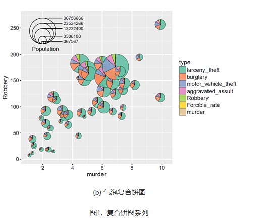
气泡复合饼图(compound bubble and pie chart)可以展示四个数据变量的信息:(x, y, z, P),其中x和y决定气泡在直角坐标系中的位置,z决定气泡的大小,P表示饼图的数据信息,决定饼图中各个类别的占比情况,如图1(b)所示。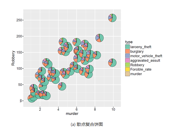
具体操作如下:
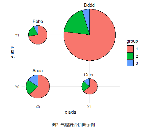
library(ggforce)library(dplyr)data_graph <- read.table(text = "x y group nb1 0 0 1 10602 0 0 2 3613 0 0 3 2674 0 1 1 7885 0 1 2 2156 0 1 3 807 1 0 1 4858 1 0 2 1689 1 0 3 10110 1 1 1 630611 1 1 2 150112 1 1 3 379", header = TRUE)# make group a factordata_graph$group <- factor(data_graph$group)# add case variable that separates the four piesdata_graph <- cbind(data_graph, case = rep(c("Aaaa", "Bbbb", "Cccc", "Dddd"), each = 3))# calculate the start and end angles for each piedata_graph <- left_join(data_graph,data_graph %>%group_by(case) %>%summarize(nb_total = sum(nb))) %>%group_by(case) %>%mutate(nb_frac = 2*pi*cumsum(nb)/nb_total,start = lag(nb_frac, default = 0))# position of the labelsdata_labels <- data_graph %>%group_by(case) %>%summarize(x = x[1], y = y[1], nb_total = nb_total[1])# overall scaling for pie sizescale = .5/sqrt(max(data_graph$nb_total))# draw the piesggplot(data_graph) +geom_arc_bar(aes(x0 = x, y0 = y, r0 = 0, r = sqrt(nb_total)*scale,start = start, end = nb_frac, fill = group)) +geom_text(data = data_labels,aes(label = case, x = x, y = y + scale*sqrt(nb_total) + .05),size =11/.pt, vjust = 0) +coord_fixed() +scale_x_continuous(breaks = c(0, 1), labels = c("X0", "X1"), name = "x axis") +scale_y_continuous(breaks = c(0, 1), labels = c("Y0", "Y1"), name = "y axis") +theme_minimal() +theme(panel.grid.minor = element_blank())
最终得到的图形如下所示:

若有收获,就点个赞吧
0 人点赞
