Button(按钮)
JavaFX 按钮 控件使 JavaFX 应用程序能够在用户单击按钮时执行某些操作。JavaFX 按钮控件由类 javafx.scene.control.Button 表示。JavaFX 按钮上可以有一个文本和一个图标,向用户指示单击该按钮将执行的操作。
A JavaFX Button control enables a JavaFX application to have some action executed when the application user clicks the button. The JavaFX Button control is represented by the class javafx.scene.control.Button. A JavaFX Button can have a text and an icon on it which indicate to the user what clicking the button will do.
创建一个 Button
您可以通过创建 Button 类的实例来创建按钮控件。这是一个 JavaFX Button 实例化的示例:
You create a button control by creating an instance of the Button class. Here is a JavaFX Button instantiation example:
Button button = new Button("My Label");
要在按钮上显示的文本将作为参数传递给 Button 类的构造器。
The text to be displayed on the button is passed as parameters to the Button constructor.
在场景图中添加 Button
要使 JavaFX Button 可见,必须将按钮对象添加到场景图中。这意味着将其添加到 Scene 对象,或者作为附加到 Scene 对象的布局组件的子节点。
For a JavaFX Button to be visible the button object must be added to the scene graph. This means adding it to a Scene object, or as child of a layout which is attached to a Scene object.
这是一个将 JavaFX Button 添加到场景图的示例:
Here is an example that attaches a JavaFX Button to the scene graph:
package com.jenkov.javafx.controls;import javafx.application.Application;import javafx.scene.Scene;import javafx.scene.control.Button;import javafx.scene.control.Label;import javafx.stage.Stage;public class ButtonExperiments extends Application {@Overridepublic void start(Stage primaryStage) throws Exception {primaryStage.setTitle("HBox Experiment 1");Button button = new Button("My Button");Scene scene = new Scene(button, 200, 100);primaryStage.setScene(scene);primaryStage.show();}public static void main(String[] args) {Application.launch(args);}}
请注意,Button 被直接添加到了 Scene 对象中。通常,您会将 Button 嵌套在某种布局组件中。为了使示例简单,我将其省略了。请参阅有关布局组件的教程以了解它们是如何工作的。
Notice that the Button is added directly to the Scene object. Normally you would nest the Button inside a layout component of some kind. I have left that out here to keep the example simple. See the tutorials about layout components to see how they work.
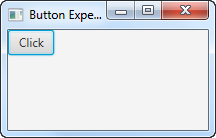
运行上述 JavaFX Button 示例的结果如下所示:
The result of running the above JavaFX Button example is an application that looks like this:
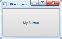
请注意,该按钮占用了窗口中的所有可用空间。这就是为什么很难看到按钮边缘的原因。将 JavaFX 按钮添加到布局组件时,您可以更轻松地看到按钮的边缘。
Notice that the button takes up all the space available in the window. That is why it is hard to see the edges of the button. When a JavaFX button is added to a layout component you can more easily see the edges of the button.
Button 文本
有两种方法可以设置 JavaFX 按钮的文本。第一种方法是将文本传递给 Button 类的构造器。您已经在前面的示例中看到了这一点。
There are two ways to set the text of a JavaFX button. The first way is to pass the text to the Button constructor. You have already seen this in earlier examples.
设置按钮文本的第二种方法是调用 Button 实例上的 setText() 方法。这可以在 Button 实例创建后完成。因此,它可用于更改已经可见的 Button 的文本。下面是如何在 JavaFX Button 上调用 setText() 的示例:
The second way to set the button text is by calling the setText() method on the Button instance. This can be done after the Button instance is created. Thus it can be used to change the text of a Button that is already visible. Here is an example how how calling setText() on a JavaFX Button looks:
button.setText("Click me if you dare!");
Button 文本大小
您可以设置 JavaFX Button 的文本大小。您可以使用 CSS 属性 -fx-text-size 来执行此操作。这个 CSS 属性在关于 按钮 CSS 样式 的部分中进行了解释。
You can set the text size of a JavaFX Button. You do so using the CSS property -fx-text-size. This CSS property is explained in the section about Button CSS Styling.
Button 文本换行
JavaFX Button 控件支持按钮文本的换行。文本换行意味着如果文本太长而无法显示在按钮内的单行上,则文本会被分成多行。
The JavaFX Button control supports text wrapping of the button text. By text wrapping is meant that if the text is too long to be displayed on a single line inside the button, the text is broken onto multiple lines.
您可以使用方法 setWrapText() 在 JavaFX Button 实例上启用文本换行。setWrapText() 方法有一个 boolean 类型的参数。如果将 true 值传递给 setWrapText(),则启用文本换行;如果将 false 值传递给 setWrapText(),则禁用文本换行。下面是一个在 JavaFX 按钮上启用文本换行的示例:
You enable text wrapping on a JavaFX Button instance using the method setWrapText(). The setWrapText() method takes a single boolean parameter. If you pass a value of true to setWrapText() then you enable text wrapping. If you pass a value of false to setWrapText() then you disable text wrapping. Here is an example that enables text wrapping on a JavaFX button:
button.setWrapText(true);
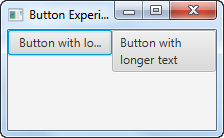
这是两个 JavaFX 按钮的屏幕截图,其中一个启用了文本换行:
Here is a screenshot of two JavaFX buttons one of which has text wrapping enabled:
Button 字体
您可以通过其 setFont() 方法指定应使用 JavaFX 按钮上的呈现文本的字体。您可以在 JavaFX Fonts(字体) 教程中阅读有关创建字体的更多信息。下面是在 JavaFX 按钮上设置字体的示例:
You can specify what font the text on a JavaFX Button should be rendered with via its setFont() method. You can read more about creating fonts in JavaFX Fonts tutorial. Here is an example of setting a font on a JavaFX Button:
Button button = new Button("Click me!");Font font = Font.font("Courier New", FontWeight.BOLD, 36);button.setFont(font);
Button 默认模式
JavaFX 按钮可以设置为 默认模式。当按钮处于默认模式时,它的呈现方式不同,因此用户可以看到这是默认按钮。在 Windows 上,按钮的背景颜色会发生变化,尽管我猜这也取决于应用程序中使用的颜色主题等,并且可能会在 JavaFX 的未来版本中发生变化。
A JavaFX Button can be set into a default mode. When a Button is in default mode it is rendered differently, so the user can see that this is the default button. On Windows, the Button’s background color changes, although I guess that also depends on the color theme used in the application etc. and may change in future versions of JavaFX.
默认按钮旨在用于对话框或表单中的“默认选择”。因此,用户更容易选择最有可能、最常做出的选择。
The default button is intended to be used for the “default choice” in a dialog or form. Thus, it becomes easier for the user to select the choice that the user is most likely making most often.
对话框或表单的默认按钮有一些额外的键盘快捷键来帮助用户单击它:
The default button of a dialog or form has some additional keyboard shortcuts to help the user click it:
- Windows 和 Linux
- 如果没有其它按钮具有焦点,按 ENTER 键盘键将激活默认按钮(If no other button has focus, pressing the ENTER keyboard key will activate the default button)
- 如果默认按钮有焦点,按 ENTER 键盘键将激活默认按钮(If the default button has focus, pressing the ENTER keyboard key will activate the default button)
- macOS
- 只有默认按钮可以通过按 ENTER 键盘键激活(Only the default button can be activated by pressing the ENTER keyboard key)
- 通过按 SPACE 键盘键可激活所有其它按钮(All other buttons are activated by pressing the the SPACE keyboard key)
将 JavaFX 按钮设置为默认按钮是通过其 setDefaultButton() 方法完成的。以下是将 JavaFX 按钮设置为默认按钮的示例:
Setting a JavaFX Button as the default button is done via its setDefaultButton() method. Here is an example of setting a JavaFX button as default button:
button.setDefaultButton(true);
Button 取消模式
JavaFX 按钮可以设置为 取消模式。当按钮处于取消模式时,可以通过按 ESC 键盘键更轻松地激活它 —— 如果场景图中没有其它节点使用此键来激活。
A JavaFX Button can be set into cancel mode. When a Button is in cancel mode it can be activated more easily by pressing the ESC keyboard key - if no other node in the Scene graph consumes this key press.
将 JavaFX 按钮设置为取消按钮是通过其 setCancelButton() 方法完成的。以下是将 JavaFX 按钮设置为取消模式的示例:
Setting a JavaFX Button in cancel mode (as cancel button) is done via its setCancelButton() method. Here is an example of setting a JavaFX Button in cancel mode:
buttonDefault.setCancelButton(true);
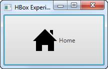
Button 图片
可以在按钮文本旁边显示图像。JavaFX Button 类包含一个可以将 Node 作为额外参数的构造器。这是一个 JavaFX 标签示例,它使用 JavaFX ImageView(图像视图) 组件向按钮添加图像:
It is possible to display an image inside a button next to the button text. The JavaFX Button class contains a constructor that can take a Node as extra parameter. Here is a JavaFX label example that adds an image to the button using an JavaFX ImageView component:
package com.jenkov.javafx.controls;import javafx.application.Application;import javafx.scene.Scene;import javafx.scene.control.Button;import javafx.scene.image.Image;import javafx.scene.image.ImageView;import javafx.stage.Stage;import java.io.FileInputStream;public class ButtonExperiments extends Application {@Overridepublic void start(Stage primaryStage) throws Exception {primaryStage.setTitle("HBox Experiment 1");FileInputStream input = new FileInputStream("resources/images/iconmonstr-home-6-48.png");Image image = new Image(input);ImageView imageView = new ImageView(image);Button button = new Button("Home", imageView);Scene scene = new Scene(button, 200, 100);primaryStage.setScene(scene);primaryStage.show();}public static void main(String[] args) {Application.launch(args);}}
运行上述 JavaFX Button 示例的结果如下所示:
The result of running the above JavaFX Button example is an application that looks like this:
Button 大小
JavaFX Button 类包含一组可用于设置按钮大小的方法。控制按钮大小的方法有:
The JavaFX Button class contains a set of methods you can use to set the button size. The methods controlling the button size are:
button.setMinWidth()button.setMaxWidth()button.setPrefWidth()button.setMinHeight()button.setMaxHeight()button.setPrefHeight()button.setMinSize()button.setMaxSize()button.setPrefSize()
setMinWidth() 和 setMaxWidth() 方法设置按钮应该允许的最小和最大宽度。setPrefWidth() 方法设置按钮的首选宽度。当有足够的空间以首选宽度显示按钮时,JavaFX 会这样做。如果没有,JavaFX 将按比例缩小按钮,直到它达到其最小宽度。
The methods setMinWidth() and setMaxWidth() sets the minimum and maximum width the button should be allowed to have. The method setPrefWidth() sets the preferred width of the button. When there is space enough to display a button in its preferred width, JavaFX will do so. If not, JavaFX will scale the button down until it reaches its minimum width.
setMinHeight() 和 setMaxHeight() 方法设置按钮应该允许的最小和最大高度。setPrefHeight() 方法设置按钮的首选高度。当有足够的空间以首选高度显示按钮时,JavaFX 会这样做。如果没有,JavaFX 将按比例缩小按钮,直到达到其最小高度。
The methods setMinHeight() and setMaxHeight() sets the minimum and maximum height the button should be allowed to have. The method setPrefHeight() sets the preferred height of the button. When there is space enough to display a button in its preferred height, JavaFX will do so. If not, JavaFX will scale the button down until it reaches its minimum height.
setMinSize()、setMaxSize() 和 setPrefSize() 方法在一次调用中设置按钮的宽度和高度。因此,这些方法同时具有宽度和高度参数。例如调用:
The methods setMinSize(), setMaxSize() and setPrefSize() sets both width and height for the button in a single call. Thus, these methods takes both a width and a height parameter. For instance, calling:
button.setMaxSize(100, 200);
相当于调用:
is equivalent to calling:
button.setMaxWidth(100);button.setMaxHeight(200);
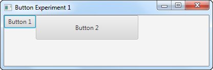
这是两个 JavaFX 按钮的屏幕截图。第一个按钮的默认大小是根据其按钮文本和嵌套在其中的布局组件计算得出的。第二个按钮的首选宽度为 200,高度为 48:
Here is a screenshot of two JavaFX buttons. The first button has the default size calculated from its button text and the layout component it is nested inside. The second button has a preferred width of 200 and height of 48 set on it:
Button 事件
为了响应按钮的单击,您需要将事件侦听器附加到 Button 对象。看起来是这样的:
In order to respond to the click of a button you need to attach an event listener to the Button object. Here is how that looks:
:::: code-group ::: code-group-item 匿名实现类
button.setOnAction(new EventHandler() {@Overridepublic void handle(ActionEvent actionEvent) {//... 在这里做一些事}});
::: ::: code-group-item Lambda 表达式
button.setOnAction(actionEvent -> {//... 在这里做一些事});
::: ::::
最后,让我们看一个在单击按钮时更改 JavaFX Label(标签) 文本的完整示例:
Finally, let us see a full example that changes the text of a JavaFX Label when the button is clicked:
package com.jenkov.javafx.controls;import javafx.application.Application;import javafx.event.ActionEvent;import javafx.event.EventHandler;import javafx.scene.Scene;import javafx.scene.control.Button;import javafx.scene.control.Label;import javafx.scene.layout.HBox;import javafx.stage.Stage;public class ButtonExperiments extends Application {@Overridepublic void start(Stage primaryStage) throws Exception {primaryStage.setTitle("HBox Experiment 1");Label label = new Label("Not clicked");Button button = new Button("Click");button.setOnAction(value -> {label.setText("Clicked!");});HBox hbox = new HBox(button, label);Scene scene = new Scene(hbox, 200, 100);primaryStage.setScene(scene);primaryStage.show();}public static void main(String[] args) {Application.launch(args);}}
Button 助记符
您可以在 JavaFX Button 实例上设置助记符。助记符 是一个键盘键,当与 ALT 键一起按下时会激活按钮。因此,助记符是激活按钮的键盘快捷键。稍后我将解释如何通过其助记符激活按钮。
You can set a mnemonic on a JavaFX Button instance. A mnemonic is a keyboard key which activates the button when pressed in conjunction with the ALT key. Thus, a mnemonic is a keyboard shortcut to activating the button. I will explain how to activate a button via its mnemonic later.
按钮的助记符在按钮文本中指定。您可以通过在要设置为该按钮的助记符的按钮文本中的字符前面放置一个下划线字符(_)来标记哪个键将用作助记符。下划线字符不会显示在按钮文本中。以下是为按钮设置助记符的示例:
The mnemonic for a button is specified inside the button text. You mark which key is to be used as mnemonic by placing an underscore character (_) in front of the character in the button text you want to set as mnemonic for that button. The underscore character will not be displayed in the button text. Here is an example setting a mnemonic for a button:
button.setMnemonicParsing(true);button.setText("_Click");
请注意,必须首先在值为 true 的按钮上调用setMnemonicParsing()。这将使按钮解析按钮文本中的助记符。如果您使用 false 值调用此方法,则按钮文本中的下划线字符将仅显示为文本,不会被解释为助记符。
Notice that it is necessary to first call setMnemonicParsing() on the button with a value of true. This instructs the button to parse mnemonics in the button text. If you call this method with a value of false instead, the underscore character in the button text will just show up as text, and will not be interpreted as a mnemonic.
第二行在按钮上设置文本 _Click。这告诉按钮使用键 c 作为助记符。助记符不区分大小写,因此它不必是激活按钮的大写 C。
The second line sets the text _Click on the button. This tells the button to use the key c as mnemonic. Mnemonics are case insensitive, so it does not have to be an a uppercase C that activates the button.
要激活该按钮,您现在可以按 ALT + C(两者同时)。这将激活按钮,就像您用鼠标单击它一样。
To activate the button you can now press ALT + C (both at the same time). That will activate the button just as if you had clicked it with the mouse.
您也可以先按一次 ALT 键。这将在按钮文本中显示按钮的助记符。然后,您可以按 c 键。如果您按 ALT 后再按一次 ALT,助记符首先显示,然后再次隐藏。当助记符可见时,您可以单独使用助记键激活按钮,而无需同时按下 ALT。当助记符不可见时,您必须同时按下 ALT 和助记符键才能激活该按钮。
You can also first press the ALT key once. That will show the mnemonic of the button in the button text. You can then press the c key. If you press ALT and then ALT again, the mnemonic is first shown, then hidden again. When the mnemonic is visible you can activate the button with the mnemonic key alone, without ALT pressed at the same time. When the mnemonic is not visible you have to press both ALT and the mnemonic key at the same time to activate the button.
这是两个屏幕截图,显示了助记符不可见和可见时的样子:
Here are two screenshots showing what it looks like when the mnemonic is invisible and visible:

Button CSS 样式
您可以使用 CSS 样式设置 JavaFX 按钮的样式。JavaFX Button 控件支持以下 CSS 样式:
You can style a JavaFX button using CSS styles. The JavaFX Button control supports the following CSS styles:
-fx-border-width-fx-border-color-fx-background-color-fx-font-size-fx-text-fill
这是一个将 JavaFX 按钮的背景颜色设置为红色的示例:
Here is an example setting the background color of a JavaFX button to red:
Button button = new Button("My Button");button.setStyle("-fx-background-color: #ff0000; ");
此示例通过 setStyle() 方法直接在按钮上设置样式,但您也可以通过样式表设置 JavaFX 按钮的样式。有关在 JavaFX 中使用 CSS 样式表的更多信息,请参阅 JavaFX CSS 样式 教程。
This example sets the style directly on the button via the setStyle() method, but you can also style a JavaFX button via style sheets. See JavaFX CSS Styling tutorial for more information about using CSS stylesheets with JavaFX.
这是一个 JavaFX 按钮示例,它创建了 4 个不同的按钮。每个按钮都设置了 CSS 样式。在代码示例之后,我展示了一个屏幕截图,显示了按钮在给定样式下的外观。
Here is a JavaFX button example which creates 4 different buttons. Each button has a CSS style set on them. After the code example I have included a screenshot of how the buttons look with the given styling.
package com.jenkov.javafx.controls;import javafx.application.Application;import javafx.scene.Scene;import javafx.scene.control.Button;import javafx.scene.layout.HBox;import javafx.stage.Stage;import java.io.FileInputStream;import java.io.FileNotFoundException;public class ButtonExperiments extends Application {@Overridepublic void start(Stage primaryStage) throws Exception {primaryStage.setTitle("Button Experiment 1");Button button1 = new Button("Button 1");Button button2 = new Button("Button 2");Button button3 = new Button("Button 3");Button button4 = new Button("Button 4");button1.setStyle("-fx-border-color: #ff0000; -fx-border-width: 5px;");button2.setStyle("-fx-background-color: #00ff00");button3.setStyle("-fx-font-size: 2em; ");button4.setStyle("-fx-text-fill: #0000ff");HBox hbox = new HBox(button1, button2, button3, button4);Scene scene = new Scene(hbox, 400, 100);primaryStage.setScene(scene);primaryStage.show();}public static void main(String[] args) {Application.launch(args);}}
这是 4 个带有 CSS 样式 的 JavaFX 按钮的屏幕截图:
Here is a screenshot of the 4 JavaFX buttons with their CSS styling:
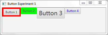
第一个按钮同时设置了 -fx-border-width 和 -fx-border-color CSS 属性。这会使按钮有 5 像素宽的红色边框。
The first button has both the -fx-border-width and -fx-border-color CSS properties set. This results in a 5 pixel wide red border for the button.
第二个按钮设置了 -fx-background-color CSS 属性。这使按钮的背景颜色为绿色。
The second button has the -fx-background-color CSS property set. This results in a green background color for the button.
第三个按钮设置了 -fx-font-size CSS 属性。这会使按钮文本是正常大小的 2 倍。
The third button has the -fx-font-size CSS property set. This results in a button with a text that is 2 times as big as normal.
第四个按钮设置了 -fx-text-fill CSS 属性。这会生成一个带有蓝色文本颜色的按钮。
The fourth button has the -fx-text-fill CSS property set. This results in a button with a blue text color.
您可以简单地通过在其上设置多个 CSS 属性来组合 JavaFX 按钮的 CSS 样式,就像上面示例中的第一个按钮一样。
You can combine the CSS styles for a JavaFX button simply by setting multiple CSS properties on it, like the first button in the example above has.
禁用 Button
您可以通过其 setDisable() 方法禁用 JavaFX 按钮。setDisable() 方法接受一个 boolean 类型的参数,它指定按钮是否应该被禁用。true 值意味着按钮将被禁用,而 false 值意味着它不会被禁用 —— 也就是启用。下面是通过 setDisable() 方法禁用 JavaFX 按钮的示例:
You can disable a JavaFX Button via its setDisable() method. The setDisable() method takes a boolean parameter which specify if the button should be disabled or not. A value of true means the button will be disabled, and a value of false means it will not be disabled - which means enabled. Here is an example of disabling a JavaFX Button via its setDisable() method:
Button button = new Button();button.setText("Click me!");// 这里应用程序正在运行,并且发生了一些事情,所以现在应该禁用该按钮// here the app is running, and something happens so// the button should now be disabledbutton.setDisable(true);// 应用程序再次运行,并且发生了一些事情,因此现在应该再次启用该按钮// again the app runs, and something happens so// the button should now be enabled againbutton.setDisable(false);
Button FXML
可以在 JavaFX FXML 文件中声明 JavaFX 按钮。我不会在这里详细解释 FXML。单击第一句中的链接以阅读有关 FXML 工作原理的更多信息。我将只向您展示与 JavaFX Button 控件相关的 FXML 部分。这是一个非常简单的 FXML 文件示例,展示了如何声明 Button:
It is possible to declare a JavaFX Button inside a JavaFX FXML file. I will not explain FXML in every detail here. Click on the link in the first sentence to read more about how FXML works. I will just show you the parts of FXML related to the JavaFX Button control. Here is a very simple FXML file example that shows how to declare a Button:
<?xml version="1.0" encoding="UTF-8"?><?import javafx.scene.layout.VBox?><?import javafx.scene.control.Button?><VBox xmlns:fx="http://javafx.com/fxml" spacing="20"><children><Button fx:id="button1" text="Click me!" onAction="#buttonClicked"/></children></VBox>
声明 Button 控件的是 <Button> 元素。 fx:id 属性可用于将声明的 Button 连接到 FXML 控制器对象内的 Button 类型的成员变量。
It is the <Button> element that declares the Button control. The fx:id attribute can be used to wire up the declared Button to a Button member variable inside an FXML Controller object.
text 属性用于在为此 Button 声明创建的 Button 实例中设置相应的 text 属性值。也就是按钮上显示的文本。
The text attribute is used to set the corresponding text property value in the Button instance created for this Button declaration. That is the text displayed on the button.
onAction 属性用于将 Button 的 onAction 事件链接到 FXML 控制器对象中的方法。在此示例中,它是 FXML 控制器中名为 buttonClicked() 的方法。
The onAction attribute is used to link the Button’s onAction event to a method in the FXML controller object. In this example it is the method named buttonClicked() in the FXML controller.
下面是相应的 FXML 控制器对象的类的实例。注意 button1 按钮成员变量的名称与 FXML 文件中的 fx:id 属性值匹配。 顺便说一下,这个成员变量必须是公共的( 还要注意从 FXML 文件中的 Button public)。onAction 属性引用的方法 buttonClicked()。
Here is how the corresponding FXML controller object’s class looks. Notice the name of the button1 Button member variable matches the fx:id attribute value in the FXML file. This member variable must be public, by the way. Notice also the method buttonClicked() which is referenced from the Button onAction attribute in the FXML file.
::: warning ⚠ 译注
若将变量声明为非公共的(如 private),需要在变量上方添加 @FXML 注解。
:::
import javafx.event.Event;import javafx.fxml.FXML;import javafx.scene.control.Button;public class ButtonFXMLController {public Button button1 = null;private int button1ClickCount = 0;@FXMLpublic void buttonClicked(Event e){this.button1ClickCount++;String text = "Button1 clicked " + this.button1ClickCount + " times";System.out.println(text);button1.setText(text);}}
这是加载 FXML 文件并创建 FXML 控制器等的完整 JavaFX 应用程序:
And here is the full JavaFX app that loads the FXML file and creates the FXML controller etc. :
import javafx.application.Application;import javafx.fxml.FXMLLoader;import javafx.scene.Scene;import javafx.scene.layout.VBox;import javafx.stage.Stage;import java.io.File;import java.net.URL;public class ButtonFXMLExample extends Application {public static void main(String[] args) {launch(args);}@Overridepublic void start(Stage primaryStage) throws Exception {FXMLLoader loader = new FXMLLoader();ButtonFXMLController controller = new ButtonFXMLController();loader.setController(controller);File fxmlFile = new File("assets/fxml/button-example.fxml");URL fxmlUrl = fxmlFile.toURI().toURL();loader.setLocation(fxmlUrl);VBox vbox = loader.<VBox>load();Scene scene = new Scene(vbox);primaryStage.setScene(scene);primaryStage.setTitle("Button FXML Example");primaryStage.setWidth(300);primaryStage.setHeight(300);primaryStage.show();}}
Button 变换
您可以将 JavaFX 变换 添加到 JavaFX 按钮,例如缩放、旋转、平移等。如下所示将变换对象添加到 JavaFX 按钮:
You can add JavaFX transformations to a JavaFX Button such as scaling, rotation, translation etc. You add transformation objects to a JavaFX Button like this:
button.getTransforms().add(scaleTransformation);
这是向 JavaFX 按钮添加比例变换的完整示例:
Here is a full example of adding a Scale transformation to a JavaFX Button:
import javafx.application.Application;import javafx.scene.Scene;import javafx.scene.control.Button;import javafx.scene.layout.VBox;import javafx.scene.transform.Scale;import javafx.stage.Stage;public class ButtonTransformationExample extends Application {public static void main(String[] args) {launch(args);}@Overridepublic void start(Stage primaryStage) {Button button = new Button();button.setText("Click me!");button.setOnAction((event) -> {System.out.println("Button clicked!");});Scale scaleTransformation = new Scale();scaleTransformation.setX(3.0);scaleTransformation.setY(2.0);scaleTransformation.setPivotX(0);scaleTransformation.setPivotY(0);button.getTransforms().add(scaleTransformation);VBox vbox = new VBox(button);Scene scene = new Scene(vbox);primaryStage.setScene(scene);primaryStage.setWidth(512);primaryStage.setHeight(256);primaryStage.show();}}

若有收获,就点个赞吧
0 人点赞
