垂直水平居中
宽高定不定看的是子元素
定宽高
absolute + 负 margin
.father {width: 400px;height: 400px;position: relative;}.child {width: 200px;height: 200px;position: absolute;top: 50%;left: 50%;margin-top: -100px;margin-left: -100px;}
absolute + margin auto
.father {width: 400px;height: 400px;position: relative;}/* 子元素要定宽高,不然就会占领整个父元素 */.child {width: 200px;height: 200px;position: absolute;top: 0;left: 0;bottom: 0;right: 0;margin: auto;}
absolute + calc
.father {width: 400px;height: 400px;position: relative;}.child {width: 200px;height: 200px;position: absolute;top: calc(50% - 100px);left: calc(50% - 100px);}
不定宽高
子元素不定宽高
absolute + transform
.father {width: 400px;height: 400px;position: relative;}.child {position: absolute;top: 50%;left: 50%;transform: translate(-50%, -50%);}
flex
.father {width: 400px;height: 400px;display: flex;justify-content: center;align-items: center;}.child {}
grid
.father {width: 400px;height: 400px;display: grid;}.child {align-self: center;justify-self: center;}
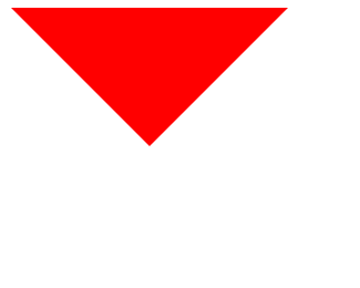
实现一个三角形
首先,实现一个这个效果: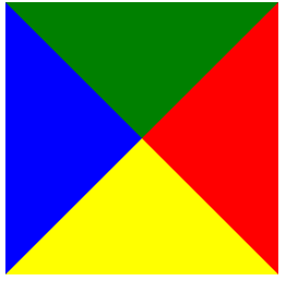
div {height: 0;width: 0;border-top: 100px solid green;border-left: 100px solid blue;border-right: 100px solid red;border-bottom: 100px solid yellow;}
然后变成三角形,就是颜色问题,将不需要的border的边颜色设置为 transparent 透明。
div {height: 0;width: 0;border-style: solid;border-width: 100px;border-color: red transparent transparent transparent;font-size: 0; // 兼容低版本line-height: 0; // 兼容低版本}
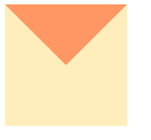
可以看到,其实还是占了这么多空间,只是其他部分设置成透明看不见了而已
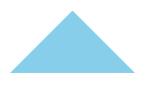
最后我们指定三角的对立边 border 宽度为0
div {width: 0;height: 0;border-style: solid;border-width: 0 50px 50px;border-color: transparent transparent skyblue;}
实现一个直角边,只指定邻边border
两栏布局
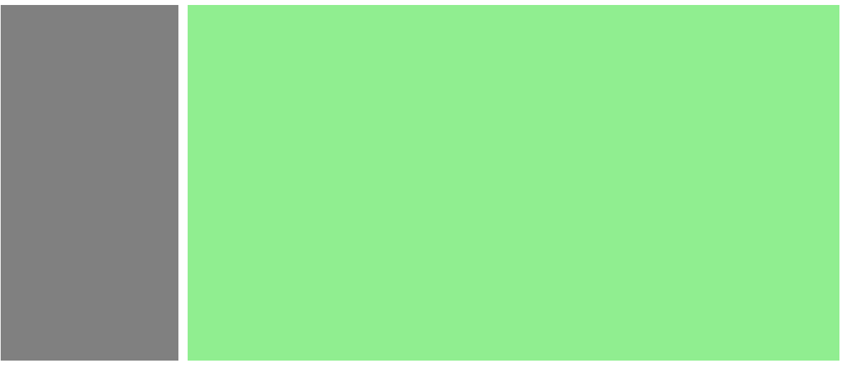
<div class="box"><div class="left"></div><div class="right"></div></div>
浮动
.box {overflow: hidden;}.left {float: left;width: 200px;background: gray;height: 400px;}.right {margin-left: 210px;background-color: lightgreen;height: 400px;}
Flex(推荐)
.box{display: flex;}.left {width: 100px;}.right {flex: 1;}
三栏布局
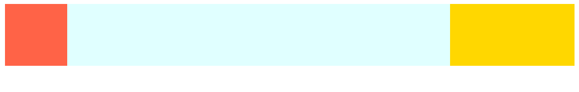
<div class="outer"><div class="left"></div><div class="center"></div><div class="right"></div></div>
绝对定位
左右设置为绝对定位,中间设置margin-left为左边的宽度、margin-right为右边的宽度
.outer {position: relative;height: 100px;}.left {position: absolute;width: 100px;height: 100px;background: tomato;}.right {position: absolute;top: 0;right: 0;width: 200px;height: 100px;background: gold;}.center {margin-left: 100px;margin-right: 200px;height: 100px;background: lightblue;}
flex(推荐)
外部设置为 flex,左右设置flex-grow(放大比例)、flex-shrink(收缩比例)为 0,flex-basis为宽度。中间设置flex:auto(== flex: 1 1 auto)
.outer {display: flex;height: 100px;}.left {flex: 0 0 200px;background: tomato;}.right {flex: 0 0 100px;background: gold;}.center {flex: auto;background: lightblue;}或者只需要设置父组件 flex & flex: space-between。然后左右两边设置固定宽度,中间宽度设置100%
Float
左右设置为对应方向的浮动,然后中间设置水平方向的 margin 值。这种方式center盒子必须放在最后
.outer {height: 100px;}.left {float: left;width: 100px;height: 100px;background: tomato;}.right {float: right;width: 200px;height: 100px;background: gold;}.center {height: 100px;margin-left: 100px;margin-right: 200px;background: lightgreen;}
圣杯布局
.outer {height: 100px;padding-left: 100px;padding-right: 200px;}.left {position: relative;left: -100px;float: left;margin-left: -100%;width: 100px;height: 100px;background: tomato;}.right {position: relative;left: 200px;float: right;margin-left: -200px;width: 200px;height: 100px;background: gold;}.center {float: left;width: 100%;height: 100px;background: lightgreen;}
双飞翼布局
<style>.outer {height: 100px;}.left {float: left;margin-left: -100%;width: 100px;height: 100px;background: tomato;}.right {float: left;margin-left: -200px;width: 200px;height: 100px;background: gold;}.wrapper {float: left;width: 100%;height: 100px;background: lightgreen;}.center {margin-left: 100px;margin-right: 200px;height: 100px;}</style><body><div class="outer"><div class="wrapper"><div class="center"></div></div><div class="left"></div><div class="right"></div></div></body>
本质和圣杯布局差不多,只是双飞翼是通过中间的设置margin而不是外部设置padding
Grid布局(推荐)
只需要设置 grid & grid-template-columns: 左宽度 auto 右宽度。

若有收获,就点个赞吧
0 人点赞
