1. 垂直对齐 vertical-align
基线(baseline):浏览器文字类型元素排版中存在用于对齐的基线
| 属性值 | 效果 |
|---|---|
| baseline | 默认,基线对齐 |
| top | 顶部对齐 |
| middle | 中部对齐 |
| bottom | 底部对齐 |
vertical-align: middle;
lipboardErrorCopied
示例:
<style>
    .text {
        border-bottom: 1px solid #ccc;
    }

    .text-baseline {
        vertical-align: baseline;
    }

    .text-top {
        vertical-align: top;
    }

    .text-middle {
        vertical-align: middle;
    }

    .text-bottom {
        vertical-align: bottom;
    }
</style>
<div>
    <span class="text text-baseline">绝知此事要躬行</span>
    <span class="text text-top">绝知此事要躬行</span>
    <span class="text text-middle">绝知此事要躬行</span>
    <span class="text text-bottom">绝知此事要躬行</span>
</div>
 浏览器把行内和行内块当做文字处理,文字默认基线对齐
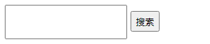
示例一:输入框垂直居中对齐
<style>
    input {
        height: 50px;
    }

    input[type="button"] {
        height: 30px;
    }

    .middle input {
        vertical-align: middle;
    }
</style>

<div>

    <input type="text" />
    <input type="button"
           value="搜索" />
</div>
py to clipboardErrorCopied
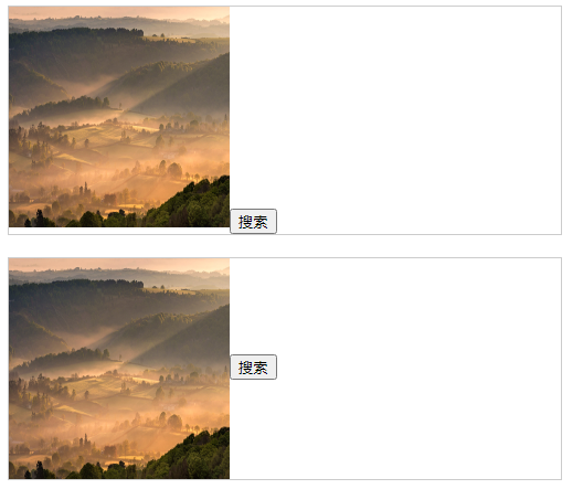
示例二:图片垂直居中对齐
<style>
    .box {
        border: 1px solid #ccc;
        width: 500px;
    }

    img {
        height: 200px;
        width: 200px;
    }

    .middle-box {
        margin-top: 20px;
    }

    .middle-box img {
        vertical-align: middle;
    }
</style>

<div>
    <div class="box">
        <img src="https://api.isoyu.com/bing_images.php" /><input type="button"
               value="搜索" /></div>

    <div class="box middle-box">
        <img src="https://api.isoyu.com/bing_images.php" /><input type="button"
               value="搜索" /></div>
</div>
to clipboardErrorCopied
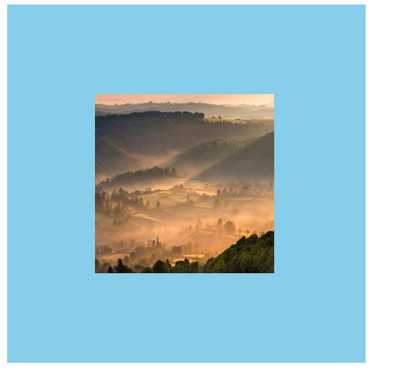
示例三:图片水平垂直居中
<style>
    .box {
        width: 400px;
        height: 400px;
        background-color: skyblue;
        /* 水平居中 */
        text-align: center;
    }

    .box::after {
        height: 100%;
        content: '';
        display: inline-block;
        vertical-align: middle;
    }

    img {
        height: 200px;
        width: 200px;
        /* 垂直居中 */

        /*方式一*/
        vertical-align: middle;
        /*方式二*/
        /* display: block; */
    }
</style>

<div class="box">
    <img src="https://api.isoyu.com/bing_images.php" />
</div>
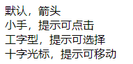
2. 光标类型 cursor
| 属性值 | 效果 |
|---|---|
| default | 默认,箭头 |
| pointer | 小手,提示可点击 |
| text | 工字型,提示可选择 |
| move | 十字光标,提示可移动 |
示例:
<style>
    .cursor--pointer {
        cursor: pointer;
    }

    .cursor--text {
        cursor: text;
    }

    .cursor--move {
        cursor: move;
    }
</style>

<div class="box">
    <div>默认,箭头</div>
    <div class="cursor--pointer">小手,提示可点击</div>
    <div class="cursor--text">工字型,提示可选择</div>
    <div class="cursor--move">十字光标,提示可移动</div>
</div>
3. 边框圆角 border-radius
/* 单值 4个角一样*/
border-radius: 数字px/百分比;

/* 多值 左上角开始,顺时针赋值,没有赋值看对角*/
border-radius: 左上 右上 右下 左下;
(1)正圆
- 盒子必须是正方形
- 设置边框圆角为盒子宽高的一半
示例:
<style>
  .box {
    width: 200px;
    height: 200px;
    border-radius: 50%;
    background-color: skyblue;
  }
</style>

<div class="box"></div>
/* 最大值 50% */
border-radius: 50%;
(2)胶囊按钮
- 盒子设置为长方形
- 设置边框圆角为高度的一半
示例: ```htmlborder-radius: height/2;
<br />lipboardErrorCopied
<a name="f1LEy"></a>
## 4. 溢出部分效果 overflow
溢出部分:盒子内容部分超出盒子范围的区域
| **属性值** | **效果** |
| --- | --- |
| visible | 默认,溢出部分可见 |
| hidden | 溢出部分隐藏 |
| scroll | 无论是否溢出都显示滚动条 |
| auto | 根据是否溢出,自动显示或隐藏滚动条 |
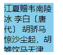
示例:
```html
<style>
.box {
width: 100px;
height: 100px;
background-color: skyblue;
overflow: hidden;
}
</style>
<div class="box">
江夏赠韦南陵冰
李白〔唐代〕
胡骄马惊沙尘起,胡雏饮马天津水。
君为张掖近酒泉,我窜三色九千里。(三色 一作:三巴)
天地再新法令宽,夜郎迁客带霜寒。
西忆故人不可见,东风吹梦到长安。
宁期此地忽相遇,惊喜茫如堕烟雾。
玉箫金管喧四筵,苦心不得申长句。
昨日绣衣倾绿尊,病如桃李竟何言。
昔骑天子大宛马,今乘款段诸侯门。
赖遇南平豁方寸,复兼夫子持清论。
有似山开万里云,四望青天解人闷。
人闷还心闷,苦辛长苦辛。
愁来饮酒二千石,寒灰重暖生阳春。
山公醉后能骑马,别是风流贤主人。
头陀云月多僧气,山水何曾称人意。
不然鸣笳按鼓戏沧流,呼取江南女儿歌棹讴。
我且为君槌碎黄鹤楼,君亦为吾倒却鹦鹉洲。
赤壁争雄如梦里,且须歌舞宽离忧。
</div>
5. 元素本身隐藏
/* 占位隐藏 */
visibility: hidden;

/* 不占位隐藏(常用) */
display: none;
o clipboardErrorCopied
示例:默认隐藏 鼠标悬停显示
<style>
    .box-1 {
        width: 100px;
        height: 100px;
        visibility: hidden;
    }

    .box-2 {
        width: 100px;
        height: 100px;
        display: none;
    }
</style>

<div class="box-1"></div>
<div class="box-2"></div>
示例:默认隐藏 鼠标悬停显示
<style>
  .box {
    width: 100px;
    height: 100px;
    background-color: skyblue;
    position: relative;
  }

  .box:hover .box-qrcode {
    display: block;
  }

  .box-qrcode {
    position: absolute;
    top: 100px;
    width: 100px;
    height: 100px;
    background-color: pink;
    display: none;
  }
</style>

<div class="box">
  <div class="box-qrcode"></div>
</div>
6. 元素整体透明 opacity
属性值:
- 0-1 之间的数字;
- 0 完全透明,1 完全不透明
示例:
<style>
    .box {
        width: 100px;
        height: 100px;
        background-color: skyblue;
        opacity: .5;
    }
</style>

<div class="box"></div>
7.半透明
background-color: rgba(0, 0, 0, 0.5);
opy to clipboardErrorCopied
示例:
<style>
    .box {
        /* width: 100px; */
        height: 100px;
        background-color: rgba(0, 0, 0, 0.4);
    }
</style>

<div class="box"></div>
8.精灵图
将多张小图合并成一张大图
- 优点:减少服务器发送次数,减轻服务器压力,提高页面加载速度
- 缺点:修改起来比较麻烦
精灵图使用步骤
- 设置盒子尺寸和小图尺寸相同
- 将精灵图设置为盒子的背景图片
修改背景图位置 ```css
<br />y to clipboardErrorCopied
<a name="DAFzf"></a>
## 9.背景图片大小 background-size
```css
background-size: 宽度 高度;
to clipboardErrorCopied
| 取值 | 场景 |
|---|---|
| 数字+px | 简单方便 |
| 百分比 | 相对于当前盒子自身的宽高百分比 |
| contain | 包含,背景图等比缩放,直到不会超出盒子的最大,可能有留白 |
| cover | 覆盖,背景图等比缩放,直到刚好填满整个盒子没有空白,图片可能显示不全 |
background 连写
background: color image repeat position/size;
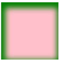
10.盒子阴影 box-shadow
| 参数 | 作用 |
|---|---|
| h-shadow | 必须,水平偏移量,允许负值 |
| v-shadow | 必须,垂直偏移量,允许负值 |
| blur | 可选,模糊度 |
| spread | 可选,阴影扩大 |
| color | 可选,阴影颜色 |
| inset | 可选,将阴影改为内部阴影 |
  <style>
        .box {
            width: 200px;
            height: 200px;
            background-color: pink;
            box-shadow: 5px 10px 20px 10px green inset;

            /* 注意: 外阴影, 不能添加outset, 添加了会导致属性报错 */
            /* box-shadow: 5px 10px 20px 10px green outset; */
        }
    </style>

    <div class="box"></div>
11.过渡 transition
- 让元素样式慢慢变化
- 常配合 hover 使用
to clipboardErrorCopiedtransition 属性 时长, 属性 时长;
| 参数 | 取值 |
|---|---|
| 过渡属性 | 所有属性 all;具体属性 width |
| 过渡时长 | 数字 + s(秒) |
注意:
- 过渡需要默认状态和 hover 样式不同,才能有过渡效果
- transition 属性给需要过渡的元素本身加
transition 属性设置在不同状态中,效果不同
- 给默认状态设置,鼠标移入移出都有过渡效果
给 hover 状态设置,鼠标移入有过渡效果,移出没有过渡效果
<style>
   /* 过渡配合hover使用, 谁变化谁加过渡属性 */
   .box {
       width: 200px;
       height: 200px;
       background-color: pink;
       /* 宽度200, 悬停的时候宽度600, 花费1秒钟 */
       /* transition: width 1s, background-color 2s; */

       /* 如果变化的属性多, 直接写all,表示所有 */
       transition: all 1s;
   }

   .box:hover {
       width: 600px;
       background-color: red;
   }
</style>

<div class="box"></div>

若有收获,就点个赞吧
0 人点赞
