一次设计师画了一个设计图,是一个卡券信息,左右各有两个圆。
起初觉得很难实现,网上也很少有类似的答案。
后来看了些 background 卡券的实例,顺便探究了一下 background 的MDN 文章,学到了其更多的属性和使用方法。
MDN-background
首先,要学会分辨的误区就是:background不止可以使用一个 background-image.
介绍实现的原理
知识准备:
1.根据MDN的解释,background能够被设置1个或者多个background-image属性
background: center / contain no-repeat url("../../media/examples/firefox-logo.svg"),10% 10% / 20% no-repeat url("../../media/examples/lizard.png");
2.background-image可以使用以下3种值
- url() - 最常用的就是这个,但是还有下面那个值,容易被我们忽略
gradient - 渐变,其中又分为线性渐变、径向渐变、重复线性渐变、重复径向渐变。我们这次的主角是:radial-gradient
通过 circle at 属性,我们可以决定径向渐变的圆心,从而实现我们这次的功能
elemnet() - 没什么研究,不管它了
- 3.优化,去除锯齿,渐变需要留下1px来消除锯齿,参考: https://www.imooc.com/qadetail/138930?t=176061
原理实现:
1、将背景分成4份。
2、使用径向渐变,圆心分别为两个小半圆分成的4个四分之一圆的圆心。
3、内置渐变颜色使用两个半圆的颜色。
大致完成。
代码一(存在小瑕疵)
<!DOCTYPE html><html lang="en"><head><meta charset="UTF-8"><meta name="viewport" content="width=device-width, initial-scale=1.0"><title>Document</title></head><body><div class="wrap"></div></body><style>.wrap {margin: 0 auto;width: 300px;height: 200px;border-radius: 4px;background: radial-gradient(circle at 0px 100%, #fff 10px, #0898ea 10px) top left / 50% 50% no-repeat,radial-gradient(circle at 100% 100%, #fff 10px, #0898ea 10px) top right / 50% 50% no-repeat,radial-gradient(circle at 0 0, #fff 10px, #0898ea 10px) bottom left / 50% 50% no-repeat,radial-gradient(circle at 100% 0%, #fff 10px, #0898ea 10px) bottom right / 50% 50% no-repeat;}</style></html>
效果如下
通过观察,我们发现代码一,存在两个问题
1、中间存在四条白线(原因未知)
解决方案,将分成的四分之一块,x轴,多分1%;然后横轴的白线,通过伪元素补全。
2、两个半圆有锯齿
这个是因为渐变需要1px的缓冲区,我们给它增加 1px 的缓冲区。
radial-gradient(circle at 0px 100%, #fff 10px, #0898ea 10px) top left / 50% 50% no-repeat改成radial-gradient(circle at 0px 100%, #fff 10px, #0898ea 11px) top left / 50% 50% no-repeat
于是有了下面的代码二。
代码二(完美版)
<!DOCTYPE html><html lang="en"><head><meta charset="UTF-8"><meta name="viewport" content="width=device-width, initial-scale=1.0"><title>Document</title></head><body><div class="wrap"></div></body><style>.wrap {position: relative;margin: 0 auto;width: 300px;height: 300px;border-radius: 4px;background: radial-gradient(circle at 0px 100%, #fff 10px, #0898ea 11px) top left / 51% 50% no-repeat,radial-gradient(circle at 100% 100%, #fff 10px, #0898ea 11px) top right / 51% 50% no-repeat,radial-gradient(circle at 0 0, #fff 10px, #0898ea 11px) bottom left / 51% 50% no-repeat,radial-gradient(circle at 100% 0%, #fff 10px, #0898ea 11px) bottom right / 51% 50% no-repeat;}.wrap::after {content: '';position: absolute;left: 11px;top: calc(50% - 1px);bottom: calc(50% + 1px);right: 11px;height: 2px;background: #0898ea;}</style></html>
最终效果如下: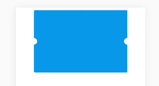
complete.

若有收获,就点个赞吧
0 人点赞
