transition 属性的缺点
- transition需要事件触发,所以没法在网页加载时自动发生。
- transition是一次性的,不能重复发生,除非一再触发。
- transition只能定义开始状态和结束状态,不能定义中间状态,也就是说只有两个状态。
- 一条transition规则,只能定义一个属性的变化,不能涉及多个属性。
而 animation 属性都可以解决这些问题,相当于 transition 的增强版。
animatioin
animation 是一个复合属性,是由 animation-name 、 animation-duration 、 animation-timing-funciton 、 animation-iteration-count 、 animation-diretion 、 animation-play-state 、 animation-fill-mode 七个子属性组成。
各个子属性的功能
animation-name: 动画名称(默认值为none)animation-duration: 持续时间(默认值为0)animation-timing-function: 时间函数(默认值为ease)animation-delay: 延迟时间(默认值为0)animation-iteration-count: 循环次数(默认值为1)animation-direction: 动画方向(默认值为normal)animation-play-state: 播放状态(默认值为running)animation-fill-mode: 填充模式(默认值为none)
一个简单的例子
<style>.demo {width: 100px;height: 100px;animation-name: test;animation-duration: 2s;animation-timing-function: ease;animation-iteration-count: infinite;animation-direction: alternate;animation-play-state: running;animation-fill-mode: none;/* 等价于 animation: test 2s ease 0s infinite alternate running none; */}@keyframes test {0% {background: yellow;}100% {background: pink;}}</style><body><div class='demo'></div></body>

keyframes 关键字
animation 制作动画需要两步,首先用关键帧声明动画,然后 animation 调用动画。
关键帧用 keyframes 声明
@ keyframes {0% {width: 0px;}100% {width: 100px;}}
注意:0% 可以用 from 代替,100% 可以用 to 代替。如果不声明 0% 或 100% 则使用元素的默认状态。
注意:如果声明多个相同的 keyframes 则使用最后一个声明的。
注意:出现负百分数或高于 100% 会被忽略。
animation-name
默认值:none 没有动画效果,或者是 keyframes 声明的动画名。
animation-duration
默认值:0s 没有动画,不能是负值否则动画失效。
单位可以是 ms或 s。
animation-timing-function
默认值:ease
和 transition 差不多也是可以写三种属性值:关键字、steps 函数、贝塞尔曲线。
不过这个可以应用在整个动画期间,也可以在某两个百分比之间。
<style>.demo{width: 100px;height: 100px;position: relative;background-color: pink;animation-name: test;animation-duration: 5s;animation-direction: alternate;animation-iteration-count: infinite;}@keyframes test{0%{left: 0px;animation-timing-function: ease;}20%{left: 50px;animation-timing-function: linear;}40%{left: 100px;animation-timing-function: ease-in;}60%{left: 150px;animation-timing-function: ease-out;}80%{left: 200px;animation-timing-function: step-start;}100%{left: 250px;animation-timing-function: step-end;}}</style><body><div class='demo'></div></body>

animation-iteration-count
默认值:1
可以是 infinite(无限循环)、number(循环次数)。
animation-direction
默认值:normal
- normal: 正向播放。
- reverse: 反向播放。
- alternate: 若动画只播放一次,则和正向播放一样。若播放两次以上,偶数次效果为反向播放。
- alternate-reverse: 若动画只播放一次,则和反向播放一样。若播放两次以上,偶数次效果为正向播放。
以下是 alternate 的效果,其他属性值做一下实验也知道是怎样的。
<style>.demo{width: 100px;height: 100px;position: relative;background-color: pink;animation-name: test;animation-duration: 2s;animation-direction: alternate;animation-iteration-count: infinite;}@keyframes test{0%{left: 0px;}100%{left: 250px;}}</style><body><div class='demo'></div></body>

animation-delay
默认值:0s。
注意:该延迟是指整个动画的延迟,而不是指每次循环的延迟,只有动画开始时执行一段延迟。
注意:可以是负值,表示动画的起始时间从 0s 变为延迟时间的绝对值。
/* 上面的例子加上这句代码 */.demo {animation-delay: -1s;}
注意动画开始的位置

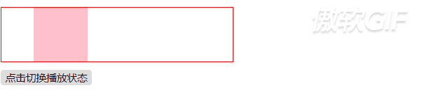
animation-play-state
默认值:running。
- running:播放中。
- paused:暂停。
<style>.demo {height: 70px;width: 300px;border: 1px solid red;position: relative;}.move {height: 70px;width: 70px;background: pink;position: absolute;animation: test 2s linear 2s infinite alternate;}@keyframes test {0% {left: 0px;}50% {left: 115px;}100% {left: 230px;}}</style><body><div class='demo'><div class='move'></div></div><button id='trigger'>点击切换播放状态</button></body><script>var move = document.getElementsByClassName('move')var button = document.getElementById('trigger')button.addEventListener('click', () => {var state = move[0].style.animationPlayStatemove[0].style.animationPlayState = state === 'paused' ? 'running' : 'paused'})</script>
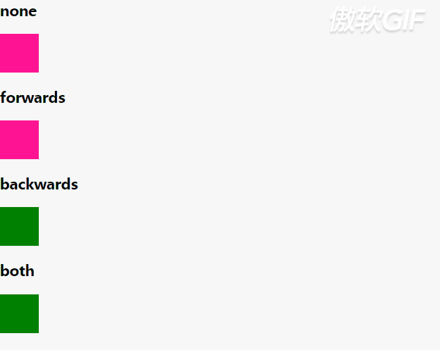
animation-fill-mode
默认值:none
- none :默认值,表示动画播放完成后,恢复到初始的状态。
- forwards: 表示动画播放完成后,保持 keyframes 里最后一帧的属性。
- backwards: 表示开始播放动画的时候,应用 keyframes 里第一帧的属性,播放完成的时候,恢复到初始状态,通常设置 animation-delay 后,才能看出效果。
- both: 表示 forwards 和 backwards 都应用。
直接看代码,很难解释。
<style>.box{position: relative;width: 50px;height: 50px;background-color: deeppink;margin-top: 10px;animation: mode-a 5s 1 2s;}.forwards{animation-fill-mode: forwards;}.backwards{animation-fill-mode: backwards;}.both{animation-fill-mode: both;}@keyframes mode-a {from {left:0;background-color: green;}to{left: 500px;background-color: blue;}}</style><body><h3>none</h3><div class="box"></div><h3>forwards</h3><div class="box forwards"></div><h3>backwards</h3><div class="box backwards"></div><h3>both</h3><div class="box both"></div></body>
参考:
[1] CSS动画简介
[2] CSS系列——一步一步带你认识animation动画效果
[3] animation

若有收获,就点个赞吧
0 人点赞
