学习目标
- 目标
- 掌握给图形添加辅助功能(如:标注、x,y轴名称、标题等)
- 知道图形的保存
- 知道如何多次plot绘制图形
- 知道如何多个坐标系显示图形
- 知道折线图的应用场景
1 完善原始折线图 — 给图形添加辅助功能
为了更好地理解所有基础绘图功能,我们通过天气温度变化的绘图来融合所有的基础API使用
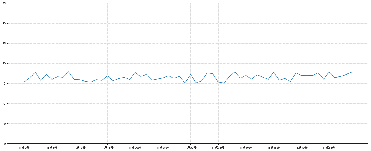
需求:画出某城市11点到12点1小时内每分钟的温度变化折线图,温度范围在15度~18度
效果: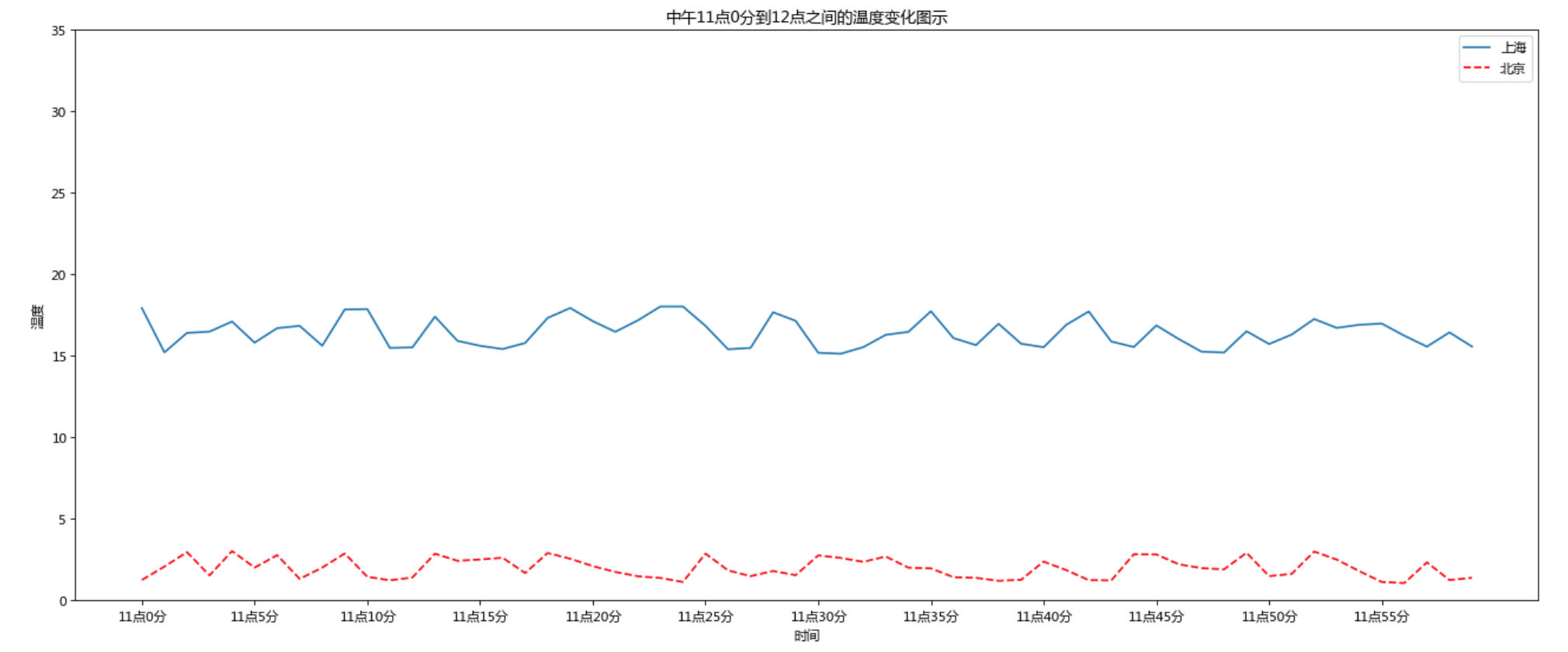
1.1 准备数据并画出初始折线图
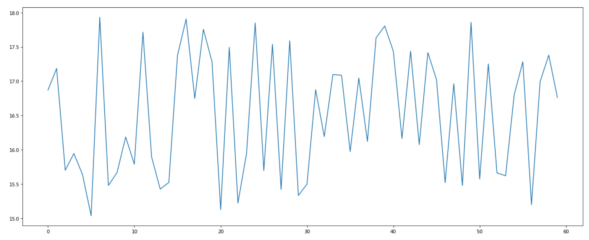
import matplotlib.pyplot as pltimport random# 画出温度变化图# 0.准备x, y坐标的数据x = range(60)y_shanghai = [random.uniform(15, 18) for i in x]# 1.创建画布plt.figure(figsize=(20, 8), dpi=80)# 2.绘制折线图plt.plot(x, y_shanghai)# 3.显示图像plt.show()
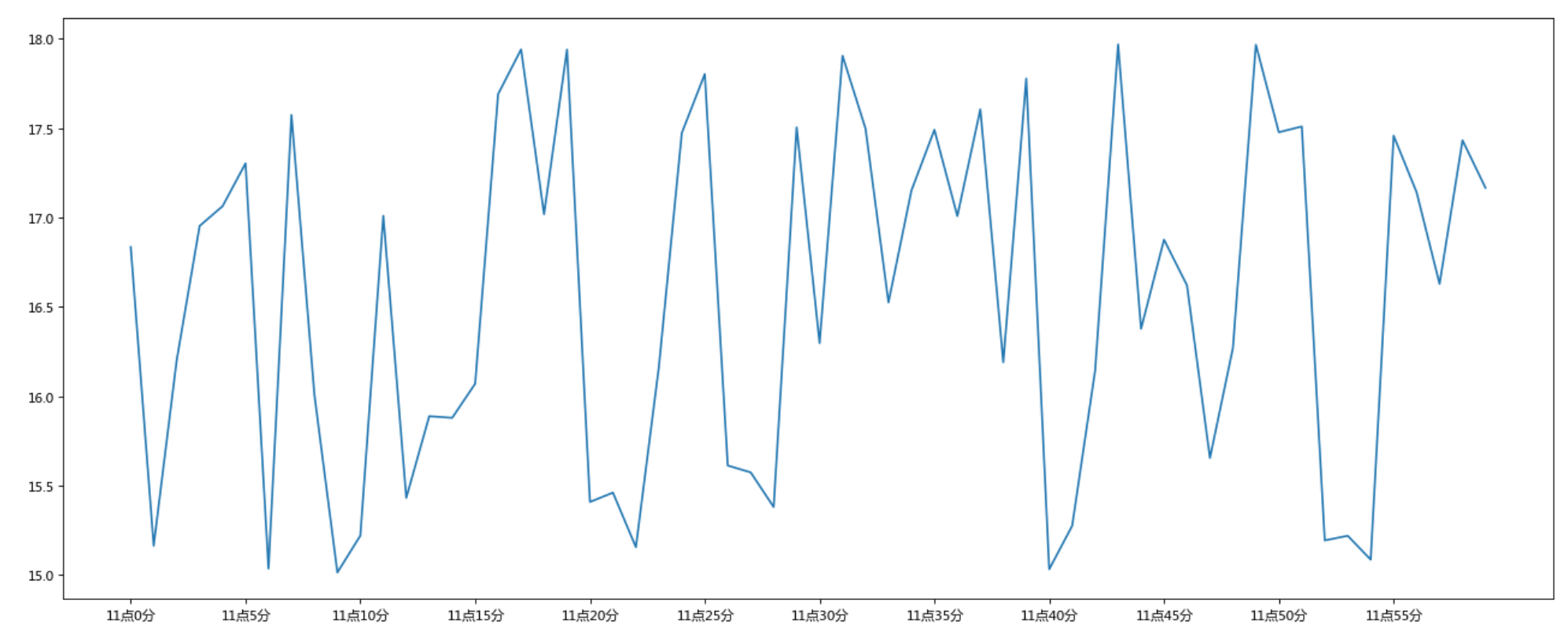
1.2 添加自定义x,y刻度
构造x轴刻度标签
x_ticks_label = [“11点{}分”.format(i) for i in x]
构造y轴刻度
y_ticks = range(40)
修改x,y轴坐标的刻度显示
plt.xticks(x[::5], x_ticks_label[::5]) plt.yticks(y_ticks[::5])
<br />如果没有解决过中文问题的话,会显示这个样子: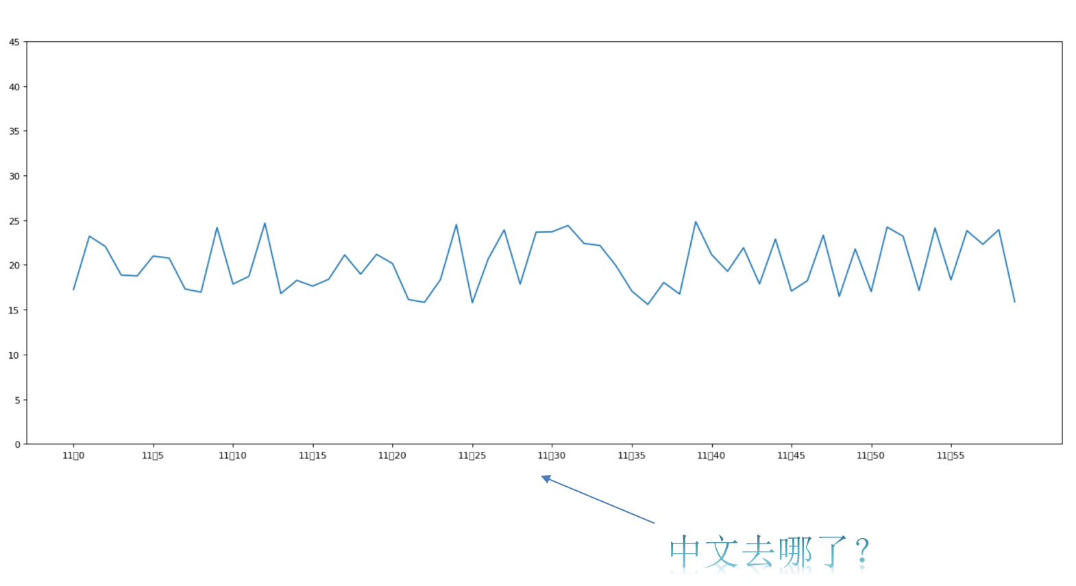<a name="RVn7k"></a>### 1.3 中文显示问题解决**解决方案一:**<br />下载中文字体(黑体,看准系统版本)- 步骤一:下载 [SimHei](images/SimHei.ttf) 字体(或者其他的支持中文显示的字体也行)- 步骤二:安装字体- linux下:拷贝字体到 usr/share/fonts 下:```bashsudo cp ~/SimHei.ttf /usr/share/fonts/SimHei.ttf
- windows和mac下:双击安装
- 步骤三:删除~/.matplotlib中的缓存文件
cd ~/.matplotlibrm -r *
- 步骤三:删除~/.matplotlib中的缓存文件
- 步骤四:修改配置文件
将文件内容修改为:vi ~/.matplotlib/matplotlibrc
解决方案二:font.family : sans-seriffont.sans-serif : SimHeiaxes.unicode_minus : False
在Python脚本中动态设置matplotlibrc,这样也可以避免由于更改配置文件而造成的麻烦,具体代码如下:
有时候,字体更改后,会导致坐标轴中的部分字符无法正常显示,此时需要更改axes.unicode_minus参数:from pylab import mpl# 设置显示中文字体mpl.rcParams["font.sans-serif"] = ["SimHei"]
# 设置正常显示符号mpl.rcParams["axes.unicode_minus"] = False
1.4 添加网格显示
为了更加清楚地观察图形对应的值plt.grid(True, linestyle='--', alpha=0.5)
1.5 添加描述信息
添加x轴、y轴描述信息及标题通过fontsize参数可以修改图像中字体的大小
plt.xlabel("时间")plt.ylabel("温度")plt.title("中午11点0分到12点之间的温度变化图示", fontsize=20)
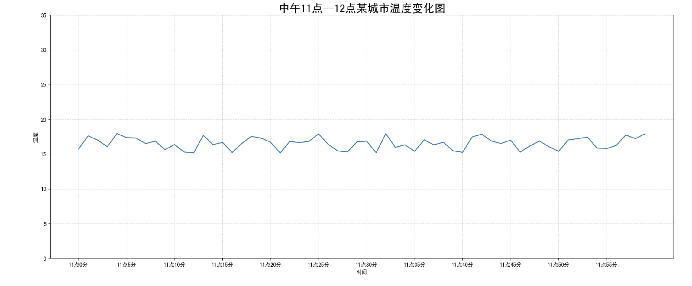
1.6 图像保存
保存图片到指定路径
# 保存图片到指定路径plt.savefig("test.png")
- 注意:plt.show()会释放figure资源,如果在显示图像之后保存图片将只能保存空图片。
完整代码:
import matplotlib.pyplot as pltimport randomfrom pylab import mpl# 设置显示中文字体mpl.rcParams["font.sans-serif"] = ["SimHei"]# 设置正常显示符号mpl.rcParams["axes.unicode_minus"] = False# 0.准备数据x = range(60)y_shanghai = [random.uniform(15, 18) for i in x]# 1.创建画布plt.figure(figsize=(20, 8), dpi=100)# 2.绘制图像plt.plot(x, y_shanghai)# 2.1 添加x,y轴刻度# 构造x,y轴刻度标签x_ticks_label = ["11点{}分".format(i) for i in x]y_ticks = range(40)# 刻度显示plt.xticks(x[::5], x_ticks_label[::5])plt.yticks(y_ticks[::5])# 2.2 添加网格显示plt.grid(True, linestyle="--", alpha=0.5)# 2.3 添加描述信息plt.xlabel("时间")plt.ylabel("温度")plt.title("中午11点--12点某城市温度变化图", fontsize=20)# 2.4 图像保存plt.savefig("./test.png")# 3.图像显示plt.show()
2 在一个坐标系中绘制多个图像
2.1 多次plot
需求:再添加一个城市的温度变化
收集到北京当天温度变化情况,温度在1度到3度。怎么去添加另一个在同一坐标系当中的不同图形,其实很简单只需要再次plot即可,但是需要区分线条,如下显示
# 增加北京的温度数据y_beijing = [random.uniform(1, 3) for i in x]# 绘制折线图plt.plot(x, y_shanghai)# 使用多次plot可以画多个折线plt.plot(x, y_beijing, color='r', linestyle='--')
我们仔细观察,用到了两个新的地方,一个是对于不同的折线展示效果,一个是添加图例。
2.2 设置图形风格
| 颜色字符 | 风格字符 |
|---|---|
| r 红色 | - 实线 |
| g 绿色 | - - 虚线 |
| b 蓝色 | -. 点划线 |
| w 白色 | : 点虚线 |
| c 青色 | ‘ ‘ 留空、空格 |
| m 洋红 | |
| y 黄色 | |
| k 黑色 |
2.3 显示图例
- 注意:如果只在plt.plot()中设置label还不能最终显示出图例,还需要通过plt.legend()将图例显示出来。
```python
绘制折线图
plt.plot(x, y_shanghai, label=”上海”)使用多次plot可以画多个折线
plt.plot(x, y_beijing, color=’r’, linestyle=’—‘, label=”北京”)
显示图例
plt.legend(loc=”best”)
| **Location String** | **Location Code** || --- | --- || 'best' | 0 || 'upper right' | 1 || 'upper left' | 2 || 'lower left' | 3 || 'lower right' | 4 || 'right' | 5 || 'center left' | 6 || 'center right' | 7 || 'lower center' | 8 || 'upper center' | 9 || 'center' | 10 |完整代码:```python# 0.准备数据x = range(60)y_shanghai = [random.uniform(15, 18) for i in x]y_beijing = [random.uniform(1,3) for i in x]# 1.创建画布plt.figure(figsize=(20, 8), dpi=100)# 2.绘制图像plt.plot(x, y_shanghai, label="上海")plt.plot(x, y_beijing, color="r", linestyle="--", label="北京")# 2.1 添加x,y轴刻度# 构造x,y轴刻度标签x_ticks_label = ["11点{}分".format(i) for i in x]y_ticks = range(40)# 刻度显示plt.xticks(x[::5], x_ticks_label[::5])plt.yticks(y_ticks[::5])# 2.2 添加网格显示plt.grid(True, linestyle="--", alpha=0.5)# 2.3 添加描述信息plt.xlabel("时间")plt.ylabel("温度")plt.title("中午11点--12点某城市温度变化图", fontsize=20)# 2.4 图像保存plt.savefig("./test.png")# 2.5 添加图例plt.legend(loc=0)# 3.图像显示plt.show()
2.4 练一练
练习多次plot流程(从上面复制代码,到自己电脑,确保每人环境可以正常运行),
同时明确每个过程执行实现的具体效果
3 多个坐标系显示— plt.subplots(面向对象的画图方法)
如果我们想要将上海和北京的天气图显示在同一个图的不同坐标系当中,效果如下:
可以通过subplots函数实现(旧的版本中有subplot,使用起来不方便),推荐subplots函数
- matplotlib.pyplot.subplots(nrows=1, ncols=1, **fig_kw) 创建一个带有多个axes(坐标系/绘图区)的图 ``` Parameters:
nrows, ncols : 设置有几行几列坐标系 int, optional, default: 1, Number of rows/columns of the subplot grid.
Returns:
fig : 图对象
axes : 返回相应数量的坐标系
设置标题等方法不同: set_xticks set_yticks set_xlabel set_ylabel
关于axes子坐标系的更多方法:参考[https://matplotlib.org/api/axes_api.html#matplotlib.axes.Axes](https://matplotlib.org/api/axes_api.html#matplotlib.axes.Axes)- 注意:**plt.函数名()**相当于面向过程的画图方法,**axes.set_方法名()**相当于面向对象的画图方法。```python# 0.准备数据x = range(60)y_shanghai = [random.uniform(15, 18) for i in x]y_beijing = [random.uniform(1, 5) for i in x]# 1.创建画布# plt.figure(figsize=(20, 8), dpi=100)fig, axes = plt.subplots(nrows=1, ncols=2, figsize=(20, 8), dpi=100)# 2.绘制图像# plt.plot(x, y_shanghai, label="上海")# plt.plot(x, y_beijing, color="r", linestyle="--", label="北京")axes[0].plot(x, y_shanghai, label="上海")axes[1].plot(x, y_beijing, color="r", linestyle="--", label="北京")# 2.1 添加x,y轴刻度# 构造x,y轴刻度标签x_ticks_label = ["11点{}分".format(i) for i in x]y_ticks = range(40)# 刻度显示# plt.xticks(x[::5], x_ticks_label[::5])# plt.yticks(y_ticks[::5])axes[0].set_xticks(x[::5])axes[0].set_yticks(y_ticks[::5])axes[0].set_xticklabels(x_ticks_label[::5])axes[1].set_xticks(x[::5])axes[1].set_yticks(y_ticks[::5])axes[1].set_xticklabels(x_ticks_label[::5])# 2.2 添加网格显示# plt.grid(True, linestyle="--", alpha=0.5)axes[0].grid(True, linestyle="--", alpha=0.5)axes[1].grid(True, linestyle="--", alpha=0.5)# 2.3 添加描述信息# plt.xlabel("时间")# plt.ylabel("温度")# plt.title("中午11点--12点某城市温度变化图", fontsize=20)axes[0].set_xlabel("时间")axes[0].set_ylabel("温度")axes[0].set_title("中午11点--12点某城市温度变化图", fontsize=20)axes[1].set_xlabel("时间")axes[1].set_ylabel("温度")axes[1].set_title("中午11点--12点某城市温度变化图", fontsize=20)# # 2.4 图像保存plt.savefig("./test.png")# # 2.5 添加图例# plt.legend(loc=0)axes[0].legend(loc=0)axes[1].legend(loc=0)# 3.图像显示plt.show()
4 折线图的应用场景
- 呈现公司产品(不同区域)每天活跃用户数
- 呈现app每天下载数量
- 呈现产品新功能上线后,用户点击次数随时间的变化
- 拓展:画各种数学函数图像
- 注意:plt.plot()除了可以画折线图,也可以用于画各种数学函数图像
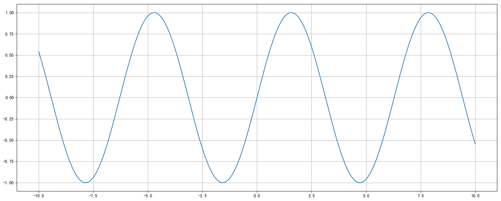
- 注意:plt.plot()除了可以画折线图,也可以用于画各种数学函数图像
代码:
import numpy as np# 0.准备数据x = np.linspace(-10, 10, 1000)y = np.sin(x)# 1.创建画布plt.figure(figsize=(20, 8), dpi=100)# 2.绘制函数图像plt.plot(x, y)# 2.1 添加网格显示plt.grid()# 3.显示图像plt.show()
5 小结
- 添加x,y轴刻度【知道】
- plt.xticks()
- plt.yticks()
- 注意:在传递进去的第一个参数必须是数字,不能是字符串,如果是字符串吗,需要进行替换操作
- 添加网格显示【知道】
- plt.grid(linestyle=”—“, alpha=0.5)
- 添加描述信息【知道】
- plt.xlabel()
- plt.ylabel()
- plt.title()
- 图像保存【知道】
- plt.savefig(“路径”)
- 多次plot【了解】
- 直接进行添加就OK
- 显示图例【知道】
- plt.legend(loc=”best”)
- 注意:一定要在plt.plot()里面设置一个label,如果不设置,没法显示
- 多个坐标系显示【了解】
- plt.subplots(nrows=, ncols=)
- 折线图的应用【知道】
- 1.应用于观察数据的变化
- 2.可是画出一些数学函数图像

若有收获,就点个赞吧
0 人点赞
