flex 容器属性之 align-content
align-content属性定义了多根轴线的对齐方式。如果项目只有一根轴线,该属性不起作用。
flex 布局有主轴和交叉轴, 也就是 flex 布局默认的两根轴。那怎么才算是定义了多根轴线呢?经过反复实践, 终于发现了规律, 原来需要显式的定义一下布局方向, 比如:
<div class="flex-container"><div class="flex-item flex-item-1">1</div><div class="flex-item flex-item-1">1</div><div class="flex-item flex-item-2">2</div><div class="flex-item flex-item-2">2</div><div class="flex-item flex-item-3">3</div><div class="flex-item flex-item-3">3</div><div class="flex-item flex-item-4">4</div><div class="flex-item flex-item-4">4</div><div class="flex-item flex-item-5">5</div><div class="flex-item flex-item-5">5</div></div>
横向主轴:定义容器的布局方向flex-direction: row;
.flex-container {height: 400px;display: flex;flex-flow: row wrap; /*必须定义某一个方向, 才会形成多根轴线*/align-content: flex-end;/*更改 align-content 的值,体验不同的效果*/background: gray;}.flex-item {white-space: nowrap;margin-right: 10px;margin-bottom: 10px;text-align: end;}.flex-item-1, .flex-item-3 {width: 60px;height: 80px;background: lightcoral;}.flex-item-2, .flex-item-4 {width: 90px;height: 40px;background: lightblue;}.flex-item-5 {width: 105px;height: 20px;background: lightgreen;}
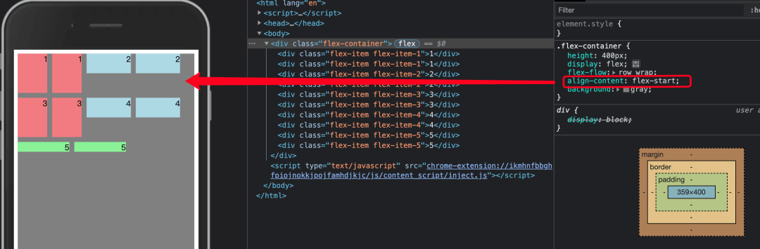
align-content: flex-start 效果
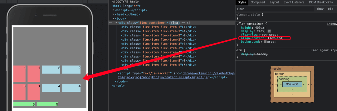
align-content: flex-end 效果
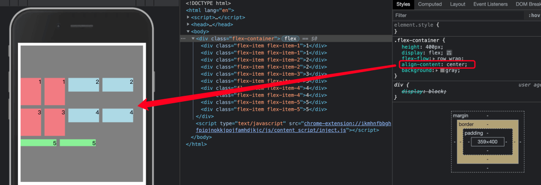
align-content: center 效果
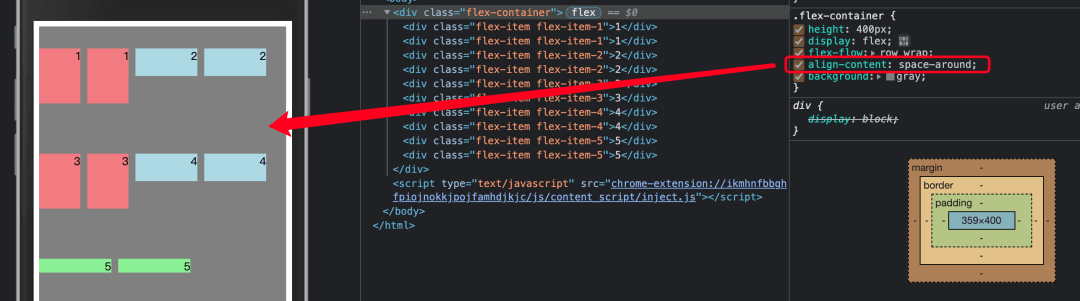
align-content: space-around 效果
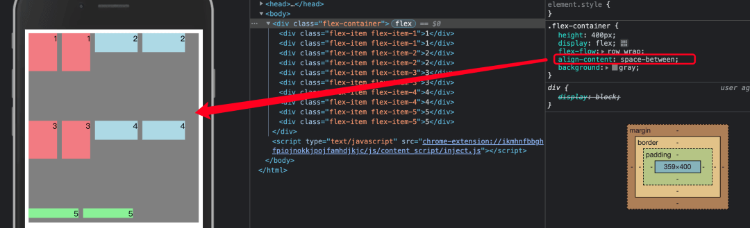
align-content: space-between 效果
align-content: stretch 效果
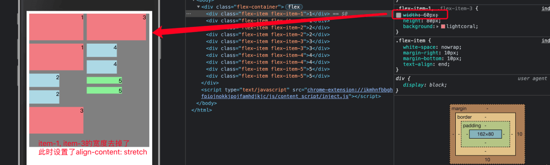
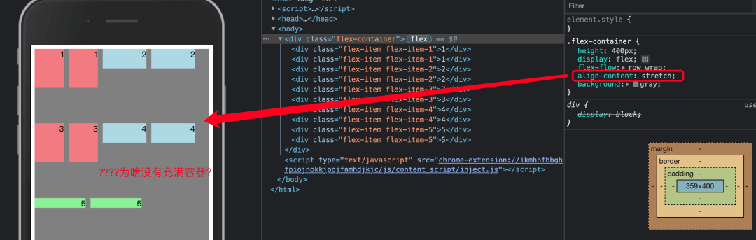 stretch 不是要占满容器的吗, 为啥没有效果!看了一眼 align-items 的值, 里面也有一个 stretch,如果项目未设置高度或设为 auto,将占满整个容器的高度。align-content 的 stretch 属性跟这里应该是一个意思, 验证一下!把这些高度去掉或者改为 auto 试一下:
子项目高度改为 auto 时,align-content: stretch 效果
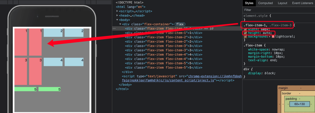
只改了 item-1 和 item-3 的高度为 auto, 发现他们得到了延伸 stretch, 而其他没有修改高度的子项还是没有延伸。终于发现其中的奥秘了!!
加以思索, 这个是设置了横向的布局方向, 纵向的是什么表现?也来看一看。
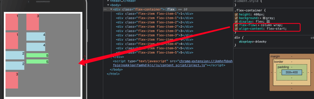
纵向交叉轴:定义容器的布局方向flex-direction: column;
align-content: flex-start 效果
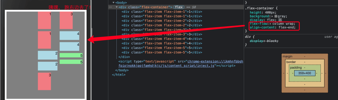
align-content: flex-end 效果
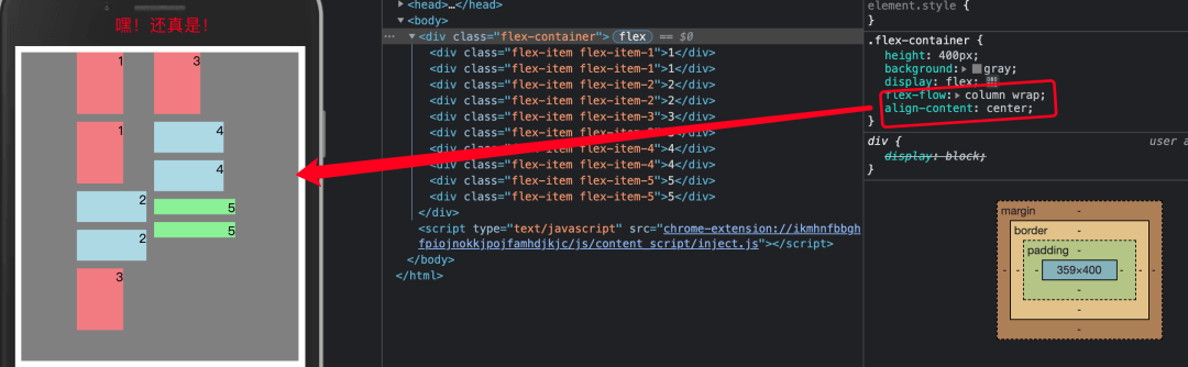
 说明设置布局方向为 column 的时候, align-content 表现体现在水平方向上?如果是 center, 那就是水平居中了?试试!
align-content: center 效果
align-content: space-around 效果

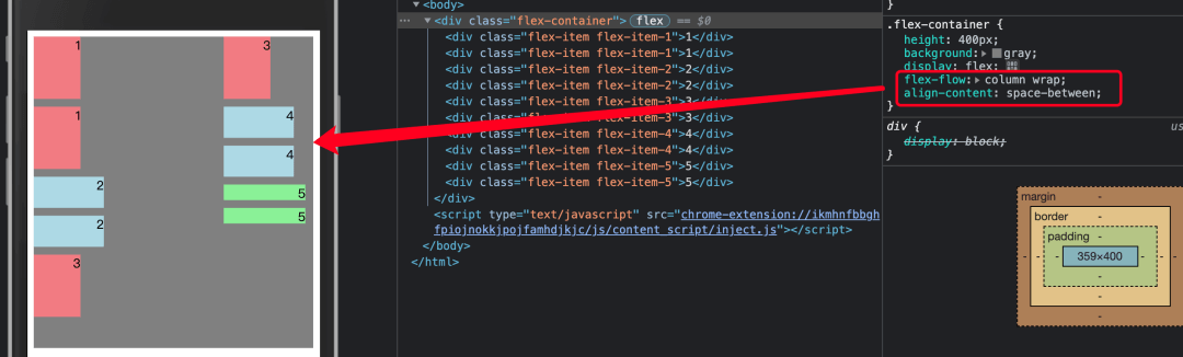
align-content: space-between 效果
align-content: stretch 效果
总结
对于容器属性align-content, 要让它生效的条件是:必须显式的设置布局方向
- 如果布局方向为横向主轴:
flex-direction: row;- 1、此时 align-content 的变化体现在竖直方向
- 2、如果要让
align-content: stretch;生效,这个时候应该去掉子项的高度或者设置子项的高度为 auto
- 如果布局方向为纵向交叉轴:
flex-direction: column;- 1、此时 align-content 的变化体现在水平方向
- 2、如果要让
align-content: stretch;生效,这个时候应该去掉子项的宽度或者设置子项的宽度为 auto

若有收获,就点个赞吧
0 人点赞
