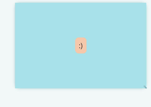
1、水平居中和垂直居中
结合 grid和place-items优雅的实现同时水平居中和垂直居中。
<div class="parent" ><div class="child" contenteditable>:)</div></div>
.parent {display: grid;place-items: center;background: lightblue;width: 500px;height: 500px;resize: both;overflow: auto;}.child {// etc.padding: 0.5rem;border-radius: 10px;border: 1px solid red;background: lightpink;font-size: 2rem;text-align: center;}body {font-family: system-ui, serif;}
源码地址:https://codepen.io/una/pen/YzyYbBx
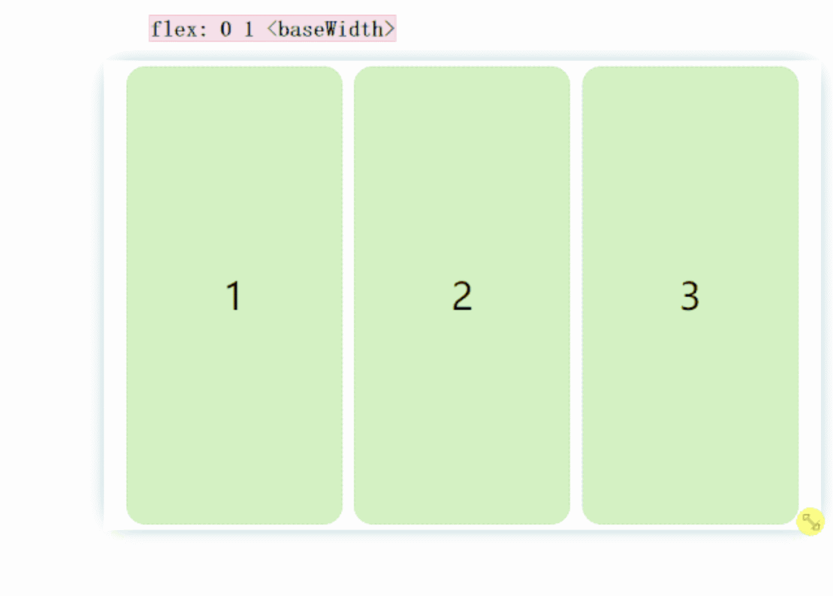
2、可解构的自适应布局(The Deconstructed Pancake)
这种布局经常出现在电的网站:
- 在视口足够的时候,三个框固定宽度横放
- 在视口不够的时候(宽度在移动上面),宽度仍然固定,,但是自动解构(原谅我的中文水平),不在同一水平面上
```css .parent { display: flex; flex-wrap: wrap; }<div class="parent"><div class="child">1</div><div class="child">2</div><div class="child">3</div></div>
.child { // flex: none | [ <’flex-grow’> <’flex-shrink’>? || <’flex-basis’> ] // If we don’t want the items to stretch: flex: 0 1 300px; // If we do want the items to stretch: flex: 1 1 300px;
// etc. border: 1px solid red; background: lightpink; font-size: 2rem; text-align: center; }
body { font-family: system-ui, serif; }
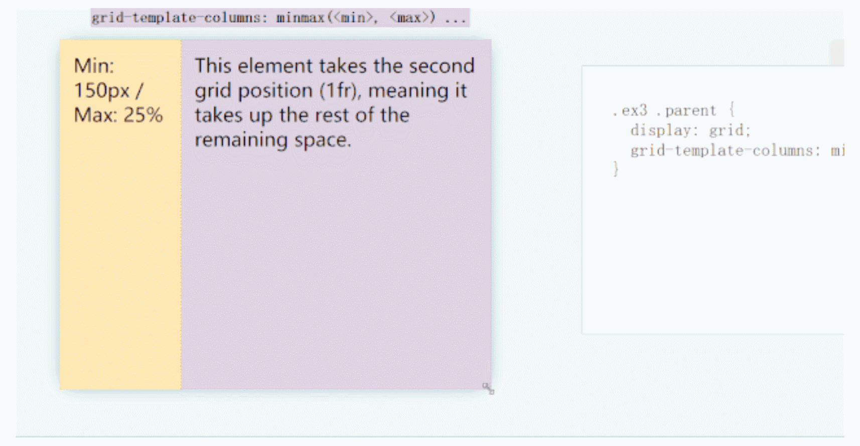
<br />当设置`flex: 1 1 150px;`时候:<br />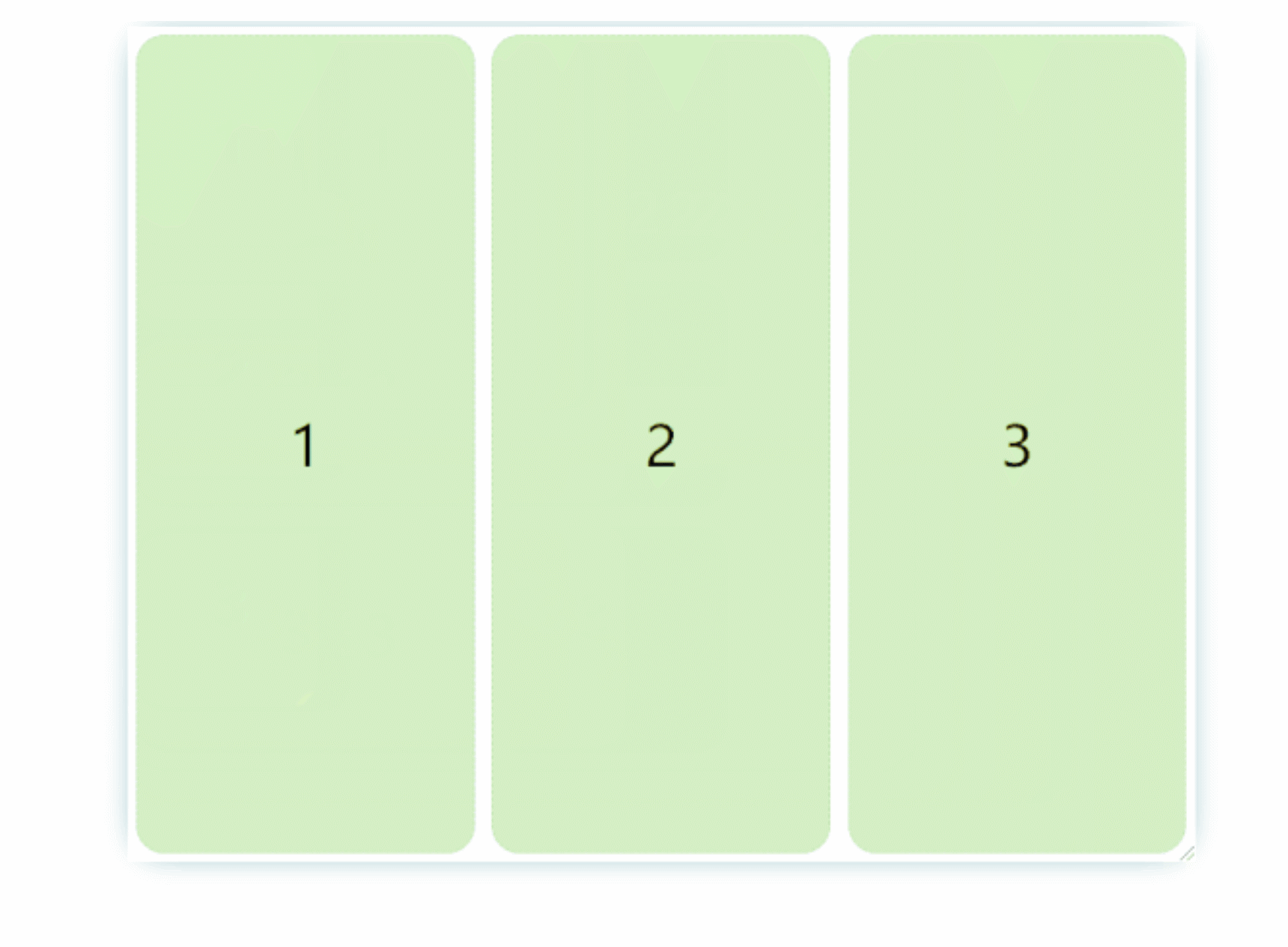<br />源码地址:[https://codepen.io/una/pen/WNQdBza](https://codepen.io/una/pen/WNQdBza)<a name="SLsWy"></a>### 3、经典的侧边栏同样使用`grid`布局,结合可以`minmax()`实现弹性的伸缩,这在要适应大屏幕的时候很有用)。`minmax(<min>, <max>)`就是字面意思。结合`<flex>`单位,非常优雅,避免了数学计算宽度等不灵活的手段(设置间隙手段的时候)。```html<div class="sidebar" contenteditable>Min: 150px<br/>Max: 25%</div><p class="content" contenteditable>Lorem ipsum dolor sit amet consectetur adipisicing elit. Omnis nulla architecto maxime modi nisi. Quas saepe dolorum, architecto quia fugit nulla! Natus, iure eveniet ex iusto tempora animi quibusdam porro?</p>
body {display: grid;grid-template-columns: minmax(150px, 25%) 1fr;padding: 0;margin: 0;}.sidebar {height: 100vh;// etc.background: lightpink;font-size: 2rem;text-align: center;}.content {padding: 2rem;}body {font-family: system-ui, serif;}
源码地址:https://codepen.io/una/pen/gOaNeWL
4、固定的页眉和页脚
固定高度的页眉和页脚,并保留剩余空间的主体是经常使用的布局,可以利用grid和fr单位完子实现。
<header><h1>Header.com</h1></header><main></main><footer>Footer Content — Header.com 2020</footer>
body {display: grid;height: 100vh;grid-template-rows: auto 1fr auto;}// etcheader {background: lightpink;padding: 2rem;}main {background: coral;}footer {background: wheat;padding: 2rem;text-align: center;}body {font-family: system-ui, sans-serif;}
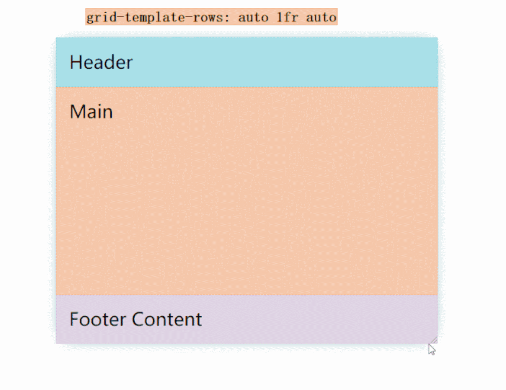
源码地址:https://codepen.io/una/pen/bGVXPWB
5、经典的圣杯布局(古典圣杯布局)
<header><h1 contenteditable>Header.com</h1></header><div class="left-sidebar" contenteditable>Left Sidebar</div><main contenteditable></main><div class="right-sidebar" contenteditable>Right Sidebar</div><footer contenteditable>Footer Content — Header.com 2020</footer>
body {display: grid;height: 100vh;grid-template: auto 1fr auto / auto 1fr auto}// etcheader {background: lightpink;padding: 2rem;grid-column: 1 / 4;}.left-sidebar {background: lightblue;grid-column: 1 / 2;}main {background: coral;grid-column: 2 / 3;}.right-sidebar {background: yellow;grid-column: 3 / 4;}footer {background: wheat;padding: 2rem;text-align: center;grid-column: 1 / 4;}body {font-family: system-ui, sans-serif;}.left-sidebar,.right-sidebar {padding: 1rem;}
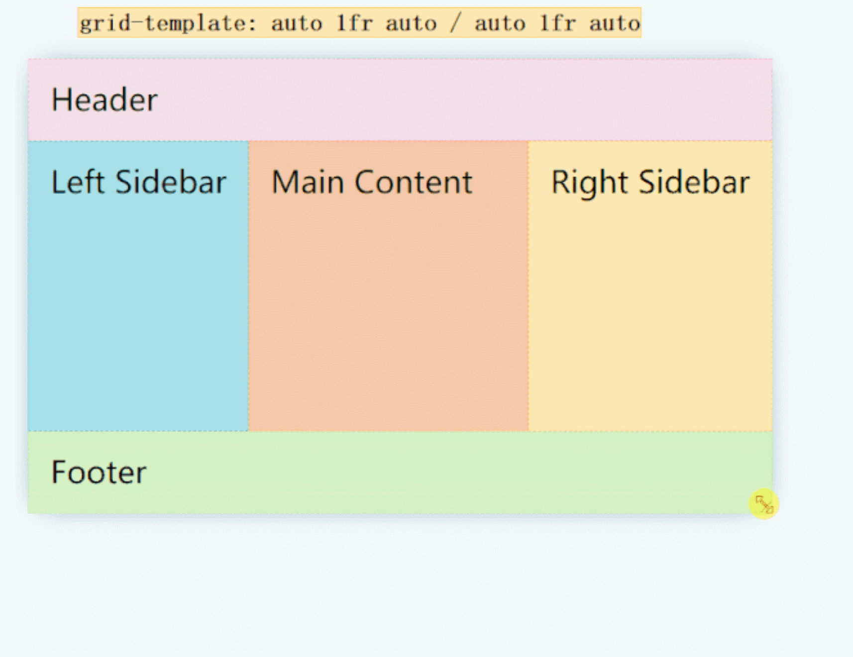
源码地址:https://codepen.io/una/pen/mdVbdBy
6、叠块
使用grid-template-columns状语从句:grid-column可以实现如下图产品所示的布局。说明进一步了repeat状语从句:fr的便捷性。
<div class="span-12">Span 12</div><div class="span-6">Span 6</div><div class="span-4">Span 4</div><div class="span-2">Span 2</div>
body {display: grid;height: 100vh;grid-template-columns: repeat(12, 1fr);}// etcdiv {display: grid;place-items: center;}.span-12 {background: lightpink;grid-column: 1 / 13;}.span-6 {background: lightblue;grid-column: 1 / 7;}.span-4 {background: coral;grid-column: 4 / 9;}.span-2 {background: yellow;grid-column: 3 / 5;}body {font-family: system-ui, sans-serif;}
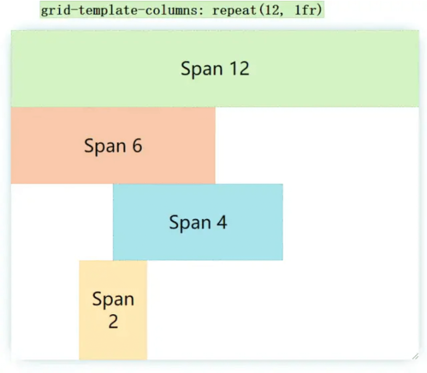
源码地址:https://codepen.io/una/pen/eYJOYjj
7、RAM技巧
这在弹性布局图片/ box这种非常有用(行可以排放的卡片数量自动适应)
其效果是如果确保能够满足多个盒的最小宽度(例如上面的150px),则自动弹性适应放置多行。
- 当前宽度是
160px(不考虑gap),那么上面四个box的宽度会适应为160px,并且分为4行 - 当前宽度是
310px(不考虑间隙),上面四个box分段两行,两个box平分宽度 - 当满足满足一行放下3个box时,第三个box自动到第一行
- 当满足满足一行放下4个box时,第四个box自动到第一行
```css body { display: grid; height: 100vh; grid-gap: 1rem; grid-template-columns: repeat(auto-fit, minmax(200px, 1fr)); }<div>1</div><div>2</div><div>3</div><div>4</div>
// etc
div { display: grid; place-items: center; background: lightpink; }
body { font-family: system-ui, sans-serif; }
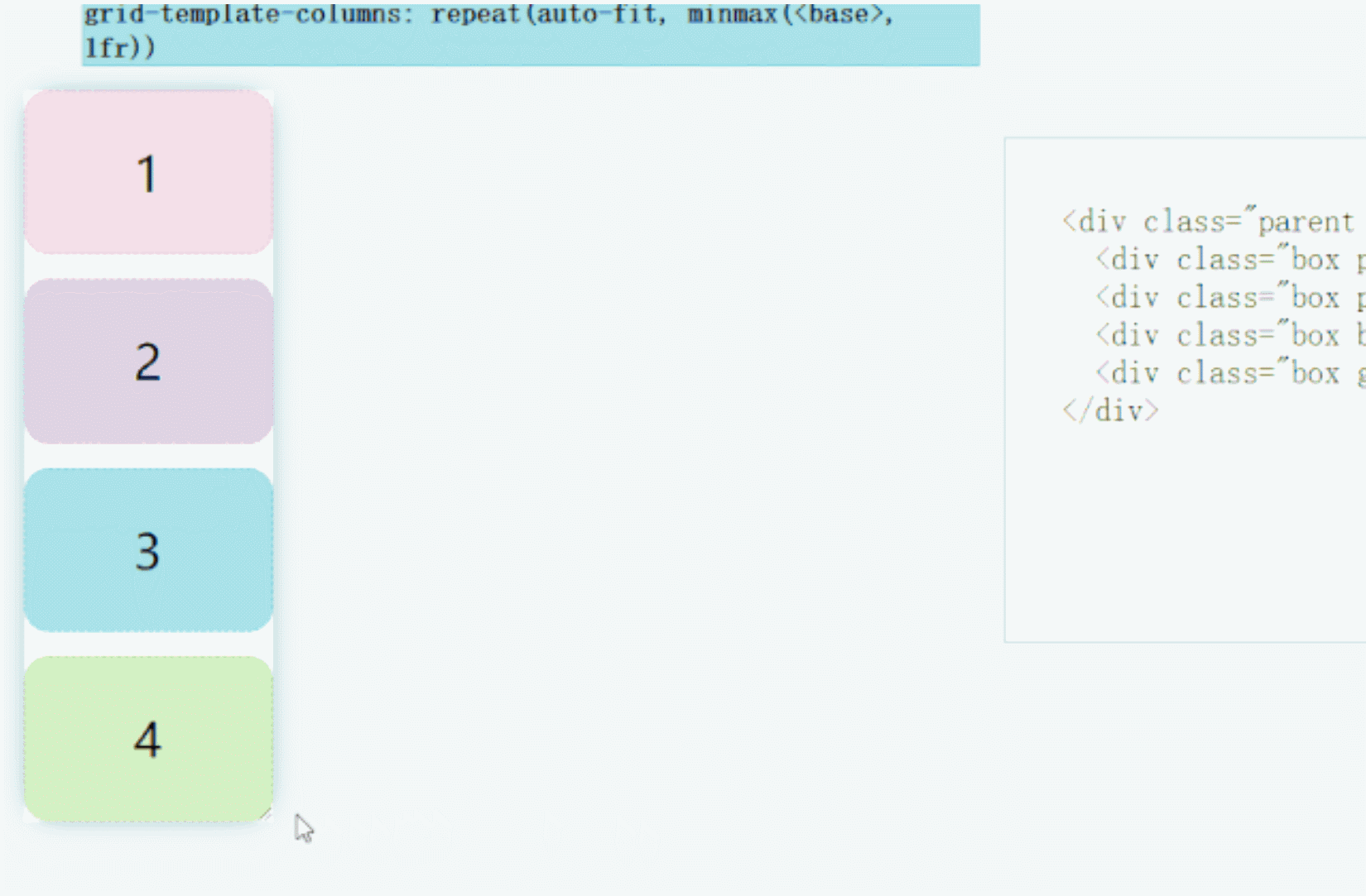<br />如果将`auto-fit`对划线`auto-fill`:<br />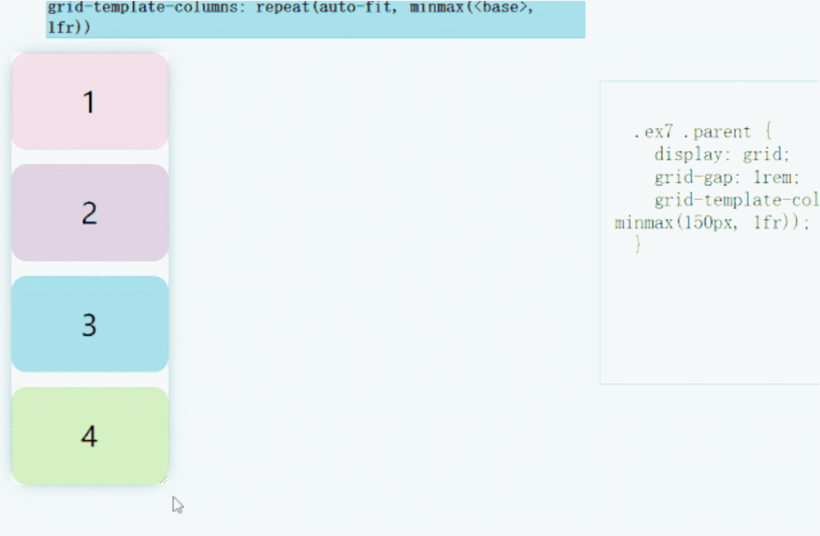<br />源码地址:[https://codepen.io/una/pen/oNbvNQv](https://codepen.io/una/pen/oNbvNQv)<a name="96JwR"></a>### 8、卡片弹性适应性`justify-content: space-between`,结合`grid`和`flex`实现完的布局。```html<div class="card"><h1>Title - Card 1</h1><p>Medium length description. Let's add a few more words here.</p><div class="visual"></div></div><div class="card"><h1>Title - Card 2</h1><p>Long Description. Lorem ipsum dolor sit, amet consectetur adipisicing elit. Sed est error repellat veritatis.</p><div class="visual"></div></div><div class="card"><h1>Title - Card 3</h1><p>Short Description.</p><div class="visual"></div></div>
body {display: grid;grid-gap: 1rem;grid-template-columns: repeat(3, 1fr);}// etc.visual {height: 100px;width: 100%;background: wheat;margin: 0.5rem 0;}.card {display: flex;flex-direction: column;justify-content: space-between;background: lightpink;padding: 1rem;}body {font-family: system-ui, sans-serif;}h1 {font-size: 1.5rem;}

无论是宽度或高度的收缩还是延展,都可以完子的展现卡的布局。
源码地址:https://codepen.io/una/pen/ExPYomq
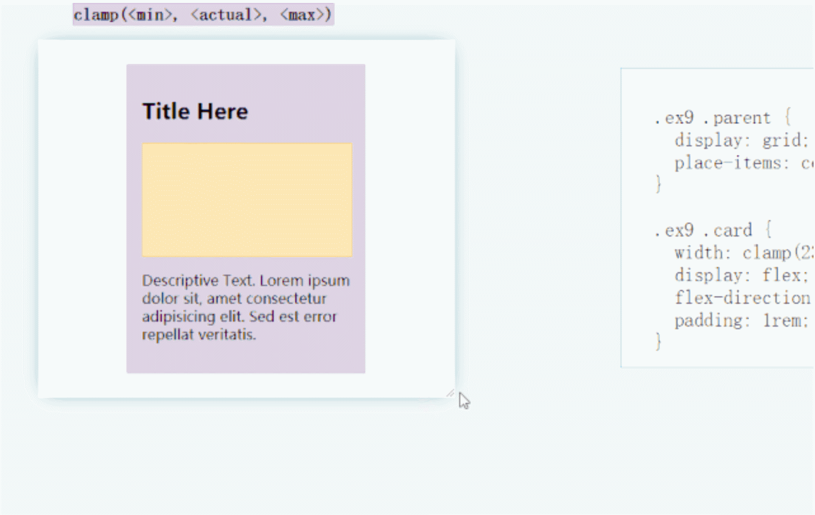
9、使用夹具实现流体印刷
最新使用的clamp()方法可以一行实现流体排版。提高UX,非常适合包含阅读内容的卡,因为不希望一行字太短或太长。
<div class="card"><h1>Title Here</h1><div class="visual"></div><p>Descriptive Text. Lorem ipsum dolor sit, amet consectetur adipisicing elit. Sed est error repellat veritatis.</p></div>
body {display: grid;place-content: center;height: 100vh;}.visual {height: 100px;width: 100%;background: wheat;margin: 0.5rem 0;}.card {width: clamp(23ch, 50vw, 46ch);display: flex;flex-direction: column;background: lightpink;padding: 1rem;}body {font-family: system-ui, sans-serif;}h1 {font-size: 1.5rem;}
源码地址:https://codepen.io/una/pen/QWyLxaL
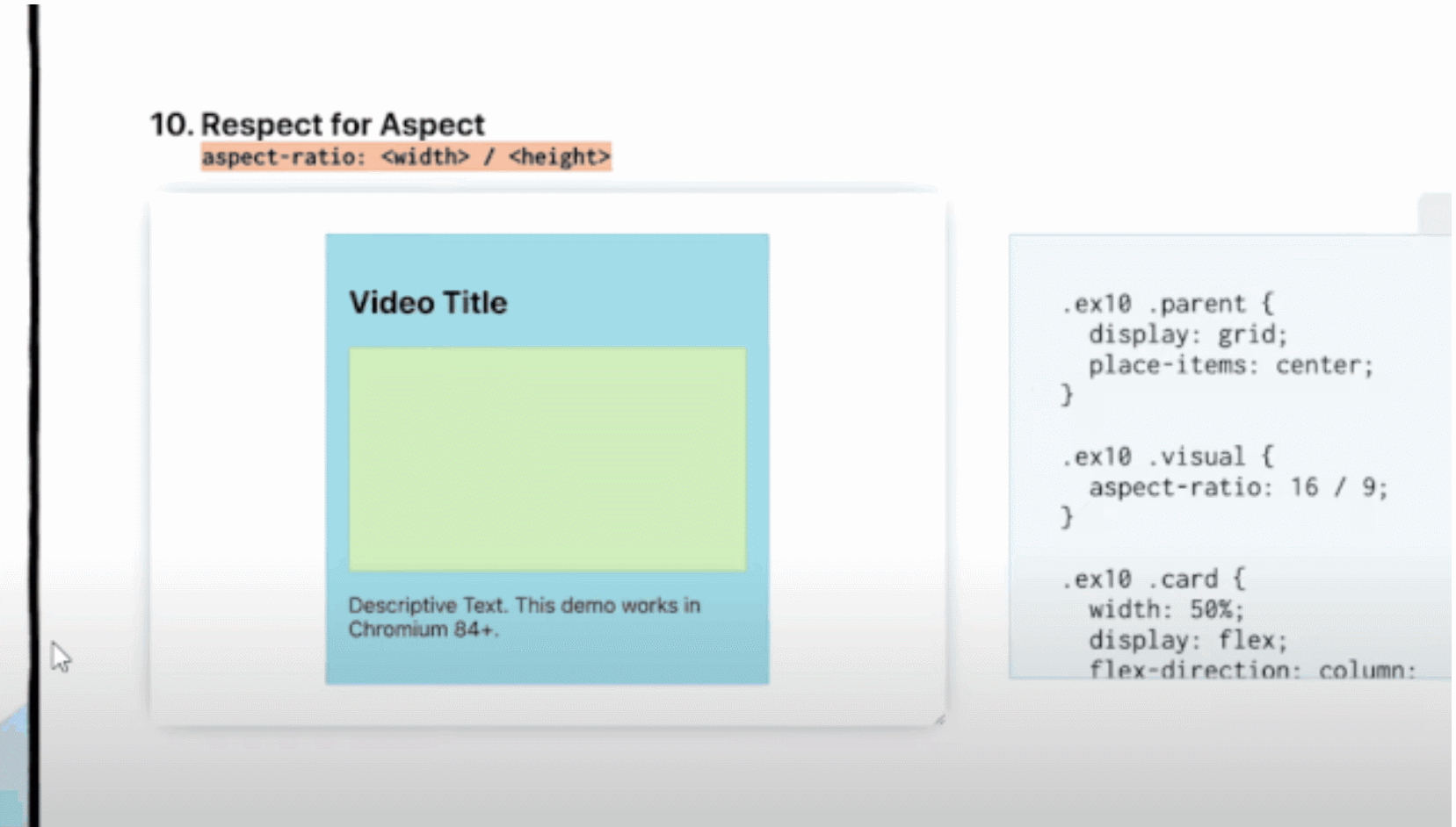
10、比例伸缩
在展现CMS或其他设计内容时,会期待图片,视频,卡片能够按照固定的比例进行布局。而最新的aspect-ratio可以优雅的实现该功能(使用chrome 84+)
<div class="card"><h1>Title Here</h1><div class="visual"></div><p>Descriptive Text. Lorem ipsum dolor sit, amet consectetur adipisicing elit. Sed est error repellat veritatis.</p></div>
body {display: grid;place-items: center;height: 100vh;}.visual {aspect-ratio: 16/9;background: wheat;margin: 0.5rem 0;}.card {width: 80%;display: flex;flex-direction: column;background: lightpink;padding: 1rem;}body {font-family: system-ui, sans-serif;}h1 {font-size: 1.5rem;}

若有收获,就点个赞吧
0 人点赞
