思路
外层容器也就是ul设置display:flex,对项目也就是li设置flex:auto,代表 flex: 1 1 auto
实现
<style>* {list-style: none;border: 0;padding: 0;margin: 0}ul {width: 500px;height: 200px;background: red;display: flex;margin: auto;margin-top: 100px;padding: 010px;align-items: center;}li {background: green;height: 100px;width: 500px;display: inline-block;margin: 2px;line-height: 100px;text-align: center;flex: auto}</style>
<body><ul><li>1</li><li>2</li><li>3</li></ul></body>
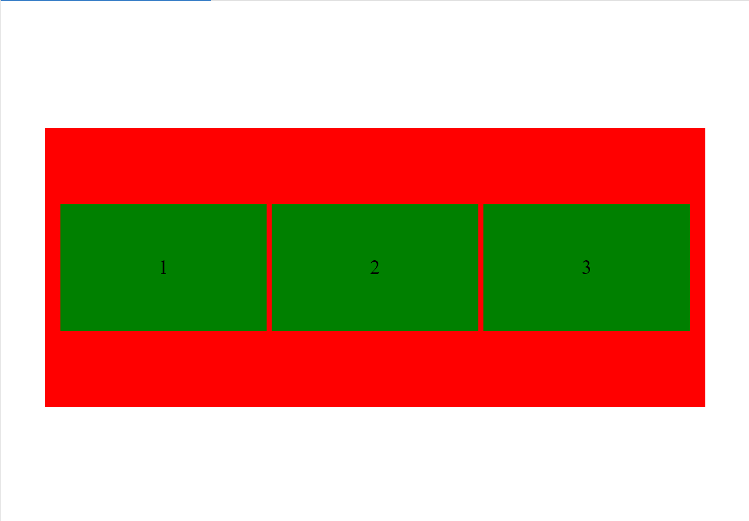
效果
解析
注意width的设置,外层ul是500,li也是500,但是实际看到的确实li平分了ul的宽度,这是因为设置了flex:auto,代表有剩余空间的话项目等分剩余空间放大,空间不足项目等比例缩小

若有收获,就点个赞吧
0 人点赞
