重复功能
该函数repeat()用于重复网格布局中的列数和行数。可以在CSS Grid属性grid-template-columns和中使用此功能grid-template-rows。它还可以嵌套其他功能,例如minmax()和fit-content。repeat()函数还允许以更紧凑的形式写入大量的列和行。它包含两个参数:要重复的次数以及要重复的列大小或行大小。假设要创建一个具有6列的网格布局,则可以使用以下语法,来做到这一点:
div {display:grid;grid-template-columns:1fr 1fr 1fr 1fr 1fr 1fr;}
代码看起来很丑陋,很难编写。可以通过使用repeat()函数来解决此问题。
示例代码如下:
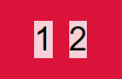
div {display:grid;grid-template-columns:repeat(6,1fr) ;}
结果如下: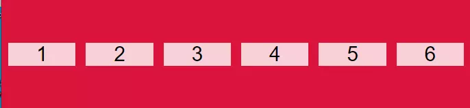
这更容易编写。例如,如果要创建4行50px的行,可以再次使用repeat()函数:
div {display:grid;grid-template-rows:repeat(4,50px) ;}
最小-最大功能
该功能minmax()定义了最小尺寸和最大尺寸之间的尺寸范围。如果调整手机的屏幕尺寸,内容将缩小直到达到最小尺寸为止。如果调整桌面屏幕的大小,内容将一直延伸到达到最大大小为止。
minmax(200px,1fr);minmax(400px,50%);minmax(30%,300px);
CSS Grid属性grid-template-columns和中也使用此功能grid-template-rows。它有两个参数:最小大小和最大大小。
假设要制作一个具有4列的网格布局,并且还希望使用该功能minmax()来拉伸内容并使所有内容具有响应性。将手机屏幕的最小像素为50px,桌面屏幕的最大像素为380px。
看下面的例子:
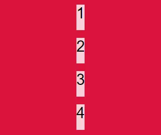
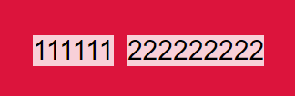
.container {display:grid;grid-template-columns:repeat(4,minmax(50px,380px));}
如上所示,由于需要4列,因此使用该函数将函数repeat()重复了minmax()4次。minmax()嵌套在里面reapeat()。
在小屏幕上输出的结果如下: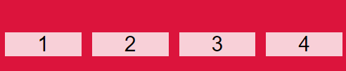
在更大屏幕上输出的结果如下:
因此,该功能minmax()允许根据屏幕尺寸来拉伸和缩小内容。
适合内容功能
该函数fit-content采用绝对长度或百分比的参数。它用于根据列和行内部的内容自动更改列和行的大小。
该函数fit-content根据以下公式将给定尺寸夹紧为可用尺寸:
/ * 最小值(最大大小,最大值(最小大小,参数))* // * 上面的公式等效于:* /fit-content(arguments )
它也可以用作CSS属性进行使用。
以下为演示示例代码:
.container {display:grid;grid-template-columns:fit-content(300px)fit-content(300px) ;}
计数器
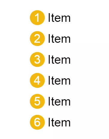
要为编号列表中的数字设置样式,需要使用称为CSS计数器的属性。CSS计数器可以根据内容在文档中的位置来调整内容的外观。
<ul class="list"><li>Item</li><li>Item</li><li>Item</li><li>Item</li><li>Item</li><li>Item</li></ul>
li {font-size: 40px;margin-bottom: 20px;counter-increment: li;}.list li::before {content: counter(li);margin-right: 10px;width: 50px;height: 50px;border-radius: 50%;display: inline-block;background-color: #f3b70f;color: white;text-align: center;line-height: 50px;}
::选择
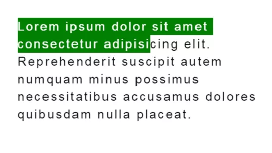
:: selection伪元素适用于DOM上突出显示的元素。语法如下所示:
p::selection {color: white;background-color: green;}
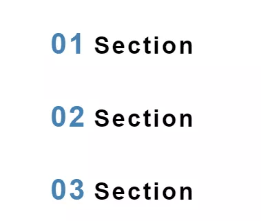
attr()函数。
它用于检索所选元素的属性值,并在样式表中使用它。
<h2 class="title" data-count="01">Section</h2><h2 class="title" data-count="02">Section</h2><h2 class="title" data-count="03">Section</h2>
.title {font-size: 35px;letter-spacing: 3px;}.title::before {content: attr(data-count);font-size: 1.2em;color: steelblue;margin-right: 10px;}
将笔划添加到Web文本
<h2>Css is Awesome</h2>
h2 {-webkit-text-fill-color: transparent;-webkit-text-stroke: 3px tomato;}

使用 :not() 在菜单上应用/取消应用边框
先给每一个菜单项添加边框
/* add border */.nav li {border-right: 1px solid #666;}
然后再除去最后一个元素
// remove border /.nav li:last-child {border-right: none;}
可以直接使用 :not() 伪类来应用元素:
.nav li:not(:last-child) {border-right: 1px solid #666;}
这样代码就干净,易读,易于理解了。
当然,如果新元素有兄弟元素的话,也可以使用通用的兄弟选择符(~):
.nav li:first-child ~ li {border-left: 1px solid #666;}
给 body添加行高
不需要分别添加 line-height 到每个 <p>,<h*>等。只要添加到 body 即可:
body {line-height: 1;}
所有一切都垂直居中
要将所有元素垂直居中:
html, body {height: 100%;margin: 0;}body {-webkit-align-items: center;-ms-flex-align: center;align-items: center;display: -webkit-flex;display: flex;}
:::tips 注:在IE11中要小心flexbox。 :::
逗号分隔的列表
让HTML列表项看上去像一个真正的,用逗号分隔的列表:
ul > li:not(:last-child)::after {content: ',';}
使用负的 nth-child 选择项目
在CSS中使用负的 nth-child 选择项目1到项目n。
li {display: none;}/* select items 1 through 3 and display them */li:nth-child(-n+3) {display: block;}
对图标使用SVG
.logo {background: url('logo.svg');}
SVG对所有的分辨率类型都具有良好的扩展性,并支持所有浏览器都回归到IE9。这样可以避开.png、.jpg或.gif文件了。
优化显示文本
有时,字体并不能在所有设备上都达到最佳的显示,所以可以让设备浏览器来处理:
html {-moz-osx-font-smoothing: grayscale;-webkit-font-smoothing: antialiased;text-rendering: optimizeLegibility;}
:::info 注:请负责任地使用 optimizeLegibility。此外,IE /Edge没有 text-rendering 支持。 :::
对纯CSS滑块使用 max-height
使用 max-height 和溢出隐藏来实现只有CSS的滑块:
.slider ul {max-height: 0;overlow: hidden;}.slider:hover ul {max-height: 1000px;transition: .3s ease;}
继承 box-sizing
让 box-sizing 继承 html:
html {box-sizing: border-box;}*, *:before, *:after {box-sizing: inherit;}
这样在插件或杠杆其他行为的其他组件中就能更容易地改变 box-sizing 了。
表格单元格等宽
表格工作起来很麻烦,所以务必尽量使用 table-layout: fixed 来保持单元格的等宽:
.calendar {table-layout: fixed;}
用Flexbox摆脱外边距的各种hack
当需要用到列分隔符时,通过flexbox的 space-between 属性,就可以摆脱nth-,first-,和 last-child 的hack了:
.list {display: flex;justify-content: space-between;}.list .person {flex-basis: 23%;}
使用属性选择器用于空链接
当 <a> 元素没有文本值,但 href 属性有链接的时候显示链接:
a[href^='http']:empty::before {content: attr(href);}
相当方便。

若有收获,就点个赞吧
0 人点赞
