clientWidth、offsetWidth 和 scrollWidth
注:添加white-space: wrap让内容超出,得到scrollWidth > offsetWidth
<div class="container" style="padding: 10px; border: 5px solid #ccc; width: 50px;white-space: nowrap;">content is here and may overflow let's see the result</div>
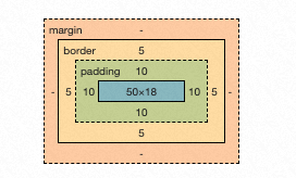
clientWidth: 70px;
offsetWidth: 80px; // 50+10*2
scrollWidth: 339px; // 实际内容宽度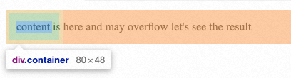
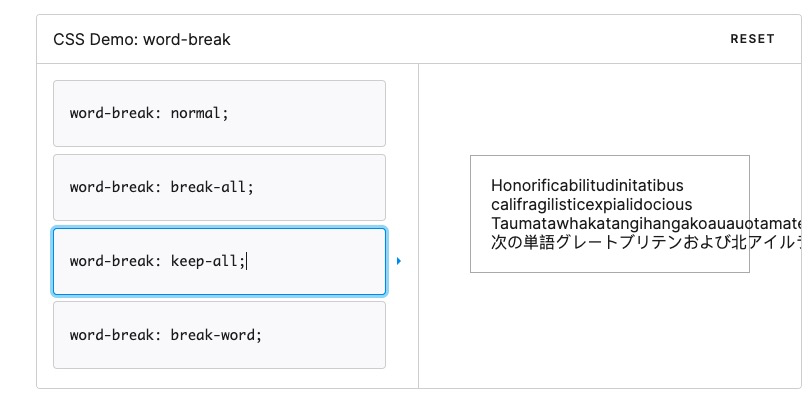
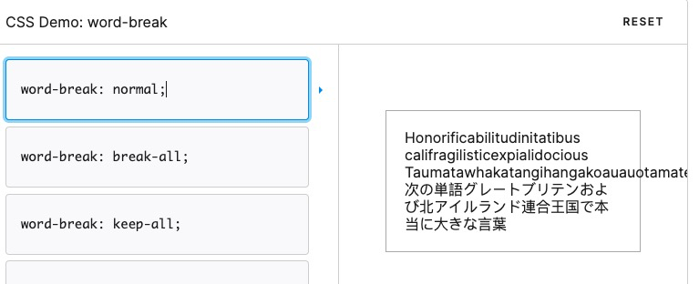
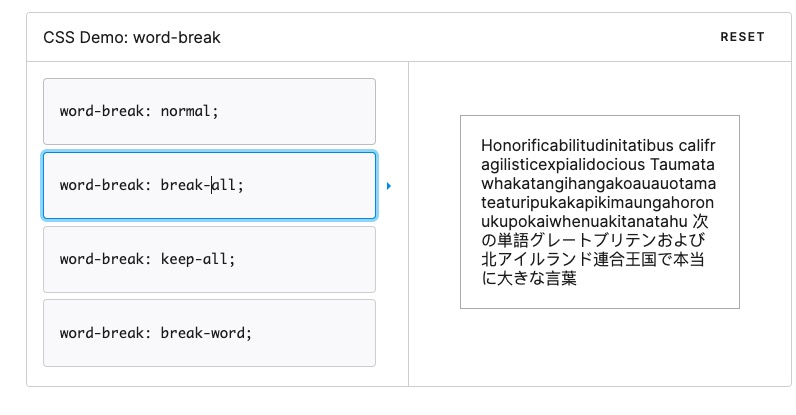
word-break 和 white-space
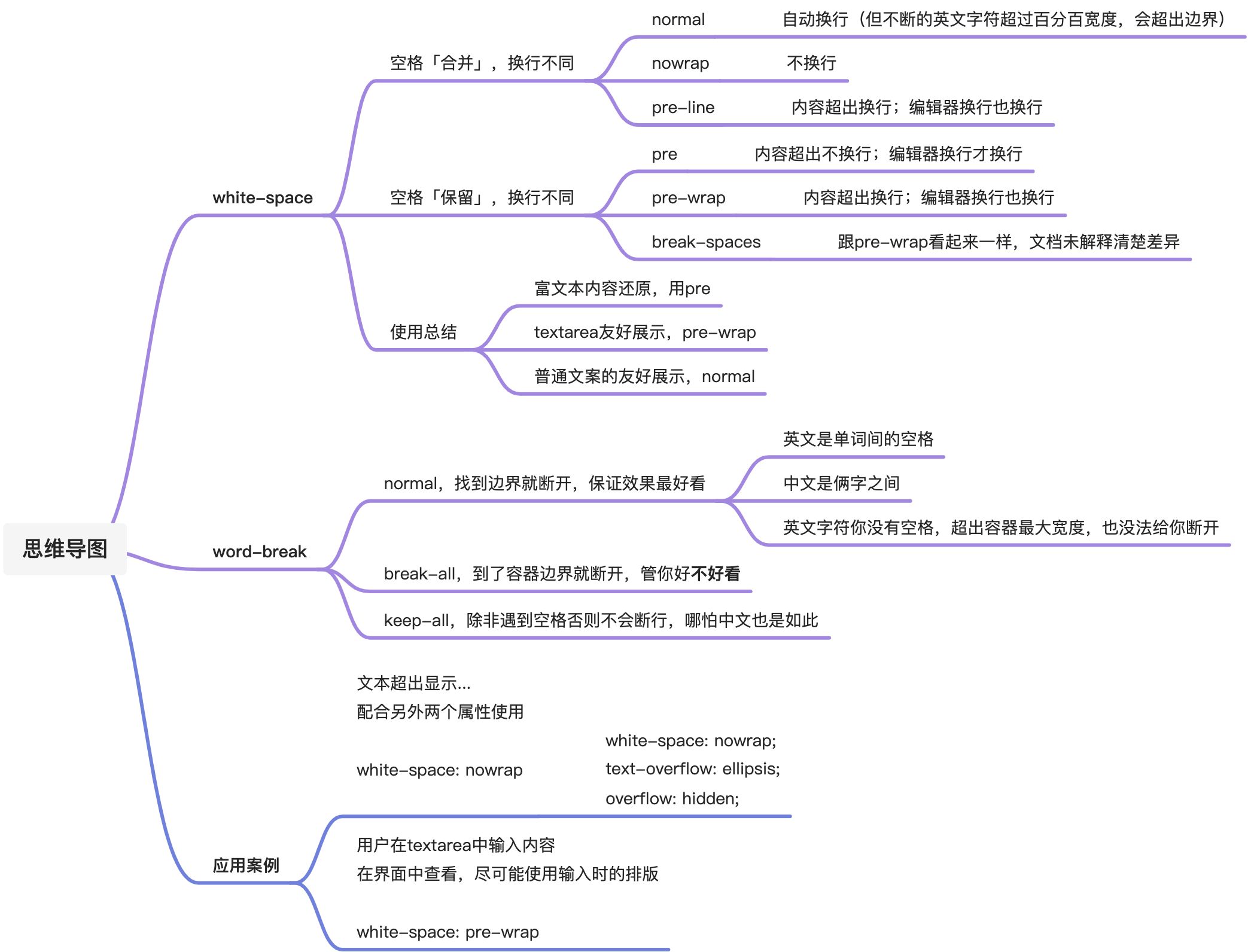
演示:word-break
演示:whie-space
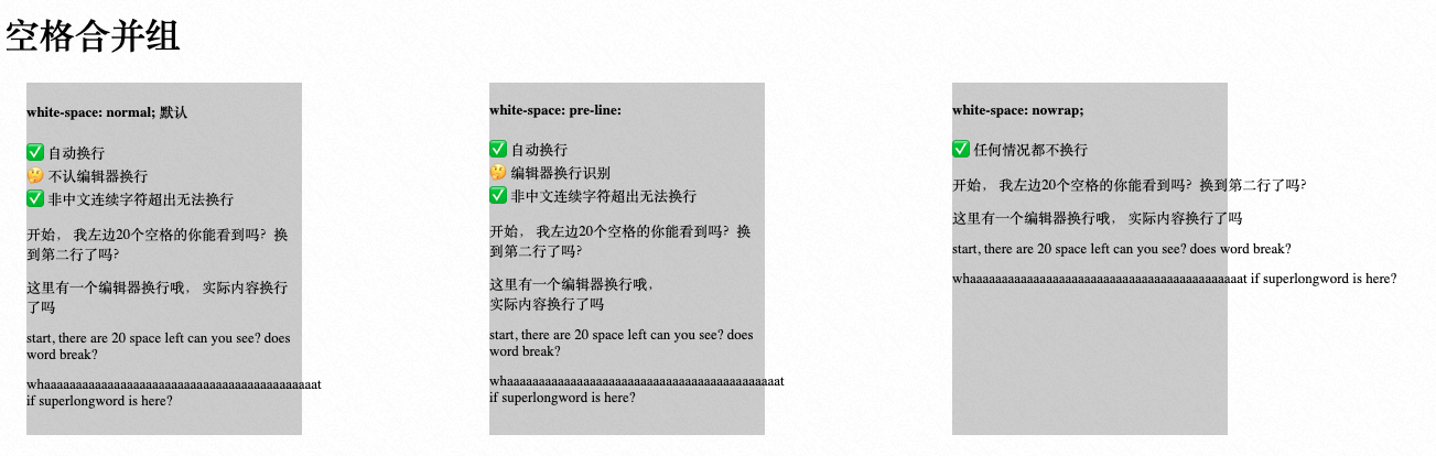
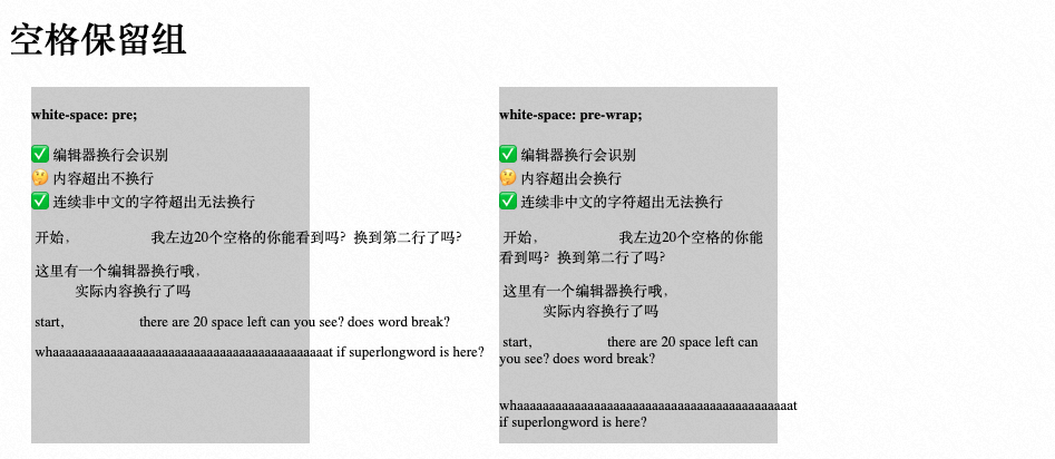
<!DOCTYPE html><html lang="en"><head><meta charset="UTF-8"><meta http-equiv="X-UA-Compatible" content="IE=edge"><meta name="viewport" content="width=device-width, initial-scale=1.0"><title>Document</title><style>.group {display: flex;flex-direction: row;}.container {font-size: 13px;background: #ccc;margin-bottom: 20px;margin-left: 20px;width: 250px;height: 320px;margin-right: 150px;}li {list-style: none;;}.white-space-normal div {white-space: normal;}.white-space-nowrap div {white-space: nowrap;}.white-space-pre div {white-space: pre;}.white-space-pre-wrap div {white-space: pre-wrap;}.white-space-pre-line div {white-space: pre-line;}.white-space-break-space div {white-space: break-spaces;}.container div {margin-bottom: 12px;}</style></head><body><h1>空格合并组</h1><div class="group"><div class="container"><h4>white-space: normal; 默认</h4><p><li>✅ 自动换行</li><li>🤔 不认编辑器换行</li><li>✅ 非中文连续字符超出无法换行</li></p><div> 开始, 我左边20个空格的你能看到吗?换到第二行了吗?</div><div> 这里有一个编辑器换行哦,实际内容换行了吗</div><div> start, there are 20 space left can you see? does word break?</div><div> whaaaaaaaaaaaaaaaaaaaaaaaaaaaaaaaaaaaaaaaaaaat if superlongword is here?</div></div><div class="container white-space-pre-line"><h4>white-space: pre-line:</h4><p><li>✅ 自动换行</li><li>🤔 编辑器换行识别</li><li>✅ 非中文连续字符超出无法换行</li></p><div> 开始, 我左边20个空格的你能看到吗?换到第二行了吗?</div><div> 这里有一个编辑器换行哦,实际内容换行了吗</div><div> start, there are 20 space left can you see? does word break?</div><div> whaaaaaaaaaaaaaaaaaaaaaaaaaaaaaaaaaaaaaaaaaaat if superlongword is here?</div></div><div class="container white-space-nowrap"><h4>white-space: nowrap;</h4><p><li>✅ 任何情况都不换行</li><li></li><li></li></p><div> 开始, 我左边20个空格的你能看到吗?换到第二行了吗?</div><div> 这里有一个编辑器换行哦,实际内容换行了吗</div><div> start, there are 20 space left can you see? does word break?</div><div> whaaaaaaaaaaaaaaaaaaaaaaaaaaaaaaaaaaaaaaaaaaat if superlongword is here?</div></div></div><h1>空格保留组</h1><div class="group"><div class="container white-space-pre"><h4>white-space: pre;</h4><p><li>✅ 编辑器换行会识别</li><li>🤔 内容超出不换行</li><li>✅ 连续非中文的字符超出无法换行</li></p><div> 开始, 我左边20个空格的你能看到吗?换到第二行了吗?</div><div> 这里有一个编辑器换行哦,实际内容换行了吗</div><div> start, there are 20 space left can you see? does word break?</div><div> whaaaaaaaaaaaaaaaaaaaaaaaaaaaaaaaaaaaaaaaaaaat if superlongword is here?</div></div><div class="container white-space-pre-wrap"><h4>white-space: pre-wrap;</h4><p><li>✅ 编辑器换行会识别</li><li>🤔 内容超出会换行</li><li>✅ 连续非中文的字符超出无法换行</li></p><div> 开始, 我左边20个空格的你能看到吗?换到第二行了吗?</div><div> 这里有一个编辑器换行哦,实际内容换行了吗</div><div> start, there are 20 space left can you see? does word break?</div><div> whaaaaaaaaaaaaaaaaaaaaaaaaaaaaaaaaaaaaaaaaaaat if superlongword is here?</div></div></div></body></html>
案例:单行文字超出部分显示…
text-overflow: ellipsis;overflow: hidden;white-space: nowrap; // 必须配合上面两个属性一起使用
案例:文字超出容器但不换行展示
假定有一个公告栏宽度500px,公告内容是单行的文字,可能很长例如1000px,希望文字在容器内滚动。如何设置不换行的展示。因为录入时候就是单行文字,可以选择属性和值有哪些。
- white-space的nowrap、pre可以达到效果,pre可用是因为录入内容时候假定就没有换换行符。
- word-break的keep-all可以达到效果。
下面是示例代码:
<!DOCTYPE html><html lang="en"><head><meta charset="UTF-8"><meta http-equiv="X-UA-Compatible" content="IE=edge"><meta name="viewport" content="width=device-width, initial-scale=1.0"><title>Document</title><style>.container {display: flex;flex-direction: row;overflow: hidden;/* white-space: pre; */word-break: keep-all;}</style></head><body><div class="container" style="width:200px;background-color: #ccc;"><div class="content" style="border: 1px solid red;background-color: yellow;">1234567890wertyuiopsQWERTYUIOPASDFGHJKLZXCVBNM</div></div></body></html>
案例:容器内两个子元素并排显示
默认效果是这样的: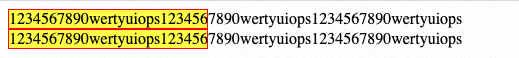
<div class="container" style="width:200px;background-color: #ccc;"><div class="content" style="border: 1px solid red;background-color: yellow;">1234567890wertyuiops1234567890wertyuiops1234567890wertyuiops</div><div class="content" style="border: 1px solid red;background-color: yellow;">1234567890wertyuiops1234567890wertyuiops1234567890wertyuiops</div></div>
为了并排展示,我们在container上面增加flex布局
<div class="container" style="width:100px;background-color: #ccc;"><div class="content" style="border: 1px solid red;background-color: yellow;">1234567890wertyuiops1234567890wertyuiops1234567890wertyuiops</div><div class="content" style="border: 1px solid red;background-color: yellow;">1234567890wertyuiops1234567890wertyuiops1234567890wertyuiops</div></div>
中文字符展示不正常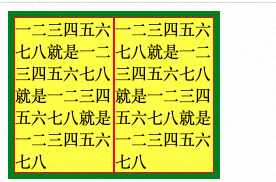
<div class="container" style="width:200px;background-color: #ccc;display:flex;flex-direction: row;border:6px solid green;"><div class="content" style="border: 1px solid red;background-color: yellow;">一二三四五六七八就是一二三四五六七八就是一二三四五六七八就是一二三四五六七八</div><div class="content" style="border: 1px solid red;background-color: yellow;">一二三四五六七八就是一二三四五六七八就是一二三四五六七八就是一二三四五六七八</div></div>
两种思路都可以解决问题:
- 在.content上增加 white-space: no-wrap;
- 在.content上增加 flex-shrink: 0; (shrink默认是1按照比例收缩设置为0,代表不收缩按内容显示)
遇到的问题
超长标点符号没换行
在项目中有个用户发表并论的区块,为了评论展示整体齐整,我们对于white-space没有设置任何属性,即换行符会被丢弃掉。但是也发现一个问题,即超长的英文字符,会超出容器展示。break-word既然默认是normal都不能满足,需要更果断的断行,即break-all。对于超长的英文单词,确实会在边界主动换行。但是对于标点符号,例如’…………..’ 在边界仍旧不会换行。
word-break: break-word; 就是那个被当做废弃的属性,虽然能端非中文,但它又会造成中文和英文字符自动断裂。另有两个两个属性用起来(break-word和anywhere)仍旧不能解决文本超出容器的问题: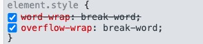
在Chrome上写了一个属性,另外一个就不起作用了,可以理解为只有一个属性能表达?
检索了Twitter的style,发现它使用了这两个样式:
https://developer.mozilla.org/zh-CN/docs/Web/CSS/overflow-wrap
https://www.w3schools.com/cssref/playdemo.asp?filename=playcss_word-wrap
已经无法推进了,更多需要了解字体设计等更底层的内容了。
flex-basis和height的差异
flex-basis对于具体的宽度、高度不像height那样有约束力,例如:flex-basis为40px,如果padding为17px 0,line-height为20px,实际高度是 17*2+20=54px,而非40px。
更多疑问待解答
- CSS种,为什么使用calc表达式种的变量(其值为具体的px),无法成功被转化为rem?

若有收获,就点个赞吧
0 人点赞
