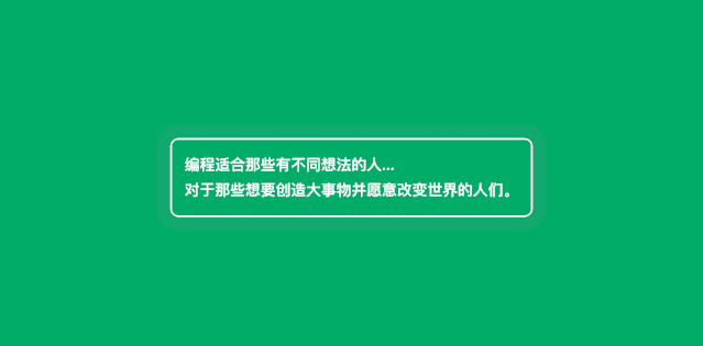
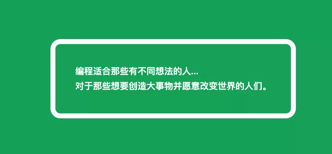
1、动画CSS边框
<div id="box">编程适合那些有不同想法的人... <br/>对于那些想要创造大事物并愿意改变世界的人们。</div><style>@keyframes animated-border {0% {box-shadow: 0000rgba(255,255,255,0.4);}100% {box-shadow: 00020pxrgba(255,255,255,0);}}#box {animation: animated-border 1.5s infinite;font-family: Arial;font-size: 18px;line-height: 30px;font-weight: bold;color: white;border: 2px solid;border-radius: 10px;padding: 15px;}</style>
**
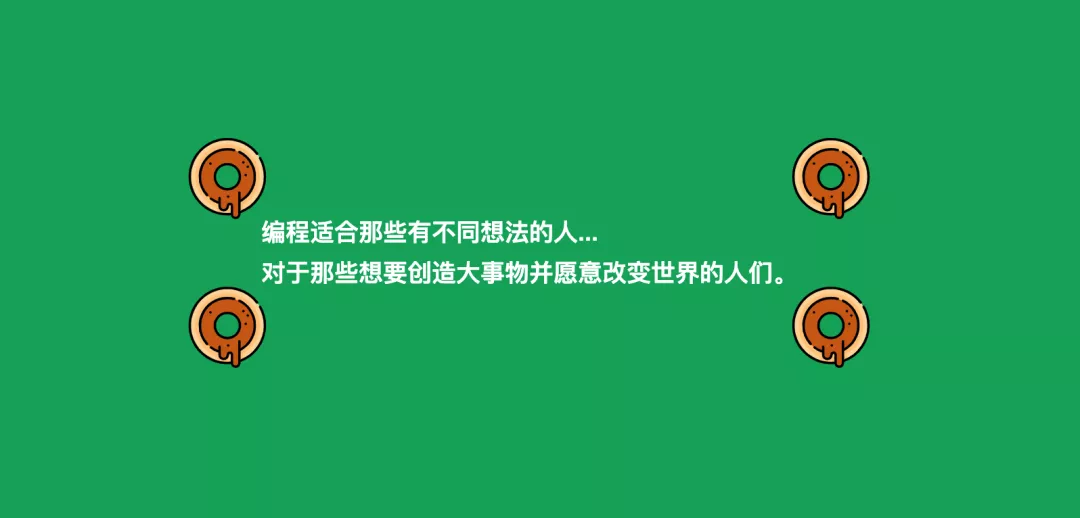
2、CSS图像边框
<div id="box">编程适合那些有不同想法的人... <br/>对于那些想要创造大事物并愿意改变世界的人们。</div><style>#box {font-family: Arial;font-size: 18px;line-height: 30px;font-weight: bold;color: white;border: 40px solid transparent;border-image: url(https://image.flaticon.com/icons/svg/648/648787.svg);border-image-slice: 100%;border-image-width: 60px;padding: 15px;}</style>
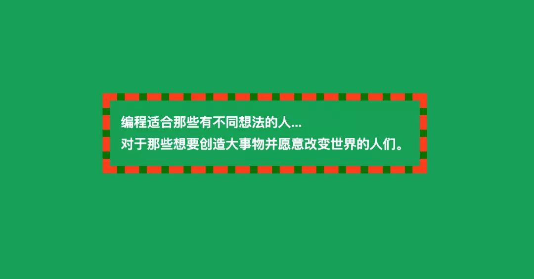
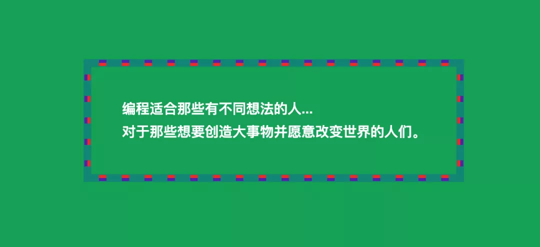
3、蛇式CSS边框
<div id="box">编程适合那些有不同想法的人... <br/>对于那些想要创造大事物并愿意改变世界的人们。</div><style>#box {font-family: Arial;font-size: 18px;line-height: 30px;font-weight: bold;color: white;padding: 15px;border: 10px dashed #FF5722;background:linear-gradient(to top, green, 10px, transparent 10px),linear-gradient(to right, green, 10px, transparent 10px),linear-gradient(to bottom, green, 10px, transparent 10px),linear-gradient(to left, green, 10px, transparent 10px);background-origin: border-box;}</style>
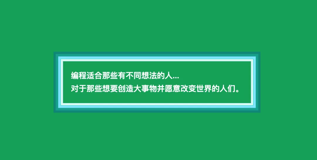
4、阶梯样式CSS边框
<style>#box {font-family: Arial;font-size: 18px;line-height: 30px;font-weight: bold;color: white;padding: 40px;box-shadow:inset #0096880005px,inset #059c8e0001px,inset #0cab9c00010px,inset #1fbdae00011px,inset #8ce9ff00016px,inset #48e4d600017px,inset #e5f9f700021px,inset #bfecf700022px}</style>
5、只有阴影CSS边框
#box {font-family: Arial;font-size: 18px;line-height: 30px;font-weight: bold;color: white;padding: 40px;border-radius: 10px;box-shadow: 00010px white;}
6、带阴影和轮廓的CSS边框
#box {font-family: Arial;font-size: 18px;line-height: 30px;font-weight: bold;color: white;padding: 40px;box-shadow:0001px#009688,0005px#F44336,0009px#673AB7,00010px#009688;outline: dashed 10px#009688;}
7、少量阴影和轮廓
#box {font-family: Arial;font-size: 18px;line-height: 30px;font-weight: bold;color: white;padding: 40px;box-shadow:0001px#009688,0005px#F44336,0009px#673AB7,00010px#009688;outline: dashed 10px#009688;}

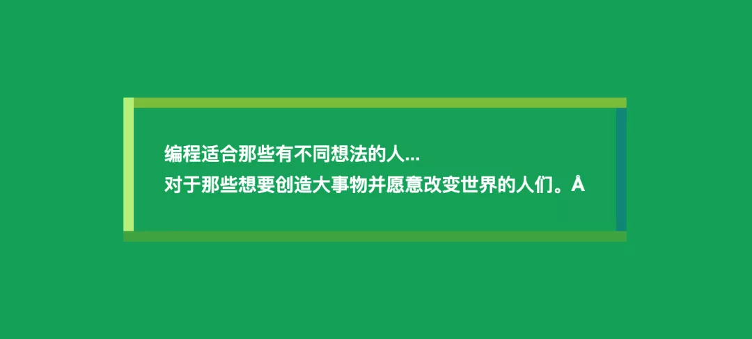
8、带有阴影的双CSS边框
#box {font-family: Arial;font-size: 18px;line-height: 30px;font-weight: bold;color: white;padding: 40px;box-shadow: 00010px#009688;border: 10px solid #009688;outline: dashed 10px white;}

9、多色CSS边框
#box {font-family: Arial;font-size: 18px;line-height: 30px;font-weight: bold;color: white;padding: 40px;background:linear-gradient(to top, #4caf50, #4caf50 10px, transparent 10px),linear-gradient(to right, #c1ef8c, #c1ef8c 10px, transparent 10px),linear-gradient(to bottom, #8bc34a, #8bc34a 10px, transparent 10px),linear-gradient(to left, #009688, #00968810px, transparent 10px);background-origin: border-box;}
**

若有收获,就点个赞吧
0 人点赞
