一. 单子布局组件
单子布局组件的含义是其只有一个子组件,可以通过设置一些属性设置该子组件所在的位置信息等; 比较常用的单子布局组件有:Align、Center、Padding、Container;
1.1. Align组件
1.1.1. Align介绍
iOS、Android、前端中Align通常只是一个属性而已,Flutter中Align也是一个组件;
const Align({Key key,this.alignment: Alignment.center, // 对齐方式,默认居中对齐this.widthFactor, // 宽度因子,不设置的情况,会尽可能大this.heightFactor, // 高度因子,不设置的情况,会尽可能大Widget child // 要布局的子Widget})
widthFactor和heightFactor:
- 子组件在父组件中的对齐方式必须有一个前提,就是父组件得知道自己的范围(宽度和高度);
widthFactor和heightFactor不设置,默认Align会尽可能的大(尽可能占据自己所在的父组件);- 可以进行设置,widthFactor设置为3,相对于Align的宽度是子组件跨度的3倍;
1.1.2. Align
class MyHomeBody extends StatelessWidget {@overrideWidget build(BuildContext context) {return Align(child: Icon(Icons.pets, size: 36, color: Colors.red),alignment: Alignment.bottomRight,widthFactor: 3,heightFactor: 3,);}}
1.2. Center组件
1.2.1. Center
Center组件继承自Align,只是将alignment设置为Alignment.center。class Center extends Align {const Center({Key key,double widthFactor,double heightFactor,Widget child}) : super(key: key, widthFactor: widthFactor, heightFactor: heightFactor, child: child);}
1.2.2. Center
class MyHomeBody extends StatelessWidget {@overrideWidget build(BuildContext context) {return Center(child: Icon(Icons.pets, size: 36, color: Colors.red),widthFactor: 3,heightFactor: 3,);}}
1.3. Padding组件
1.3.1. Padding
Padding也是一个Widget,但Flutter没有Margin-Widget,因为外边距也可以通过Padding来完成; Padding通常用于设置子Widget到父Widget的边距(父组件的内边距或子Widget的外边距);
const Padding({Key key,@required this.padding, // EdgeInsetsGeometry类型(抽象类),使用EdgeInsetsWidget child,})
1.3.2. Padding
class MyHomeBody extends StatelessWidget {@overrideWidget build(BuildContext context) {return Padding(padding: EdgeInsets.all(20),child: Text("莫听穿林打叶声,何妨吟啸且徐行。竹杖芒鞋轻胜马,谁怕?一蓑烟雨任平生。",style: TextStyle(color: Colors.redAccent,fontSize: 18),),);}}
1.4. Container组件
Container组件类似于其他Android中的View,iOS中的UIView。 如果需要一个视图,有一个背景颜色、图像、有固定的尺寸、需要一个边框、圆角等效果,那么就可以使用Container组件。
14.1. Container介绍
Container经常作为容器组件。
Container({this.alignment,this.padding, //容器内补白,属于decoration的装饰范围Color color, // 背景色Decoration decoration, // 背景装饰Decoration foregroundDecoration, //前景装饰double width,//容器的宽度double height, //容器的高度BoxConstraints constraints, //容器大小的限制条件this.margin,//容器外补白,不属于decoration的装饰范围this.transform, //变换this.child,})
- 容器的大小可以通过
width、height属性来指定,也可以通过constraints来指定,如果同时存在时,width、height优先。实际上Container内部会根据width、height来生成一个constraints; color和decoration是互斥的,实际上,当指定color时,Container内会自动创建一个decoration;-
1.4.2. Container
class MyHomeBody extends StatelessWidget {@overrideWidget build(BuildContext context) {return Center(child: Container(color: Color.fromRGBO(3, 3, 255, .5),width: 100,height: 100,child: Icon(Icons.pets, size: 32, color: Colors.white),),);}}
1.4.3. BoxDecoration
Container有一个非常重要的属性
decoration: 对应的类型是Decoration类型,是一个抽象类;
- 开发中,经常使用它的实现类BoxDecoration来进行实例化;
部分效果演示:const BoxDecoration({this.color, // 颜色,会和Container中的color属性冲突this.image, // 背景图片this.border, // 边框,对应类型是Border类型,里面每一个边框使用BorderSidethis.borderRadius, // 圆角效果this.boxShadow, // 阴影效果this.gradient, // 渐变效果this.backgroundBlendMode, // 背景混合this.shape = BoxShape.rectangle, // 形变})
class MyHomeBody extends StatelessWidget {@overrideWidget build(BuildContext context) {return Center(child: Container(// color: Color.fromRGBO(3, 3, 255, .5),width: 150,height: 150,child: Icon(Icons.pets, size: 32, color: Colors.white),decoration: BoxDecoration(color: Colors.amber, // 背景颜色border: Border.all(color: Colors.redAccent,width: 3,style: BorderStyle.solid), // 这里也可以使用Border.all统一设置// top: BorderSide(// color: Colors.redAccent,// width: 3,// style: BorderStyle.solid// ),borderRadius: BorderRadius.circular(20), // 这里也可以使用.only分别设置boxShadow: [BoxShadow(offset: Offset(5, 5),color: Colors.purple,blurRadius: 5)],// shape: BoxShape.circle, // 会和borderRadius冲突gradient: LinearGradient(colors: [Colors.green,Colors.red])),),);}}
1.4.4. 实现圆角图像
Container+BoxDecoration来实现圆角图像。class HomeContent extends StatelessWidget {@overrideWidget build(BuildContext context) {return Center(child: Container(width: 200,height: 200,decoration: BoxDecoration(borderRadius: BorderRadius.circular(20),image: DecorationImage(image: NetworkImage("https://tva1.sinaimg.cn/large/006y8mN6gy1g7aa03bmfpj3069069mx8.jpg"),)),),);}}
二. 多子布局组件
开发中,经常需要将多个Widget放在一起进行布局,比如水平方向、垂直方向排列,甚至有时候需要他们进行层叠,比如图片上面放一段文字等; 使用多子布局组件(Multi-child layout widgets); 常用的多子布局组件是Row、Column、Stack;
2.1. Flex组件
Row组件和Column组件继承自Flex组件
- Flex组件和Row、Column属性主要的区别就是多一个direction;
- 当direction的值为Axis.horizontal的时候,则是Row;
- 当direction的值为Axis.vertical的时候,则是Column;
2.1. Row组件
2.1.1. Row
Row组件用于将所有的子Widget排成一行
Row({Key key,MainAxisAlignment mainAxisAlignment = MainAxisAlignment.start, // 主轴对齐方式MainAxisSize mainAxisSize = MainAxisSize.max, // 水平方向尽可能大CrossAxisAlignment crossAxisAlignment = CrossAxisAlignment.center, // 交叉处对齐方式TextDirection textDirection, // 水平方向子widget的布局顺序(默认为系统当前Locale环境的文本方向(如中文、英语都是从左往右,而阿拉伯语是从右往左))VerticalDirection verticalDirection = VerticalDirection.down, // 表示Row纵轴(垂直)的对齐方向TextBaseline textBaseline, // 如果上面是baseline对齐方式,那么选择什么模式(有两种可选)List<Widget> children = const <Widget>[],})
部分属性详细解析:
mainAxisSize:
- 表示Row在主轴(水平)方向占用的空间,默认是
MainAxisSize.max,表示尽可能多的占用水平方向的空间,此时无论子widgets实际占用多少水平空间,Row的宽度始终等于水平方向的最大宽度 - 而
MainAxisSize.min表示尽可能少的占用水平空间,当子widgets没有占满水平剩余空间,则Row的实际宽度等于所有子widgets占用的的水平空间;
mainAxisAlignment:表示子Widgets在Row所占用的水平空间内对齐方式
- 如果mainAxisSize值为
MainAxisSize.min,则此属性无意义,因为子widgets的宽度等于Row的宽度 - 只有当mainAxisSize的值为
MainAxisSize.max时,此属性才有意义 MainAxisAlignment.start表示沿textDirection的初始方向对齐,- 如textDirection取值为
TextDirection.ltr时,则MainAxisAlignment.start表示左对齐,textDirection取值为TextDirection.rtl时表示从右对齐。 - 而
MainAxisAlignment.end和MainAxisAlignment.start正好相反; MainAxisAlignment.center表示居中对齐。
crossAxisAlignment:表示子Widgets在纵轴方向的对齐方式
- Row的高度等于子Widgets中最高的子元素高度
- 它的取值和MainAxisAlignment一样(包含
start、end、center三个值) 不同的是crossAxisAlignment的参考系是verticalDirection,即verticalDirection值为
VerticalDirection.down时crossAxisAlignment.start指顶部对齐,verticalDirection值为VerticalDirection.up时,crossAxisAlignment.start指底部对齐;而crossAxisAlignment.end和crossAxisAlignment.start正好相反;2.1.2. Row
class MyHomeBody extends StatelessWidget {@overrideWidget build(BuildContext context) {return Row(mainAxisAlignment: MainAxisAlignment.spaceEvenly,crossAxisAlignment: CrossAxisAlignment.end,mainAxisSize: MainAxisSize.max,children: <Widget>[Container(color: Colors.red, width: 60, height: 60),Container(color: Colors.blue, width: 80, height: 80),Container(color: Colors.green, width: 70, height: 70),Container(color: Colors.orange, width: 100, height: 100),],);}}
2.1.3. mainAxisSize
默认Row会尽可能占据多的宽度,让子Widget在其中进行排布,因为mainAxisSize属性默认值是
MainAxisSize.max。2.1.4. TextBaseline
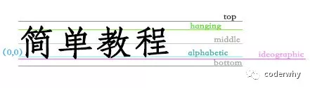
2.1.5. Expanded
在Row中如果希望Container Widget不要设置固定的宽度,而是占据剩余的部分?
可以使用Expanded来包裹 Container Widget,并且将它的宽度不设置值;flex属性,弹性系数,Row会根据两个Expanded的弹性系数来决定它们占据剩下空间的比例
class MyHomeBody extends StatelessWidget {@overrideWidget build(BuildContext context) {return Row(mainAxisAlignment: MainAxisAlignment.spaceEvenly,crossAxisAlignment: CrossAxisAlignment.end,mainAxisSize: MainAxisSize.min,children: <Widget>[Expanded(flex: 1,child: Container(color: Colors.red, height: 60),),Container(color: Colors.blue, width: 80, height: 80),Container(color: Colors.green, width: 70, height: 70),Expanded(flex: 1,child: Container(color: Colors.orange, height: 100),)],);}}
2.2. Column组件
Column组件用于将所有的子Widget排成一列;
2.2.1. Column
Column({Key key,MainAxisAlignment mainAxisAlignment = MainAxisAlignment.start,MainAxisSize mainAxisSize = MainAxisSize.max,CrossAxisAlignment crossAxisAlignment = CrossAxisAlignment.center,TextDirection textDirection,VerticalDirection verticalDirection = VerticalDirection.down,TextBaseline textBaseline,List<Widget> children = const <Widget>[],})
2.2.2. Column
class MyHomeBody extends StatelessWidget {@overrideWidget build(BuildContext context) {return Column(mainAxisAlignment: MainAxisAlignment.spaceEvenly,crossAxisAlignment: CrossAxisAlignment.end,mainAxisSize: MainAxisSize.min,children: <Widget>[Expanded(flex: 1,child: Container(color: Colors.red, width: 60),),Container(color: Colors.blue, width: 80, height: 80),Container(color: Colors.green, width: 70, height: 70),Expanded(flex: 1,child: Container(color: Colors.orange, width: 100),)],);}}
2.3. Stack组件
开发中,多个组件很有可能需要重叠显示,比如在一张图片上显示文字或者一个按钮等; Flutter中需要使用层叠布局Stack;
2.3.1. Stack
Stack({Key key,this.alignment = AlignmentDirectional.topStart,this.textDirection,this.fit = StackFit.loose,this.overflow = Overflow.clip,List<Widget> children = const <Widget>[],})
参数解析:
- alignment:此参数决定如何去对齐没有定位(没有使用Positioned)或部分定位的子widget。所谓部分定位,在这里特指没有在某一个轴上定位:**left、right为横轴,top、bottom为纵轴,只要包含某个轴上的一个定位属性就算在该轴上有定位。
- textDirection:和Row、Wrap的textDirection功能一样,都用于决定alignment对齐的参考系即:textDirection的值为
TextDirection.ltr,则alignment的start代表左,end代表右;textDirection的值为TextDirection.rtl,则alignment的start代表右,end代表左。 - fit:此参数用于决定没有定位的子widget如何去适应Stack的大小。
StackFit.loose表示使用子widget的大小,StackFit.expand表示扩伸到Stack的大小。 - overflow:此属性决定如何显示超出Stack显示空间的子widget,值为
Overflow.clip时,超出部分会被剪裁(隐藏),值为Overflow.visible时则不会。2.3.2. Stack
Stack会经常和Positioned一起使用,Positioned决定组件在Stack中的位置,实现类似绝对定位效果。class MyHomeBody extends StatelessWidget {@overrideWidget build(BuildContext context) {return Stack(children: <Widget>[Container(color: Colors.purple,width: 300,height: 300,),Positioned(left: 20,top: 20,child: Icon(Icons.favorite, size: 50, color: Colors.white)),Positioned(bottom: 20,right: 20,child: Text("hello world", style: TextStyle(fontSize: 20, color: Colors.white)),)],);}}

若有收获,就点个赞吧
0 人点赞


