如果Android原生开发让搞个阴影,那就把UI拉出去暴打一顿吧。当然,搞个带阴影的背景切图也是能勉强接受的。
用了Flutter之后发现写带阴影控件简直不要太简单,妈妈再也不用担心我画不出来好看的阴影了。
先上图: 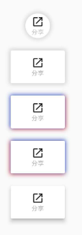
这次分享的例子是用Container的decoration属性实现的,当然你也可以使用Material家族的MaterialButton等,但是隐形的位置不可控。如上图第五个用的就是官方MaterialButton,阴影主要就是在下方,如果想改上下左右的阴影大小颜色等, 就没法实现了。不废话了,直接上代码:
第一个圆形button:
Widget _circleButton() {return Container(margin: EdgeInsets.only(left: 20),decoration: BoxDecoration(shape: BoxShape.circle, boxShadow: [///阴影颜色/位置/大小等BoxShadow(color: Colors.grey[300],offset: Offset(1, 1),///模糊阴影半径blurRadius: 5,),BoxShadow(color: Colors.grey[300], offset: Offset(-1, -1), blurRadius: 5),BoxShadow(color: Colors.grey[300], offset: Offset(1, -1), blurRadius: 5),BoxShadow(color: Colors.grey[300], offset: Offset(-1, 1), blurRadius: 5)]),child: CircleAvatar(radius: 20,backgroundColor: Colors.white,child: Column(mainAxisAlignment: MainAxisAlignment.center,children: <Widget>[Icon(Icons.launch,color: Colors.black87,size: 20,),Text("分享",style: TextStyle(color: Colors.grey[400],fontSize: 10,),)],),),);}Widget _rectangleButton() {return Container(margin: EdgeInsets.only(top: 20, left: 20),decoration: BoxDecoration(shape: BoxShape.rectangle, boxShadow: [BoxShadow(color: Colors.grey[300],offset: Offset(1, 1),blurRadius: 5,),BoxShadow(color: Colors.grey[300], offset: Offset(-1, -1), blurRadius: 5),BoxShadow(color: Colors.grey[300], offset: Offset(1, -1), blurRadius: 5),BoxShadow(color: Colors.grey[300], offset: Offset(-1, 1), blurRadius: 5)]),child: FlatButton(onPressed: () {},color: Colors.white,padding: EdgeInsets.only(left: 30, right: 30, top: 10, bottom: 10),child: Column(mainAxisAlignment: MainAxisAlignment.center,children: <Widget>[Icon(Icons.launch,color: Colors.black87,size: 20,),Text("分享",style: TextStyle(color: Colors.grey[400],fontSize: 10,),)],)),);}Widget _flatButton1() {return Container(margin: EdgeInsets.only(top: 20, left: 20),decoration: BoxDecoration(shape: BoxShape.rectangle, boxShadow: [//BoxShadow中Offset (1,1)右下,(-1,-1)左上,(1,-1)右上,(-1,1)左下BoxShadow(color: Colors.red,offset: Offset(1, 1),blurRadius: 5,),BoxShadow(color: Colors.blueAccent, offset: Offset(-1, -1), blurRadius: 5),]),child: FlatButton(onPressed: () {},color: Colors.white,padding: EdgeInsets.only(left: 30, right: 30, top: 10, bottom: 10),child: Column(mainAxisAlignment: MainAxisAlignment.center,children: <Widget>[Icon(Icons.launch,color: Colors.black87,size: 20,),Text("分享",style: TextStyle(color: Colors.grey[400],fontSize: 10,),)],)),);}Widget _flatButton2() {return Container(margin: EdgeInsets.only(top: 20, left: 20),decoration: BoxDecoration(shape: BoxShape.rectangle, boxShadow: [//BoxShadow中Offset (1,1)右下,(-1,-1)左上,(1,-1)右上,(-1,1)左下BoxShadow(color: Colors.red,offset: Offset(-1, 1),blurRadius: 5,),BoxShadow(color: Colors.blueAccent, offset: Offset(1, -1), blurRadius: 5),]),child: FlatButton(onPressed: () {},color: Colors.white,padding: EdgeInsets.only(left: 30, right: 30, top: 10, bottom: 10),child: Column(mainAxisAlignment: MainAxisAlignment.center,children: <Widget>[Icon(Icons.launch,color: Colors.black87,size: 20,),Text("分享",style: TextStyle(color: Colors.grey[400],fontSize: 10,),)],)),);}Widget _materialButton() {return Padding(padding: EdgeInsets.only(top: 20, left: 20),child: MaterialButton(padding: EdgeInsets.only(left: 30, right: 30, top: 10, bottom: 10),color: Colors.white,onPressed: () {},elevation: 5,child: Column(mainAxisAlignment: MainAxisAlignment.center,children: <Widget>[Icon(Icons.launch,color: Colors.black87,size: 20,),Text("分享",style: TextStyle(color: Colors.grey[400],fontSize: 10,),)],),),);}
decoration的boxShadow就是一系列的阴影组件,根据坐标位置和大小,颜色以及阴影模糊半径,想怎么实现就怎么实现,阴影实现就是这么简单。

若有收获,就点个赞吧
0 人点赞
