table,position,flexbox,grid,响应式布局(适配终端)
盒模型
margin => border => padding => content
- 标准模型(宽度和高度:content+padding+border)
- IE替代模型(宽度和高度:content)
box-sizing:border-box;
position
- static
- relative
- absolute
- fixed
注意: 外边距重叠 块的上外边距(margin-top)和下外边距(margin-bottom)会合并(折叠)为单个边距的最大值
float
做文字环绕的效果
- 尽量靠上,尽量靠左
- 父级的高度会坍塌
解决:清除浮动
// 父级元素设置 overflow:auto或者overflow:hidden.parent {overflow:hidden}// 父级元素设置.parent::after {content: ' ';clear: both; // 元素2侧没有浮动元素display: block; // 默认为inlinevisibility: hidden; // 不显示内容height: 0; // 不占高度}
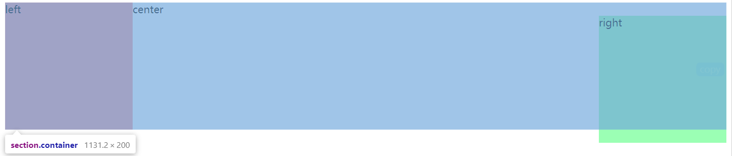
三栏布局
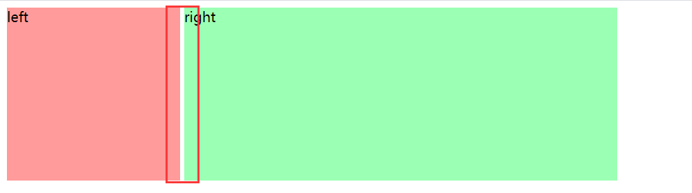
<section class="container"><style>.container {height: 200px;}.b1 {float: left;width: 200px;height: 100%;background-color: #ff9b9b;}.b2 {margin-left: 200px;margin-right: 200px;// padding-left: 100px;}.b3 {float: right;width: 200px;height: 100%;background-color: #9bffb4;}</style><div class="b1">left</div>// b3 在这 显示正常<div class="b3">right</div><div class="b2">center</div>// b3在最下面会出现下图情况// <div class="b3">right</div></section>
inline-block
需要考虑间隙的问题
<section class="container"><style>.container {height: 200px;width: 800px;font-size: 0;}.b1 {display: inline-block;width: 200px;height: 100%;background-color: #ff9b9b;font-size: 14px;}.b2 {display: inline-block;width: 600px;height: 100%;background-color: #9bffb4;font-size: 14px;}</style><div class="b1">left</div><div class="b2">right</div></section>
问题:会有间隙
解决:
- 父元素
font-size:0,子元素需设置font-size - 代码里去除空格或者加注释
<div class="b1">left</div><div class="b2">right</div>
BFC
响应式布局
- 隐藏+折行+自适应空间
- rem/viewport/media query

若有收获,就点个赞吧
0 人点赞
