Introduction
Material is a design system created by Google to help teams build high-quality digital experiences for Android, iOS, Flutter, and the web.
CONTENTS
Principles
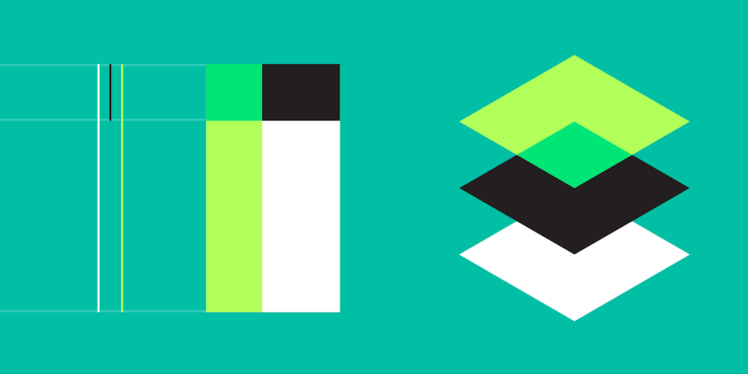
Material is the metaphor
Material Design is inspired by the physical world and its textures, including how they reflect light and cast shadows. Material surfaces reimagine the mediums of paper and ink.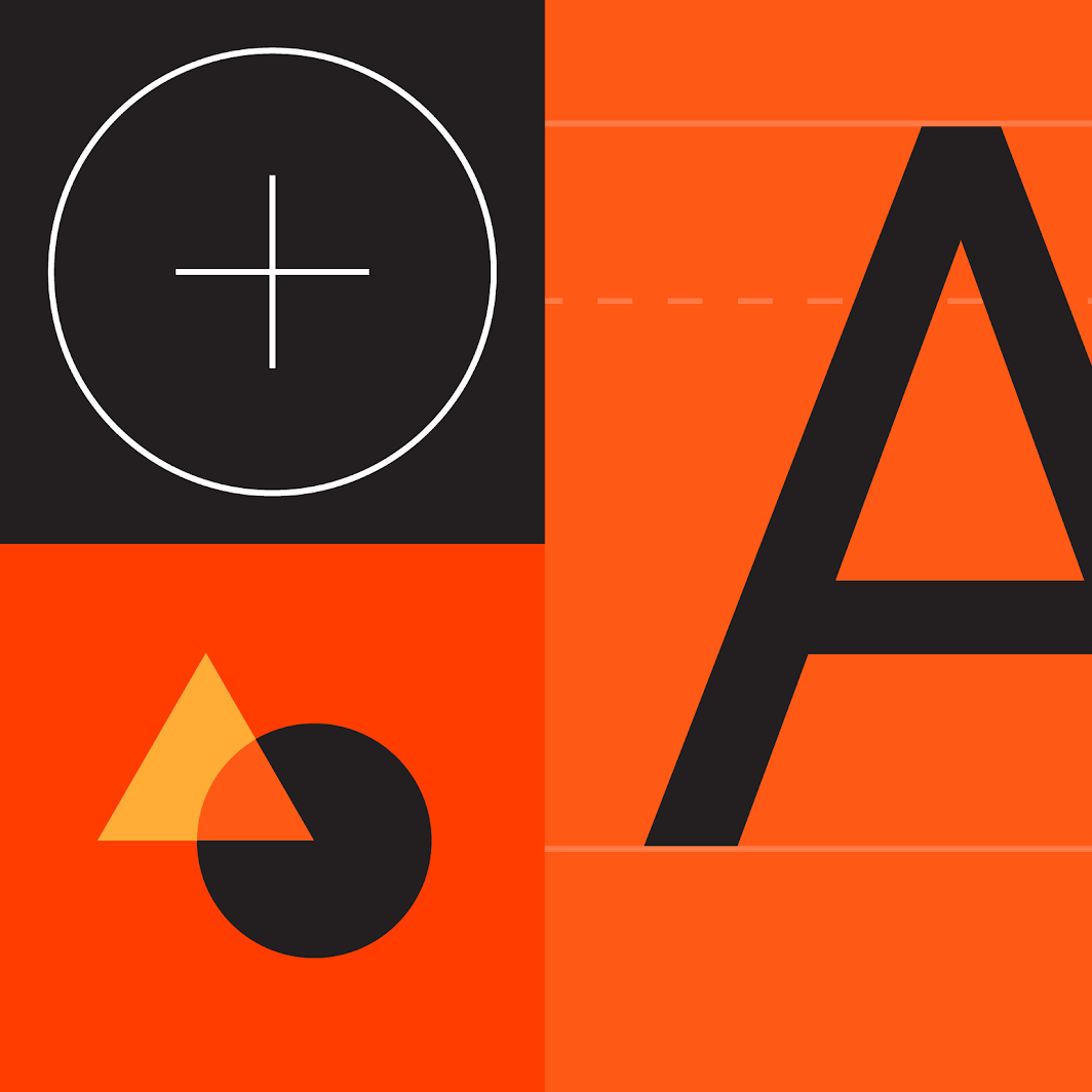
Bold, graphic, intentional
Material Design is guided by print design methods — typography, grids, space, scale, color, and imagery — to create hierarchy, meaning, and focus that immerse viewers in the experience.
Motion provides meaning
Motion focuses attention and maintains continuity through subtle feedback and coherent transitions. As elements appear on screen, they transform and reorganize the environment with interactions generating new transformations.
Components
Material Components are interactive building blocks for creating a user interface, and include a built-in states system to communicate focus, selection, activation, error, hover, press, drag, and disabled states. Component libraries are available for Android, iOS, Flutter, and the web.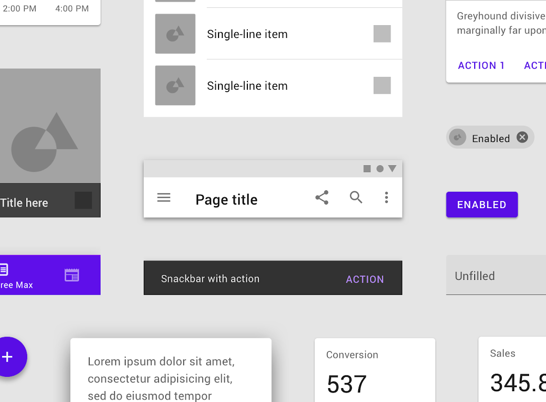
Examples of some of the many components Material Design offers for designing and developing interfaces.
Components cover a range of interface needs, including:
- Display: Placing and organizing content using components like cards, lists, and sheets.
- Navigation: Allowing users to move through the product using components like navigation drawers and tabs.
- Actions: Allowing users to perform tasks using components such as the floating action button.
- Input: Allowing users to enter information or make selections using components like text fields, chips, and selection controls.
Communication: Alerting users to key information and messages using components such as snackbars, banners, and dialogs.
Resources
Component guidelines covering usage, behaviors, and specifications
- Developer documentation and code for Android, iOS, the web, and Flutter
- Downloadable design files for Figma on the Resources page
Theming
Material Theming makes it easy to customize Material Design to match the look and feel of your brand, with built-in support and guidance for customizing colors, typography styles, and corner shapes.
The color, typography, and shape of Material Components like buttons can be easily modified to match your brand.
Resources
- Build a Material Theme using Glitch or Android Studio
- Material Theming guidance
- Example apps using Material Theming
Color
Material’s color system is an organized approach to applying color to a UI. Global color styles have semantic names and defined usage in components – primary, secondary (brand colors), surface, background, and error.
Every color also has a complementary color used for elements placed “on” top of it to promote consistency and accessible contrast.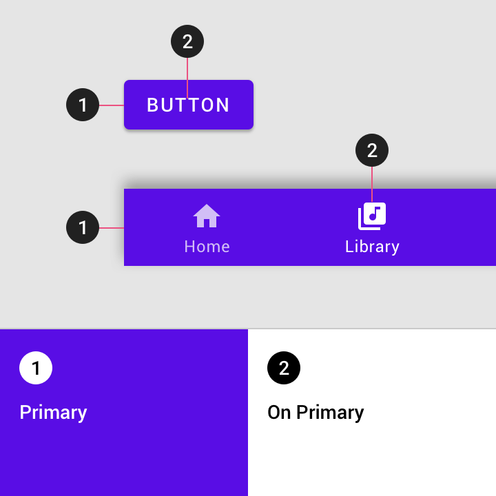
When the “Primary” color style (1) is used as a container color, the “On Primary” color (2) can be used for inner contents.
Typography
The Material Design type scale provides 13 typography styles for everything from headlines to body text and captions. Each style has a clear meaning and intended application within an interface.
Important attributes, such as the typeface, font weight, and letter case, can be modified to match your brand and design.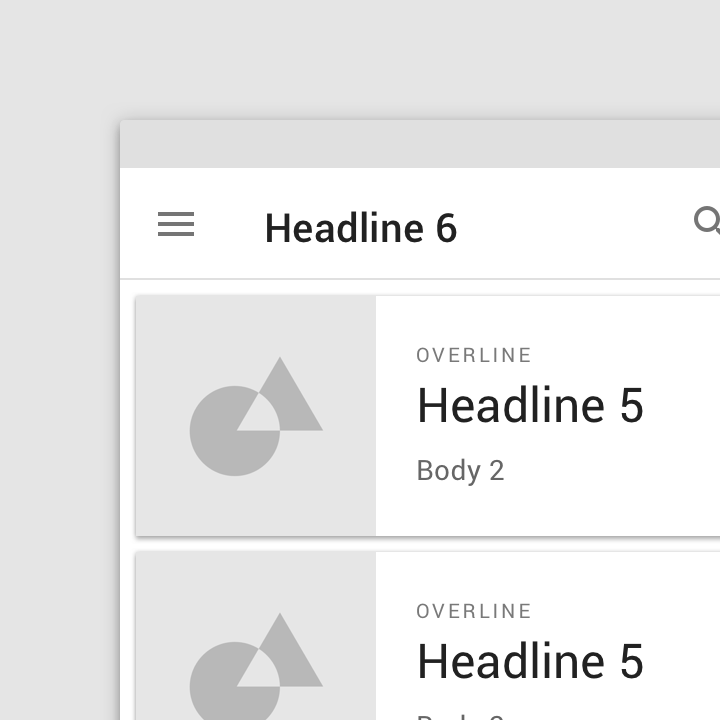
All typography in Material Components uses one of 13 global type styles.
Shape
Applying shape styles can help direct attention or identify components, communicate their state, and express your brand.
All Material Components are grouped into shape categories based on their size (small, medium, large). These global styles provide a way to quickly change the shape of similarly-sized components.
You can generate your own shape styles with the shape customization tool.
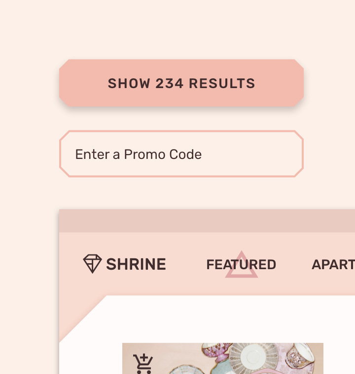
Shape categories allow a single style, such as a cut corner, to be applied at various sizes based on component size.
Updates
See the latest Material updates on our what’s new page, and sign up for the Material newsletter to get releases, announcements, and tips delivered directly to your inbox.

若有收获,就点个赞吧
0 人点赞
