<side-panel>
[[toc]]
<side-panel>是一个抽屉侧边栏。
子组件
支持任何组件作为自己的子组件,其中仅有<side-panel-menu>组件作为侧边菜单详细请看 这里,其他组件均为正文内容。
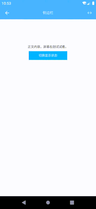
预览效果
示例代码
<template><div class="app"><side-panelref="reflectName"class="side_panel"width="380px"scrollbar="false"backgroundColor="#26c9ff"@itemClick="itemClick"@switchListener="switchListener"><!--侧滑菜单部分--><side-panel-menu class="panel_menu" name="菜单1"><text>菜单①</text></side-panel-menu><side-panel-menu class="panel_menu" name="菜单2"><text>菜单②</text></side-panel-menu><!--正文内容部分--><div class="content"><!--正文标题栏--><navbar class="content-navbar"><navbar-item type="left"><icon icon="navicon-round" class="content-navbar-icon" @click="menuToggle"></icon></navbar-item><navbar-item type="title"><text class="content-navbar-title">标题</text></navbar-item><navbar-item type="right"><icon icon="refresh" class="content-navbar-icon"></icon></navbar-item></navbar><!--正文内容--><scroller class="content-body"><text>正文内容,屏幕右划试试看。</text><text class="content-body-toggle" @click="menuToggle">切换显示状态</text></scroller></div></side-panel></div></template><style scoped>.app {width: 750px;flex: 1;}.side_panel {width: 750px;flex: 1;}.panel_menu {width: 380px;padding-top: 26px;padding-bottom: 26px;padding-right: 20px;padding-left: 20px;border-bottom-width: 1px;border-bottom-style: solid;border-bottom-color: #ffffff;}.content {width: 750px;}.content-navbar {width: 750px;height: 100px;}.content-navbar-icon {width: 100px;height: 100px;color: #ffffff;}.content-navbar-title {color: #ffffff;}.content-body {width: 750px;margin-top: 200px;justify-content: center;align-items: center;}.content-body-toggle {text-align: center;margin-top: 20px;padding-top: 20px;padding-bottom: 20px;padding-left: 30px;padding-right: 30px;color: #ffffff;background-color: #00B4FF;}</style><script>const eeui = app.requireModule('eeui');export default {methods: {itemClick(params) {eeui.toast("点击了" + (params.position + 1) + "项,name:" + params.name);},switchListener(params) {eeui.toast("侧边栏:" + (params.show?"显示了":"隐藏了"));},menuToggle() {this.$refs.reflectName.menuToggle();},}};</script>
配置参数
| 属性名 | 类型 | 描述 | 默认值 |
|---|---|---|---|
| width | Number |
侧边栏的宽度 | 380 |
| scrollbar | Boolean |
侧边栏是否显示滚动条 | false |
| backgroundColor | String |
侧边栏的背景颜色 | #ffffff |
例如:
<side-panelref="reflectName"width="380px"scrollbar="false"backgroundColor="#26c9ff"></side-panel>
事件回调 callback
/*** 组件加载完成*/@ready = function() { ... }/*** 侧边栏项目点击事件* 返回参数:data = {name: 'pageName', position: 1}*/@itemClick = function(data) { ... }/*** 侧边栏项目长按事件* 返回参数:data = {name: 'pageName', position: 1}*/@itemLongClick = function(data) { ... }/*** 侧边栏状态改变事件* 返回参数:data = {show: true}*/@switchListener = function(data) { ... }
调用方法 methods
/*** 显示侧边栏*/this.$refs.reflectName.menuShow();/*** 隐藏侧边栏*/this.$refs.reflectName.menuHide();/*** 切换侧边栏显示/隐藏*/this.$refs.reflectName.menuToggle();/*** 获取侧边栏是否显示* 返回参数:true|false*/this.$refs.reflectName.getMenuShow();/*** 设置侧边栏的宽度* 参数一:宽度*/this.$refs.reflectName.setMenuWidth(380);/*** 设置侧边栏是否显示滚动条* 参数一:true|false*/this.$refs.reflectName.setMenuScrollbar(true);/*** 设置侧边栏的背景颜色* 参数一:颜色代码*/this.$refs.reflectName.setMenuBackgroundColor('#0000ff');
side-panel-menu
支持放置任何内容作为侧边菜单。
side-panel-menu 示例代码
<side-panel-menu class="panel_menu" name="菜单1"><text>菜单①</text></side-panel-menu>
side-panel-menu 配置参数
说明:子组件类型;数据格式:字符串。
| 属性名 | 类型 | 描述 | 默认值 |
|---|---|---|---|
| name | String |
菜单名称(用于父组件点击返回的标识) | - |
例如:
<side-panel-menu name="menu_1">.....</side-panel-menu>

若有收获,就点个赞吧
0 人点赞
