- How Many Colors Are in the Rainbow? #section2
- When Colors Are Constant #section3
- The Subjectivity of Color Identification #section4
- An Argument for Relative Linguistics #section5
- An Argument for the Universal #section6
- Why All the Fuss over Color? #section7
- Color, Cultures, and Universal Associations #section8
- The Color Purple #section9
- “Pink Is for Girls, Blue Is for Boys” #section10
- Not All Colors Are Created Equal #section11
- How Is This Knowledge Useful? #section12
Color is, without a doubt, the visual element most often misunderstood and misused.
Article Continues Below
As mentioned earlier, when designing visual representations, color is often the first visual encoding that people use. It’s also quite limited to about a dozen, distinguishable colors. It’s a potent visual element, but one fraught with accessibility and perceptual problems. A general rule of thumb: Save color for things you want to draw people’s attention to. Start with grayscale representations. Add in color only later, where it might be really, really useful. That’s it. We can move along.
Except…
We need to dispel some popular beliefs about colors, beliefs that are often held up as truth, when, in fact, this is not the case. What’s presented in this short chapter is more foundational knowledge than tips for immediate application. But also, this understanding of color is—we found in retrospect—a powerful lens for understanding the concepts shared throughout this book. We see in our exploration of color this pattern: while many of the absolutes we cling to are social constructs (varying across cultures and over time), behind these changing constructs we also find some universal human constants.
How Many Colors Are in the Rainbow?#section2
Let’s begin by unpacking the statement above, suggesting that we only see about a dozen colors. Actually, the human eye can perceive many more colors, perhaps a million or so. Of this million, it’s estimated that each of us—individually—can distinguish somewhere between 130 to 300 colors.[1] But within a cultural group, we can only share about a dozen such colors. These limitations have little to do with personal visual acuity, but rather with language: a group’s ability to see and perceive a specific color is determined by language. Do we—as a society—share the same named color value associations?
We can talk about something being “red” and feel confident in what we all see. From both a developmental perspective and an anthropological perspective, red is the first color (after white and black) that most cultures are aware of. But if I describe something as magenta, do we have a shared agreement as to what that named concept refers to? Perhaps you see hot pink where I see a vibrant, purply-reddish color? Another example of this language-color dependency: the Russian language has a specific word for the color that we (English speakers) perceive as light blue.
To put this shared vocabulary into perspective, let’s start with something that is constant and beyond our language: the visible spectrum of light that is a rainbow.
When Colors Are Constant#section3
Around the world, the meteorological phenomenon we describe as a rainbow is a constant thing. Light refracts across water droplets to create a spectrum visible to humans. What we see as colors are the wavelengths of light visible to the human eye (see Figure 8.1). On either end of this visible spectrum are ultraviolet and infrared waves, which while invisible to human eyes, we know they are visible—that is, seen—by cameras and some nonhuman creatures (cats can see certain infrared frequencies, for example). Beyond this visible spectrum, we have things like gamma rays, X-rays, and radio waves, which all make up the entire spectrum of white light from the sun.
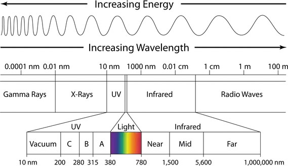
Figure 8.1 The visible light spectrum is a small part of the broader electromagnetic spectrum. Starting from this perspective helps us recognize the subjectivity of what is “seen” and how this might vary with different creatures and devices.
But let’s stay focused on the portion of this light spectrum that is visible to humans, the part that allows us to see. Within this spectrum, the rainbow possesses millions of color combinations, as there are no clearly defined boundaries between the colors.
Why then, should diverse cultures over thousands of years arrive at the same set of color language definitions? Are colors an absolute thing? Not exactly.
The Subjectivity of Color Identification#section4
Consider “ROYGBIV,” which is the acronym we all learned to name the colors of the rainbow. How did we conclude, at least in Western cultures, that a rainbow has seven colors? Why not five, or six, or eleven? We have Sir Isaac Newton to thank for this.
These seven colors—red, orange, yellow, green, blue, indigo, and violet—were not the result of any serious scientific inquiry. Rather, Newton was fond of the number seven. Just as there are seven musical notes in a scale, Newton believed that colors should follow a similar pattern. He might have connected this with seven days in the week or the seven known planets (at the time) in our universe. In other words, ROYGBIV was an arbitrary choice based on mystical superstition.
Understanding how we arrived at these seven colors sheds light on the subjective nature of color identification. This may also explain a bit about the challenge that so many people have with indigo—that odd color that sits somewhere between blue and violet—as a separate color!
But here is where we have to be careful, as we are stepping into a decades old debate: Do the number of basic color terms and the location of color category boundaries vary across languages? Or might there be a universal pattern to the color naming systems of all cultures?
This Wikipedia entry sums up the debate rather nicely:
There are two formal sides to the color debate, the universalist and the relativist. The universalist side claims that the biology of all human beings is all the same, so the development of color terminology has absolute universal constraints. The relativist side claims that the variability of color terms cross-linguistically (from language to language) points to more culture-specific phenomena. Because color exhibits both biological and linguistic aspects, it has become a deeply studied domain that addresses the relationship between language and thought. [2]
An Argument for Relative Linguistics#section5
We can characterize what Newton did as imposing an arbitrary number of colors upon the color spectrum. And we might conclude the same thing has happened throughout history as different people groups formed words to describe the world around them.
Indeed, various studies of diverse cultures reveal that “although the physiological basis of color vision is essentially the same for all humans with normal trichromatic color vision, there is considerable diversity in the way that different languages segment the continuum of visible colors.”[3] In other words, the rainbow has no natural boundaries; how we slice it up into colors is a subjective thing that varies across different cultures and time. (See Figure 8.2 for an illustration of this concept.) From one research paper, we learned that “some languages have been reported to use as few as two terms to describe all visible colors (Rosch Heider, 1972). Others have been reported to use between three and eleven (Berlin & Kay, 1969), while some (e.g., Russian; Davies and Corbett, 1997) may have twelve.”[4]
Specific examples in support of this argument:
- In Russian culture, there is no generic concept of blue. Rather, Russian makes an obligatory distinction between lighter blues (goluboy) and darker blues (siniy).
- The Japanese language (before the modern period) had just one word, Ao, for both blue and green. It wouldn’t be until the year 1,000 that the word midori would be introduced to distinguish a greenish shade of blue
- The Himba tribe from Namibia recognizes five basic colors.
- The Berinmo of Papua New Guinea has also reached a different conclusion as to the number of colors they recognize. While they draw no distinction between blue and green, they do “draw a distinction within what English speakers would consider yellow, with the word nol on one side and wor on the other.”
From this, we might conclude that the colors of the rainbow do seem to be arbitrary and dependent upon language. (Connect this with earlier points we made about thoughts and cognition as layers upon layers of prior associations.)

Figure 8.2 This comic from Randall Munroe of xkcd nicely illustrates the subjectivity of the shared color language for English speakers.[5]
But surely, you may be thinking, color identification isn’t entirely subjective? Here’s where the research gets interesting: despite these regional differences, a fascinating and consistent pattern begins to emerge.
An Argument for the Universal#section6
In the late 1960s, after studying color terms across many different languages, researchers Berlin and Kay introduced the idea that there were eleven possible basic color categories: white, black, red, green, yellow, blue, brown, purple, pink, orange, and gray. They argued a universalist theory: that color cognition is an innate, physiological process rather than a cultural one.
While their research has been challenged on different grounds, what has since followed is some agreement that for all noted language differences, there is a fixed order in which color names arise. The ways in which color language evolves across cultures suggest maybe there is a universal pattern governing the direction of patterns in the evolution of colors. All cultures start with the ability to distinguish dark things from light things. This is followed by the recognition of red. After that, it might be the addition of yellow or green. And blue always seems to come last. Not every language follows the exact same path, but they adhere to this same general pattern.
While the broader debate is not necessarily concluded, the general consensus seems to be that “in color, relativism appears to overlay a universalist foundation.”
Why All the Fuss over Color?#section7
While this is certainly fascinating, how is this useful? We include this as a mirror to challenge assumptions. If we turn a critical eye to the commonly accepted color wheel, this was likely influenced by Newton’s original color wheel sketch. But is this the “right” way to think about colors? Primary colors combine to make secondary colors, which in turn allow us to describe tertiary colors. We learn this from an early age and accept this way of thinking about color as absolute. But this is just one frame. This is just a way of thinking about visible light. And this singular perspective has limitations, especially when used in medical, scientific, and engineering visualizations. Research papers such as “Rainbow Color Map (Still) Considered Harmful”[6] question the value of the rainbow color spectrum in data visualization applications. The point is simple: there are other ways we might think about color. We can look at alternatives such as perceptually ordered color spectrums, an isoluminant color map, or simply use representations of color that aren’t derived from a wheel. Tools such as ColorBrewer 2.0[7] or the NASA Ames Color Tool[8] are incredibly useful for choosing a palette more suitable for visualizing data.
Since this book is concerned with how human creatures understand information, and because we so often use color to clarify, we felt it worth calling out that color and color recognition are not necessarily universal things, but are dependent on cognition, language, and biology. Understanding this allows us to challenge common assumptions about what is “true” about color and perception.
Which leads us to…
Color, Cultures, and Universal Associations#section8
Red means stop. Green means go. These concepts are universal, right? Not so fast. Across cultures, colors do not necessarily convey the same concept. And where we may have the same ability to identify a color, the associated meaning is just that—a learned association. Concluding that red means passion, vitality, or energy, because blood and fire are red things is not a universal idea. Neither is associating green with growth, just because nature involves so much green. (In some Chinese cultures, green can be associated with death.) At this point, please throw away those blog posts and posters about colors to choose for different cultures. While we’re keen to seek out human universals, color has proven to be something that does not have consistent meaning across cultures, or even within a culture group. Rather, the concepts we associate with particular colors are highly contextual and local, not just to a particular culture, but sometimes to smaller social groups. The meanings we point to—blue as a safe, corporate color, for example—are highly generalized assumptions, highly contextual, and mostly learned associations.
The Color Purple#section9
Let’s take purple, as an example. For many centuries, purple dye was expensive and rare. Procuring purple dye was labor intensive and required collecting a secretion from sea snails. Historian David Jacoby remarked that “twelve thousand snails of Murex brandaris yield no more than 1.4 g of pure dye, enough to colour only the trim of a single garment.”[9] As a result of this laborious process, the high cost of producing purple clothing made this color a status symbol among kings, queens, and other rulers. If you could afford to wear purple, you were quite wealthy. The conceptual association then is one of scarcity (in this case of a particular dye), signaling something to be valued above other things. While we may still see the lingering effects of this history (the Purple Heart is among the highest honors awarded for U.S. military service), the constraint of purple as a scarce color is no longer true. As such, this color is able to take on new meanings.
“Pink Is for Girls, Blue Is for Boys”#section10
To put this into perspective, let’s investigate the idea that “pink is for girls, blue is for boys.” From clothing choices to marketing toys to how we decorate bedrooms, most of us grow up believing there’s some inherent gender association built into the colors pink and blue. But, were we to travel back in time—just over 100 years—we’d find no such distinction. Or we might find the opposite association.
According to University of Maryland historian Jo B. Paoletti, author of Pink and Blue: Telling the Girls from the Boys in America, pink and blue weren’t always gender-specific colors. For centuries, young children mostly wore a functional white dress, and then in the early 20th century, things began to change. Consider this quote, pulled from the June 1918 issue of Earnshaw’s Infants’ Department, a trade publication:
The generally accepted rule is pink for the boys, and blue for the girls. The reason is that pink, being a more decided and stronger color, is more suitable for the boy, while blue, which is more delicate and dainty, is prettier for the girl.
A Smithsonian review of Paoletti’s book,[10] goes on to add:
Other sources said blue was flattering for blonds, pink for brunettes; or blue was for blue-eyed babies, pink for brown-eyed babies, according to Paoletti. In 1927, Time magazine printed a chart showing sex-appropriate colors for girls and boys according to leading U.S. stores. In Boston, Filene’s told parents to dress boys in pink. So did Best & Co. in New York City, Halle’s in Cleveland, and Marshall Field in Chicago.
By the 1940s, this association had flipped. Manufacturers had settled on pink for girls and blue for boys (see Figure 8.3 as an example of this association). Baby Boomers were raised with wearing the two colors. The point of this narrative? Color associations are learned things and can change over time. Even something as seemingly strong as the pink/blue binary was a manufactured association. To be clear, this doesn’t mean a color association is any less powerful in the moment, at a particular point in history, but these color associations do not represent any universal truths.

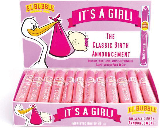
Figure 8.3 – The “blue is for boys and pink is for girls” concept was a manufactured one, originating in the first half of the 20th century.
Accordingly, it’s good to be wary of generalizations such as “blue is a safe, corporate color.” In the case of corporate associations, one generation’s “safe” may—depending on the media and actions—signal stuffy, inauthentic, or distrustful to the next generation. It all depends on the learned associations embraced—for a time—by a particular culture.
Not All Colors Are Created Equal#section11
We tend to treat our color palettes like interchangeable parts. Just pick a color. Or pick some colors we all find pleasing. Consider how many of us use the default color palettes built into software tools like Excel or PowerPoint. We usually choose a pleasing color palette, with the sentiment being “as long as you can distinguish one color from another, it’s okay, right?”
Not exactly. Not all colors are created equal. In terms of visual perception, some colors jump out at you while others recede into the background (see Figure 8.4). This is because of variances in hue and saturation.
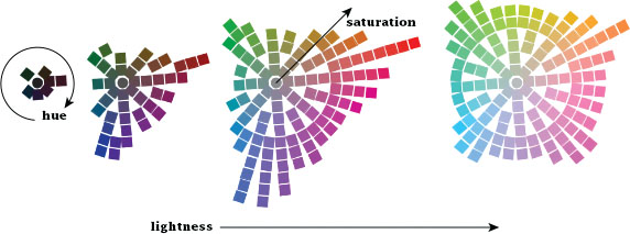
Figure 8.4 The range of colors perceived by humans is uneven.
(Equiluminant colors from the NASA Ames Color Tool)
A very bright color is going to draw more visual attention than a more desaturated color. This makes sense if we consider how things farther away from us tend to be hazier and desaturated. If something in the distance is noticed, it’s likely because it’s moving or contrasts with the surroundings.
This same disparity applies to color hues. We tend to look at color charts like this one and assume that the extreme ends of red, green, and blue are on equal footing.


However, because of the wavelengths of these colors and how our eyes perceive color, we see green as brighter than red, which itself is brighter than blue.
How Is This Knowledge Useful?#section12
While it’s nice to think that precise color values are interchangeable (setting aside any cultural associations), your perception doesn’t work that way. In the same way that certain frequencies on the radio come in clearer than others, certain colors do the same. You need to account for, or at least consider, the unevenness of color perception.
In the example in Figure 8.5, you see the same eight-segment pie chart. The example on the right uses all high-saturation colors while the example on the left mixes high- and low- saturation colors.
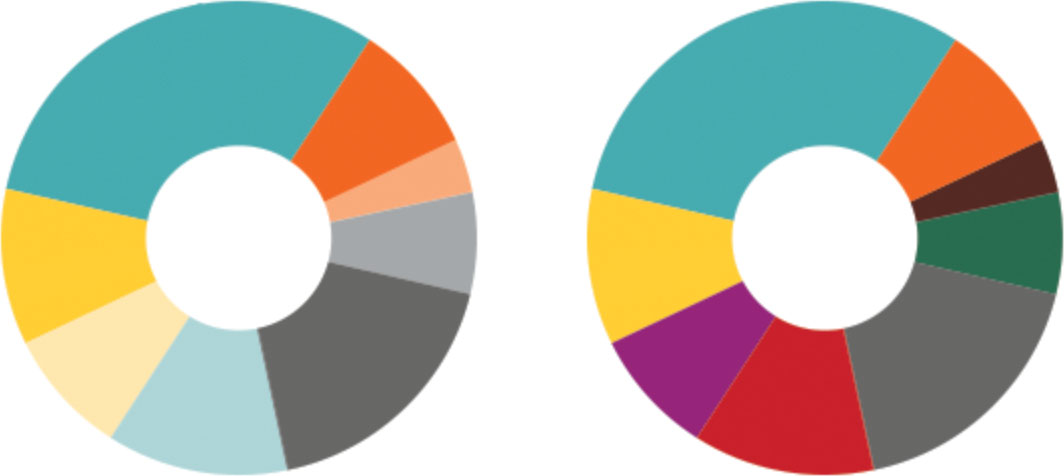
Figure 8.5 Two pie charts showing identical information. The chart on the left uses colors of mixed saturation, meaning some colors will naturally stand out more than others, making this an uneven representation.
Functionally, these both communicate the same thing. But consider how you perceive each. With the example on the right, use of high saturation is consistent; no color should be more prominent than another. But when you mix high and low saturation, as with the example on the left, the higher saturation colors tend to “pop” more—drawing you to these segments. While this chart is more aesthetically pleasing (as it uses half as many colors), it’s also a bit misleading—notice how your eye is drawn to the orange segment in the upper right. The lesson? Assuming the goal is objectivity and truthfulness, you’d want to avoid mixing saturations and hues that are unevenly perceived. If the goal were the opposite, to draw attention away from or toward a particular bit of data, you could manipulate perception by adjusting saturation and hue (not that this is being recommended!). This ability to direct attention by using bolder colors is something that everyone should be aware of and intentional about.
https://alistapart.com/article/figure-it-out/

