take “KIRC” for example
突变数据下载
https://portal.gdc.cancer.gov/repository
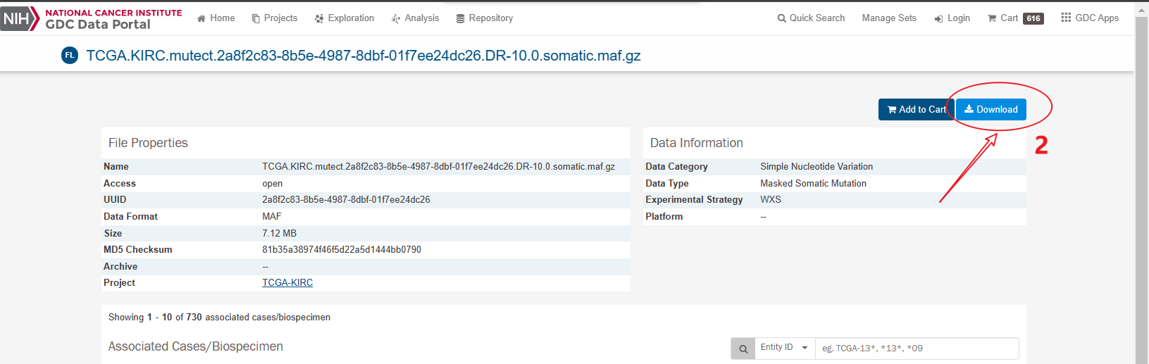
勾选:

然后点:
下载之后解压,得到一个tar.gz文件
数据读取
note:我的临床矩阵之前根据某些条件分成了三组,所以下面都是三组一起跑的
library(maftools)library(dplyr)library(stringr)library(RColorBrewer)library(ggplot2)library(ggpubr)library(patchwork)library(tibble)load('Rdata/train_exp_cl.Rdata') # 读取表达矩阵和临床信息laml = read.maf(maf = 'import/TCGA.KIRC.mutect.somatic.maf.gz') #读取突变数据
计算突变负荷
没必要打包 一步一步跑吧
tmb = tmb(maf = laml)tmb$Tumor_Sample_Barcode <- stringr::str_sub(tmb$Tumor_Sample_Barcode,1,12)tmb <- as.data.frame(tmb)tmb <- tmb[tmb$Tumor_Sample_Barcode %in% rownames(cl),]rownames(tmb) = tmb[,1]cl = cl[match(rownames(tmb), rownames(cl)),]table(rownames(cl) == rownames(tmb)) # 注意这里要是TRUEtmb$group = cl$groupp1 = ggplot(tmb, aes(group, total_perMB_log))+geom_boxplot(aes(fill= group), show.legend = F) +scale_fill_manual(values = c('#86d1d4','#98b4dc','#e5c9e0'))+geom_jitter(size = 1, alpha = 0.5)+theme_classic()+xlab("")+ylab("TMB")+# labs(title="normal&tumor")+theme(plot.title = element_text(hjust = 0.5))+stat_compare_means(aes(label = ..p.signif..),comparisons = list(c("group1","group2"),c("group2","group3"),c("group1","group3")),na.rm = FALSE)+theme(panel.background = element_rect(colour = "black",size = 1))
突变分类
MAF = laml@dataMAF$Tumor_Sample_Barcode <- str_sub(MAF$Tumor_Sample_Barcode,1,12)vc_cols <- RColorBrewer::brewer.pal(n = 9, name = 'Paired')names(vc_cols) = names(table(MAF$Variant_Classification))[order(table(MAF$Variant_Classification),decreasing = T)]# cl的group列是我的三个分组!!!group1 <- as.character(MAF[MAF$Tumor_Sample_Barcode %in% rownames(cl[cl$group == 'group1',]),]$Variant_Classification)group2 <- as.character(MAF[MAF$Tumor_Sample_Barcode %in% rownames(cl[cl$group == 'group2',]),]$Variant_Classification)group3 <- as.character(MAF[MAF$Tumor_Sample_Barcode %in% rownames(cl[cl$group == 'group3',]),]$Variant_Classification)data = data.frame(group = rep(c('group1','group2','group3'),c(4337,6266,627)),mut = c(group1, group2, group3))level = names(table(MAF$Variant_Classification))[order(table(MAF$Variant_Classification),decreasing = T)]data$mut = factor(data$mut, levels = rev(level))p2 = ggplot(data, aes(group, fill = mut))+geom_bar(position = 'fill')+scale_fill_manual(values = vc_cols)+coord_flip()+theme_classic()+theme(panel.border = element_rect(fill=NA,color="black",size=1,linetype="solid"))
突变类型
vt_cols <- RColorBrewer::brewer.pal(n = 3, name = 'Set3')names(vt_cols) <- c("DEL", "INS", "SNP")group1 <- as.character(MAF[MAF$Tumor_Sample_Barcode %in% rownames(cl[cl$group == 'group1',]),]$Variant_Type)group2 <- as.character(MAF[MAF$Tumor_Sample_Barcode %in% rownames(cl[cl$group == 'group2',]),]$Variant_Type)group3 <- as.character(MAF[MAF$Tumor_Sample_Barcode %in% rownames(cl[cl$group == 'group3',]),]$Variant_Type)data = data.frame(group = rep(c('group1','group2','group3'),c(length(group1),length(group2),length(group3))),mut = c(group1, group2, group3))p3 = ggplot(data, aes(group, fill = mut))+geom_bar(position = 'fill')+scale_fill_manual(values = vt_cols)+coord_flip()+theme_classic()+theme(panel.border = element_rect(fill=NA,color="black",size=1,linetype="solid"))
突变top10基因
group = c('group1','group2','group3')p = list()for (i in 1:3){maf <- MAF[MAF$Tumor_Sample_Barcode %in% rownames(cl[cl$group == group[i],]),]df <- as.data.frame(table(maf$Hugo_Symbol))df <- df[order(df$Freq, decreasing = T),]df <- maf[maf$Hugo_Symbol %in% df$Var1[1:10],]df <- df[,c("Hugo_Symbol", "Variant_Classification")]df$Hugo_Symbol <- factor(df$Hugo_Symbol,levels = names(table(df$Hugo_Symbol))[order(table(df$Hugo_Symbol),decreasing = T)])df$Variant_Classification <- factor(df$Variant_Classification,levels = names(table(df$Variant_Classification))[order(table(df$Variant_Classification),decreasing = T)])p[[i]] <- ggplot(df, aes(Hugo_Symbol, fill = Variant_Classification))+geom_bar(position = 'stack')+scale_fill_manual(values=vc_cols)+theme_classic()+xlab("")+labs(title = paste("top10 mutated genes of", group[i], collapse = ' '))+# theme(legend.position = "")+scale_y_continuous(expand = c(0,0))+coord_flip()+theme(panel.background = element_rect(colour = "black",size = 1))}p[[1]]+p[[2]]+p[[3]]
瀑布图
oncoplot(maf = laml, top = 15, fontSize = 0.7, colors = vc_cols)
看图 ↓

若有收获,就点个赞吧
0 人点赞
