作用类似于html的div和span等标签。对页面进行排版,在传统的winform中,一般把窗体页面的左上角作为坐标的原点,控件都通过这个坐标原点进行布局,winform中的控件就两种关系,相邻和叠加。
而wpf中,控件都是用xaml写,控件可以包含另外的控件。所以wpf的控件比winform就多了一层关系,包含。
★Grid
相当于表格table,有行row和列col。
用的最频繁的布局。
定义布局
一个Grid(表格)里面设置
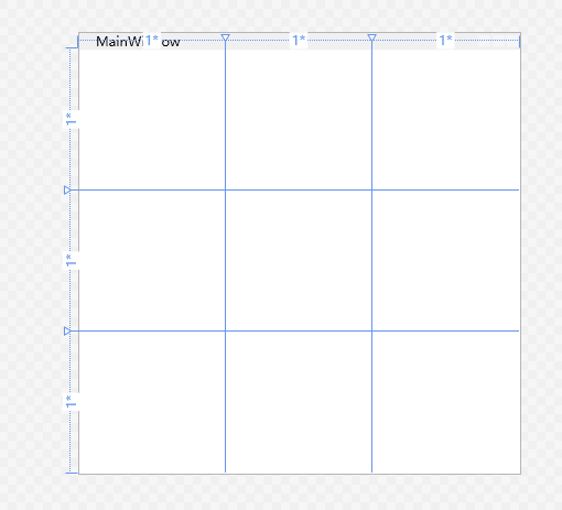
Grid.RowDefinitions和Grid.ColumnDefinitions代表行和列的集合。里面分别设置RowDefinition和ColumnDefinition表示这个Grid有几行,几列。 可以给每行每列设置高度,宽度
用的最多的布局,但是这种写法写html习惯了,真的好奇怪。wpf的grid写法打个比喻:
有一个国家叫(Grid),民众(控件)都要住在这个国家里面。由于考虑到民众越来越,就需要划分区域,这时候,掌管这个国家的天理(写代码的人)就在这个国家里面,用规则(RowDefinitions和ColumnDefinitions)规划好整个国家的区域。 现在这个国家里面有A城,B省,C市,D区…… 天理给每个民众发放一个类似身份证的,区域证(Grid.Row和Grid.Column),持有证件的居民将自动传送到对应的区域。规则定的,只有持有区域证的才能进入进对应的区域,其余方式都不能通行。 而有些居民他没有证,黑户口,[0,0]区域就是给黑户口用的,没有证的都挤在这里。
<Grid><Grid.RowDefinitions><RowDefinition></RowDefinition><RowDefinition></RowDefinition><RowDefinition></RowDefinition></Grid.RowDefinitions><Grid.ColumnDefinitions><ColumnDefinition></ColumnDefinition><ColumnDefinition></ColumnDefinition><ColumnDefinition></ColumnDefinition></Grid.ColumnDefinitions></Grid>
布局宽高
固定值
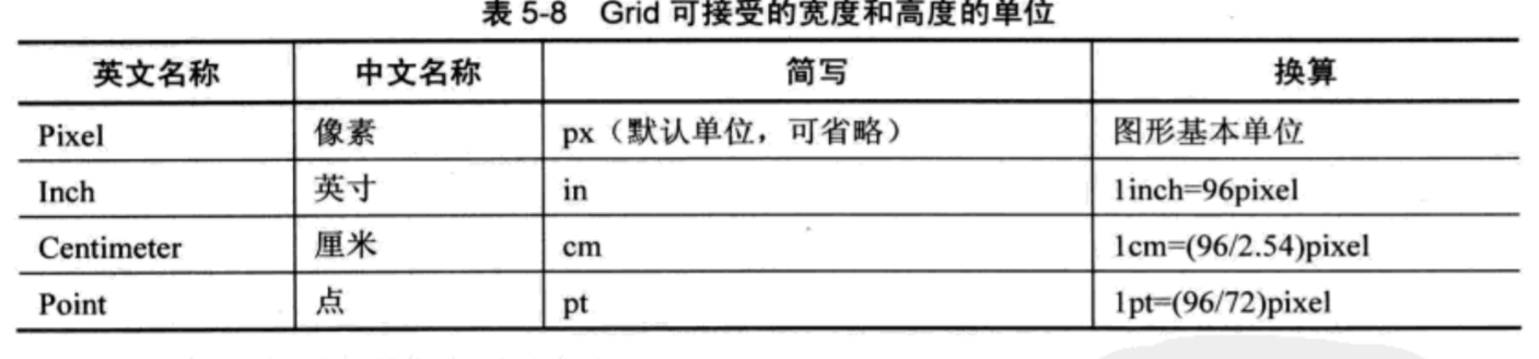
可以给每行设置高度,每列设置宽度,单位默认是像素(不写单位就是默认)
<Grid><Grid.RowDefinitions><RowDefinition Height="50"/><RowDefinition Height="50px"/><RowDefinition Height="1in"/><RowDefinition Height="1cm"/><RowDefinition Height="10pt"/><RowDefinition/></Grid.RowDefinitions></Grid>
单位
比例值
double数值后加一个星号()
把所有比例值的数值加起来,当做分母,占用的比例值就是分子。
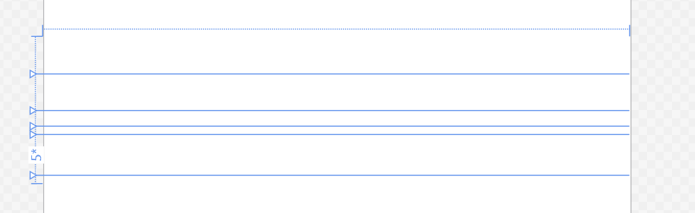
这里的例子:Grid高200像素,有5行。前面两行分别50像素,占了100像素。后面三行都是比例值,2+1+5=8,分母做8.意思是把剩下的100像素分成8份,2占2份,2/8100=25px,1占一份,1/8100=12.5px,5占5份,5/8*100=62.5px
<Grid Height="200"><Grid.RowDefinitions><RowDefinition Height="50"/><RowDefinition Height="50px"/><RowDefinition Height="2*"/><RowDefinition Height="1*"/><RowDefinition Height="5*"/><RowDefinition/></Grid.RowDefinitions></Grid>
比例值最大的特点是当UI的整体尺寸改变后,它会保持固有的比例
自动值
字符串Auto
如果你使用自动值(字符串“Auto”)为行高或列宽赋值,那么行高或列宽的实际值将由行列内控件的高度和宽度决定,通俗点讲就是控件会把行列“撑”到合适的宽度和高度。如果行列中没有控件,则行高和列宽均为0。
布局内放置元素
放置在Grid里面的元素会被附加一些Grid的属性。
如果要在Grid里面放东西,像下面这样写,在Grid标签里面写上要放的东西,然后用Grid.Row和Grid.Column来指定放在这个元素的哪一行哪一列,索引从0开始
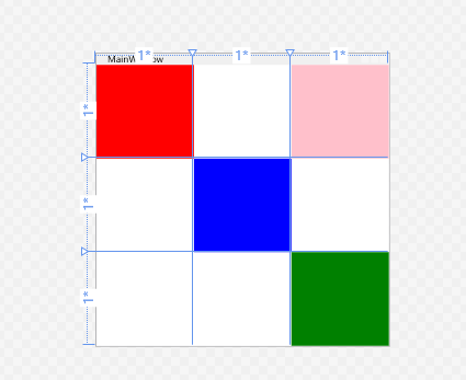
<Grid><Grid.RowDefinitions><RowDefinition></RowDefinition><RowDefinition></RowDefinition><RowDefinition></RowDefinition></Grid.RowDefinitions><Grid.ColumnDefinitions><ColumnDefinition></ColumnDefinition><ColumnDefinition></ColumnDefinition><ColumnDefinition></ColumnDefinition></Grid.ColumnDefinitions><Border Background="red" Grid.Row="0" Grid.Column="0"></Border><Border Background="blue" Grid.Row="1" Grid.Column="1"></Border><Border Background="green" Grid.Row="2" Grid.Column="2"></Border><Border Background="pink" Grid.Row="0" Grid.Column="2"></Border></Grid>
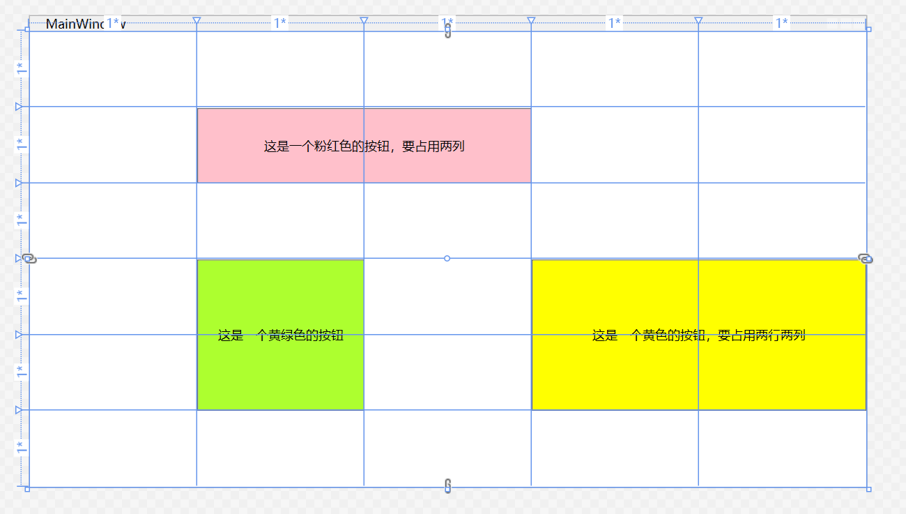
跨行跨列
<Grid><Grid.RowDefinitions><RowDefinition /><RowDefinition /><RowDefinition /><RowDefinition /><RowDefinition /><RowDefinition/></Grid.RowDefinitions><Grid.ColumnDefinitions><ColumnDefinition/><ColumnDefinition/><ColumnDefinition/><ColumnDefinition/><ColumnDefinition/></Grid.ColumnDefinitions><Button Grid.Column="1" Grid.Row="1" Background="pink" Grid.ColumnSpan="2">这是一个粉红色的按钮,要占用两列</Button><Button Grid.Column="1" Grid.Row="3" Background="GreenYellow" Grid.RowSpan="2">这是一个黄绿色的按钮</Button><Button Grid.Column="3" Grid.Row="3" Background="Yellow" Grid.ColumnSpan="2" Grid.RowSpan="2">这是一个黄色的按钮,要占用两行两列</Button></Grid>
StackPanel
StackPanel可以把内部元素在纵向或横向上紧凑排列、形成栈式布局,通俗地讲就是把内部元素像垒积木一样“撂起来”。垒积木大家都玩过,当把排在前面的积木块抽掉之后排在它后面的元素会整体向前移动、补占原有元素的空间。
基于这个特点,StackPanel适合的场合有:
- 需要紧密排列的场景,比如侧边栏菜单,横着的菜单等
- 移除某个元素能够自动补缺的场景
Orientation属性决定StackPanel是横着排列还是竖着排列,默认是竖着
- Horizontal:水平排列
- Vertical:垂直排列
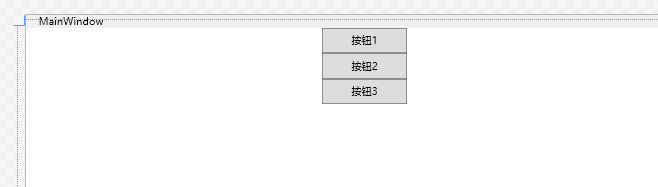
<StackPanel><Button Height="30" Width="100">按钮1</Button><Button Height="30" Width="100">按钮2</Button><Button Height="30" Width="100">按钮3</Button></StackPanel>
Canvas
画布。
在Canvas里面就像在画布上画画一样。放置在Canvas里面的元素被附加了Canvas.Top,Left,Right,Bottom等属性,可以只有的控制元素的位置,可以重叠。
适用于:
- 一经设计就不会改变的小型布局
- 艺术较强的布局,图标图形等
- 依赖的坐标的动画等
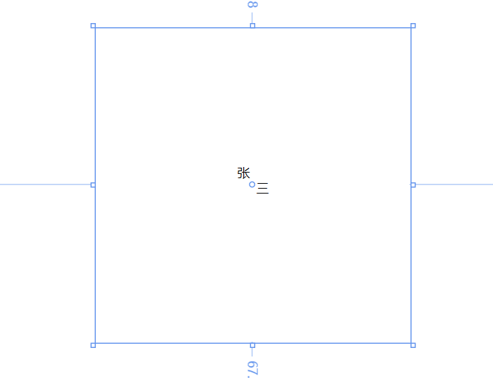
<Canvas Width="300" Height="300"><Label Canvas.Left="130" Canvas.Top="125">张</Label><Label Canvas.Right="130" Canvas.Bottom="135">三</Label></Canvas>
WrapPanel
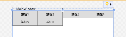
和StackPanel一样,区别是WrapPanel,内部采用的是流式布局,超过了外层容器的宽度高度会自动换行 ```xml<WrapPanel Orientation="Horizontal"><Button Height="30" Width="100">按钮1</Button><Button Height="30" Width="100">按钮2</Button><Button Height="30" Width="100">按钮3</Button><Button Height="30" Width="100">按钮4</Button><Button Height="30" Width="100">按钮5</Button><Button Height="30" Width="100">按钮6</Button></WrapPanel>
//外层容器宽400
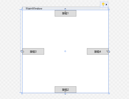
<a name="s8jmF"></a># DockPanelDockPanel内的元素会被附加上DockPanel.Dock这个属性。<br />可以设置里面元素的边界,靠近上面还是靠近下面,左边还是右边,像船舶一样停靠。> 里面有个重要的属性`LastChildFill`,默认为`true`。当这个属性为true时,DockPanel内最后一个元素的 DockPanel.Dock 属性值会被忽略,这个元素会把DockPanel内部所有剩余空间充满```xml<DockPanel LastChildFill="False"><Button Height="30" Width="100" DockPanel.Dock="Top">按钮1</Button><Button Height="30" Width="100" DockPanel.Dock="Bottom">按钮2</Button><Button Height="30" Width="100" DockPanel.Dock="Left">按钮3</Button><Button Height="30" Width="100" DockPanel.Dock="Right">按钮4</Button></DockPanel>

若有收获,就点个赞吧
0 人点赞
