在Framer X中,我们引入了代码组件,即基于React可以从头开始编程的可重用元素。您可以创建自己的文件,也可以从商店中安装它们。在这些组件中,您可以定义自己的属性,并允许其他人根据自己的喜好对其进行自定义。本质上,这使您可以破解Framer的UI,并设计自己的属性面板。在本文中,我将介绍所有受支持的属性控件,它们的工作方式,并为您提供入门示例。让我们开始吧。
工程文件:Code Components - Property Controls.framerx.zip
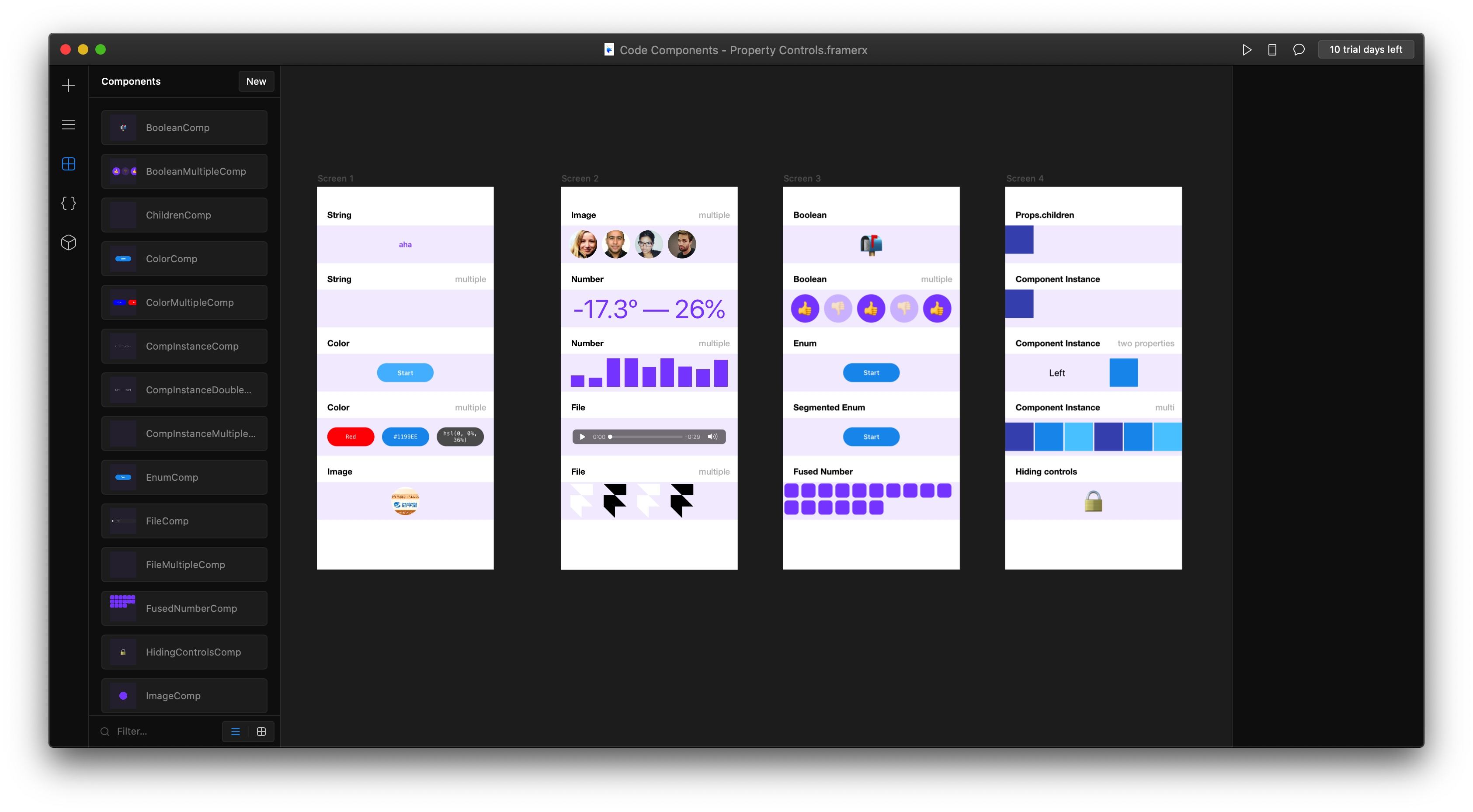
这个工程文件中介绍了主要的几种property controls的类型。
主要类型
这种property controls,简单点说,就是添加了控制属性面板。
第一种:Text(string)
这种可以更改code components的文字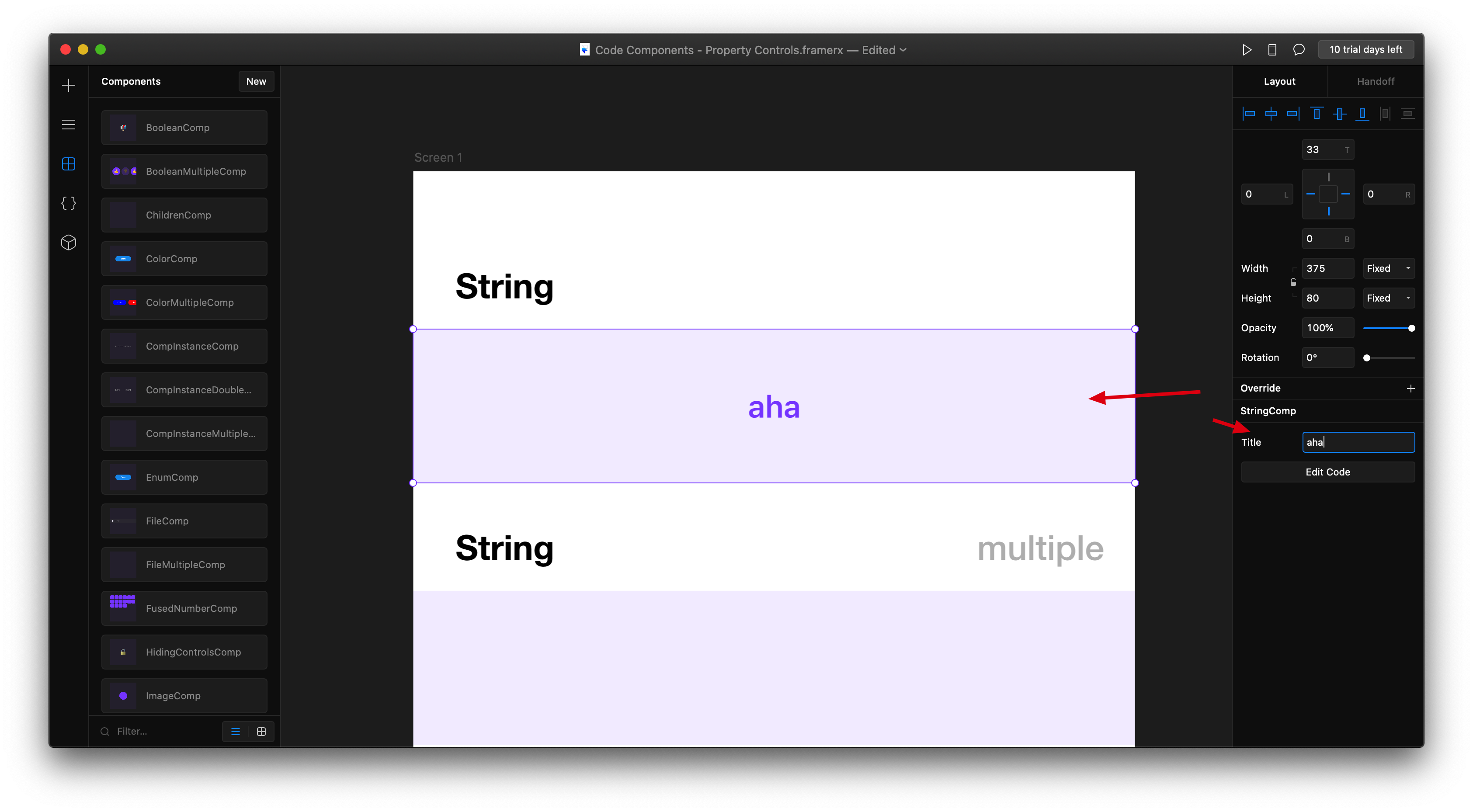
import * as React from "react";import { Frame, addPropertyControls, ControlType } from "framer";export function StringComp(props) {return (<Framesize="100%"background="rgba(136, 85, 255, 0.1)"color="#8855FF"style={{fontSize: 16,fontWeight: 600}}>{props.title}</Frame>);}StringComp.defaultProps = {title: "Default title"};addPropertyControls(StringComp, {title: {type: ControlType.String,title: "Title",placeholder: "Set title"}});
第二种:color
这种可以控制代码组件的颜色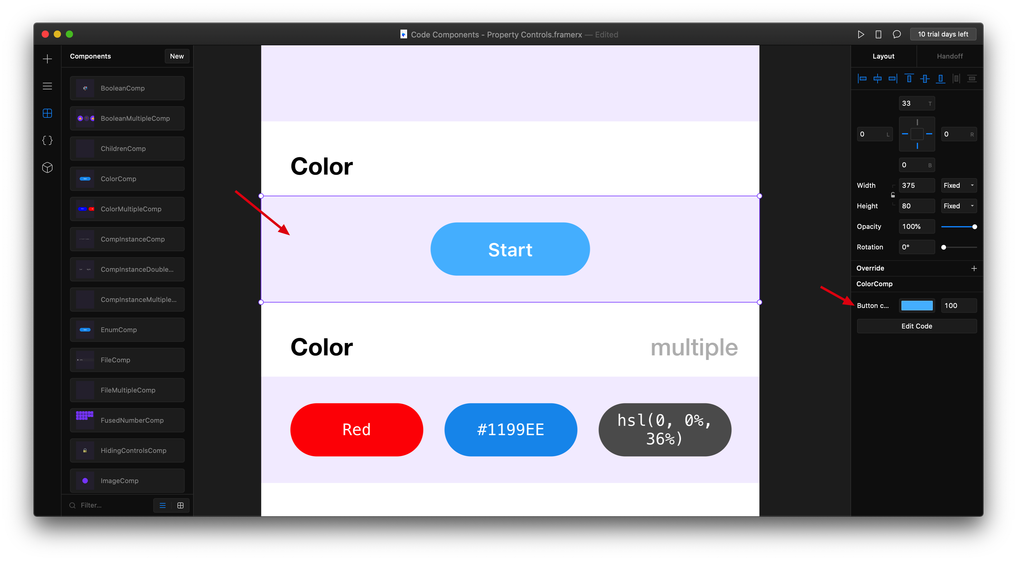
import * as React from "react";
import { Frame, addPropertyControls, ControlType } from "framer";

export function ColorComp(props) {
  return (
    <Frame size="100%" background="rgba(136, 85, 255, 0.1)">
      <Frame
        width={120}
        height={40}
        borderRadius={20}
        center
        color="#fff"
        style={{ fontSize: 14, fontWeight: 600 }}
        background={props.buttonColor}
      >
        Start
      </Frame>
    </Frame>
  );
}

ColorComp.defaultProps = {
  buttonColor: "#1199EE"
};

addPropertyControls(ColorComp, {
  buttonColor: {
    type: ControlType.Color,
    title: "Button color"
  }
});
第三种:image
这种可以通过加载文件的形式,添加图片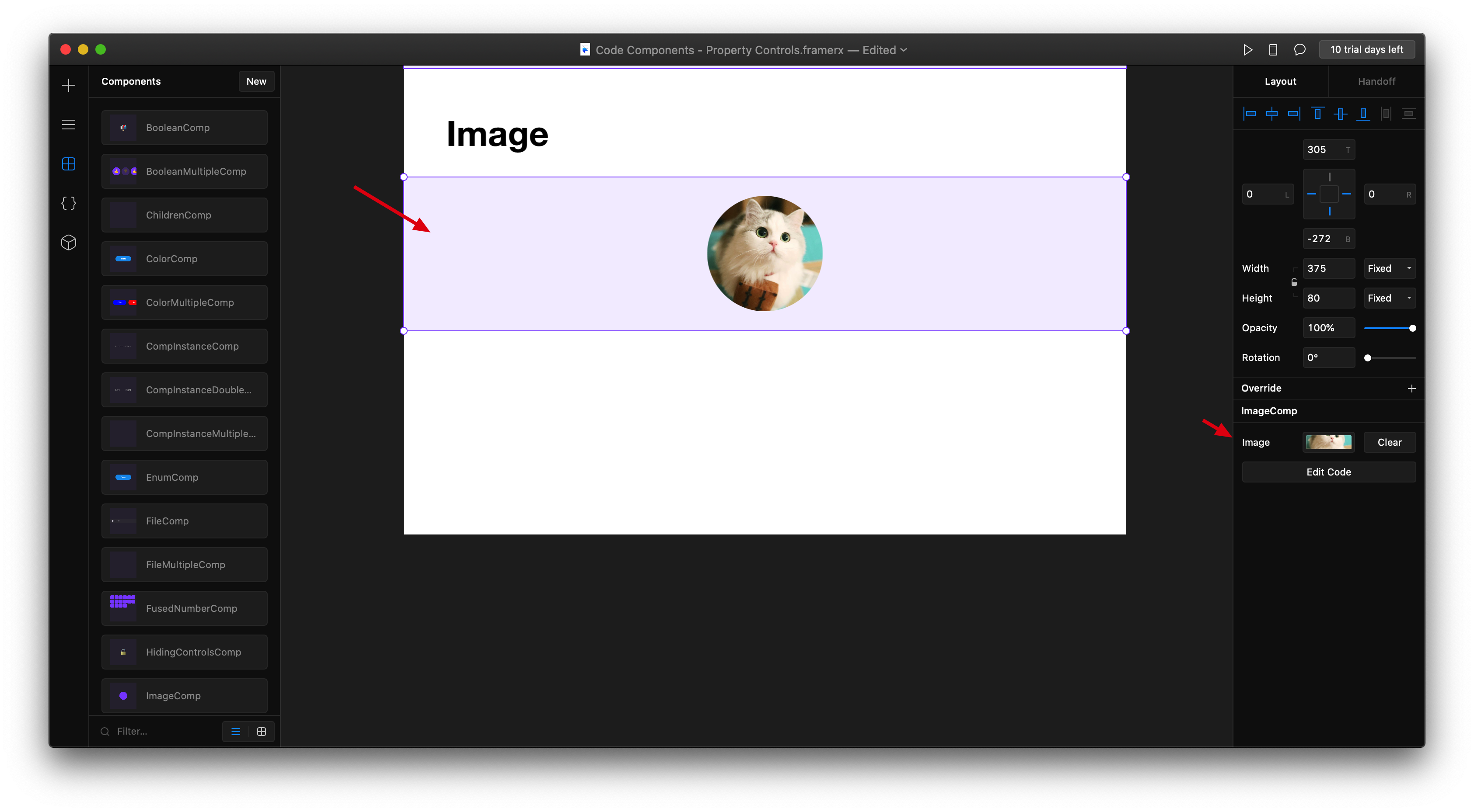
import * as React from "react";
import { Frame, addPropertyControls, ControlType } from "framer";

export function ImageComp(props) {
  return (
    <Frame size="100%" background="rgba(136, 85, 255, 0.1)">
      <Frame
        size={60}
        borderRadius={30}
        center
        background={props.avatar ? { src: props.avatar } : "#8855FF"}
      />
    </Frame>
  );
}

ImageComp.defaultProps = {
  avatar: null
};

addPropertyControls(ImageComp, {
  avatar: {
    type: ControlType.Image,
    title: "Image"
  }
});
第四种:Number
这种可以更改数字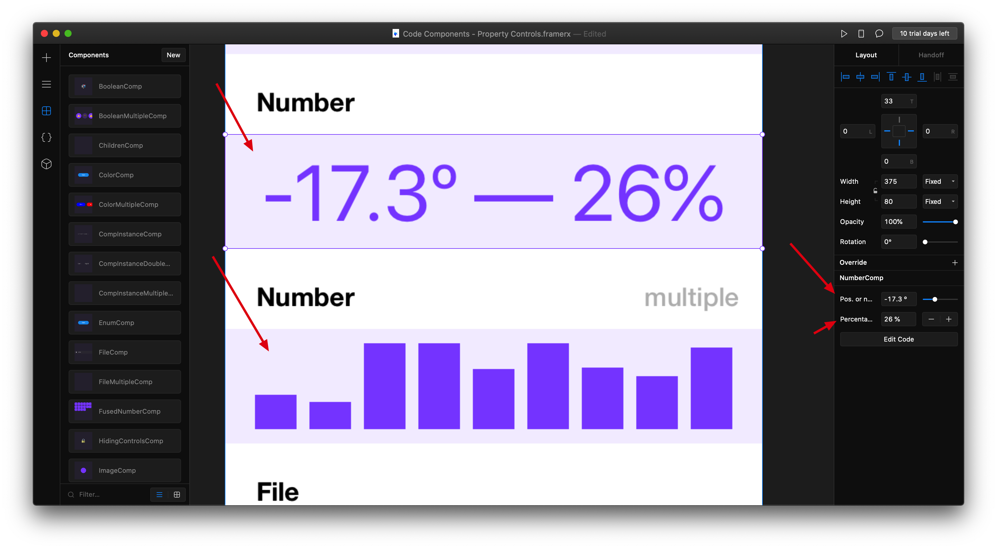
import * as React from "react";
import { Frame, addPropertyControls, ControlType } from "framer";

export function NumberComp(props) {
  return (
    <Frame
      size="100%"
      background="rgba(136, 85, 255, 0.1)"
      color="#8855FF"
      style={{ fontSize: 55 }}
    >
      {`${props.negativeOrPositive}º — ${props.steppable}%`}
    </Frame>
  );
}

NumberComp.defaultProps = {
  negativeOrPositive: 0,
  steppable: 6
};

addPropertyControls(NumberComp, {
  negativeOrPositive: {
    type: ControlType.Number,
    title: "Pos. or neg.",
    unit: " º",
    min: -50,
    max: 50,
    step: 0.1
  },
  steppable: {
    type: ControlType.Number,
    title: "Percentage",
    unit: " %",
    min: 0,   //最小值
    max: 100, //最大值
    step: 10, //最小间隔
    displayStepper: true //这里是控制有没有加减按钮
  }
});
第五种:File
这种呢,主要是可以添加文件,一般是通过src的方式引入
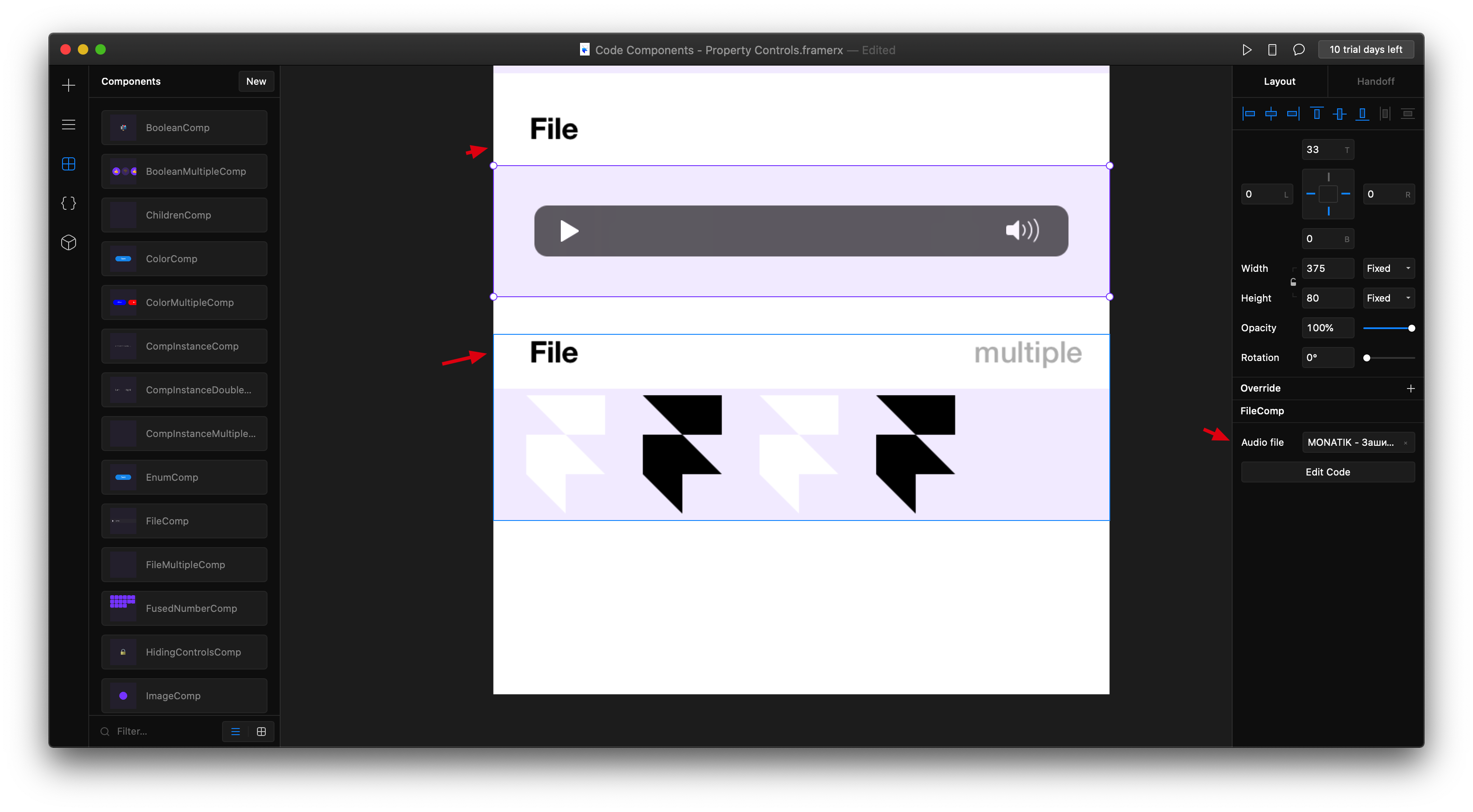
import * as React from "react";
import { Stack, addPropertyControls, ControlType } from "framer";

export function FileMultipleComp(props) {
  return (
    <Stack
      size="100%"
      background="rgba(136, 85, 255, 0.1)"
      direction="horizontal"
      distribution="start"
      gap={23}
      paddingLeft={20}
      alignment="center"
    >
      {props.svgs.map((url, index) => (
        <img key={index} src={url} />
      ))}
    </Stack>
  );
}

FileMultipleComp.defaultProps = {
  svgs: []
};

addPropertyControls(FileMultipleComp, {
  svgs: {
    type: ControlType.Array,
    title: "SVGs",
    propertyControl: {
      type: ControlType.File,
      allowedFileTypes: ["svg"]
    },
    maxCount: 5
  }
});
第六种:Boolean (布尔)
这种主要是通过布尔类型,来控制两种状态。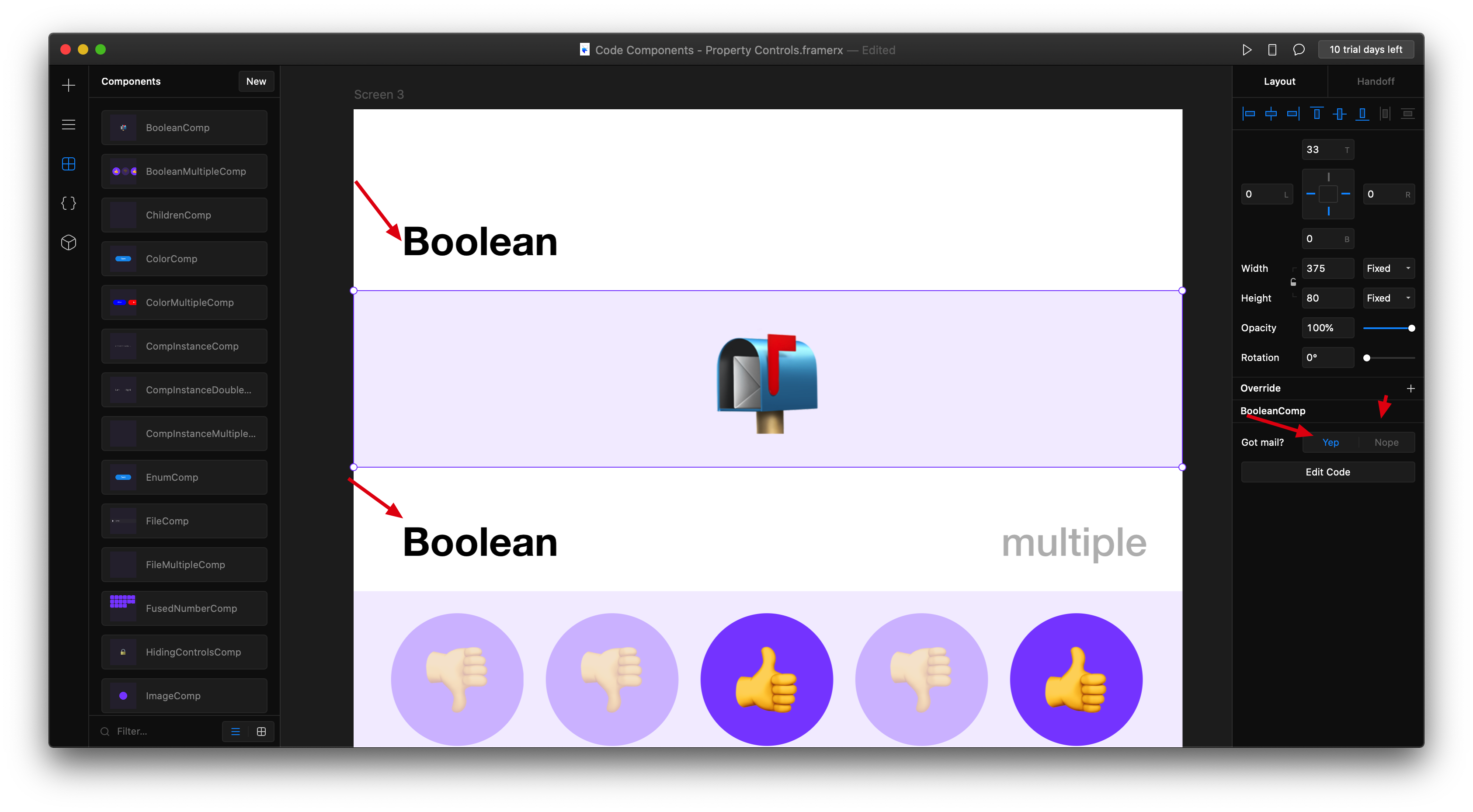
import * as React from "react";
import { Frame, addPropertyControls, ControlType } from "framer";

export function BooleanComp(props) {
  return (
    <Frame
      size="100%"
      background="rgba(136, 85, 255, 0.1)"
      style={{ fontSize: 50 }}
    >
      {props.isMail ? "📬" : "📭"}
    </Frame>
  );
}

BooleanComp.defaultProps = {
  isMail: true
};

addPropertyControls(BooleanComp, {
  isMail: {
    type: ControlType.Boolean,
    title: "Got mail?",
    enabledTitle: "Yep",
    disabledTitle: "Nope"
  }
});
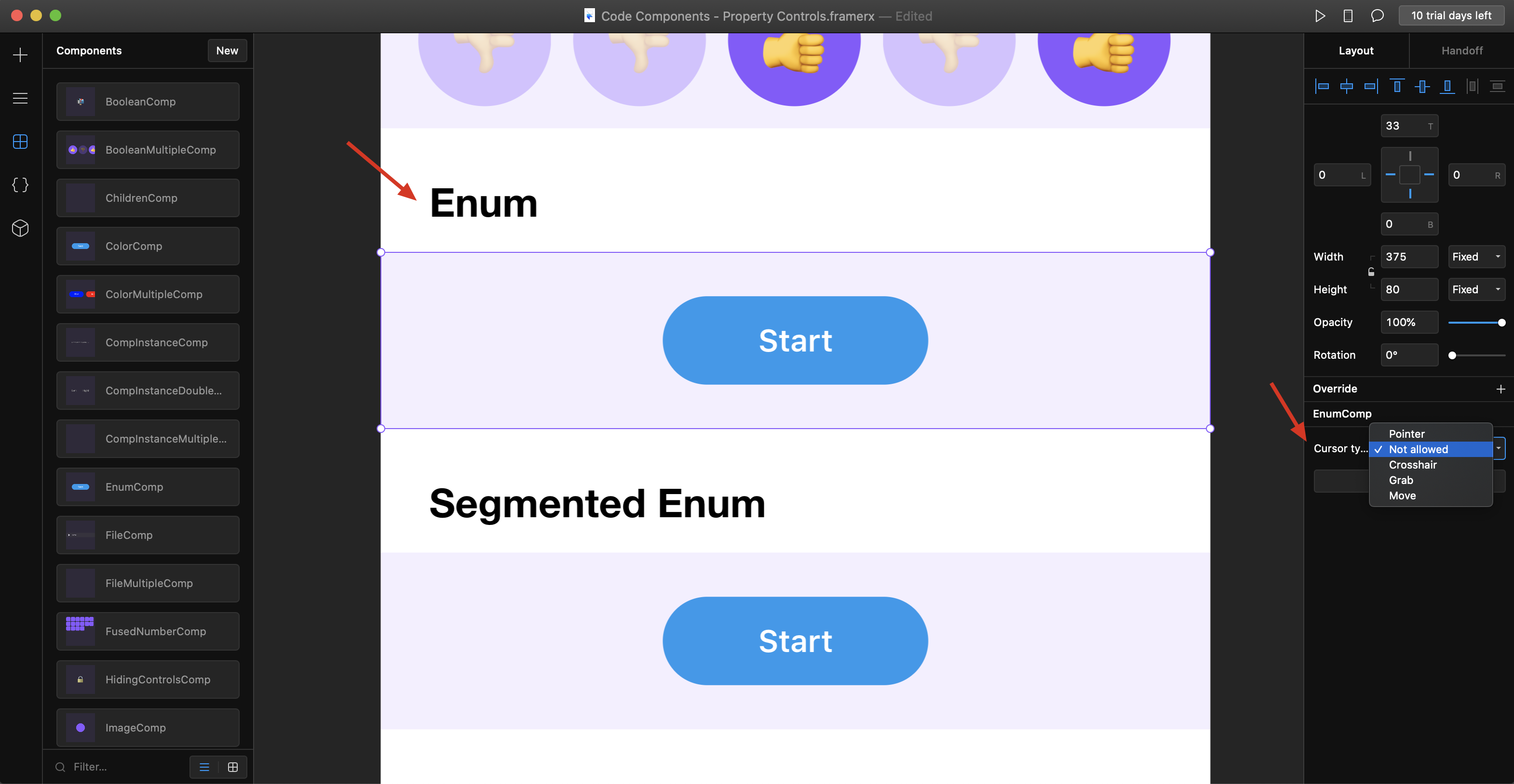
第七种:Enum(下拉选项)
这种可以将多种状态放到一个下拉选项里面。
import * as React from "react";
import { Stack, addPropertyControls, ControlType } from "framer";

const buttonStyle: React.CSSProperties = {
  width: 120,
  height: 40,
  borderRadius: 20,
  display: "flex",
  alignItems: "center",
  justifyContent: "center",
  textAlign: "center",
  color: "#fff",
  fontSize: 14,
  fontWeight: 600,
  border: 0,
  background: "#1199EE"
};

export function EnumComp(props) {
  return (
    <Stack
      size="100%"
      background="rgba(136, 85, 255, 0.1)"
      direction="horizontal"
      distribution="center"
    >
      <button
        style={{
          ...buttonStyle,
          cursor: props.cursor
        }}
      >
        Start
      </button>
    </Stack>
  );
}

EnumComp.defaultProps = {
  cursor: "pointer"
};

addPropertyControls(EnumComp, {
  cursor: {
    type: ControlType.Enum,
    title: "Cursor type",
    options: ["pointer", "not-allowed", "crosshair", "grab", "move"],
    optionTitles: ["Pointer", "Not allowed", "Crosshair", "Grab", "Move"]
  }
});
第八种:Segmented Enum(并排选项)

import * as React from "react";
import { Stack, addPropertyControls, ControlType } from "framer";

const buttonStyle: React.CSSProperties = {
  width: 120,
  height: 40,
  borderRadius: 20,
  display: "flex",
  alignItems: "center",
  justifyContent: "center",
  textAlign: "center",
  color: "#fff",
  fontSize: 14,
  fontWeight: 600,
  border: 0,
  background: "#1199EE"
};

export function SegmentedEnumComp(props) {
  return (
    <Stack
      size="100%"
      background="rgba(136, 85, 255, 0.1)"
      direction="horizontal"
      distribution="center"
    >
      <button
        style={{
          ...buttonStyle,
          cursor: props.cursor
        }}
      >
        Start
      </button>
    </Stack>
  );
}

SegmentedEnumComp.defaultProps = {
  cursor: "pointer"
};

addPropertyControls(SegmentedEnumComp, {
  cursor: {
    type: ControlType.SegmentedEnum,
    title: "Cursor type",
    options: ["pointer", "not-allowed", "crosshair", "grab", "move"],
    optionTitles: ["👆", "🚫", "✚", "✊", "↔"]
  }
});
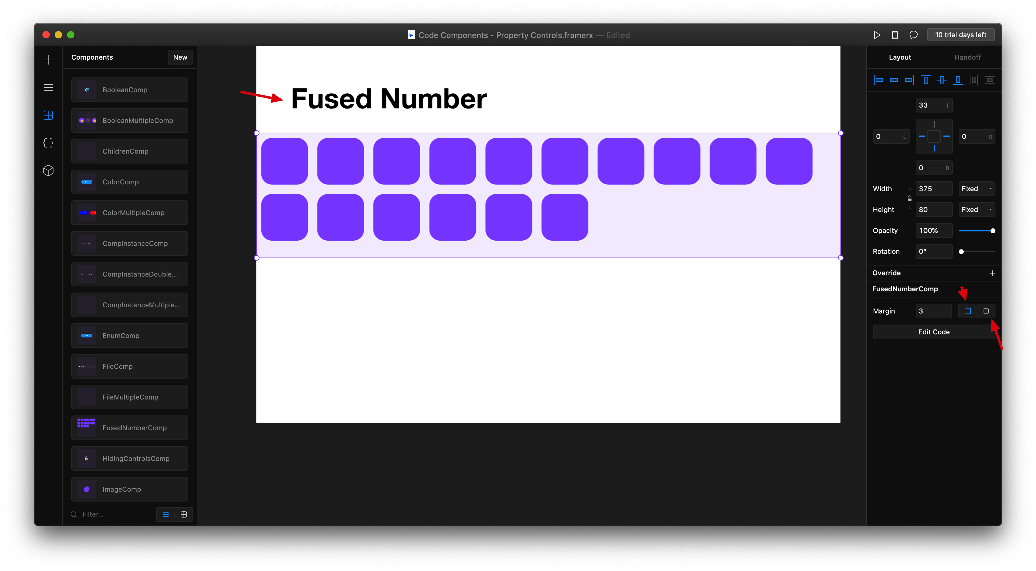
第九种:Fused number
这种主要是应用于padding和margin上面。单一值和统一值可以一起处理。
import * as React from "react";
import { addPropertyControls, ControlType } from "framer";

const divStyle: React.CSSProperties = {
  height: "100%",
  display: "flex",
  flexWrap: "wrap",
  alignContent: "flex-start",
  alignItems: "start",
  justifyContent: "start",
  background: "rgba(136, 85, 255, 0.1)",
  overflow: "hidden"
};

const swatchStyle: React.CSSProperties = {
  width: 30,
  height: 30,
  borderRadius: 7,
  background: "#8855FF"
};

export function FusedNumberComp(props) {
  let marginProperties = {};

  if (props.marginPerSide) {
    marginProperties = {
      marginTop: props.marginTop,
      marginRight: props.marginRight,
      marginBottom: props.marginBottom,
      marginLeft: props.marginLeft
    };
  } else {
    marginProperties = {
      margin: props.margin
    };
  }

  let swatches = [];
  for (let i = 0; i < 16; i++) {
    swatches.push(
      <div
        key={i}
        style={{
          ...swatchStyle,
          ...marginProperties
        }}
      />
    );
  }

  return <div style={divStyle}>{swatches}</div>;
}

FusedNumberComp.defaultProps = {
  margin: 1,
  marginPerSide: false,
  marginTop: 0,
  marginRight: 4,
  marginBottom: 4,
  marginLeft: 0
};

addPropertyControls(FusedNumberComp, {
  margin: {
    type: ControlType.FusedNumber,
    title: "Margin",
    toggleKey: "marginPerSide",
    toggleTitles: ["All Sides", "Per Side"],
    valueKeys: ["marginTop", "marginRight", "marginBottom", "marginLeft"],
    valueLabels: ["Top", "Right", "Bottom", "Left"],
    min: 0
  }
});
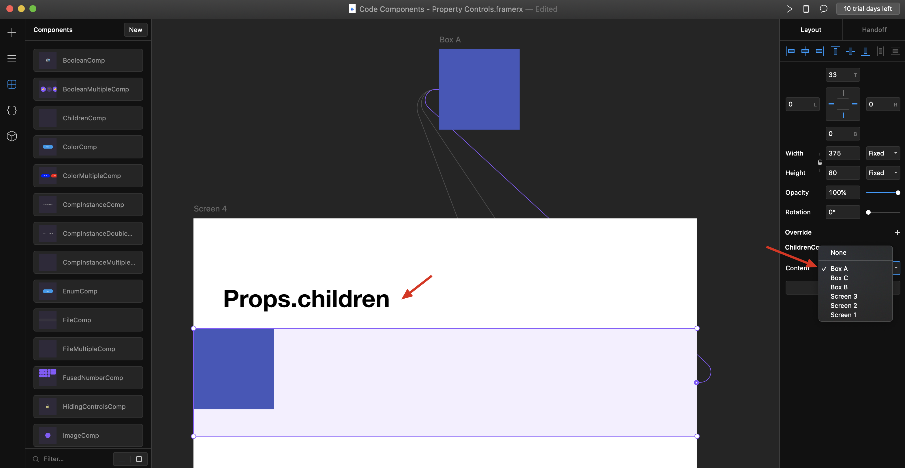
第十种:props.children
这种可以将一个组件,包含画布上的其他组件。(但是这种只能包含一个)
import * as React from "react";
import { Frame } from "framer";

export function ChildrenComp(props) {
  return (
    <Frame size="100%" background="rgba(136, 85, 255, 0.1)">
      {props.children}

    </Frame>
  );
}
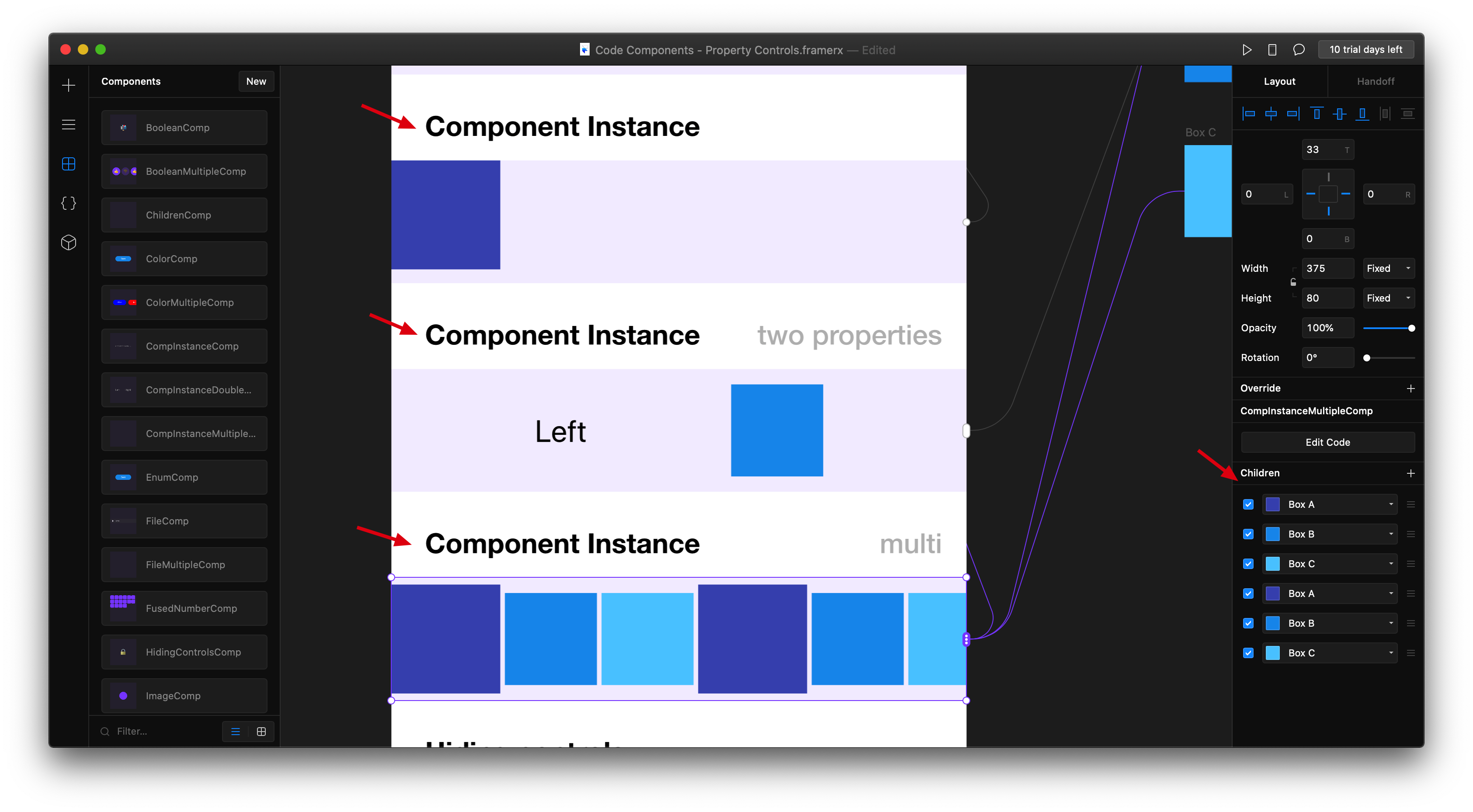
第十一种:Component Instance
这种类似第八种,不过他可以加载多个画布上的子组件,他这个就比较麻烦了。
import * as React from "react";
import { Frame, Stack, addPropertyControls, ControlType } from "framer";

export function CompInstanceDoubleComp(props) {
  return (
    <Stack
      size="100%"
      background="rgba(136, 85, 255, 0.1)"
      direction="horizontal"
      alignment="center"
      distribution="space-evenly"
    >
      {props.leftInstance[0] ? (
        React.cloneElement(props.leftInstance[0], {
          top: 0,
          left: 0
        })
      ) : (
        <Frame
          size="auto"
          background="transparent"
          style={{ fontSize: "20px" }}
        >
          Left
        </Frame>
      )}

      {props.rightInstance[0] ? (
        React.cloneElement(props.rightInstance[0], {
          style: {
            top: 0,
            left: 0
          }
        })
      ) : (
        <Frame
          size="auto"
          background="transparent"
          style={{ fontSize: "20px" }}
        >
          Right
        </Frame>
      )}
    </Stack>
  );
}

CompInstanceDoubleComp.defaultProps = {
  leftInstance: null,
  rightInstance: null
};

addPropertyControls(CompInstanceDoubleComp, {
  leftInstance: {
    type: ControlType.ComponentInstance,
    title: "Left"
  },
  rightInstance: {
    type: ControlType.ComponentInstance,
    title: "Right"
  }
});
第十二种:Hiding controls
这种怎么理解呢?就是当我们的属性控制比较多的时候,可以隐藏一些。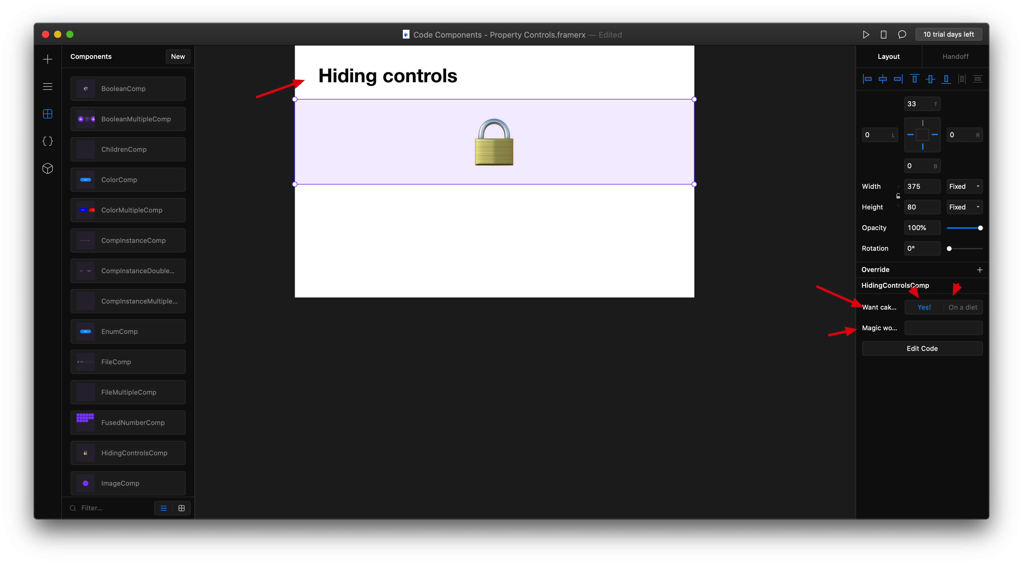
import * as React from "react";
import { Frame, addPropertyControls, ControlType } from "framer";

export function HidingControlsComp(props) {
  let cake = "🔒";
  if (props.showPasswordField && props.password === "Is it Abracadabra?") {
    cake = "🧁";
    if (props.whichCake === "pieceOfCake") {
      cake = "🍰";
    } else if (props.whichCake === "entireCake") {
      cake = "🎂";
    }
  }
  return (
    <Frame
      size="100%"
      background="rgba(136, 85, 255, 0.1)"
      style={{ fontSize: 50 }}
    >
      {cake}
    </Frame>
  );
}

HidingControlsComp.defaultProps = {
  showPasswordField: false,
  password: "",
  whichCake: "cupcake"
};

addPropertyControls(HidingControlsComp, {
  showPasswordField: {
    type: ControlType.Boolean,
    title: "Want cake?",
    enabledTitle: "Yes!",
    disabledTitle: "On a diet"
  },
  password: {
    type: ControlType.String,
    title: "Magic word?",
    hidden(props) {
      return props.showPasswordField === false;
    }
  },
  whichCake: {
    type: ControlType.Enum,
    title: "Hungry?",
    options: ["cupcake", "pieceOfCake", "entireCake"],
    optionTitles: ["Not really", "Just a bit", "Could eat a horse!"],
    hidden(props) {
      if (props.showPasswordField && props.password === "Is it Abracadabra?") {
        return false;
      } else {
        return true;
      }
    }
  }
});

若有收获,就点个赞吧
0 人点赞
