1: Toogle菜单
关键知识点:
delayChildren 、 variants 、延时动画
视频演示:

源文件:
01 Accordion-Menu copy.framerx.zip
代码演示
import { Data, Override } from "framer"// View related tutorial: https://www.framer.com/learn/lesson/build-an-animated-accordion/const appState = Data({open: false,})export function ListContainer(props): Override {const containerVariants = {closed: { height: 71 },open: {height: 332,transition: { staggerChildren: 0.14, delayChildren: 0.1 },},}return {initial: "closed",animate: appState.open ? "open" : "closed",variants: containerVariants,onTap() {appState.open = !appState.open},}}export function ListItem(props): Override {const itemVariants = {closed: { opacity: 0, y: 40 },open: { opacity: 1, y: 0 },}return {variants: itemVariants,transition: { ease: "easeInOut", duration: 0.2 },}}export function Cheveron(): Override {const cheveronVariants = {closed: { rotate: 0 },open: { rotate: 180 },}return {initial: "closed",animate: appState.open ? "open" : "closed",variants: cheveronVariants,transition: { ease: "easeInOut", duration: 0.2 },}}
2: 菜单切换
关键知识点:
data 、useAnimation 、 controls
视频演示:

源文件:
02 Align-Animation.framerx.zip
代码演示
import { Data, Override, useAnimation } from "framer"const appState = Data({state: "",})export function Left(): Override {return {onTap() {appState.state = "left"},}}export function Center(): Override {return {onTap() {appState.state = "center"},}}export function Right(): Override {return {onTap() {appState.state = "right"},}}export function firstLine(): Override {const controls = useAnimation()if (appState.state === "left") {controls.start({ x: 0 })} else if (appState.state === "center") {controls.start({ x: 78 })} else if (appState.state === "right") {controls.start({ x: 156 })}return {animate: controls,transition: { type: "spring", mass: 1.1, velocity: 350 },}}export function secondLine(): Override {const controls = useAnimation()if (appState.state === "left") {controls.start({ x: 0 })} else if (appState.state === "center") {controls.start({ x: 81 })} else if (appState.state === "right") {controls.start({ x: 162 })}return {animate: controls,transition: { type: "spring", mass: 0.8, velocity: 200 },}}export function thirdLine(): Override {const controls = useAnimation()if (appState.state === "left") {controls.start({ x: 0 })} else if (appState.state === "center") {controls.start({ x: 78 })} else if (appState.state === "right") {controls.start({ x: 156 })}return {animate: controls,transition: { type: "spring", mass: 1, velocity: 120 },}}
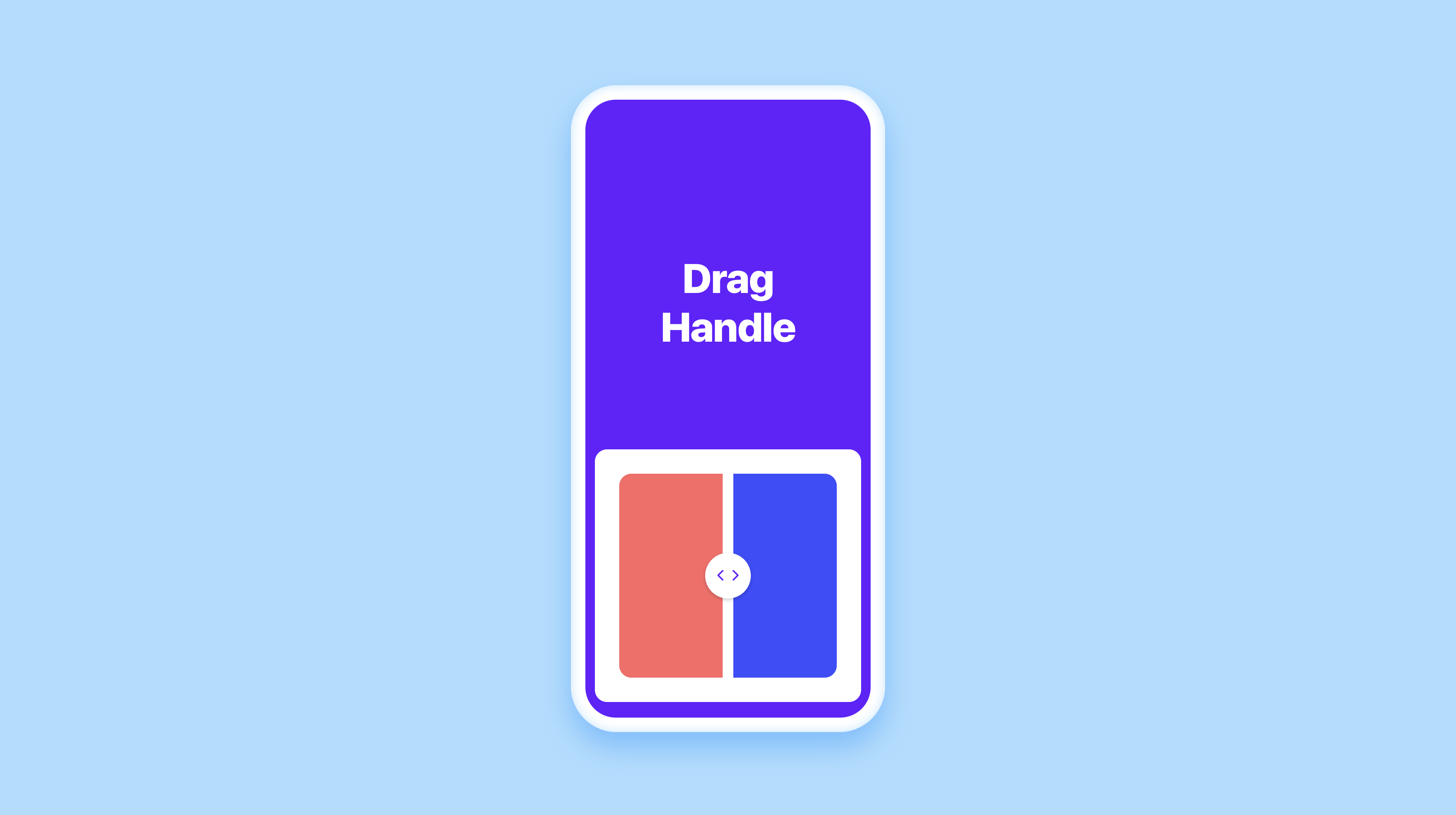
3: Drag-Handle
关键知识点:
useTransform, motionValue, drag
图片演示:
源文件:
代码演示
import { Data, Override, useTransform, motionValue } from "framer"

// View the full tutorial: https://www.framer.com/learn/lesson/build-a-drag-handle/

const handleX = motionValue(0)

export function Handle(): Override {
    return {
        x: handleX,
        drag: "x",
        dragConstraints: {
            left: -113,
            right: 113,
        },
        dragElastic: 0.1,
        dragMomentum: false,
    }
}

export function LeftPanel(props): Override {
    const { width } = props
    const panelWidth = useTransform(handleX, value => {
        return width + value
    })

    return {
        width: panelWidth,
    }
}

export function RightPanel(props): Override {
    const { width } = props
    const panelWidth = useTransform(handleX, value => {
        return width - value
    })

    return {
        width: panelWidth,
    }
}
6:heart点赞动效
关键知识点:
视频演示:

源文件:
代码演示
import { Data, Override, useAnimation } from "framer"

// Store the animating state and heart ids
const appState = Data({
    animating: false,
    heartsId: [],
})

// Create a function to get a random integer
function getRandomInt(min, max) {
    min = Math.ceil(min)
    max = Math.floor(max)
    return Math.floor(Math.random() * (max - min)) + min
}

// Scale the button when tapped and set the animating state to true
export function HeartButton(): Override {
    return {
        whileTap: { scale: 1.2 },
        onTap() {
            appState.animating = true
        },
    }
}

export function Heart(props): Override {
    // Get the index of the heart
    const { id } = props
    appState.heartsId.length == 5 ? null : appState.heartsId.push(id)

    let index = appState.heartsId.indexOf(id)

    // Randomly generate rotate and x travel distance values for each heart
    let rotate = getRandomInt(-10, 10)
    let travelX = (getRandomInt(0, 2) * 2 - 1) * 14

    // Create an animation control for the heart
    const controls = useAnimation()

    if (appState.animating === true) {
        // Scale the heart up quickly when the animation starts
        controls.start({
            scale: 1,
            transition: {
                ease: "easeInOut",
                duration: 0.2,
                delay: 0.4 * index,
            },
        })
        // Float the heart to the top
        controls.start({
            y: -660,
            opacity: 0,
            transition: {
                ease: "easeOut",
                duration: 5.6,
                delay: 0.35 * index,
            },
        })
        // Rotate and make the heart float left and right as it goes up
        controls.start({
            rotate: [rotate, -rotate, rotate, -rotate, rotate],
            x: [travelX, -travelX, travelX, -travelX, travelX],
            transition: {
                ease: "easeOut",
                duration: 3,
                delay: 0.4 * index,
            },
        })
        // Wait for the duration of the animation then turn the animating state to false
        if (appState.heartsId.indexOf(id) === 0) {
            setTimeout(() => {
                appState.animating = false
            }, 400 * 4 + 2200)
        }
    }
    // Revert the heart back to its original place on completion
    else {
        controls.start({
            x: 0,
            y: 0,
            rotate: 0,
            scale: 0,
            opacity: 1,
            transition: { duration: 0 },
        })
    }

    return {
        initial: { x: 0, y: 0, rotate: 0, scale: 0, opacity: 1 },
        animate: controls,
    }
}
7: 点赞计数
关键知识点
视频演示

源文件
代码展示
import { Data, Override, useAnimation } from "framer"

const appState = Data({
    counter: 0,
    tapped: false,
})

export function Container(): Override {
    return {
        onTap() {
            // Start the animation
            appState.tapped = true
            // Update the counter
            appState.counter++
        },
    }
}

export function Heart(): Override {
    const heartAnimation = useAnimation()

    // Sequence for heart animation
    async function heartSequence() {
        await heartAnimation.start(
            { scale: 1.3 },
            { ease: "easeInOut", duration: 0.2 }
        )
        await heartAnimation.start(
            { scale: 1 },
            { ease: "easeInOut", duration: 0.2 }
        )
        await (() => {
            // Update the tapped value to false when the animation has finished
            return new Promise(() => {
                appState.tapped = false
            })
        })
    }

    // Only play the sequence if the container has been tapped
    appState.tapped ? heartSequence() : null

    return {
        initial: { scale: 1 },
        animate: heartAnimation,
    }
}

export function Counter(): Override {
    return {
        text: appState.counter,
    }
}
8: Long-Press-Menu
关键知识点
视频演示

源文件
08 Long-Press-Menu.framerx.zip
代码展示
import { Data, Override, useAnimation } from "framer"

const appState = Data({
    holdTap: false,
    pointX: 0,
    pointY: 0,
    menuId: [],
})

export function Container(): Override {
    return {
        onTapStart(event, info) {
            // Convert the x, y point information so that it is relative to the top left of the container
            let convertX = info.point.x - 32 - 20
            let convertY = info.point.y - 534 - 20

            // If tapped within the tappable area, set the tapping state to true
            if (convertX > 50 && convertX < 282 && convertY > 50) {
                appState.pointX = convertX
                appState.pointY = convertY
                appState.holdTap = true
            }
        },
        onTap() {
            // When the tap ends, set the tapping state to false
            appState.holdTap = false
        },
    }
}

export function Menu(props): Override {
    // Get the individual ids of each element and store it in an array
    const { id } = props
    if (appState.menuId.length < 3) {
        appState.menuId.push(id)
    }

    // Add animation controls to the element
    const controls = useAnimation()

    async function startAnimation() {
        // Set the position of the element to the x, y point of the tap
        await controls.start({
            x: appState.pointX,
            y: appState.pointY,
            transition: { duration: 0 },
        })
        // Animate the first menu item
        if (appState.menuId.indexOf(id) === 0) {
            await controls.start({
                x: appState.pointX - 40,
                y: appState.pointY - 30,
                scale: 1,
                opacity: 1,
                transition: { duration: 0.2 },
            })
        }
        // Animate the second menu item
        else if (appState.menuId.indexOf(id) === 1) {
            await controls.start({
                x: appState.pointX,
                y: appState.pointY - 50,
                scale: 1,
                opacity: 1,
                transition: { duration: 0.2 },
            })
        }
        // Animate the third menu item
        else {
            await controls.start({
                x: appState.pointX + 40,
                y: appState.pointY - 30,
                scale: 1,
                opacity: 1,
                transition: { duration: 0.2 },
            })
        }
    }

    // Animate back into the initial position
    function endAnimation() {
        controls.start({
            x: appState.pointX,
            y: appState.pointY,
            scale: 0,
        })
        controls.start({
            opacity: 0,
            transition: { duration: 0.14 },
        })
    }

    // Begin and end the animation based on the tapping state
    if (appState.holdTap) {
        startAnimation()
    } else {
        endAnimation()
    }

    return {
        animate: controls,
        // Scale the menu items when hovered upon
        onHoverStart() {
            controls.start({
                scale: 1.1,
            })
        },
        onHoverEnd() {
            controls.start({
                scale: 1,
            })
        },
    }
}
9: Perspective-3D
关键知识点
视频演示

源文件
代码展示
import { Data, Override } from "framer"

const appState = Data({
    tapped: false,
})

export function Container(): Override {
    return {
        style: { perspective: 2000 },
    }
}

export function CardA(): Override {
    return {
        // Create a gap between the cards by moving up the frame by 60%
        style: { transformOrigin: "center 60%" },
        initial: { rotateX: 0 },
        animate: appState.tapped
            ? {
                  rotateX: -40,
                  boxShadow: "0px -10px 30px 0px rgba(0, 0, 0, 0.05)",
              }
            : { rotateX: 0, boxShadow: "0px 0px 0px 0px rgba(0, 0, 0, 0)" },
        onTap() {
            appState.tapped = !appState.tapped
        },
    }
}

export function CardB(): Override {
    return {
        style: { transformOrigin: "center 0%" },
        initial: { rotateX: 0 },
        animate: appState.tapped
            ? {
                  rotateX: -40,
                  boxShadow: "0px -10px 30px 0px rgba(0, 0, 0, 0.05)",
              }
            : { rotateX: 0, boxShadow: "0px 0px 0px 0px rgba(0, 0, 0, 0)" },
    }
}

export function CardC(): Override {
    return {
        // Create a gap between the cards by moving down the frame by 60%
        style: { transformOrigin: "center -60%" },
        initial: { rotateX: 0 },
        animate: appState.tapped
            ? {
                  rotateX: -40,
                  boxShadow: "0px -10px 30px 0px rgba(0, 0, 0, 0.05)",
              }
            : {
                  rotateX: 0,
                  boxShadow: "0px 0px 0px 0px rgba(0, 0, 0, 0)",
              },
    }
}
10: Perspective-Tilt
关键知识点
视频演示

源文件
10 Perspective-Tilt.framerx.zip
11: Progress-Bar
关键知识点
视频演示

源文件
代码展示
import { Data, Override } from "framer"

const appState = Data({
    upload: "false",
    uploadCount: 0,
})

export function Bar(): Override {
    return {
        initial: { width: "0%" },
        // Animate the progress bar
        animate:
            appState.upload === "uploading" || appState.upload === "complete"
                ? { width: "100%" }
                : { width: "0%" },
        transition: { ease: "linear", duration: 1 },
        // Change the state to complete when the animation is finished
        onAnimationComplete: () => {
            appState.upload = "complete"
        },
    }
}

export function Button(): Override {
    return {
        onTap() {
            // Only trigger the animation once
            if (appState.uploadCount === 0) {
                appState.upload = "uploading"
                appState.uploadCount = 1
            }
        },
    }
}

export function Upload(): Override {
    return {
        initial: { opacity: 1 },
        animate: {
            opacity: appState.upload === "false" ? 1 : 0,
        },
        transition: { ease: "easeInOut", duration: 0.1 },
    }
}

export function UploadDisabled(): Override {
    return {
        initial: { opacity: 0 },
        animate: {
            opacity: appState.upload === "uploading" ? 1 : 0,
        },
        transition: { ease: "easeInOut", duration: 0.1 },
    }
}

export function Check(): Override {
    return {
        initial: { opacity: 0 },
        animate: {
            opacity: appState.upload === "complete" ? 1 : 0,
        },
        transition: { ease: "easeInOut", duration: 0.1 },
    }
}
12 : Pull-to-Refresh
关键知识点
视频演示

源文件
12 Pull-to-Refresh.framerx.zip
代码展示
import {
    Data,
    Override,
    motionValue,
    transform,
    useTransform,
    useAnimation,
} from "framer"

const appState = Data({
    loading: "false",
})

// Set up to track the offset of the content as an animatable value
const scrollY = motionValue(0)

export function Scroll(): Override {
    const controls = useAnimation()

    return {
        contentOffsetY: scrollY,

        // Only enable drag when the spinner is not loading
        dragEnabled: appState.loading === "false",

        // When the layer has been dragged past a certain point, begin the loading animation
        onPanEnd: () => {
            if (appState.loading === "false" && scrollY.get() > 116) {
                // Keep the layer pinned at 116px from the top while loading
                appState.loading = "true"
                controls.start({ y: 116 })

                // When the animation is complete, animate the layer back to the top and set the loading state to false
                setTimeout(() => {
                    appState.loading = "false"
                    controls.start({ y: 0 })
                }, 1500)
            } else {
                controls.start({ y: 0 })
            }
        },
        scrollAnimate: controls,
    }
}

export function Spinner(): Override {
    // Change the opacity of the spinner based on how much the layer has been dragged
    const spinnerOpacity = useTransform(scrollY, [76, 116], [0, 1])

    // Change the y position of the spinner based on how much the layer has been dragged
    const spinnerY = useTransform(scrollY, [76, 116], [-20, 0])

    return {
        opacity: spinnerOpacity,
        y: spinnerY,
    }
}
13 :Shuffle 随机加载
关键知识点
视频演示

源文件
14: 手写效果
关键知识点
视频演示

源文件
15 : Slider
关键知识点
视频演示

源文件
代码展示
import * as React from "react"
import { Override, Data } from "framer"

const appState = Data({
    number: "0",
})

export function Slider(): Override {
    return {
        onValueChange: number => {
            appState.number = Math.floor(number).toString()
        },
    }
}

export function Number(): Override {
    return {
        text: appState.number,
    }
}
16: Long-Press-Menu
关键知识点
视频演示

源文件
代码展示
import * as React from "react"
import { Frame, ControlType, addPropertyControls } from "framer"
import { url } from "framer/resource"
import { facebook, google } from "./kits"

function isPathAbsolute(path: string): boolean {
    return /^(?:\/|[a-z]+:\/\/)/.test(path)
}

export const sounds = Object.assign(facebook, { "———————": "" }, google)

export function playSound(soundName: string | HTMLAudioElement): void {
    if (typeof soundName === "string") {
        let sound: HTMLAudioElement

        if (isPathAbsolute(soundName)) {
            sound = new Audio(soundName)
        } else {
            sound = new Audio(
                url(
                    soundName.replace(
                        "./",
                        "./node_modules/@framer/ismael.sounds/"
                    )
                )
            )
        }

        // @ts-ignore
        sound.cloneNode(false).play()
    } else {
        // @ts-ignore
        soundName.cloneNode(false).play()
    }
}

function playSoundLocal(soundName: string | HTMLAudioElement): void {
    if (typeof soundName === "string") {
        let sound: HTMLAudioElement = new Audio(url(soundName))

        // @ts-ignore
        sound.cloneNode(false).play()
    }
}

export function Sounds(props: any): any {
    const {
        eventName,
        soundName,
        eventName2,
        soundName2,
        soundName3,
        eventName3,
        soundName4,
        eventName4,
        soundName5,
        eventName5,
        triggers,
        ...rest
    } = props

    let event, event2, event3, event4, event5

    event = { [eventName]: () => playSoundLocal(sounds[soundName]) }

    if (triggers >= 2) {
        event2 = { [eventName2]: () => playSoundLocal(sounds[soundName2]) }
    }

    if (triggers >= 3) {
        event3 = { [eventName3]: () => playSoundLocal(sounds[soundName3]) }
    }

    if (triggers >= 4) {
        event4 = { [eventName4]: () => playSoundLocal(sounds[soundName4]) }
    }

    if (triggers >= 5) {
        event5 = { [eventName5]: () => playSoundLocal(sounds[soundName5]) }
    }

    if (!props.children.length) {
        return <Frame size={"100%"}>Connect to a frame</Frame>
    }

    return (
        <Frame
            size={"100%"}
            background="transparent"
            {...event}
            {...event2}
            {...event3}
            {...event4}
            {...event5}
            {...rest}
        >
            {props.children}
        </Frame>
    )
}

const events = [
    "onTap",
    "whileTap",
    "whileHover",
    "onAnimationStart",
    "onAnimationEnd",
    "onDrag",
    "onDragStart",
    "onDragEnd",
    "onFocus",
]

addPropertyControls(Sounds, {
    triggers: {
        type: ControlType.Number,
        defaultValue: 1,
        step: 1,
        min: 1,
        max: 5,
        displayStepper: true,
        title: "Triggers",
    },
    eventName: {
        type: ControlType.Enum,
        defaultValue: events[0],
        options: events,
        optionTitles: events,
        title: "Event",
    },
    soundName: {
        type: ControlType.Enum,
        defaultValue: "",
        options: Object.keys(sounds),
        title: "Sound",
    },
    eventName2: {
        type: ControlType.Enum,
        defaultValue: "",
        options: events,
        optionTitles: events,
        title: "Event 2",
        hidden(props) {
            return props.triggers < 2
        },
    },
    soundName2: {
        type: ControlType.Enum,
        defaultValue: "",
        options: Object.keys(sounds),
        title: "Sound 2",
        hidden(props) {
            return props.triggers < 2
        },
    },
    eventName3: {
        type: ControlType.Enum,
        defaultValue: "",
        options: events,
        optionTitles: events,
        title: "Event 3",
        hidden(props) {
            return props.triggers < 3
        },
    },
    soundName3: {
        type: ControlType.Enum,
        defaultValue: "",
        options: Object.keys(sounds),
        title: "Sound 3",
        hidden(props) {
            return props.triggers < 3
        },
    },
    eventName4: {
        type: ControlType.Enum,
        defaultValue: "",
        options: events,
        optionTitles: events,
        title: "Event 4",
        hidden(props) {
            return props.triggers < 4
        },
    },
    soundName4: {
        type: ControlType.Enum,
        defaultValue: "",
        options: Object.keys(sounds),
        title: "Sound 4",
        hidden(props) {
            return props.triggers < 4
        },
    },
    eventName5: {
        type: ControlType.Enum,
        defaultValue: "",
        options: events,
        optionTitles: events,
        title: "Event 5",
        hidden(props) {
            return props.triggers < 5
        },
    },
    soundName5: {
        type: ControlType.Enum,
        defaultValue: "",
        options: Object.keys(sounds),
        title: "Sound 5",
        hidden(props) {
            return props.triggers < 5
        },
    },
})
17 : Toast-Prompt
关键知识点
视频演示

源文件
代码展示
import { Data, Override } from "framer"

const appState = Data({
    clicked: false,
})

export function Button(): Override {
    return {
        onTap() {
            // Ensure the animation only runs once
            if (appState.clicked === false) {
                // Toggle the clicked state to true
                appState.clicked = true
                // Toggle back to false after the animation has ended
                setTimeout(() => {
                    appState.clicked = false
                }, 400 * 2 + 2000)
            }
        },
    }
}

export function Toast(): Override {
    return {
        initial: { opacity: 0, y: 100 },
        animate:
            appState.clicked === true
                ? { opacity: 1, y: 0 }
                : { opacity: 0, y: 100 },
        transition: {
            ease: "easeInOut",
            duration: 0.4,
            flip: 1,
            repeatDelay: 2,
        },
    }
}
18: toogle advanced
关键知识点
视频演示

源文件
18 Toggle-Advanced.framerx.zip
代码展示
import * as React from "react"
import { Frame, Override, Data, useCycle } from "framer"

const appState = Data({
    rotated: false,
})

export function Button(): Override {
    // Create a hook to toggle between the variants
    const [currentVariant, cycleVariant] = useCycle("default", "rotate")

    // Animation variants for the button
    const buttonVariants = {
        default: {
            rotate: 0,
            scale: 1,
        },
        rotate: {
            rotate: 45,
            scale: 0.7,
        },
    }

    return {
        animate: currentVariant,
        variants: buttonVariants,
        onTap() {
            // Toggle between the variants
            cycleVariant()
            // Store the toggled state in the Data object
            appState.rotated = !appState.rotated
        },
    }
}

export function MenuItemOne(props): Override {
    // Animation variants for the menu item
    const menuItemVariants = {
        default: { y: 0, opacity: 0 },
        rotate: { y: -64, opacity: 1 },
    }

    return {
        animate: appState.rotated ? "rotate" : "default",
        variants: menuItemVariants,
        transition: { ease: "easeInOut", duration: 0.2 },
    }
}

export function MenuItemTwo(props): Override {
    // Animation variants for the menu item
    const menuItemVariants = {
        default: { y: 0, opacity: 0 },
        rotate: { y: -134, opacity: 1 },
    }

    return {
        animate: appState.rotated ? "rotate" : "default",
        variants: menuItemVariants,
        transition: { ease: "easeInOut", duration: 0.2 },
    }
}

export function MenuItemThree(props): Override {
    // Animation variants for the menu item
    const menuItemVariants = {
        default: { y: 0, opacity: 0 },
        rotate: { y: -204, opacity: 1 },
    }

    return {
        animate: appState.rotated ? "rotate" : "default",
        variants: menuItemVariants,
        transition: { ease: "easeInOut", duration: 0.2 },
    }
}

若有收获,就点个赞吧
0 人点赞
