在 stack 中 可以使用 Positioned定位。
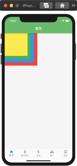
Stack 基本用法。
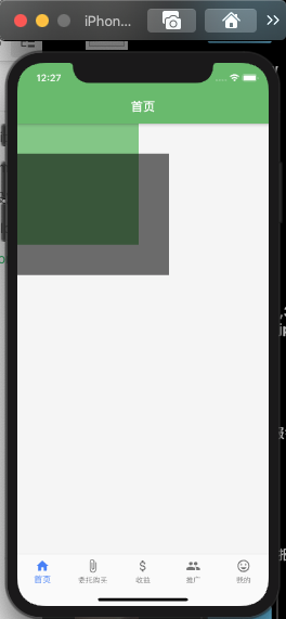
Stack(fit : StackFit.loose,children : <Widget>[Container(width : 200,height : 200,color: Colors.red,),Container(width : 180,height : 180,color: Colors.blue,),Container(width : 160,height : 160,color: Colors.green,),Container(width : 140,height : 140,color: Colors.yellow,),])
Stack的基本属性都有
Stack({Key key,this.alignment = AlignmentDirectional.topStart,this.textDirection,this.fit = StackFit.loose,this.overflow = Overflow.clip,List<Widget> children = const <Widget>[],}) : super(key: key, children: children);
- alignment : 指的是子Widget的对齐方式,默认对齐方式为左上角Alignment.topLeft。这个属性 使用Positioned 和 未使用 Positioned 是有些区别的。
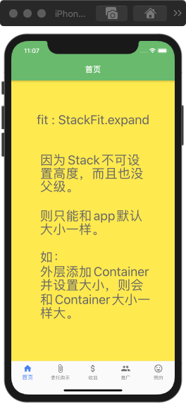
- fit : 用来决定没有使用Positioned方式时候Widget的大小,StackFit.loose是指Widget多大就多大【上面情况下设置了Container 的大小,则设置了多大就多大】,Stack.expand使子Widget的大小和父组件一样大【上面情况下,如果设置这个属性,则Container的大小和父级一样大】。
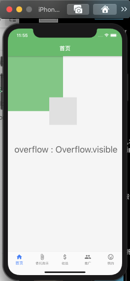
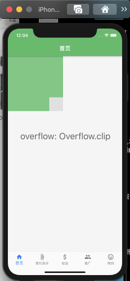
- overflow : 指子Widget超出Stack时候如何显示,默认值是Overflow.clip, 子Widget超出Stack会被截断。Overflow.visible则超出后会显示。
未使用Positioned
【alignment】对齐方式。
给大体的 children 子组件设置对齐方式【此处没有Positioned】。 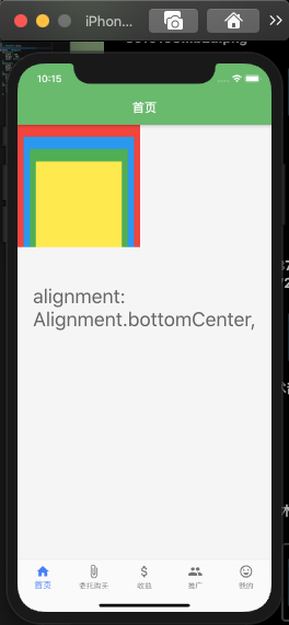
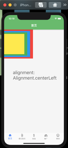
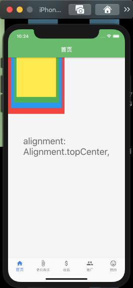
alignment 可设置属性为:
/// The top left corner.static const Alignment topLeft = Alignment(-1.0, -1.0);/// The center point along the top edge.static const Alignment topCenter = Alignment(0.0, -1.0);/// The top right corner.static const Alignment topRight = Alignment(1.0, -1.0);/// The center point along the left edge.static const Alignment centerLeft = Alignment(-1.0, 0.0);/// The center point, both horizontally and vertically.static const Alignment center = Alignment(0.0, 0.0);/// The center point along the right edge.static const Alignment centerRight = Alignment(1.0, 0.0);/// The bottom left corner.static const Alignment bottomLeft = Alignment(-1.0, 1.0);/// The center point along the bottom edge.static const Alignment bottomCenter = Alignment(0.0, 1.0);/// The bottom right corner.static const Alignment bottomRight = Alignment(1.0, 1.0);
【fil】设定大小
StackFit.loose是指Widget多大就多大【上面情况下设置了Container 的大小,则设置了多大就多大】,Stack.expand使子Widget的大小和父组件一样大【上面情况下,如果设置这个属性,则Container的大小和父级一样大】
源码和上面一样,就替换了fit相应的值,这里就不贴代码了,以图说话。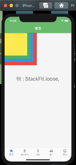
【overflow】在没使用 Positioned 时没啥作用。
下面是使用Positioned时候的作用。
Stack(fit : StackFit.loose,// alignment: Alignment.topLeft,overflow: Overflow.visible,children : <Widget>[Container(width : 200,height : 200,color: Colors.green[300],),Positioned(bottom: -50,right: -50,child: Container(width: 100,height: 100,color: Colors.grey[300]),)]),
使用Positioned
Positioned的基本属性都有
const Positioned({Key key,this.left,this.top,this.right,this.bottom,this.width,this.height,@required Widget child,}) : assert(left == null || right == null || width == null),assert(top == null || bottom == null || height == null),super(key: key, child: child);
上面的属性都是 见名知意 ,这里就不过多的讲解了。
那就直接贴码贴图吧。
【width && height】
Stack(fit : StackFit.loose,// alignment: Alignment.topLeft,overflow: Overflow.visible,children : <Widget>[Container(width : 200,height : 200,color: Colors.green[300],),Positioned(bottom: -50,right: -50,width: 300,height: 200,child: Container(width: 100,height: 100,color: Color(0x90000000)),)]),
这里你会发现,前面在Positioned中子级Container设置了宽高是有效果。但是在Positioned设置了宽高,则Container是不起效果的。因为在Stack中Container权重没有Positioned权重高。
【left && right && top && bottom】
直接贴码,贴图吧。
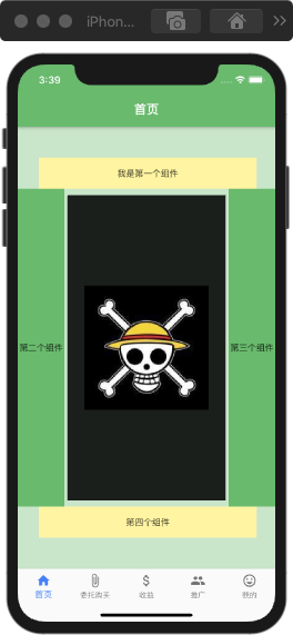
class _HomeScene extends State<HomeScene>{Widget build(BuildContext context){return Scaffold(appBar: AppBar(title: Text("首页"),centerTitle: true, // 标题是否居中backgroundColor: Colors.green[400], // 头部背景色。),body: Stack(alignment: Alignment.topLeft,overflow: Overflow.visible,children : <Widget>[Positioned(child: Container(color: Colors.green[100],),),Positioned(top: 50,// 此处注意// left: 20,right: 30,width: 350,height: 50,child: Container(color: Colors.yellow[200],alignment: Alignment.center,child: Text("我是第一个组件"),),),Positioned(top: 100,bottom: 100,width: 75,child: Container(alignment: Alignment.center,color: Colors.green[400],child: Text("第二个组件"),),),Positioned(top: 100,bottom: 100,right: 0,width: 75,child: Container(alignment: Alignment.center,color: Colors.green[400],child: Text("第三个组件"),),),Positioned(bottom: 50,right: 30,width: 350,height: 50,child: Container(alignment: Alignment.center,color: Colors.yellow[200],child: Text("第四个组件"),),),_Position(context)]),);}Widget _Position(BuildContext context){var _context;_context = Positioned(top: 110,bottom: 110,left: 80,right: 80,// bottom: 0,child: Container(width: 200,height: 200,decoration: BoxDecoration(color : Colors.black87,image: DecorationImage(image: AssetImage("lib/image/img1.jpg"),)) ,));return _context;}}
值得关注的就是我这里使用了外部定义的Widget【_Positioned】,当我们代码很多,的时候,在一个容器中书写可能需要几百几千行,你就可以吧这个组件抽离出来写,比较好阅读。
我这有些Positioned书写了width && height属性,但有些没有书写.
是因为你书写width 和 height属性的时候你要注意的是,当你的 width 和 left && right 同时存在时候,会报错,当你的 height 和 top && bottom 同时存在的时候也会报错。
因为当你的设置了, left top 则他会距离顶部距离单位的时候,则就会空出那么多距离单位
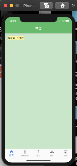
Stack(children : <Widget>[Positioned(child: Container(color: Colors.green[100],),),Positioned(left: 20.0,top: 20.0,child: Container(color: Colors.yellow[200],alignment: Alignment.center,child: Text("我是第一个组件"),),),]),
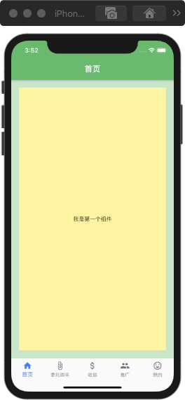
当你四个值都设置的时候,则会以父级大小,空出设置距离的位置来填充。
Stack(children : <Widget>[Positioned(child: Container(color: Colors.green[100],),),Positioned(left: 20.0,top: 20.0,right : 20.0,bottom : 20.0,child: Container(color: Colors.yellow[200],alignment: Alignment.center,child: Text("我是第一个组件"),),),]),
那现在载回过来想一想
当你的 width 和 left && right 同时存在时候,会报错?因为Flutter都不知道要怎么设置值了。
但是报错信息也是挺直白的,直接
“left == null | right==null | width == null “:is not true.
当你使用Positioned来定位的时候,则Alignment则就不会起效果了。
不管水平方向上还是垂直方向上只要设定了一个值该方向上位置就已经确定过了,aligment对这这个方向上就不会起作用了,如果Positioned 设置了其中任意三个方向的值,这个Widget的位置就是固定的,aligment对它不会起任何作用。

若有收获,就点个赞吧
0 人点赞
