Radio
基本属性
const Radio({Key key,@required this.value, // 此单选按钮表示的值。@required this.groupValue, //一组单选按钮的当前选择值。如果该单选按钮的[value]与[groupValue]匹配,则认为该按钮已被选中。@required this.onChanged, //当用户选择此单选按钮时调用。单选按钮将[value]作为参数传递给这个回调。this.activeColor, //选择此单选按钮时要使用的颜色。this.focusColor,this.hoverColor, // 悬浮的颜色this.materialTapTargetSize,this.visualDensity, // 紧凑程度this.focusNode,this.autofocus = false,}) : assert(autofocus != null),super(key: key);
基本用法
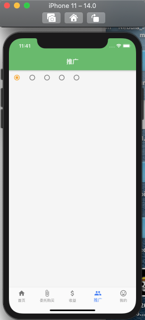
Radio(value: "小钟",groupValue: _radioValue,activeColor: Colors.yellow[800],focusColor : Colors.green[300],visualDensity: VisualDensity(horizontal: 1),onChanged: (e){setState(() {_radioValue = e;});}),
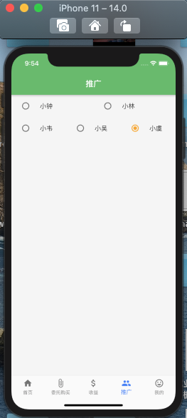
然而我们使用Radio的时候不单单需要给出选择的位置,而且还需要文本提示。
上面的话,只能在后面添加一个Text来实现文本提示。
RadioListTile 解决上述问题
基本属性
const RadioListTile({Key key,@required this.value,@required this.groupValue,@required this.onChanged,this.activeColor,this.title, // 标题this.subtitle, // 标题下面显示的附加内容。this.isThreeLine = false, //此列表平铺是否用于显示三行文本。如果为false,则在副标题为空的情况下,列表平铺被视为只有一行,在副标题为非空的情况下,则视为有两行。this.dense,this.secondary,this.selected = false,this.controlAffinity = ListTileControlAffinity.platform,}) : assert(isThreeLine != null),assert(!isThreeLine || subtitle != null),assert(selected != null),assert(controlAffinity != null),super(key: key);
基本用法
Flexible(child: RadioListTile(value: "小钟",groupValue: _radioValue,activeColor: Colors.yellow[800],title: Text("小钟"),subtitle: Text("小钟是一枚认真的程序员!"),isThreeLine: true,dense: false,secondary: IconButton(onPressed: (){},icon: Icon(IconData(0xe660, fontFamily : 'wz')),),onChanged: (e){setState(() {_radioValue = e;});})),

若有收获,就点个赞吧
0 人点赞
