CSS介绍
层叠样式表(CSS) , 主要用来美化网页, 有 W3C 定义和维护的标准, 一种用来结构化文档,如HTML文档或XML应用,添加样式(字体,颜色,间距等)的计算机语言
W3C退出 CSS , 把结构分离,HTML只负责结构, 样式交给CSS来实现,开发效率大提升,页面维护更加容易
CSS学习
组成: 选择器 , 属性, 属性值
selector { // 选择器 { 属性: 属性值 }property: value ;}
- selector 选择器, 通常是需要改变的样式的HTML元素
- 每条属性由一个属性(property ) 和一个属性值(value) 组成
- 属性(property)是希望设置的样式属性(style attribute)。每一个属性都有一个 value
- 属性和属性值用冒号分开
CSS 导入方法
- 行间样式 , 写在HTML的单个标签中, 使用 style=”” 一个属性对应一个值
<!-- 1, 行间样式 , 单行样式 --><!-- 使用 style对单行样式进行美化,style中 也是使用着 CSS 语法中的 一个属性对应一个属性值; --><div style="color: #777; font-size: 19px; width: 100px; border: 1px solid rgba(16, 149, 206, 0.87);"> 单行样式</div><!-- color 字体颜色font-size : 字体大小width 宽度border 设置边框,和边框颜色--><div style=""> 单行样式对比 </div></br>
内部样式 , 写在HTML的头部中 ,style 标签中使用的是 CSS的语法
<head><!-- 2, 内部样式 , 写在HTML的头部中 ,style 标签中使用的是 CSS的语法 --><style>/* 导入外部样式 ,是在 HTML的首部 style 中进行导入的 *//* @import "文件路径 " */@import "../css/daoru.css";/* p 选择器, 属性和属性值可以有多个 */p {/* 背景颜色 background-color: */background-color: aqua;/* 字体大小 : font-size */font-size: 16px;/* 字体倾斜 font-style*/font-style: italic;}</style></head><body><!-- 内部样式测试 --><p> 内部样式测试 </p><p> 段落</p></body>
- 外部样式 , 写一个CSS 文件 在 head 头中使用 link:css 的方法进行文件的导入
<head><meta charset="UTF-8"><meta http-equiv="X-UA-Compatible" content="IE=edge"><meta name="viewport" content="width=device-width, initial-scale=1.0"><title>CSS 的引入方式 </title><!-- 3 外部样式 , 通过外部css文件导入对网页及逆行美化 --><!-- 使用 Emmet语法 : link:css -> TAB键 --><link rel="stylesheet" href="../css/style.css"></head><body><!-- 外部样式测试 --><span> 外部样式测试 </span></body>
外部导入样式 ,写一个css 文件, 在head中的 style中使用 @import 方法进行导入
<head><!-- 2, 内部样式 , 写在HTML的头部中 ,style 标签中使用的是 CSS的语法 --><style>/* 导入外部样式 ,是在 HTML的首部 style 中进行导入的 *//* @import "文件路径 " */@import "../css/daoru.css";</style></head><body><!-- 4 导入外部样式 --><!-- 语法 : .box{导入外部样式}*3 --><div class="box">导入外部样式</div><div class="box">导入外部样式</div><div class="box">导入外部样式</div><div class="box"> 直接使用 .box 引用外部导入的样式 </div></body>
四种导入方法的区别 :
- 行间样式 只作用于当前标签
- 内部样式 只作用于当前文件
- 外部样式 可以被多个 HTML文件引用
在实际开发过程中使用最多的 是 外部样式
外部导入CSS方法和外部样式导入CSS的方法 区别:
CSS选择器分类
*: 用来匹配HTML中的所有标签 , 但是*的性能比较差,因为匹配所有标签需要时间<head><title>CSS 选择器的分类</title><style>/* 1. * 号 , 用于匹配所有的HTML标签 */* {color: red;}</style></head><body><p> 测试 CSS选择器的分类 </p><div class="test"> 所有标签</div></body>
标签选择器 : ```html
测试 CSS选择器的分类
所有标签标签选择器,的span 标签
3. 类选择器, 根据类名进行设置样式```html<head><title>CSS 选择器的分类</title><style>/* 3, 类选择器 , 根据类名进行设置样式 */.wapt {color: pink;display: inline;}</style></head><body><p> 测试 CSS选择器的分类 </p><div class="test"> 所有标签</div><span> 标签选择器,的span 标签</span> <br /><!-- 语法 : Emmit : .wapt --><div class="wapt"> 这是 类选择器 .wapt </div></body>
ID 选择器 ,
<head><title>CSS 选择器的分类</title><style>/* 4, ID 选择器 ,根据ID进行选择匹配 */#content {color: blue;}</style></head><body><p> 测试 CSS选择器的分类 </p><div class="test"> 所有标签</div><span> 标签选择器,的span 标签</span> <br /><div class="wapt"> 这是 类选择器 .wapt </div><!-- #content --><div id="content"> ID选择器, 根据 ID进行 选择样式 </div><div id="content"> 测试两个 ID 选择器 </div></body>
派出选择器 , 根据上下文进行 匹配
<head><title>CSS 选择器的分类</title><style>/* 5, 派出选择器 , 根据上下文进行 匹配 */.box1 {color: aqua;}.box2 {color: rgb(44, 191, 231);}/* 关键 : 让 li下的ul 不同的颜色 */.box2 li ul li {border: 1px solid #ccc;color: brown;}</style></head><body><p> 测试 CSS选择器的分类 </p><div class="test"> 所有标签</div><span> 标签选择器,的span 标签</span> <br /><div class="wapt"> 这是 类选择器 .wapt </div><div id="content"> ID选择器, 根据 ID进行 选择样式 </div><div id="content"> 测试两个 ID 选择器 </div><!-- 派出选择器 --><ul class="box1"><li>li001</li><li>li002</li><li>li003</li></ul><ul class="box2"><li>lili001</li><li>lili002</li><li>lili003<ul><li>01</li><li>02</li></ul></li></ul></body>
- 伪类选择器
选择器的分组
让多个选择器的元素具有相同的样式, 一般用于设置公共样式。
语法 : 用逗号需要将需要分组的选择器分开
<head><title>CSS 选择器的分组 </title><style>/* 选择器的分组 :将有类型一样的标签一起写样式 *//* 用逗号将需要的分组进行隔开*/h1,.box,p {color: red;}/* 再写一个 p 的样式 */p {width: 100px;background-color: blueviolet;font-size: 12px;}</style></head><body><!-- 分组的测试 --><h1> H1 </h1><div class="box"> 测试内容</div><p> P </p></body>
选择器的继承
子类元素可以继承父类元素的样式, 父类元素不能继承子类元素的样式
<!DOCTYPE html><html lang="en"><head><meta charset="UTF-8"><meta http-equiv="X-UA-Compatible" content="IE=edge"><meta name="viewport" content="width=device-width, initial-scale=1.0"><title>选择器的继承</title><style>/* 选择器的继承 *//* */.test {font-size: 20px;font-weight: bold;}.test span {/* 改写父类传过来的样式 */font-size: 12px;color: aqua;}</style></head><body><div class="test"> 选择器继承的<span>测试内容</span> 。</div></body></html>
CSS 样式权重
!important (10000) > 内联样式(1000) > id选择器 (100) > 类, 伪类,伪元素选择器(10)> 标签选择器(1)
p {color: !important;}
<p style="color: red">test</p>
#content {font-size: 12px;}
.content {font-family: FrieCode;}/* 伪类 */p:before {color: green;}
span {background-color: blue;}
CSS 字体
列举CSS对字体的修饰,和属性
font-size: 字体大小 (px / % )font-family: 字体 ( )- 宋体
- 黑体
- 微软
也可以从网站导入字体
font-style: 字体样式 ( normal / italic / oblique )- normal : 默认
- italic : 斜体
- oblique : 斜体
font-weight: 文字加粗 ( normal / bold / bolder / lighter / 100-900)- normal : 默认字体
- bold : 加粗
- bolder : 比bold 粗
- lighter : 细体
- 100-900 : 按照值来分粗细
line-height: 文字行高 ( px/ 数字 / em 等)color: 文字颜色 ( 颜色单词/ rgb() -> r(0-255) , g: 0-255 , b : 0-255 / 16 进制(以#号开头,后跟六位(#rrggbb),或三位(#rgb) 的16进制 ))- 颜色单词
- rgb()
- 十六进制
text-decoration: 文字修饰 ( none /underline / overline / line-through )- none : 默认字体
- underline : 下划线
- overline : 上划线
- line-through : 删除线
text-aline: 文本对齐方式 ( left / right / center )- left : 默认居左
- right : 居右
- center : 居中
text-transform: 字母的大小写 ( capitalize / uppercase / lowercase / none )- capitalize : 首字母大写
- uppercase : 全部大写
- lowercase :字母小写
- none : 默认字体
text-indent: 文本的缩进 ( px / em / % 等 )- px
- em
- %
Tip :
font 复合属性 :
默认顺序 : font : font-style font-variant font-weight font-size / line-height font-family
1. 注意元素位置的顺序2. 除了 font-style 和 font-size 需要设置值, 其他的值可以忽略3. font-variant : 文本修饰 , small-caps 字母大写
<head><style>p {/* 字号大小 28像素*/font-size: 28px;/* font-family 设置字体,多个字体用逗号隔开,浏览器识别不了第一个字体时,就会识别第二个字体 */font-family: 宋体, 黑体;/* font-style 设置文本的样式normal 默认值, 正常的字体italic 斜体oblique 斜体,当italic不起作用时,使用 oblique */font-style: italic;/* font-weight 字体加粗normal : 默认正常字体bold : 粗体bolder : 比bold 粗lighter : 比normal 细100-900 : 自定义的字体, 400等同于 normal , 700等同于 bold */font-weight: normal;/* color 字体颜色颜色的单词 red / blue / greenrgb 自定义十六进制 #定义 */color: #cf30d5;/* line-height 行高,文字底端和字体顶端的距离 */line-height: 2.5em;/* 文字修饰 text-decorationnone 默认字体underline 下划线overline 上划线line-through 删除线 */text-decoration: none;/* text-align 文本的对齐方式left : 默认 左对齐center : 居中right : 有对齐 */text-align: right;/* text-transform 字母大小写uppercase : 全部大写capitalize : 首字母大写lowercase : 字母小写*/text-transform: normal;/* text-indent 文字的缩进px 像素em 倍数 */text-indent: 2em;}p span {font-style: normal;font-weight: bolder;text-decoration: underline;text-emphasis: line-through;}p em {text-transform: normal;text-transform: capitalize;}/* div 设置不了 ? */strong {/* font: italic small-caps bolder 30px/4em 黑体; */font: 30px 黑体;/* font 复合元素: 文本大小不能省略,文本字体也不能省略 */color: #963191;}</style></head><body><p> <em> how are you ? </em> <span>海地總統遇刺</span>|嫌犯闖入台 灣駐當地大使館警方進入搜查逮捕11人, 建立在 TCP 协议之上,服务器端的实现比较容易。 与 HTTP 协议有着良好的兼容性。默认端口也是80和443,并且握手阶段采用 HTTP 协议,因此握手时不容易屏蔽,能通过各种 HTTP 代理服务器。 数据格式比较轻量,性能开销小,通信高效。 可以发送文本,也可以发送二进制数据。 没有同源限制,客户端可以与任意服务器通信。 协议标识符是ws(如果加密,则为wss),服务器网址就是URL。 </p><strong> 嫌犯闖入台 灣駐當地大使館警方進入搜查逮捕11人, 建立在 TCP 协议之上,服务器端的实现比较容易。 </strong></body>
CSS背景
background-color: 背景色 ( transparent / color )- transparent : 默认 透明
- color : 背景色
background-image: 背景图 ( none / url )- none : 默认无
- url(路径) : 设置背景图片
background-repeat: 背景图像的铺排方式 ( repeat / no-repeat / repeat-x / repeat-y )- repeat : 设置铺排方式
- norepeat : 不设置铺排方式
- repeat-x : 设置 x 轴铺排
- repeat-y : 设置 y 轴铺排
background-position: 设置对象的背景图像的位置 ( { x-number | top | center | bottom } {y-number | left | center | right }), 如果只带一个参数时, 默认y值为 50%- (x y) / (center center )
background-attachment: 背景图像滚动方式 ( scroll / fixed )- scroll : 设置背景滚动
- fixed : 背景不滚动
background复合 :background: color image repeta attachment position
body { background: #eee url(../image/img.png) repeta scroll center center }
<head><style>body {/* background-color: 设置背景颜色; *//* background-color: #4242b5; *//* background-image: url 设置背景图片 */background-image: url(../img5.png);/* background-repeat 设置铺排方式repeat : 默认 全部平铺no-repeat 不用全部平铺repeat-x|y 往 x | y 的方向平铺 *//* background-repeat: repeat; *//* background-repeat: repeat-y; *//* background-position 设置图像位置 *//* background-position: top; *//* 设置背景图片的背景方式scroll 默认 滚动时背景图也在动fixed 滚动,背景图不动*/background-attachment: scroll;/* background-attachment: fixed; */height: 2000px;}</style></head><body></body></html>
CSS 伪类选择器
伪类 : 专门用来表示元素的一种特殊状态 。
常用的伪类选择器 :
a标签的伪类:
- a:link : 没有被访问的状态 (常用)
- a:visited : 已经访问的状态
- a:hover : 鼠标悬停状态 (常用)
- a:active : 用户点击时的状态
<style>/* a标签的伪类选择器 */a:link {/* :link 是标签初始状态 */color: red;}a:hover {/* 常用 *//* :hover 是鼠标悬停状态 */color: yellow;}a:visited {/* 常用*//* 已被访问状态 */color: green;}a:active {/* 已经点击过后,二次点击状态,已激活状态 */color: blue;}</style></head><body><a href="#"> 点击这里</a></body>
:focus 获得焦点 : 表单获得焦点时触发样式
<style>/* :focus 鼠标经过表单时触发状态 */input:focus {background-color: yellow;}</style></head><body><input type="text" name="" id="test"></body>
:first-child 伪类来选择元素的第一个元素 first-child , last-child , nth-child(number)
<style>/* first-child 表单伪类 */ul li:first-child {/* 表单第一个内容状态 */color: red;}ul li:last-child {/* 标签最后内容状态 */color: green;}ul li:nth-child(3) {/* 表单的第(N)个内容状态 */color: blue;}</style></head><body><input type="text" name="" id="test"><ul><li>aaa</li><li>aaa</li><li>aaa</li></ul></body>
CSS 属性选择器
[ 属性名] : 包含有指定属性名的元素 (常用)
[ 属性名 = 值] : 属性名为值为指定的元素 ( 常用)
[属性名 ~= 值] : 属性名包含的指定值的元素
[ 属性名^= 值] : 属性名以值开头的元素
[属性名 $=值] : 属性名以值结尾的元素
<head><title>CSS 属性选择器 </title><style>/* CSS 属性选择器 */div.content[title] {/* [属性名 ] */color: red;}input[id=user] {/* [ 属性名=值] */background-color: yellow;}</style></head><body><div class="content" title="content"> content </div><div class="content2" title="content"> content2 </div><input type="text" name="" id="user"></body></html>
CSS关系选择器
- 空格 : 后代选择器
>: 只选择子代 元素+: 只选择兄弟元素
<head><style>/* 空格 后代选择器 */h1 strong {color: white;background-color: black;}/* > 子代选择器 */h1>strong {color: red;background-color: yellow;}/* + 兄弟选择器 */ul li+li+li {/* 从第三个 li 起,之后的都起作用, 因为 li+li+li 就是第三开始 */list-style-type: none;color: rgb(7, 34, 209);}</style></head><body><h1><strong> content1 </strong> <span> <strong> content2 </strong></span></h1><ul><li>li1</li><li>li2</li><li>li3</li><li>li4</li><li>li5</li></ul></body>
CSS伪元素
- CSS伪元素 与 伪类 的区别
- CSS引入伪类和伪元素概念是为了格式化文档树以外的信息,也就是说,伪类和伪元素是用来修饰不在文档树中的部分
- 伪类用于已有元素处于的某个状态时, 并为其添加对应的样式, 这个状态是根据用户的行为而动态变化的。它只有处于dom树无法描述的状态下才能为元素添加样式,所以将其称为伪类
- 伪元素用于创建一些不存在文档中的元素, 并为其添加样式,比如说,我们可以通过:before 来在第一个元素增加一些文本,并为其添加样式。 虽然用户可以看到这些文本,但是这些文本不存在文档树中。
- 伪类元素 和 伪类 的特点
- 伪元素和伪类都不会出现在源文档中或者文档树中
- 伪类允许出现在选择器的任意位置,而一个伪元素只能跟在选择器的最后一个单选择器
- 伪元素和伪类名都是大小写不敏感的
- 有些伪类是互斥的,而其他的可以同时用在一个元素上
- 伪元素
- :before : 在元素之前添加
- :after : 在元素之后添加
- :first-letter : 第一个字
- :first-line : 第一行
- :: selection :
- ::placeholder
- ::backdrop
before / after / first-litter / first-line : 前面可以是单冒号, 也可以是双冒号
::selection / ::placeholder / ::backdrop : 前面只能是双冒号
<head><style>p::first-letter {/* ::first-letter 第一个字 */font: 30px 黑体;color: red;/* 首行空格 */text-indent: 2em;}p::first-line {/* ::first-line 第一行 *//* 下划线 */text-decoration: underline;}p::before {/* 在最前面加上内容 */content: ":tada:"}p:after {/* 在最后加上内容 */content: "……"}</style></head><body><p>伪元素概念是为了格式化文档树以的信息但是这些文本不存在文档树中。 </p></body>
用CSS实现页内跳转
<body><h3> 文章导读</h3><a href="#title1">导读1</a><a href="#title2">导读2</a><a href="#title3">导读3</a><!-- 页面跳转内容 --><h2><a name="title1" id="title1"></a> 导读1 </h2><p>来源广西新闻网 。</p><h2><a name="title2" id="title2"></a> 导读2 </h2><p>极配</p><h2><a name="title3" id="title3"></a> 导读3 </h2><p>亲写给谢雯聪的感谢信。</p></body>
/* 页内跳转 */a[href^="#"] {/* 使用类元素 设置 # 在 a 下 的name 设置对应的名字 */line-height: 1.5em;font-size: 12.2px;/* 去掉下划线 */text-decoration: none;color: #3366ff;display: block;}a[href^="#"]:hover {/* 设置鼠标移到的效果 */color: rgb(241, 187, 10);}
CSS的浮动
浮动的定义 : 浮动就是让块级标签不独占一行。 目的(使用场景): 把块级标签元素可以排在一行上。
浮动的原理 : 就是让元素脱离了文档流, 不占用标准流
float 对应的值
- left : 元素向左浮动
- right : 元素向右浮动
- none : 默认值。 不浮动, 会显示在其在文本中出现的位置
- inhert : 规定应该从父元素继承 float 属性的值
<div class="warrper"><div class="content1"> content1</div><div class="content2"> content2 </div></div>
.warrper {border: 1px solid #ccc;}.content1 {background-color: blue;width: 200px;height: 100px;/* float: left 向左浮动 */float: left;}.content2 {background-color: red;width: 200px;height: 100px;/* float: right 表示向右浮动 */float: right;}
CSS清除浮动
浮动会给整个HTML布局带来一定的影响,所以需要清除浮动。
浮动后,后面的元素不管是块级还是行级元素,不会显示在下一行 。
清除浮动的目的: 让后面的元素自动掉到下一行 。
三个清除浮动的方法:
添加一个空标签,并且设置样式
clear:both- clear:left : 清除左浮动
- clear:right : 清除右浮动
- clear:both : 清除左右浮动
- clear:none : 左右浮动都不清除
```html
```content1content2content3
在要清除浮动的父级添加样式: overflow: hidde
<style>/* 浮动的定义 float */.warrper {border: 3px solid #ff0000;/* 方法二 : 在清除浮动的父级标签,添加 overflow:hidde */overflow: hidden;}.content1 {background-color: blue;width: 200px;height: 100px;/* float: left 向左浮动 */float: left;}</style><body><div class="warrper"><!-- 方法二 : 在清除浮动的父级标签,添加 overflow:hidde --><div class="content1"> content1</div><div class="content2"> content2 </div><!-- 清除浮动 方法1, 添加空元素, 然后CSS添加样式 --><!-- <div class="clear"></div> --></div><div class="content3"> content3 </div></body>
- 在浮动的元素的父级中使用伪类元素 : :after
.warrper:after {clear: both;display: block;}
浮动案例
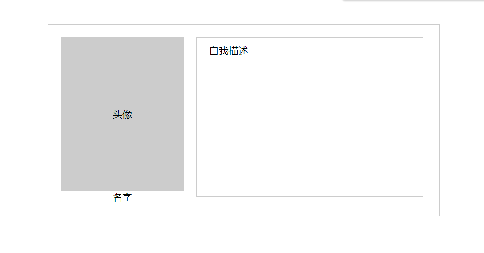
<!DOCTYPE html><html lang="en"><head><meta charset="UTF-8"><meta http-equiv="X-UA-Compatible" content="IE=edge"><meta name="viewport" content="width=device-width, initial-scale=1.0"><title>CSS 浮动案例</title><style>.info {width: 600px;border: 1px solid #ccc;padding: 20px;/* 居中 */margin: 100px auto;overflow: hidden;}.head-sculpture {float: left;text-align: center;/* 右外边距 */margin-right: 20px;}.photo {width: 200px;height: 250px;border: 1px solid #ccc;text-align: center;/* 转化为表格 */display: table-cell;/* 垂直居中 */vertical-align: middle;background-color: #ccc;}.name {text-align: center;}.maioshu {width: 350px;height: 250px;border: 1px solid #ccc;/* 盒子模型 padding : 上 右 下 左 */padding: 10px 0 0 20px;/* text-indent: 2em; */float: left;}</style></head><body><div class="info"><div class="head-sculpture"><div class="photo">头像</div><div class="name">名字</div></div><div class="maioshu">自我描述</div></div></body></html>
CSS盒子模型
每一个元素都是一个盒子,一个盒子由margin (外边距) 、 border(边框线)、padding(内边距)和 contetn (内容)组成。
区别外边距 和 内边距 是以边框为参照
系统默认外边距为 8px ;
外边距(margin) : 值元素的边框线之外的距离
- margin-left : 左边距
- margin-right : 右边距
- margin-top : 上边距
- margin-bottom : 下边距
margin : 可以设置任意一个边框的边距,可以带1-4个参数
- margin: apx : 表示上下左右都是 apx 间距;
- margin: apx bpx : 表示上下外边距为 apx , 左右外边距为bpx ;
- margin: apx bpx cpx : 表示上为 apx , 左右为 bpx , 下为cpx ;
- margin: apx bpx cpx dpx : 表示上为apx , 右为bpx , 下为cpx 左为dpx
内边距( pandding ) 指元素的文本内容与边框之间的距离
padding 的用法也是和 margin 的用法一样,有相同的格式,和参数 语法 等
CSS display 属性
display属性: 用来设置显示方式 。
属性值:
- none : 不显示元素
- block : 快级显示,在元素后面设置换行符。 目的: 将行级标签转化为块级标签(因为行级标签不识别宽高,而块级标签识别, 转化后,行级标签也可以设置宽高了 )
- inline : 行内显示,将块级标签转化为行级标签
- inline-block : 将块级 或 行级 标签转为为 行内块级标签 (行级和块级在一行)
<body><div>div1</div><div>div2</div><span>span</span></body>
div {width: 300px;height: 200px;background-color: #F00;/* 将块级转为 行级标签, 宽高不起作用 *//* display: inline; *//* inline-block 行内块级标签 */display: inline-block;/* 并排 */margin-right: -4px;}div:first-child {background-color: #0F0;/* */}span {/* 块级不会显示宽高 */width: 200px;height: 400px;background-color: #00F;/* span 转为块级标签, 独占一行 */display: block;/* span 转为 行内块级标签 并列一行,具有宽高 */display: inline-block;}
CSS table 样式
table 一般不用来布局,主要用来格式化数据 。
属性:
- width : 宽度
- height : 高度
- border-collapse : 单边框线
- border : 边框线
tr td 属性 :
- width : 宽度
- heigth : 高度
- border : 边框线
- text-algin : 文本的对齐方式 ( left 默认 / center/ right )
- vertical-algin : 文本的垂直对齐方式 (top / middle(默认) / bottom )
<body><table><tr><td>内容显示1</td><td>内容显示2</td><td>内容显示3</td><td>内容显示4</td></tr><tr><td>内容显示1</td><td>内容显示2</td><td>内容显示3</td><td>内容显示4</td></tr><tr><td>内容显示1</td><td>内容显示2</td><td>内容显示3</td><td>内容显示4</td></tr></table></body>
/* table , td td 是具有数据,可以设置边框 */table {width: 600px;height: 500px;/* 居中显示 */margin: 0 auto;/* 单线模式显示 边框线 在 tr td 中不起作用 */border-collapse: collapse;/* 不起作用 *//* vertical-align: bottom; */}tr td {/* 在 table 中不起作用 */border: 1px solid red;/* 文本居中 */text-align: center;/* 文本垂直居中。上、下 在 table 中不起作用 */vertical-align: bottom;}
CSS 列表样式
不是描述性的文本的任何内容都可以认为是列表 。 比如: 菜单、 商品列表等。
列表类型 : 有序列表(ol), 无序列表(ul), 自定义列表(dl)
区别: ul 和 ol的列表项都是由 li 表示, dl 是使用 一个 dt(标题)或 多个 dd(描述) 组成 。
有序列表(ol)
属性值 :
- list-style-image : 用图像表示
- none 默认
- url(“”) : 图标位置
- list-style-position : 标识的位置
- inside : 在列表里部,占用字节
- outside (默认): 在列表外部
- list-style-type : 标识类型
- decimal (默认)/ decimal-leading-zero : 1 / 01
- lower-roman / upper-roman : 大小写罗马
- lower-alpha / upper-alpha : 大小写
- lower-greek / upper-greek
- lower-latin / upper-latin
有序和无序都可以简写 :
list-style : list-style-image list-style-position list-style-type : 值可以任意顺序列出,而且可以任意省略,只需要设置一个值, 其他都会默认
无序列表(ul)
属性值 :
- list-style-image : 用图像表示
- none : 默认
- url(“”) : 图标位置
- list-style-position : 标识的位置
- inside : 在列表里部,占用字节
- outside (默认): 在列表外部
- list-style-type : 标识类型
- dist : 实心圆点 (默认 )
- cricle : 空心的圆点
- square : 实心矩形
- none : 无样式
<head><title>CSS 列表样式 </title><style>ul {/* dist / circle / square */list-style-type: circle;/* list-style-position: inside; */list-style-position: outside;}/* 有序列表 */ol {list-style-type: decimal-leading-zero;list-style-type: lower-roman;/* .... 其他样式 */}/* 自定义 列表 */dd {/* 使用不了 disc *//* list-style: disc; */font-size: 18px;font-weight: bold;/* 移动 */margin-left: 5px;}</style></head><body><!-- 无序列表 --><ul><li>列表样式1</li><li>列表样式2</li><li>列表样式3</li><li>列表样式4</li><li>列表样式5</li></ul><!-- ol 有序列表 --><ol><li>列表样式1</li><li>列表样式2</li><li>列表样式3</li><li>列表样式4</li><li>列表样式5</li></ol><!-- 自定义列表 --><dl><dt> 具有标题</dt><dd>自定义列表1</dd><dd>自定义列表2</dd><dd>自定义列表3</dd><dd>自定义列表4</dd></dl></body>
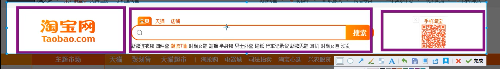
CSS轮播图
主要用于产品和公司宣传
组成:
- 轮播的主图 (至少两张以上)
- 控制器 ( 点击左右轮播图片)
- 计数器 (图片的显示顺序)
总体
<!DOCTYPE html><html lang="en"><head><meta charset="UTF-8"><meta http-equiv="X-UA-Compatible" content="IE=edge"><meta name="viewport" content="width=device-width, initial-scale=1.0"><title>CSS 轮播图</title><link rel="stylesheet" href="../css/CSS轮播组图2.css"></head><body><!-- 轮播容器 --><div class="carousel"><ul class="carsel-img"><!-- 轮播组图 --><li><a href="#"><img src="http://www.sdust.edu.cn/__local/9/7A/B1/F29B84DEF72DD329997E8172ABA_664BA3EF_32466.jpg" alt="001"></a></li><li><a href="#"><img src="http://www.sdust.edu.cn/__local/B/F3/E4/693AB931C9FFB84646970D53BFE_C506394A_4282CA.jpg" alt="002"></a></li><li><a href="#"><img src="http://www.sdust.edu.cn/__local/F/7A/AA/E1459849AA8AB0C89854A41BD41_BF3BD857_BC0D8.jpg" alt="003"></a></li></ul><!-- 控制器 按钮 --><div class="prev"></div><div class="next"></div><!-- 计数器 --><div class="cont"><ul><!-- asd --><li class="active"></li><li></li><li></li></ul></div></div></body></html>
* {padding: 0;margin: 0;}/* 初始化 */li {/* 取消点 */list-style-type: none;}a {text-decoration: none;}.carousel {width: 1000px;height: 600px;/* 居中 */margin: 0 auto;/* 补充颜色 一背景色填充*/background-color: aliceblue;/* 相对定位 : 要想使用多个浮动,脱离文档流,必须用相对定位position: relative; 是相对定位, 之后的元素使用了position: absolute; 绝对定位,是需要根据前面的相对定位来确定位置的,absolute最开始是由 relative 的 0:0 坐标开始的定位的 */position: relative;/* 超出部分隐藏把图片部分隐藏 */overflow: hidden;}/* 让图片显示在一行上 , 需要添加浮动*/.carsel-img li {float: left;}.carsel-img {/* 因为下边的图片需要显示出 1000px , 整体的宽度只有600px; 3张图片是没有办法显示在一行的,所以需要在图片组中将 图片组的宽度设多一点 */width: 99999px;}/* 如果图片没有显示完整, 需要处理图片 */.carsel-img img {/* 因为每一张图片 大小不一样,宽度不该写 100% , 只需要和 整体的宽度一样 */width: 1000px;height: 650px;}/* 控制按钮的样式 */.prev,.next {width: 70px;height: 60px;/* 设置图案 *//* 绝对定位,脱离文档流,因为设置的也是浮动 脱离文档流。使用绝对定位便于定位图标的显示 */position: absolute;top: 50%;/* 调整, top指 的 -16 像素 */margin-top: -16px;}.prev {left: 20px;background-image: url("../html_css/images/left2.png");}.next {right: 20px;background-image: url("../html_css/images/right2.png");}/* 计数器 cont */.cont {width: 1000px;height: 10px;/* 使用了 绝对定位。 li 标签出现在 0:0 的位置 */position: absolute;/* 测试向下的 像素 */bottom: 15px;}.cont ul {width: 60px;height: 10px;margin: 0 auto;/* background-color: red; */}.cont ul li {width: 10px;height: 10px;background-color: rgb(16, 166, 241);/* 鼠标单击 鼠标变成手型 cursor: pointer; */cursor: pointer;/* 给浮动 */float: left;/* opacity不透明度 [0 1 ] 取值范围*/opacity: .8;/* 调整 左边距 */margin-right: 10px;/* 圆角 */border-radius: 50%;}/* 图片激活状态 *//* 有一些设置了并 没有显示出结果 , 就是权重问题*/.cont ul li.active {background-color: rgb(253, 117, 13);}
效果

组图区
<ul class="carsel-img"><!-- 轮播组图 --><li><a href="#"><img src="http://www.sdust.edu.cn/__local/9/7A/B1/F29B84DEF72DD329997E8172ABA_664BA3EF_32466.jpg" alt="001"></a></li><li><a href="#"><img src="http://www.sdust.edu.cn/__local/B/F3/E4/693AB931C9FFB84646970D53BFE_C506394A_4282CA.jpg" alt="002"></a></li><li><a href="#"><img src="http://www.sdust.edu.cn/__local/F/7A/AA/E1459849AA8AB0C89854A41BD41_BF3BD857_BC0D8.jpg" alt="003"></a></li></ul>
/* 初始化 */li {/* 取消点 */list-style-type: none;}a {text-decoration: none;}.carousel {width: 1000px;height: 600px;/* 居中 */margin: 0 auto;/* 补充颜色 一背景色填充*/background-color: aliceblue;/* 相对定位 : 要想使用多个浮动,脱离文档流,必须用相对定位position: relative; 是相对定位, 之后的元素使用了position: absolute; 绝对定位,是需要根据前面的相对定位来确定位置的,absolute最开始是由 relative 的 0:0 坐标开始的定位的 */position: relative;/* 超出部分隐藏把图片部分隐藏 */overflow: hidden;}/* 让图片显示在一行上 , 需要添加浮动*/.carsel-img li {float: left;}.carsel-img {/* 因为下边的图片需要显示出 1000px , 整体的宽度只有600px; 3张图片是没有办法显示在一行的,所以需要在图片组中将 图片组的宽度设多一点 */width: 99999px;}/* 如果图片没有显示完整, 需要处理图片 */.carsel-img img {/* 因为每一张图片 大小不一样,宽度不该写 100% , 只需要和 整体的宽度一样 */width: 1000px;height: 650px;}
控制器
<!-- 控制器 按钮 --><div class="prev"></div><div class="next"></div>
/* 控制按钮的样式 */.prev,.next {width: 70px;height: 60px;/* 设置图案 *//* 绝对定位,脱离文档流,因为设置的也是浮动 脱离文档流。使用绝对定位便于定位图标的显示 */position: absolute;top: 50%;/* 调整, top指 的 -16 像素 */margin-top: -16px;}.prev {left: 20px;background-image: url("../html_css/images/left2.png");}.next {right: 20px;background-image: url("../html_css/images/right2.png");}
计数器
<!-- 计数器 --><div class="cont"><ul><!-- asd --><li class="active"></li><li></li><li></li></ul></div>
/* 计数器 cont */.cont {width: 1000px;height: 10px;/* 使用了 绝对定位。 li 标签出现在 0:0 的位置 */position: absolute;/* 测试向下的 像素 */bottom: 15px;}.cont ul {width: 60px;height: 10px;margin: 0 auto;/* background-color: red; */}.cont ul li {width: 10px;height: 10px;background-color: rgb(16, 166, 241);/* 鼠标单击 鼠标变成手型 cursor: pointer; */cursor: pointer;/* 给浮动 */float: left;/* opacity不透明度 [0 1 ] 取值范围*/opacity: .8;/* 调整 左边距 */margin-right: 10px;/* 圆角 */border-radius: 50%;}/* 图片激活状态 *//* 有一些设置了并 没有显示出结果 , 就是权重问题*/.cont ul li.active {background-color: rgb(253, 117, 13);}
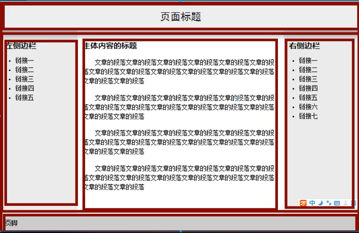
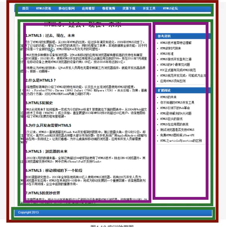
CSS实例
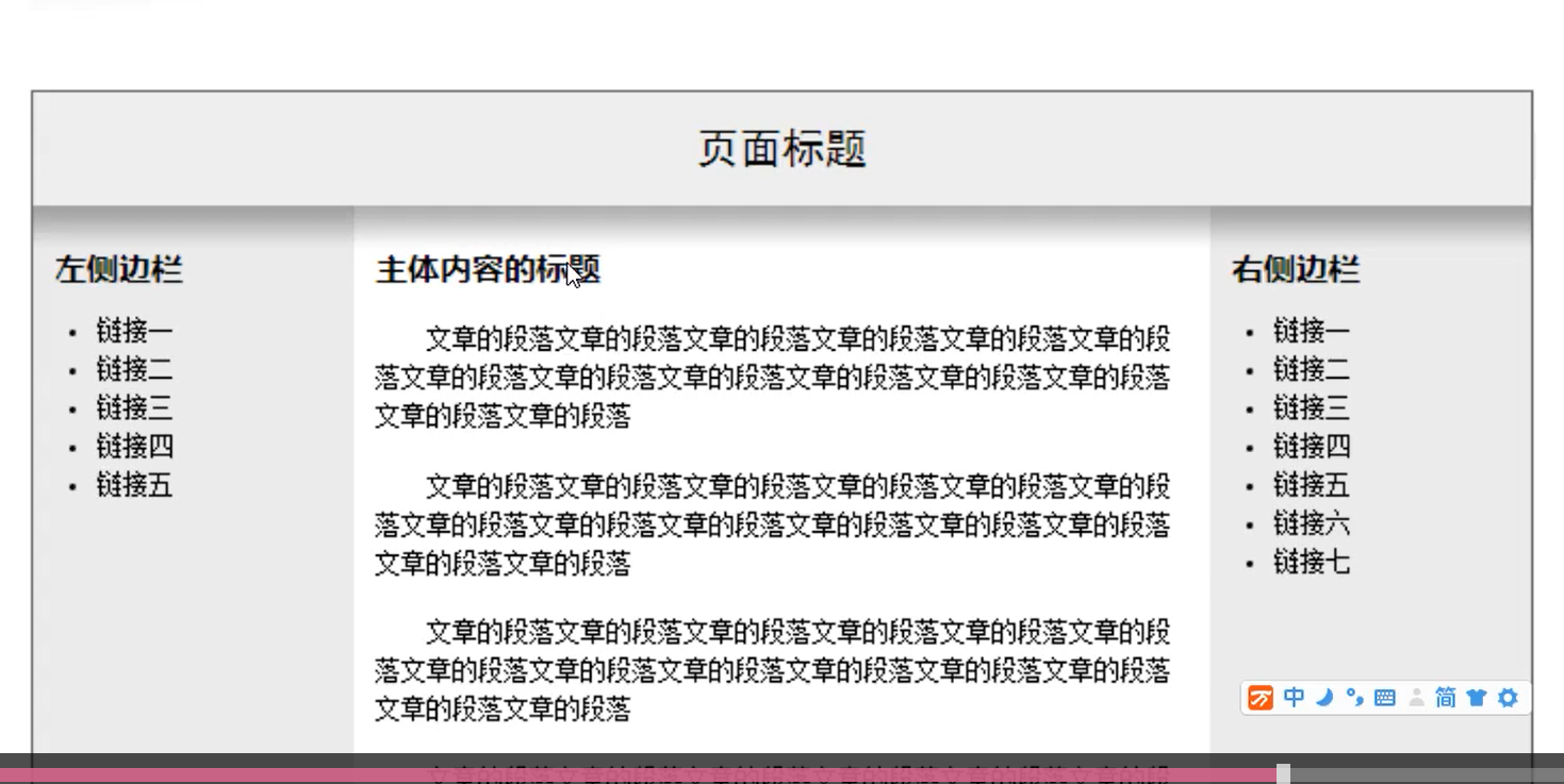
网页 一般从整体分析
整个网页
- 上边部分标题
- 中间的内容页
- (需要浮动将3个内容排在一行)
- 最后的页脚
代码
<!DOCTYPE html><html lang="en"><head><meta charset="UTF-8"><meta http-equiv="X-UA-Compatible" content="IE=edge"><meta name="viewport" content="width=device-width, initial-scale=1.0"><title>CSS day 4 作业1</title><link rel="stylesheet" href="../css/day4作业1.css"></head><body><div class="start"><!-- 标题部分 --><div class="title"><h1>页面标题</h1></div><!-- 需要 3 个 占一行 就需要浮动 --><div class="content"><div class="info left_info"><h4>左边侧栏</h4><ul><li><a href="#">链接1</a></li><li><a href="#">链接2</a></li><li><a href="#">链接3</a></li><li><a href="#">链接4</a></li><li><a href="#">链接5</a></li></ul></div><div class="cont"><h4>内容</h4><p>メSerendipity 春花、秋月、夏日、冬雪,静守时光,以待流年。</p><p>Vue Router的原理及history模式源码实现 Hash 模式 URL中 # 后面的内容作为路径地址,可以通过location.url直接切换路由地址,如果只改变了#后面的内容,浏览器不会向服务器请求这个地址, 会把这个地址记录到浏览器的访问历史中,当hash发生改变之后 会触发hashchange事件,在hashchang e事件中记</p><p>录当前的路由地址,并找到 该路径对应的组件并重新渲染。</p><p>History 模式 History模式就是一个普通的url,通过history.pushState()方法仅仅改变地址栏,并把地址栏中的地址添加到访问历史中,通过监听popstate 事件可以监听浏览器数据的变化,此时不会向服务器发送请求,只有当刷新页面或者点击 浏览器前进后退按钮的时候该事件才会被触发向 浏览器发送请求。</p></div><div class="info right_info"><h4>右边侧栏</h4><ul><li><a href="#">链接1</a></li><li><a href="#">链接2</a></li><li><a href="#">链接3</a></li><li><a href="#">链接4</a></li><li><a href="#">链接5</a></li><li><a href="#">链接6</a></li><li><a href="#">链接7</a></li></ul></div></div><!-- 这里页脚是最后的, 所以上边需要清除浮动 --><div class="foo">页脚</div></div></body></html>
/* 初始化 */* {padding: 0;margin: 0;}.start {/* 内容区一般不给高度, 高度是由内容自行撑开 */width: 1000px;/* height: 700px; */border: 1px solid #000;margin: 0 auto;}h1 {font-size: 20px;font-family: 黑体;font-weight: normal;background-color: #ccc;text-align: center;/* 设置字体的距离 padding 值 */padding: 20px 0;}/* 左栏 和 右栏 具有相同的样式 使用公共的类名 info 进行 设置样式*/.content {/* 清除浮动 */overflow: hidden;}.info {background: #ebebebeb url(../html_css/images/left2.png) repeat-x;width: 200px;height: 600px;/* 浮动 */float: left;}h4 {padding: 20px 0 15px 10px;}ul {/* 左边缩进 */padding-left: 30px;}li {/* 行和行的距离 */line-height: 1.5em;font-size: 14px;}a {text-decoration: none;color: #000;}a:hover {color: rgb(36, 10, 230);}.cont {/* 内容篇 */background: #fff url(../html_css/images/right2.png) repeat-x;width: 600px;height: 300px;float: left;}.cont p {/* p 标签的文字样式 */text-indent: 2em;line-height: 1.5em;padding: 10px 20px 10px 10px;font-size: 14px;}.foo {/* 清除浮动 *//* width: 100%; */height: 12px;background-color: #ccc;/* 给 padding 值 让内容撑开 */padding: 10px 0 15px 10px;font-size: 14px;}
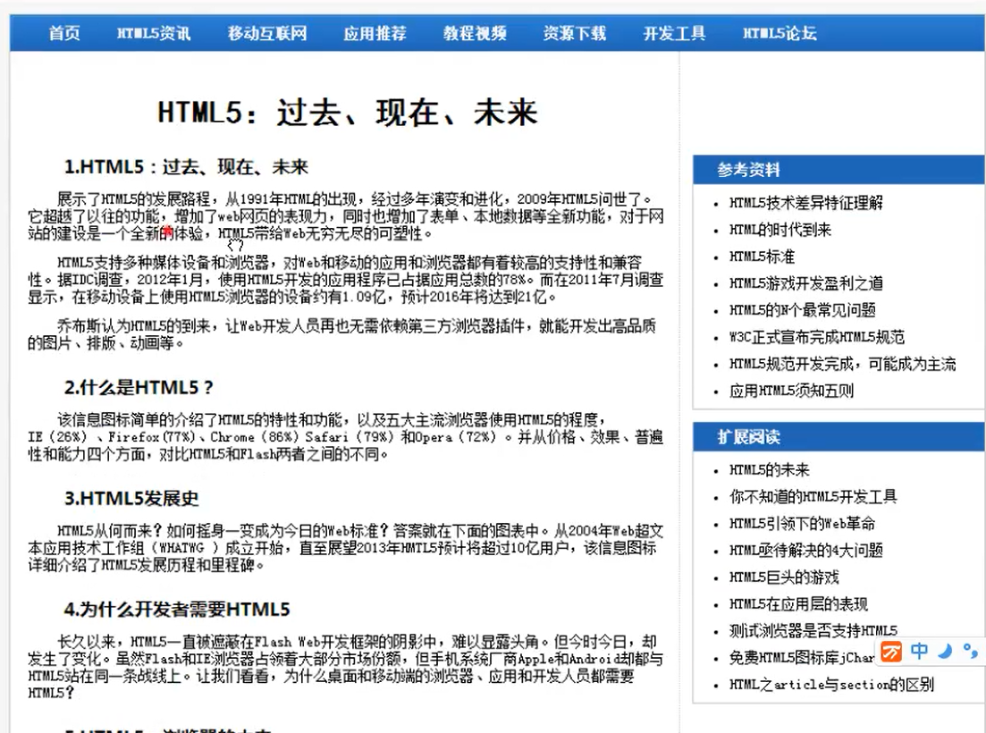
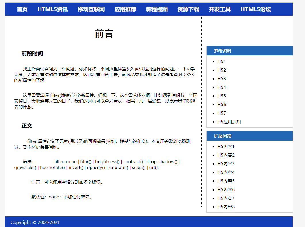
页面构成
HTML
<!DOCTYPE html><html lang="en"><head><meta charset="UTF-8"><meta http-equiv="X-UA-Compatible" content="IE=edge"><meta name="viewport" content="width=device-width, initial-scale=1.0"><title>CSS day4 实训2 </title><link rel="stylesheet" href="../css/CSSday4实训2.css"></head><body><!-- --><div class="wrapper"><!-- 列表区 --><div class="nav"><ul><li><a href="#">首页</a></li><li><a href="#">HTML5资讯</a></li><li><a href="#">移动互联网</a></li><li><a href="#">应用推荐</a></li><li><a href="#">教程视频</a></li><li><a href="#">资源下载</a></li><li><a href="#">开发工具</a></li><li><a href="#">HTML5论坛</a></li></ul></div><!-- 内容区 --><div class="content"><!-- 左边的侧栏内容 --><div class="article"><h1>前言</h1><h2>前段时间</h2><p>找工作面试官问到一个问题,你如何将一个网页整体置灰?面试遇到这样的问题,一下束手无策,之前没有接触过这样的需求,因此没有回答上来,面试结束我才知道了这是考查对 CSS3 的新属性的了解</p><p>这里需要掌握 filter(滤镜) 这个新属性。细想一下,这个需求成立啊,比如遇到清明节、全国哀悼日、大地震等灾害的日子,我们的网页可以全局置灰,相当于加一层滤镜,以表示我们对逝者的悼念。</p><h2>正文</h2><p> filter 属性定义了元素(通常是<img>)的可视效果(例如:模糊与饱和度)。本文用谷歌浏览器测试,暂不烤炉兼容问题。</p><p>语法: filter: none | blur() | brightness() | contrast() | drop-shadow() | grayscale() | hue-rotate() | invert() | opacity() | saturate() | sepia() | url();</p><p> 注意:可以使用空格分割加多个滤镜。</p><p> 默认值:none;不加任何效果。</p></div><!-- 右边的侧栏内容 --><div class="asidebar"><div class="aside"><h3>参考资料</h3><ul><li><a href="#">H51</a></li><li><a href="#">H52</a></li><li><a href="#">H53</a></li><li><a href="#">H54</a></li><li><a href="#">H55</a></li><li><a href="#">H56</a></li><li><a href="#">H57</a></li><li><a href="#">H5应用须知</a></li></ul></div><!-- 因为侧边栏的样式都一样, 所以直接设置类名一样 --><div class="aside"><h3>扩展阅读</h3><ul><li><a href="#">H5内容1</a></li><li><a href="#">H5内容2</a></li><li><a href="#">H5内容3</a></li><li><a href="#">H5内容4</a></li><li><a href="#">H5内容5</a></li><li><a href="#">H5内容6</a></li><li><a href="#">H5内容7</a></li><li><a href="#">H5内容8</a></li></ul></div></div></div><!-- 脚注版权区 --><div class="foot"><p> Copyright © 2004-2021</p></div></div></body></html>
CSS
* {margin: 0;padding: 0;}/* 设置整体 */body {background-color: #f6f6f6;font-size: 12px;padding: 10px;}.wrapper {width: 800px;margin: 0 auto;background-color: #fff;border: 1px solid #ccc;}.wrapper .nav {background-color: rgb(20, 61, 184);/* 需要一个背景颜色 */}.nav ul {list-style-type: none;padding: 8px 0 8px 20px;}.nav li {/* 列表项 需要横向平铺具有两种写法 : 1 浮动, 2,使用 display 将行级变为块级, */display: inline-block;/* inline-block 会产生间隙 */margin: 0 12px;}.nav a {text-decoration: none;color: #fff;font-size: 15px;font-weight: bold;}.nav a:hover {/* 鼠标经过样式 */color: rgb(10, 211, 67);}.content {/* 左右两边栏 清除浮动 */overflow: hidden;}.article {width: 520px;padding: 5px 10px 5px 15px;/* dotted 虚线 */border-right: 1px dotted #000;/*左边和右边站一起,需要浮动 */float: left;}.article h1 {text-align: center;font-size: 26px;font-family: 黑体;margin: 30px 20px;}.article h2 {font-size: 15px;font-family: 微软雅黑;/* 缩进 2 */text-indent: 2em;margin: 20px 0 15px;font-weight: bold;}.article p {text-indent: 2em;font-size: 12px;/* 设置间距 */padding: 10px 0 15px 10px;}.asidebar {/* 右浮动 */float: right;/* 给宽度 */width: 240px;/* 上边间隙 , 和左边间隙 */margin: 85px 0px 0 10px;}.aside {/* 下边间隔 10px */margin-bottom: 10px;border-left: 1px solid #ccc;border-bottom: 1px solid #ccc;}.aside h3 {background-color: #2267b5;font-size: 12px;color: #f5f5f5;padding: 5px 0px 5px 20px;}.aside ul {margin: 0 0 0 30px;}.aside li {margin: 8px 0;}.aside a {color: #000;text-decoration: none;}.aside a:hover {text-decoration: underline;color: rgb(21, 208, 43);}/* 页脚 */.foot p {/* width: 100%; */background-color: rgb(20, 61, 184);height: 25px;padding: 8px 0 0 15px;color: #fff;margin-bottom: 20px;}
效果
CSS定位布局
定位( position) : 设定元素在文档中的位置。会将标签(元素) 转化为块级。
定位的分类
- static : 静态定位, 默认值 ,没有定位, 不能设置偏移 ( left / top / bottom / right ), 占用标准流 (文档流),也就是占用元素本来的位置 。
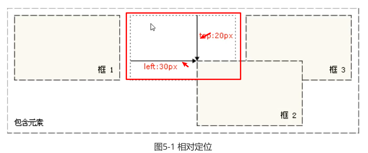
- relative : 相对定位, 占用标准流 (文档流 ),他会出现在文档中该出现的位置。 可以通过设置偏移值改变其位置, 相对于自身做偏移
- absolute : 绝对定位 , ( 脱离文档流),单独使用相对于 body 做偏移 ( left / top / right / buttom)。如果绝对定位和相对定位结合起来使用, 它相对的父级是 relative 定义的元素做偏移。relative的元素必须是 absolute 的父级在项目开发中,一般使用 relative + absolute 结合使用最多
- fixed : 固定定位 , (脱离文档流),相对于浏览器窗口左上角 (0,0) 偏移,它与 relative 设定的对象没有任何关系,也就是说,它和父级的定位没有任何关系了, 一般用于开发固定的导航栏
偏移:
CSS 定位 static 和 relative
static 静态定位 和 relative 相对定位
- static : 静态定位, 默认值 ,没有定位, 不能设置偏移 ( left / top / bottom / right ), 占用标准流(文档流),也就是占用元素本来的位置 。
- relative : 相对定位, 占用标准流 (文档流 ),他会出现在文档中该出现的位置。 可以通过设置偏移值改变其位置, 它相对于自身所占的位置做偏移。
<!DOCTYPE html><html lang="en"><head><meta charset="UTF-8"><meta http-equiv="X-UA-Compatible" content="IE=edge"><meta name="viewport" content="width=device-width, initial-scale=1.0"><title>CSS static 和 relative 定位</title><style type="text/css">.wrapper {width: 1000px;height: 600px;border: 2px solid #ccc;padding: 0 auto;/* 都占一行 */}.box1,.box2,.box3 {width: 200px;height: 200px;border: 2px dotted red;display: inline-block;}/* static */.box2 {/* 静态定位 */position: static;/* 静态定位 偏移不起作用 */left: 100px;bottom: 300px;}.box2 {/* 相对定位 */position: relative;/* 从 0,0开始, 进行偏移,元素变化后的 left 和 top 变化 */left: 100px;top: 200px;}</style></head><body><div class="wrapper"><div class="box1"></div><div class="box2"></div><div class="box3"></div></div></body></html>
CSS定位 relative 和 absolute
absolute : 绝对定位 , 脱离文档流,相对于 body 做偏移 ( left / top / right / buttom)。如果绝对定位和相对定位结合起来使用, 它相对的父级是 relative 定义的元素做偏移。relative的元素必须是 absolute 的父级在项目开发中,一般使用 relative + absolute 结合使用最多
<!DOCTYPE html><html lang="en"><head><meta charset="UTF-8"><meta http-equiv="X-UA-Compatible" content="IE=edge"><meta name="viewport" content="width=device-width, initial-scale=1.0"><title>CSS定位 相对定位 relative 和 绝对定位 absolute </title><style type="text/css">.wrapper {width: 1000px;height: 600px;border: 2px solid #ccc;/* 居中 */padding: 0 auto;/* 都占一行 *//* 父级使用 relative */position: relative;}.box1,.box2,.box3 {width: 200px;height: 200px;border: 2px dotted red;display: inline-block;}.box2 {/* 以父级的 relative 进行 (0, 0) 定位 */left: 120px;top: 100px;position: absolute;/* 脱离文档流 */}</style></head><body><div class="wrapper"><div class="box1"></div><div class="box2"></div><div class="box3"></div></div></body></html>
CSS 的fixed 固定定位
fixed : 固定定位 , 脱离文档流,相对于浏览器窗口左上角 (0,0) 偏移,它与 relative 设定的对象没有任何关系,也就是说,它和父级的定位没有任何关系了, 一般用于开发固定的导航栏
<!DOCTYPE html><html lang="en"><head><meta charset="UTF-8"><meta http-equiv="X-UA-Compatible" content="IE=edge"><meta name="viewport" content="width=device-width, initial-scale=1.0"><title>CSS 的 固定定位 fixed </title><style type="text/css">.wrapper {width: 1000px;height: 600px;border: 2px solid #ccc;/* 居中 */margin: 0 auto;/* 都占一行 *//* 父级使用 relative */position: relative;/* 当下边使用了 fixed 定位 , 就和父级的 relative 定位已经没有关系了 */}.box1,.box2,.box3 {width: 200px;height: 200px;border: 2px dotted red;display: inline-block;}.box2 {left: 120px;top: 100px;/* 相对于浏览器进行定位 */position: fixed;}</style></head><body><div class="wrapper"><div class="box1"></div><div class="box2"></div><div class="box3"></div></div></body></html>
CSS调整显示顺序
z-index : 值为 数值
当多个元素添加绝对定位, 元素会叠加在一起, 使用 z-index 可以设置元素显示的层次
文档流 默认的 z-index 的值为 0 , z-index 使用在 static 和 relative 元素上将无效
z-index : 当多个元素添加绝对定位, 元素会叠加在一起, 使用 z-index 可以设置元素显示的层次可以让挤在一起的 元素 显示的先后顺序
z-index 显示顺序 : [ -number 0 +number ]
<!DOCTYPE html><html lang="en"><head><meta charset="UTF-8"><meta http-equiv="X-UA-Compatible" content="IE=edge"><meta name="viewport" content="width=device-width, initial-scale=1.0"><title>CSS 调整显示序列 z-index </title><style type="text/css">.wrapper {width: 1000px;height: 600px;border: 2px solid #ccc;/* 居中 */margin: 0 auto;/* 父级相对定位 */position: relative;}.box1,.box2,.box3 {width: 200px;height: 200px;border: 2px dotted red;display: inline-block;/* 集中显示在 ( 0,0 ) 坐标 */position: absolute;}/* z-index : 当多个元素添加绝对定位, 元素会叠加在一起, 使用 z-index 可以设置元素显示的层次可以让挤在一起的 元素 显示的先后顺序z-index 显示顺序 : [ -number 0 +number ]*/.box1 {background-color: #f00;z-index: 1;}.box2 {background-color: #0f0;left: 50px;top: 40px;z-index: 3;}.box3 {background-color: #00f;left: 100px;z-index: 3;}</style></head><body><div class="wrapper"><div class="box1"></div><div class="box2"></div><div class="box3"></div></div></body></html>
CSS 布局
网站开发策略 : 先整体再局部,指顶向下,逐步细化
CSS 双飞翼布局
双飞翼布局: 左右宽度固定,中间的列宽根据浏览器的窗口大小自适应 。
双飞翼布局的优点 :
- 兼容性好,兼容所有的主流浏览器, 包括万恶的 IE6
- 因为在DOM中center_panel 在三列结构的前面,因此可以实现主要的内容优先加载
html
<div class="container"><div class="content"></div><div class="left"></div><div class="right"></div></div>
css
.container {width: 100%;/* 清除浮动 */overflow: hidden;}.left,.content,.right {/* 浮动,占一行 */float: left;}.content {/* 需要中间自适应 content的 width 就是设置成 100% */width: 100%;height: 100px;background-color: #F00;}.left {width: 200px;height: 100px;background-color: #0F0;/* 使用 margin-left 让元素和 content 占一行 *//* 使用 margin-left: -100% , 回到最左侧 */margin-left: -100%;}.right {width: 200px;height: 100px;background-color: #00F;/* 让 right 到 最右边使用 margin-left: -200px, right 的宽度 */margin-left: -200px;}
CSS 圣杯布局
由三列组成,两端固定,中间自适应。 外观于双飞翼的一样
和双飞翼布局的区别 :双飞翼布局是左右两边叠加在中间的, 圣杯是将左右两边移动到padding给的值,固定起来了,不会影响到 content的内容
<!-- 通常网页由三部分组成 --><!-- 1, header 头部 --><div class="header">#Header</div><!-- 2. content 内容部分 --><div class="container"><div class="content"></div><div class="left"></div><div class="right"></div></div><!-- 3, footer 尾部 --><div class="footer">#Footer </div>
body {/* 设置浏览器 最小的值 */min-width: 600px;}.header,.footer {/* 设置网页的 头部和尾部 */width: 100%;height: 100px;line-height: 100px;text-align: center;background-color: rgb(15, 240, 187);font-size: 30px;}.container {/* padding 设置的 200 是 放置left 和 right 的内容 */padding: 0 200px;overflow: hidden;}.content,.left,.right {/* 浮动 */float: left;height: 200px;/* 圣杯布局需要 增加 定位, 然后通过定位移动元素*/position: relative;}.content {/* 中间自适应 ,width 设置成 100% */width: 100%;background-color: #f00;}.left {width: 200px;background-color: #0f0;/* 使用 margin-left 样元素移动到 center 两边, 和 双飞翼布局一样 */margin-left: -100%;/* 通过定位的 relative , 将元素移动到 padding 给的200值 里边 */left: -200px;}.right {width: 200px;background-color: #00f;/* 和双飞翼布局的, 移动元素到 content 的两边 */margin-left: -200px;/* 通过定位的 relative , 将元素移动到 padding 给的200值 里边 */right: -200px;}
CSS 侧边栏固定布局
侧边栏布局是一种比较常见的布局方案
左侧固定,右侧自适应
<!DOCTYPE html><html lang="en"><head><meta charset="UTF-8"><meta http-equiv="X-UA-Compatible" content="IE=edge"><meta name="viewport" content="width=device-width, initial-scale=1.0"><title>CSS 左侧固定,右侧自适应</title><style type="text/css">body {font-size: 30px;min-width: 600px;}.container {width: 100%;/* 清除浮动 */overflow: hidden;}.left {/* 左侧固定 */width: 150px;/* 在实际开发中,尽量不要用 height,高度自由内容 自行撑开 */height: 200px;float: left;background-color: #f00;/* margin-right 让 right区 同在一行 */margin-right: -150px;position: relative;}.right {/* 右侧自适应 , width设置为100%*/width: 100%;height: 200px;float: left;background-color: #0f0;/* 往右边移动 */margin-left: 155px;}</style></head><body><div class="container"><div class="left"> # 左侧 固定</div><div class="right"> # 右侧 自适应</div></div></body></html>
右侧固定,左侧自适应
<!DOCTYPE html><html lang="en"><head><meta charset="UTF-8"><meta http-equiv="X-UA-Compatible" content="IE=edge"><meta name="viewport" content="width=device-width, initial-scale=1.0"><title>CSS 右侧固定,左侧自适应</title><style type="text/css">body {font-size: 30px;min-width: 600px;}.container {width: 100%;/* 清除浮动 */overflow: hidden;}.left {/* 左侧自适应 , width设置为100%*/width: 100%;height: 200px;float: left;background-color: #0f0;}.right {/* 右侧固定 */width: 150px;/* 在实际开发中,尽量不要用 height,高度自由内容 自行撑开 */height: 200px;float: left;background-color: #f00;/* 占同一行 */margin-left: -150px;/* position: relative; */}</style></head><body><div class="container"><div class="left"> # 左侧 自适应</div><div class="right"> # 右侧 固定</div></div></body></html>
两列定宽 , 左右固定
<!DOCTYPE html><html lang="en"><head><meta charset="UTF-8"><meta http-equiv="X-UA-Compatible" content="IE=edge"><meta name="viewport" content="width=device-width, initial-scale=1.0"><title> CSS 左右固定</title><style>body {font-size: 30px;/* min-width: 600px; */}.container {/* 内容固定 */width: 100%;/* 清除浮动 */overflow: hidden;}.left {width: 200px;height: 400px;background-color: #f00;float: left;}.right {width: 780px;height: 400px;background-color: #ff0;/* 右 浮动 */float: right;}</style></head><body><div class="connainer"><div class="left"> 左侧 固定</div><div class="right"> 右侧固定</div></div></body></html>
CSS三栏布局
右侧,左侧 固定 , 中间自适应
<!DOCTYPE html><html lang="en"><head><meta charset="UTF-8"><meta http-equiv="X-UA-Compatible" content="IE=edge"><meta name="viewport" content="width=device-width, initial-scale=1.0"><title> CSS 三栏布局</title><style type="text/css">.container {font-size: 25px;color: aliceblue;line-height: 200px;text-align: center;/* 清除浮动 */overflow: hidden;}.left,.right {/* width: 150px; */float: left;height: 200px;/* 相对定位 */position: relative;}.left {width: 150px;background-color: #f00;/* 使用 margin-right 左侧和中间占一行 */margin-right: -150px;}.right {width: 200px;background-color: #ff0;/* margin-left 让右边和中间 占 一行 */margin-left: -200px;}.content {/* 自适应 */width: 100%;height: 200px;float: left;background-color: #00f;}</style></head><body><!--右侧,左侧 固定 , 中间自适应 --><div class="container"><div class="left"> 左侧固定</div><div class="content"><div class="content"> 中间 自适应</div></div><div class="right"> 右侧固定</div></div></body></html>
右侧,中间侧 固定 , 左侧自适应
<!DOCTYPE html><html lang="en"><head><meta charset="UTF-8"><meta http-equiv="X-UA-Compatible" content="IE=edge"><meta name="viewport" content="width=device-width, initial-scale=1.0"><title>CSS 三栏布局二 </title><style type="text/css">.container {font-size: 25px;overflow: hidden;text-align: center;}.left {width: 100%;height: 200px;background-color: #00f;float: left;/* 加上content 的原因是需要腾出空间,给 中 和 右 600px是中和右的width的总宽度margin-right: -600px */margin-right: -600px;}.content {line-height: 200px;text-align: center;}.center,.right {height: 200px;float: right;line-height: 200px;}.center {width: 300px;background-color: #f00;}.right {width: 300px;background-color: #ff0;}</style></head><body><!--中间侧,右侧 固定 , 左自适应 --><div class="container"><div class="left"><div class="content"> 左侧自适应</div></div><div class="center">中间固定</div><div class="right"> 右侧固定</div></div></body></html>
中间,左侧 固定 , 右侧自适应
<!DOCTYPE html><html lang="en"><head><meta charset="UTF-8"><meta http-equiv="X-UA-Compatible" content="IE=edge"><meta name="viewport" content="width=device-width, initial-scale=1.0"><title>CSS 三栏布局3 </title><style type="text/css">.container {font-size: 25px;overflow: hidden;text-align: center;}.left {width: 300px;height: 200px;background-color: #ff0;}.content {line-height: 200px;text-align: center;margin-right: 200px;}.center,.left {height: 200px;float: left;line-height: 200px;}.center {width: 300px;background-color: #f00;}.right {width: 100%;height: 200px;background-color: #00f;float: right;margin-right: -600px;}</style></head><body><!--中间侧,右侧 固定 , 左自适应 --><div class="container"><div class="left">左侧固定</div><div class="center">中间固定</div><div class="right"><div class="content">右侧自适应 </div></div></div></body></html>
CSS的规范
FC : 格式上下文, 它是页面中的一块渲染区域, 并且有一套渲染规则,它决定了其子元素将如何定位,以及其他元素的对应关系和相互作用
分为 BFC 和 IFC
BFC 规范
BFC块级格式上下文
形成BFC的条件
- 浮动元素 ( float 除了 none 以外的值)
- 定位元素 ( position ( abolute / fixed ))
- display ( 值为 inline-block / table-cell / table-caption 时)
- overflow ( 值为 hidden / auto / scroll 时)
BFC的特性
- 内部盒子会在垂直方向上一个接一个的放置
- 垂直方向上的距离会叠加,值由最大 margin 值决定, 如果不要叠加,就需要将盒子变成一个独立的容器(在外层加一个容器进行包裹起来)
- BFC的区域不会 float 元素区域重叠
- 计算BFC高度时,浮动元素也参与计算
- BFC就是页面上的一个独立的容器, 容器里面的子元素不会影响到外面的元素
BFC 的作用
- 解决 margin 重叠的问题 (添加独立 BFC)
- 解决浮动高度塌陷的问题 ( 在父级添加 overflow: hidden)
- 解决侵占浮动元素的问题 ( 同级时候, 在其中一个添加 overflow: hidden )
<!DOCTYPE html><html lang="en"><head><meta charset="UTF-8"><meta http-equiv="X-UA-Compatible" content="IE=edge"><meta name="viewport" content="width=device-width, initial-scale=1.0"><title>CSS 的 BFC规范 </title><!-- BFC 的特性 --><!-- <style>/* 特性1 内部盒子会在垂直方向上一个接一个的放置*/.box1,.box2 {width: 200px;height: 100px;}.box1 {background-color: #f00;}.box2 {background-color: #0f0;}</style> --><!--<style>/* 特性二 : 垂直方向上的距离会叠加,值由最大 margin (20) 值决定, 如果不要叠加,就需要将盒子变成一个独立的容器(在外层加一个容器进行包裹起来) */.container {overflow: hidden;width: 100px;height: 100px;background-color: #00f;}.wrapper {/* 将 box1 变成一个独立的容器,之后的 margin值和box2 的margin值就可以叠加 */overflow: hidden;}.box1 {background-color: #f00;height: 10px;margin: 10px 0;}.box2 {background-color: #0f0;height: 10px;margin: 20px 0;}</style> --><!--<style>/* BFC的区域不会 float 元素区域重叠, 经常遇到 ,也就时 两个 BFC 区域不会重叠 */.box1 {/* 这是一个 BFC */float: left;width: 200px;height: 200px;background-color: rgb(90, 135, 38);}.box2 {/* 这又是一个 BFC */overflow: hidden;width: 500px;height: 300px;background-color: rgb(24, 88, 145);}</style>--><!-- <style>/* 计算BFC高度时,浮动元素也参与计算 */.container {border: 1px solid #000;width: 300px;/* 没有形成BFC时, 它是没有撑开下边的box2 的浮动的, 如果想要撑开包含box2,就需要将 container 设置成浮动,此时 container 的 高度时由 它里面的 浮动元素撑开*/overflow: hidden;}.box2 {width: 200px;height: 300px;/* 是一个 BFC */float: left;background-color: #f00;}</style> --></head><body><div class="container"><div class="wrapper"><div class="box1"></div></div><div class="box2"></div></div></body></html>
IFC 规范
IFC行级标签的规范
IFC : 内联(行级)格式上下文
形成IFC的条件
- font-size
- line-height
- height
- vertical-aligin
IFC 的特性
- IFC的元素会在一行中从左至右排列
- 在一行上的所有元素会在该区域形成一个行框
- 行宽的高度为 包含框的高度 ,高度为行框中最高元素的高度
- 浮动元素不会在行框中, 并且浮动元素会压缩行框的宽度
- 行框的宽度容纳不下子元素时, 子元素会换成下一行显示,并且会产生新的行框
- 行框的元素内遵循 text-align 和 vertical-aligin
span {/* width 行级标签不会识别宽高*/width: 200px;font-size: 40px;background-color: #00f;}strong {font-size: 16px;}.box {/* 浮动元素, */float: left;}div {/* 块级标签转化为: 行级标签 */display: inline;}
容器的高度
height = line-height + vertical-aligin行高 + 垂直布局的高度
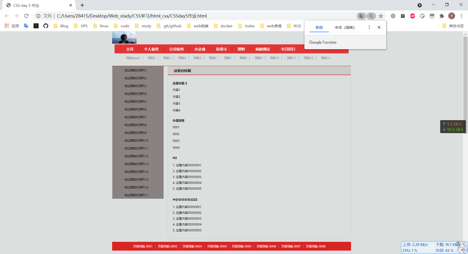
CSS 实例二
<!DOCTYPE html><html lang="en"><head><meta charset="UTF-8"><meta http-equiv="X-UA-Compatible" content="IE=edge"><meta name="viewport" content="width=device-width, initial-scale=1.0"><title>CSS day 5 作业</title><link rel="stylesheet" href="../css/day5作业.css"></head><body><!-- 页面 --><div class="container"><!-- 1 头部 --><div class="header"><!-- logo --><a href="#"><img src="../img5.png" alt="logo" width="100px" height="50px"></a><!-- 主导航 --><nav class="mainnav"><ul><li><a href="#">主页</a></li><li><a href="#">个人业务</a></li><li><a href="#">公司业务</a></li><li><a href="#">小企业</a></li><li><a href="#">信用卡</a></li><li><a href="#">理财</a></li><li><a href="#">商旅预定</a></li><li><a href="#">今日招行</a></li></ul></nav><!-- 夫导航 --><nav class="subnav"><ul><li><a href="#">导航aaaa1</a></li><li><a href="#">导航2</a></li><li><a href="#">导航3</a></li><li><a href="#">导航4</a></li><li><a href="#">导航5</a></li><li><a href="#">导航6</a></li><li><a href="#">导航7</a></li><li><a href="#">导航8</a></li><li><a href="#">导航9</a></li><li><a href="#">导航10</a></li><li><a href="#">导航11</a></li><li><a href="#">导航12</a></li><li><a href="#">导航13</a></li></ul></nav></div><!-- 2 主体 --><div class="content"><!-- 左侧 --><div class="leftsider"><ul><li><a href="#">侧边导航栏序列1</a></li><li><a href="#">侧边导航栏序列2</a></li><li><a href="#">侧边导航栏序列3</a></li><li><a href="#">侧边导航栏序列4</a></li><li><a href="#">侧边导航栏序列5</a></li><li><a href="#">侧边导航栏序列6</a></li><li><a href="#">侧边导航栏序列7</a></li><li><a href="#">侧边导航栏序列8</a></li><li><a href="#">侧边导航栏序列9</a></li><li><a href="#">侧边导航栏序列10</a></li><li><a href="#">侧边导航栏序列11</a></li><li><a href="#">侧边导航栏序列12</a></li><li><a href="#">侧边导航栏序列13</a></li><li><a href="#">侧边导航栏序列14</a></li><li><a href="#">侧边导航栏序列15</a></li><li><a href="#">侧边导航栏序列16</a></li><li><a href="#">侧边导航栏序列17</a></li></ul></div><!-- 主题 --><div class="main"><div class="title"><h1>这是内标题</h1></div><section><h2> 这是标题 2 </h2><p>内容1</p><p>内容2</p><p>内容3</p><p>内容4</p></section><section><h2> 办理流程</h2><p>0001</p><p>0002</p><p>0003</p><p>0004</p></section><section><h2> H2 </h2><ol><li>这是内容00000001</li><li>这是内容00000002</li><li>这是内容00000003</li><li>这是内容00000004</li><li>这是内容00000005</li></ol></section><section><h2> H@@@@@2222 </h2><ol><li>这是内容00000001</li><li>这是内容00000002</li><li>这是内容00000003</li><li>这是内容00000004</li><li>这是内容00000005</li></ol></section></div></div><!-- 3, 尾部 footer --><div class="footer"><ul><li><a href="#">页尾导航 0001</a></li><li><a href="#">页尾导航 0002</a></li><li><a href="#">页尾导航 0003</a></li><li><a href="#">页尾导航 0004</a></li><li><a href="#">页尾导航 0005</a></li><li><a href="#">页尾导航 0006</a></li><li><a href="#">页尾导航 0007</a></li><li><a href="#">页尾导航 0008</a></li></ul></div></div></body></html>
* {padding: 0;margin: 0;}li {/* 取消点 */list-style-type: none;}a {/* 取消下划线 */text-decoration: none;color: #000;}body {font-size: 12px;background: #dbdfde no-repeat center top;}/* 总体 */.container {/* 版图 */width: 980px;margin: 0 auto;height: 2000px;}/* 页首样式 */.header {/* 盒子往下 15 */padding-bottom: 15px;/* 下边边框 */border-bottom: 1px solid rgb(204, 19, 19);}/* 主导航栏 */.mainnav {background-color: rgb(226, 54, 54);/* 盒子 左右缩小 设为 10 */margin: 0 10px;}.mainnav ul {font-size: 15px;font-weight: bold;/* ul 这个盒子,上下左右 占的宽度 */padding: 9px 0 8px 0;/* 整体往左移动 30 */margin-left: 30px;}.mainnav ul li {/* 排在一行 */display: inline-block;/* li中的单个盒子: */padding: 0 20px 0 18px;/* 导航左边的线 */border-right: 1px solid #88180f;}.mainnav ul li:last-child {/* 去掉边框 *//* 最后一个没有边框 , 使用伪类去写 :last-child */border: none;}.mainnav ul li a {color: #fff;}.mainnav ul li a:hover {color: rgb(246, 250, 32);}/* 副导航 */.subnav ul {/* 因为center居中了,样式不一样 */text-align: center;font-size: 12px;padding: 10px 0;}.subnav ul li {display: inline-block;border-right: 1px solid #999;padding-right: 10px;margin-right: 17px;}.subnav ul li:last-child {border: none;}.subnav ul li a {color: #888;}.subnav ul li a:hover {color: #000;}/* 主体部分 */.content {/* 清除浮动 */overflow: hidden;}.leftsider {/* 浮动 */float: left;width: 210px;/* 出来上边没有边框线 */border: 1px solid #ccc;border-top: none;}.leftsider ul {background-color: rgb(138, 130, 130);/* 边框中的左边橡塑 */padding-left: 50px;}.leftsider ul li {/* 字体的间距 上 左右 下 */padding: 9px 0 7px;}.leftsider ul li a:hover {color: rgb(226, 54, 54);}/* 内容区 */.main {/* 浮动 */float: right;/* 内容往左 */padding: 0 0 20px 20px;/* margin-left: 2px; */width: 730px;border: 1px solid #ccc;}.main .title {margin-left: -20px;background-color: #ccc;border-bottom: 2px solid rgb(209, 47, 47);}.main .title h1 {font-size: 14px;padding: 8px 0 7px 25px;}.main section h2 {font-size: 12px;margin: 25px 0 10px;}.main p {line-height: 1.5em;margin: 10px 0;}.main li {list-style-type: decimal;list-style-position: inside;line-height: 2em;}/* 页尾部分 */.footer {background-color: rgb(218, 36, 36);margin-top: 15px;}.footer ul {text-align: center;padding: 10px 0;}.footer ul li {/* 转为行级标签 排在一行 */display: inline-block;border-right: 1px solid #999;padding-right: 10px;/* 盒子往右 */margin-right: 7px;}.footer ul li:last-child {border: none;}.footer ul li a:hover {color: rgb(246, 250, 32);}.footer ul li a {color: #fff;}
效果

若有收获,就点个赞吧
0 人点赞
