无障碍访问 {#accessibility}
Web 无障碍访问 (也称为 a11y) 是指创建可供任何人使用的网站的做法——无论是身患某种障碍、通过慢速的网络连接访问、使用老旧或损坏的硬件,还是仅处于某种不方便的环境。例如,在视频中添加字幕可以帮助失聪、有听力障碍或身处嘈杂环境而听不到手机的用户。同样地,确保文字样式没有处于太低的对比度,可以对低视力用户和在明亮的强光下使用手机的用户都有所帮助。
你是否已经准备开始却又无从下手?
请先阅读由万维网联盟 (W3C) 提供的 Web 无障碍访问的规划和管理。
跳过链接 {#skip-link}
你应该在每个页面的顶部添加一个直接指向主内容区域的链接,这样用户就可以跳过在多个网页上重复的内容。
通常这个链接会放在 App.vue 的顶部,这样它就会是所有页面上的第一个可聚焦元素:
<ul class="skip-links"><li><a href="#main" ref="skipLink">Skip to main content</a></li></ul>
若想在非聚焦状态下隐藏该链接,可以添加以下样式:
.skipLink {white-space: nowrap;margin: 1em auto;top: 0;position: fixed;left: 50%;margin-left: -72px;opacity: 0;}.skipLink:focus {opacity: 1;background-color: white;padding: 0.5em;border: 1px solid black;}
一旦用户改变路由,请将焦点放回到这个“跳过”链接。通过如下方式聚焦“跳过”链接的模板 ref (假设使用了 vue-router)即可实现:
vue
<script setup>
import { ref, watch } from 'vue'
import { useRoute } from 'vue-router'

const route = useRoute()
const skipLink = ref()

watch(
  () => route.path,
  () => {
    skipLink.value.focus()
  }
)
</script>
内容结构 {#content-structure}
确保设计可以支持易于访问的实现是无障碍访问最重要的部分之一。设计不仅要考虑颜色对比度、字体选择、文本大小和语言,还要考虑应用程序中的内容是如何组织的。
标题 {#headings}
用户可以通过标题在应用程序中进行导航。为应用程序的每个部分设置描述性标题,这可以让用户更容易地预测每个部分的内容。说到标题,有几个推荐的无障碍访问实践:
- 按级别顺序嵌套标题:
<h1>-<h6> - 不要在一个章节内跳跃标题的级别
- 使用实际的标题标记,而不是通过对文本设置样式以提供视觉上的标题
<main role="main" aria-labelledby="main-title"><h1 id="main-title">Main title</h1><section aria-labelledby="section-title"><h2 id="section-title"> Section Title </h2><h3>Section Subtitle</h3><!-- 内容 --></section><section aria-labelledby="section-title"><h2 id="section-title"> Section Title </h2><h3>Section Subtitle</h3><!-- 内容 --><h3>Section Subtitle</h3><!-- 内容 --></section></main>
Landmark {#landmarks}
Landmark 会为应用中的章节提供访问规划。依赖辅助技术的用户可以跳过内容直接导航到应用程序的每个部分。你可以使用 ARIA role 帮助你实现这个目标。
| HTML | ARIA Role | 地标的目的 |
|---|---|---|
| header | role=”banner” | 主标题:页面的标题 |
| nav | role=”navigation” | 适合用作文档或相关文档导航的链接集合 |
| main | role=”main” | 文档的主体或中心内容 |
| footer | role=”contentinfo” | 关于父级文档的信息:脚注/版权/隐私声明链接 |
| aside | role=”complementary” | 用来支持主内容,同时其自身的内容是相对独立且有意义的 |
| 无对应元素 | role=”search” | 该章节包含整个应用的搜索功能 |
| form | role=”form” | 表单相关元素的集合 |
| section | role=”region” | 相关的且用户可能会导航至此的内容。必须为该元素提供 label |
:::tip 提示: 在使用地标 HTML 元素时,建议加上冗余的地标 role attribute,以最大限度地与传统不支持 HTML5 语义元素的浏览器兼容。 :::
语义化表单 {#semantic-forms}
当创建一个表单,你可能使用到以下几个元素:<form>、<label>、<input>、<textarea> 和 <button>。
标签通常放置在表格字段的顶部或左侧:
<form action="/dataCollectionLocation" method="post" autocomplete="on"><div v-for="item in formItems" :key="item.id" class="form-item"><label :for="item.id">{{ item.label }}: </label><input:type="item.type":id="item.id":name="item.id"v-model="item.value"/></div><button type="submit">Submit</button></form>
请注意这里我们是如何在表单元素中引入 autocomplete='on' 的,它将应用于表单中的所有 input 框。你也可以为每个 input 框都设置不同的 autocomplete attribute 的值。
标签 {#labels}
提供标签来描述所有表单控件的用途;使 for 和 id 链接起来:
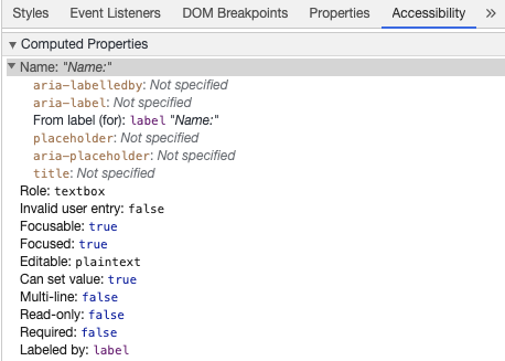
<label for="name">Name</label><input type="text" name="name" id="name" v-model="name" />
如果你在 chrome 开发工具中检查这个元素,并打开 Elements 选项卡中的 Accessibility 选项卡,你将看到输入是如何从标签中获取其名称的:
:::warning 警告: 你可能还见过这样的包装 input 框的标签:
<label>Name:<input type="text" name="name" id="name" v-model="name" /></label>
但我们仍建议你显式地为 input 元素设置 id 相匹配的标签,以更好地实现无障碍访问。 :::
aria-label {#aria-label}
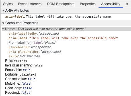
你也可以为 input 框配置一个带有 aria-label 的无障碍访问名。
<label for="name">Name</label><inputtype="text"name="name"id="name"v-model="name":aria-label="nameLabel"/>
在 Chrome DevTools 中审查此元素,查看无障碍名称是如何更改的:
aria-labelledby {#aria-labelledby}
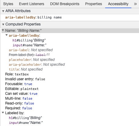
使用 aria-labelledby 类似于 aria-label,除非标签文本在屏幕上可见。它通过 id 与其他元素配对,你可以链接多个 id:
<formclass="demo"action="/dataCollectionLocation"method="post"autocomplete="on"><h1 id="billing">Billing</h1><div class="form-item"><label for="name">Name:</label><inputtype="text"name="name"id="name"v-model="name"aria-labelledby="billing name"/></div><button type="submit">Submit</button></form>
aria-describedby {#aria-describedby}
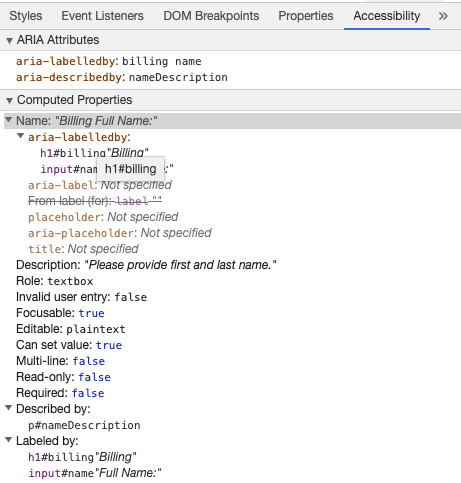
aria-describedby 的用法与 aria-labelledby 相同,它提供了一条用户可能需要的附加描述信息。这可用于描述任何输入的标准:
<formclass="demo"action="/dataCollectionLocation"method="post"autocomplete="on"><h1 id="billing">Billing</h1><div class="form-item"><label for="name">Full Name:</label><inputtype="text"name="name"id="name"v-model="name"aria-labelledby="billing name"aria-describedby="nameDescription"/><p id="nameDescription">Please provide first and last name.</p></div><button type="submit">Submit</button></form>
你可以通过使用 Chrome 开发工具来查看说明:
占位符 {#placeholder}
避免使用占位符,因为它们可能会使许多用户感到困惑。
占位符的缺陷之一是默认情况下它们不符合颜色对比度标准;应当修改其颜色,让它看起来像是预先填入 input 框中的数据一样。查看以下示例,可以看到满足颜色对比度条件的姓氏占位符看起来像预填充的数据:
<formclass="demo"action="/dataCollectionLocation"method="post"autocomplete="on"><div v-for="item in formItems" :key="item.id" class="form-item"><label :for="item.id">{{ item.label }}: </label><inputtype="text":id="item.id":name="item.id"v-model="item.value":placeholder="item.placeholder"/></div><button type="submit">Submit</button></form>
最好在表单外提供所有用户需要填写输入的信息。
用法说明 {#instructions}
添加用法说明时,请确保将其正确链接到目标 input 框。你可以提供附加用法说明并在 aria-labelledby 内绑定多个 id。这可以使设计更加灵活。
<fieldset><legend>Using aria-labelledby</legend><label id="date-label" for="date">Current Date:</label><inputtype="date"name="date"id="date"aria-labelledby="date-label date-instructions"/><p id="date-instructions">MM/DD/YYYY</p></fieldset>
或者,你可以通过 aria-describedby 将用法说明附加到 input 框上。
<fieldset><legend>Using aria-describedby</legend><label id="dob" for="dob">Date of Birth:</label><input type="date" name="dob" id="dob" aria-describedby="dob-instructions" /><p id="dob-instructions">MM/DD/YYYY</p></fieldset>
隐藏内容 {#hiding-content}
通常,即使 input 框具有无障碍的名称,也不建议在视觉上隐藏标签。但是,如果可以借助周围的内容来理解输入的功能,那么我们也可以隐藏视觉标签。
让我们看看这个搜索框:
<form role="search"><label for="search" class="hidden-visually">Search: </label><input type="text" name="search" id="search" v-model="search" /><button type="submit">Search</button></form>
现在,只要视力情况良好,用户可以就能通过按钮的内容识别出该 input 框的目的。
此时我们可以使用 CSS 从视觉上隐藏元素,同时也不会影响到无障碍访问:
.hidden-visually {position: absolute;overflow: hidden;white-space: nowrap;margin: 0;padding: 0;height: 1px;width: 1px;clip: rect(0 0 0 0);clip-path: inset(100%);}
aria-hidden="true" {#aria-hiddentrue}
添加 aria-hidden="true" 在无障碍访问时被隐藏,但对其他可视用户仍然是可见的。不要在可聚焦的元素上使用它,请只在装饰性的、重复的的或屏幕外的内容上使用它。
<p>This is not hidden from screen readers.</p><p aria-hidden="true">This is hidden from screen readers.</p>
按钮 {#buttons}
在表单中使用按钮时,必须设置类型以防止提交表单。 你也可以使用一个 input 元素来创建按钮:
<form action="/dataCollectionLocation" method="post" autocomplete="on"><!-- 按钮 --><button type="button">Cancel</button><button type="submit">Submit</button><!-- 输入按钮 --><input type="button" value="Cancel" /><input type="submit" value="Submit" /></form>
功能图片 {#functional-images}
你可以使用这种方式来创建一个带有功能的图片。
input 框
- 这些图片会像一个类型为 submit 的表单按钮一样
<form role="search"><label for="search" class="hidden-visually">Search: </label><input type="text" name="search" id="search" v-model="search" /><inputtype="image"class="btnImg"src="https://img.icons8.com/search"alt="Search"/></form>
图标
<form role="search"><label for="searchIcon" class="hidden-visually">Search: </label><input type="text" name="searchIcon" id="searchIcon" v-model="searchIcon" /><button type="submit"><i class="fas fa-search" aria-hidden="true"></i><span class="hidden-visually">Search</span></button></form>
规范 {#standards}
万维网联盟 (W3C) Web 无障碍访问倡议 (WAI) 为不同的组件制定了 Web 无障碍性标准:
- 用户代理无障碍访问指南 (UAAG)
- 浏览器和媒体查询,包括一些其他方面的辅助技术
- 创作工具无障碍访问指南 (ATAG)
- 创作工具
- Web 内容无障碍访问指南 (WCAG)
- 网站内容 - 由开发者、创作工具和无障碍访问评估工具使用。
网络内容无障碍指南 (WCAG) {#web-content-accessibility-guidelines-wcag}
WCAG 2.1 继承自 WCAG 2.0,接纳 Web 演进过程中的新技术。W3C 鼓励在开发或更新 Web 无障碍访问策略时使用 WCAG 的最新版本。
WCAG 2.1 2.1 四大指导原则 (缩写 POUR):{#wcag-21-four-main-guiding-principles-abbreviated-as-pour}
Web 无障碍倡议 – 无障碍访问丰富的互联网应用程序 (WAI-ARIA) {#web-accessibility-initiative-accessible-rich-internet-applications-wai-aria}
W3C 的 WAI-ARIA 为如何构建动态内容和高阶用户界面控件提供了指导。
资源 {#resources}
文档 {#documentation}
- WCAG 2.0
- WCAG 2.1
- Accessible Rich Internet Applications (WAI-ARIA) 1.2
- WAI-ARIA Authoring Practices 1.2
辅助技术 {#assistive-technologies}
测试 {#testing}
- 自动化相关的工具
- 颜色相关的工具
- 其他有用的工具
用户 {#users}
世界卫生组织估计,全世界 15% 的人口患有某种形式的残疾,其中约 2 - 4% 的人严重残疾。估计全世界有 10 亿残障人士,它们是世界上最大的少数群体。
残疾的种类繁多,大致可分为以下四类:
- 视觉 - 可以为这些用户提供屏幕助读器、屏幕缩放、控制屏幕对比度或盲文显示等帮助。
- 听觉 - 可以为这些用户提供视频字幕、文字记录或手语视频。
- 运动能力 - 可以为这些用户提供一系列运动障碍辅助技术中:比如语音识别软件、眼球跟踪、单刀式开关、超大轨迹球鼠标、自适应键盘等等。
- 认知能力 - 可以为这些用户提供补充媒体、更清晰和简单、更结构化的内容。
你可以查看以下来自 WebAim 的链接,更深入地了解这些用户的需求:

若有收获,就点个赞吧
0 人点赞
