flex 布局
三栏布局页面不滚动头尾固定中间根据内容自缩放调整 —- !!!不适应手机端
页面效果
中间多个板块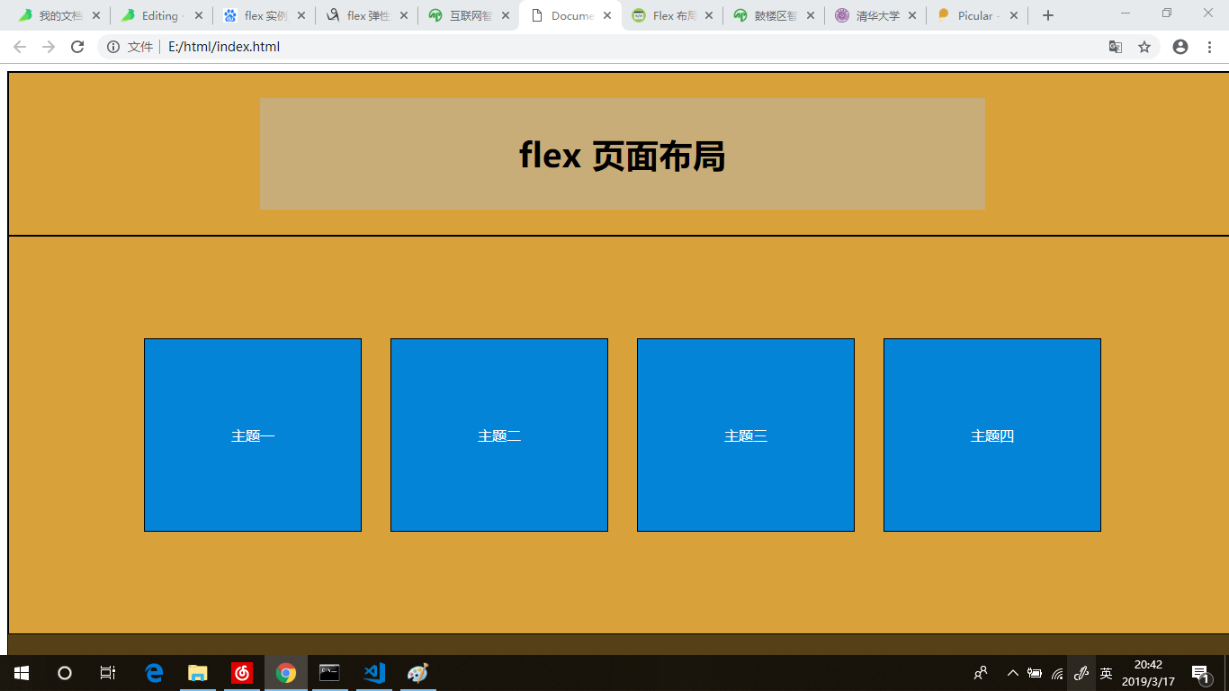
中间两个板块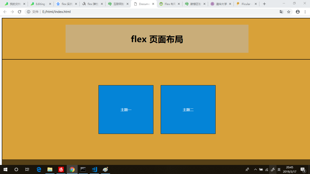
页面部分
<div class="a-container"><div class="a-header"><div class="title"><h3>flex 页面布局</h3></div></div><div class="a-main"><div>主题一</div><div>主题二</div><div>主题三</div><div>主题四</div></div><div class="a-footer"><div class="copyright"> Copyright © 版权所有 | <span>备案号</span></div></div></div>
样式部分
.a-container {display: flex;flex-direction: column;font: normal 100% Helvetica, Arial, sans-serif;margin: 0;padding: 0;width: 100%;height: 100%;position: fixed;font-family: "Microsoft YaHei", Verdana, Geneva, sans-serif;background: #D8A139;border: 1px solid #000;}.a-container > *{padding:10px;flex:1 100%}.a-main div,.a-footer div {margin: 1em;}.a-main {display: flex;justify-content: center;align-items: center;border: 1px solid #000;}.a-main div {border: 1px solid #000;background: #0484D7;color: #fff;padding: 6em;}.a-header {display: flex;justify-content: center;align-items: center;max-height: 10em;border: 1px solid #000;}.a-header .title {width: 60%;text-align: center;font-size: 2em;background-color: rgba(185, 185, 185, 0.5);}.a-footer {display: flex;justify-content: center;align-items: center;border: 1px solid #000;font-size: .16em;background: #000;opacity: 0.6;border-top: 1px solid rgba(255, 255, 255, 0.4);max-height: 4em;border: 1px solid #000;}.copyright span {color: #ccc;}
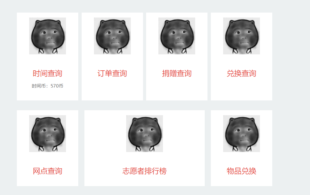
自适应页面卡片
页面部分
<!DOCTYPE html><html lang="en"><head><meta charset="UTF-8"><meta name="viewport" content="width=device-width, initial-scale=1.0"><meta http-equiv="X-UA-Compatible" content="ie=edge"><title>Document</title><style>body {font-family: sans-serif; }p {color: #666;}h2 {font-size: 1.5em;color: #e74c3c;}.centered {margin: 0 auto;padding: 0 1em;}@media screen and (min-width: 52em) {.centered {max-width: 52em;}}/* Card Based Layout - Base styles */body {background: #ecf0f1;line-height: 1.4;}.card {background: white;margin-bottom: 2em;}.card a {color: black;text-decoration: none;}.card a:hover {box-shadow: 3px 3px 8px hsl(0, 0%, 70%);}.card-content {padding: 1.4em;text-align: center;}.card-content h2 {margin-top: 0;margin-bottom: .5em;font-weight: normal;}.card-content p {font-size: 95%;}img {width: 100%;height: auto;}/* Flexbox styles */@media screen and (min-width: 40em) {.cards {margin-top: -1em;display: flex;justify-content: space-between;flex-wrap: wrap;}.card {margin-bottom: 1em;display: flex;flex: 0 1 calc(50% - 0.5em);/* width: calc(50% - 1em); */}} /* mq 40em*/@media screen and (min-width: 60em) {.cards {margin-top: 10%;}.card {margin-bottom: 2em;display: flex;flex: 0 1 calc(25% - 0.5em);/* width: calc(33% - 1em); */}.card:nth-child(6){padding: 0 6em;}} /* mq 60em*/.card:nth-child(1){}.card:nth-child(2){}.card:nth-child(3){}.card:nth-child(4){}.card:nth-child(5){}.card:nth-child(6){}.card:nth-child(7){}</style></head><body><main class="main-area"><div class="centered"><section class="cards"><article class="card"><a href="#"><figure class="thumbnail"><img src="https://graph.baidu.com/resource/102e8c3b6a9bdd4d742e201555948681.jpg" alt="meow"></figure><div class="card-content"><h2>时间查询</h2><p>时间币:570币</p></div><!-- .card-content --></a></article><!-- .card --><article class="card"><a href="#"><figure class="thumbnail"><img src="https://graph.baidu.com/resource/102e8c3b6a9bdd4d742e201555948681.jpg" alt="meow"></figure><div class="card-content"><h2>订单查询</h2></div><!-- .card-content --></a></article><!-- .card --><article class="card"><a href="#"><figure class="thumbnail"><img src="https://graph.baidu.com/resource/102e8c3b6a9bdd4d742e201555948681.jpg" alt="meow"></figure><div class="card-content"><h2>捐赠查询</h2></div><!-- .card-content --></a></article><!-- .card --><article class="card"><a href="#"><figure class="thumbnail"><img src="https://graph.baidu.com/resource/102e8c3b6a9bdd4d742e201555948681.jpg" alt="meow"></figure><div class="card-content"><h2>兑换查询</h2></div><!-- .card-content --></a></article><!-- .card --><article class="card"><a href="#"><figure class="thumbnail"><img src="https://graph.baidu.com/resource/102e8c3b6a9bdd4d742e201555948681.jpg" alt="meow"></figure><div class="card-content"><h2>网点查询</h2></div><!-- .card-content --></a></article><!-- .card --><article class="card"><a href="#"><figure class="thumbnail"><img src="https://graph.baidu.com/resource/102e8c3b6a9bdd4d742e201555948681.jpg" alt="meow"></figure><div class="card-content"><h2>志愿者排行榜</h2></div><!-- .card-content --></a></article><!-- .card --><article class="card"><a href="#"><figure class="thumbnail"><img src="https://graph.baidu.com/resource/102e8c3b6a9bdd4d742e201555948681.jpg" alt="meow"></figure><div class="card-content"><h2>物品兑换</h2></div><!-- .card-content --></a></article><!-- .card --></section><!-- .cards --></div><!-- .centered --></main></body></html>
absolute /relative 页面布局
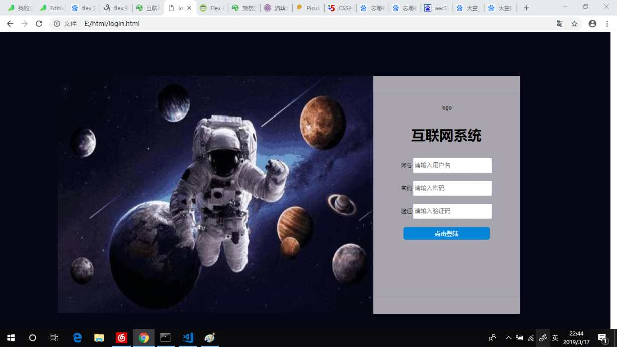
登录页面制作
效果图
页面部分
<div class="a-container"><div class="a-left"></div><div class="a-right"><form action="" class="a-form"><span class="logo"><img src="./src/assets/img/logo.png" /></span><h3>互联网系统</h3><div><label>账号<input type="text" placeholder="请输入用户名"></label></div><div><label>密码<input type="text" placeholder="请输入密码"></label></div><div><label>验证<input type="text" placeholder="请输入验证码"></label></div><div><input type="button" value="点击登陆"></input></div></form></div></div>
Css 样式部分
.a-container {background-color: #050714;width: 99%;height: 100%;position:absolute;margin: -8px;padding: 0;}.a-left {background: url(https://ss3.bdstatic.com/70cFv8Sh_Q1YnxGkpoWK1HF6hhy/it/u=1020949186,1164682391&fm=26&gp=0.jpg) no-repeat 0 0 / 100% 100%;width: 51.6%;height: 75.6%;position: relative;top: 14%;left: 9.5%;}.a-right {display: flex;background-color: #a8a5ae;justify-content: center;align-items: center;width: 23.98%;height: 75.8%;position: relative;top: -61.6%;left: 61.11%;}.a-form {font: normal 100% Helvetica, Arial, sans-serif;font-size: .14em;border: 1px solid rgba(4, 131, 215, 0.116);padding: 2em;height: 75.8%;width:100%;position: relative;text-align: center;}.a-form h3 {font-size: 14em;text-align: center;}.a-form div {padding-bottom: 1.5em;}input[type='text'] {border: none;border-bottom: 1px dotted rgba(105, 107, 107, 0.418);height: 2em;color: #eee;padding: .2em;}input[type='button'] {width: 70%;background: #0484D7;color: #fff;border: none;border-radius: .4em;padding: .4em;}.logo img {width: 30%;padding-bottom: .1em;}@media screen and (max-width: 1200px) {.a-left {width: 0%;}.a-right {width: 80%;left: 9.5%;}.a-form {width:60%;}}
垂直剧中
.main {display: relative}.item {transform: translate(-50%, -50%);position: absolute;top: 50%;left: 50%;background: #eee;}<div class="main"><div class="item">item</div></div>
新时代布局
女神讲解连接 链接
经典布局案例
瀑布流布局
页面结构
<div class="wrapper-container"><div class="item"></div></div>
CSS 样式
.wrapper-container {column-count: 2;column-gap: 1vw;padding-top: 1vw;}.item {padding: 2vw;border: 1px solid #dddfe4;border-radius: 3px;position: relative;margin-bottom: 1vw;break-inside: avoid;}

若有收获,就点个赞吧
0 人点赞
