更改背景图片颜色
/* .gray {filter: grayscale(100%);filter: gray;opacity:0.7;} */
布局
三栏布局-flex布局
<div class="container"><div class="main">main</div><div class="left">left</div><div class ="right">right</div></div><style>.container {width:100%;mine-height:300px;display:flex;}.main {background:#ddd;flex-grow:1;}.left {background:#eee;order:-1;flex-basis:60px;}.right {background:#f00;flex-basis:60px;}</style>
语法
阴影
- 文字阴影 text-shadow: 5px 5px 5px #FF0000;(水平阴影,垂直阴影,模糊距离,阴影颜色)
- 盒阴影:box-shadow: 10px 10px 5px #888888
- 边框图片:border-image: url(border.png) 30 30 round
- word-wrap(对长的不可分割单词换行)word-wrap:break-word
CSS 动画
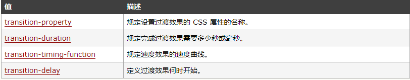
- transition
// 语法transition: property duration timing-function delay;
使用css3 使得背景图片呈现动态效果
@keyframes mlfly {0% {background: url(./image/mainbg.png) no-repeat 0 0 / 100% 100%;background-position: 0 0;}100% {background: url(./image/mainbg.png) no-repeat 0 0 / 100% 100%;background-position: 1080px 0;}}-webkit-transform-style: preserve-3d;transform-style: preserve-3d;animation: mlfly 1s steps(3, start) 1s infinite alternate;

若有收获,就点个赞吧
0 人点赞
